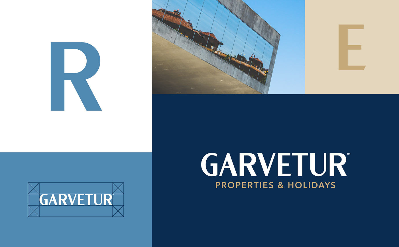
Garvetur, Properties & Holidays
To redefine, redesign and give a clear and direct purpose to the brand.
The aim was to create a graphic language more suited to the brand's mission and positioning. A clear and noise-free language. With communication that emotionally interacts with people.
We designed a bold and dynamic visual identity that represents the brand's values and purpose.
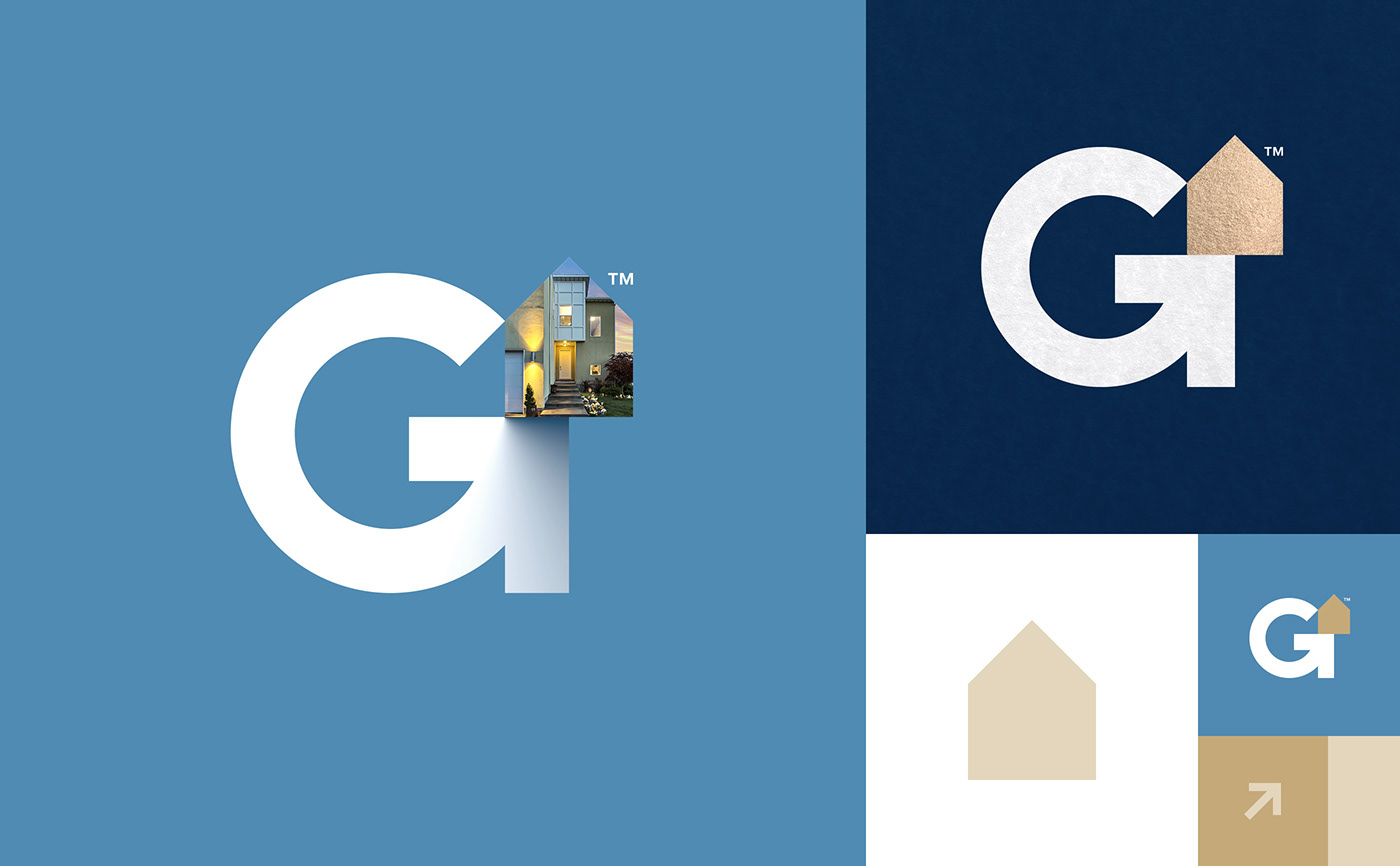
The symbol created reflects the company's core mission in a clever way. The concept created between the ambiguity of the letter G with the arrow pointing towards the goal is an impressive way to identify the brand.
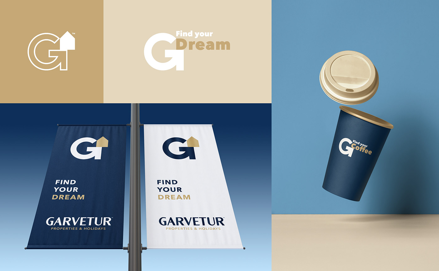
FIND YOUR DREAM HOME...
Client
Garvetur
Location
Algarve, Vilamoura
Role
Creative direction, Visual Identity & Logo Design

Concept for the new symbol
The three elements that form the symbol and their meanings.
G letter + Arrow + House
G letter + Arrow + House