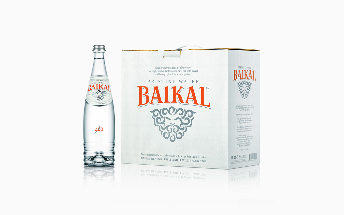
Tomatdesign agency developed a packaging for a new brand «Baikal». This premium drinking water is extracted at a depth of 400 meters, directly from the pore of the lake.
The old man of Baikal, a popular character of many legends and myths of Buryat people, became the brand symbol. The image is stylized to the national Buryat ornament. This graphical technique gives uniqueness to the brand and supports the product positioning of clean pristine water.