Larguei
About
Larguei is a Brazilian initiative that allows regular
people to buy and sell their used computer parts
to other people in an easier and cheaper way.
Challange
Our challenge with them was to design a modern
brand for a user target between 18 to 35 years which are
passionate about technology and to build their own computers.
______
Symbol & Lettering
In Portuguese, "Larguei" means "I dropped". The name idea came from our clients and its meaning might be understood as the action of pass forward the things you don't use anymore.
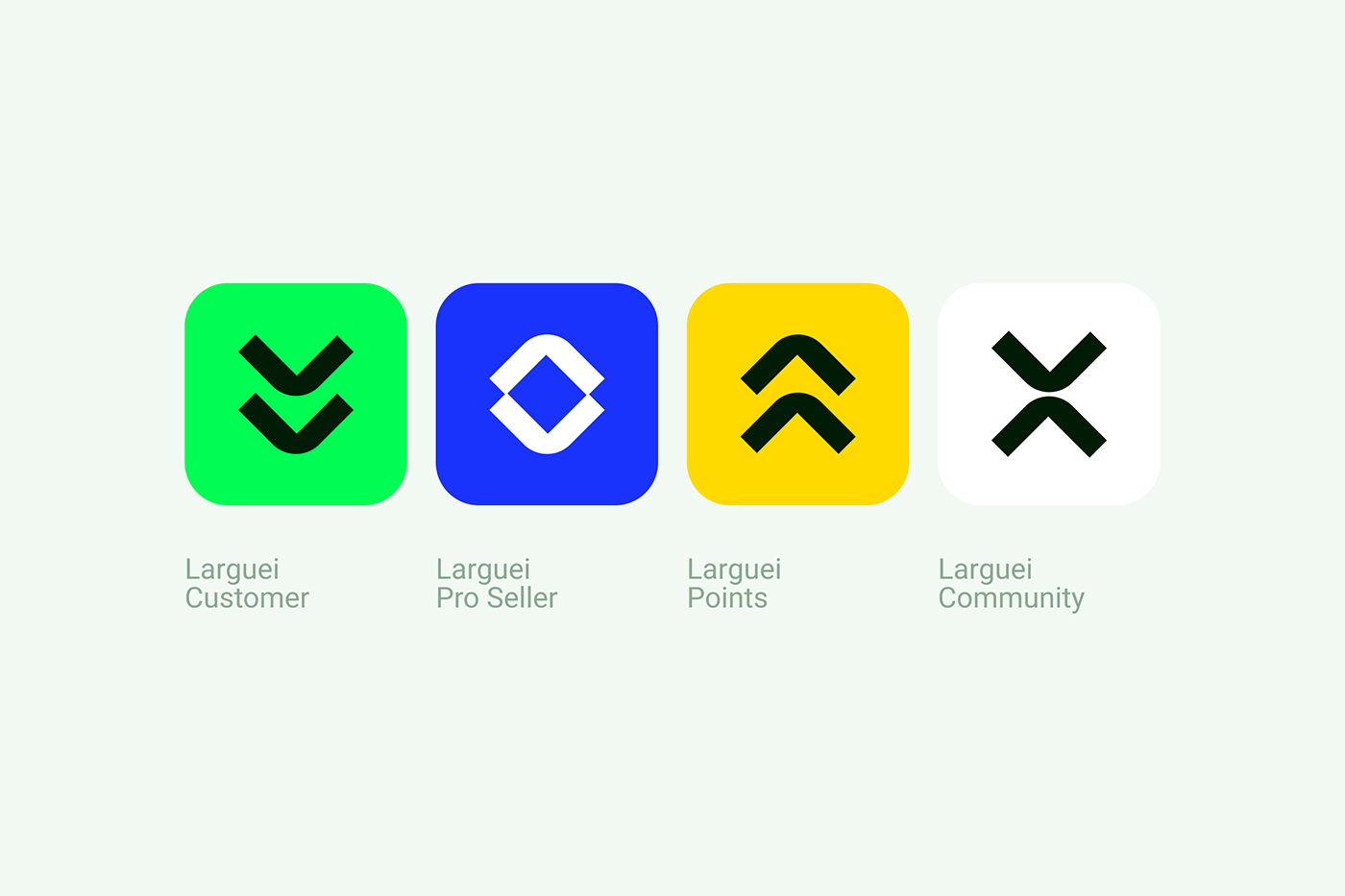
Represent this abstract meaning of dropping something is really hard. So we've created a symbol using two arrows pointing down to emphasize this movement. It is a simple and recognizable symbol that can also be viewed as if you were downloading something to yourself ⏤ like the used parts you can get using Larguei.


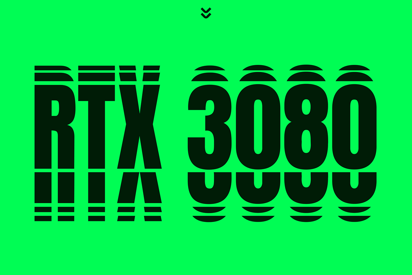
The lettering is based in a display font completely edited to fit in the style we were willing to achieve.
Some extensions for the main symbol were created to be used in different services provided by the company.
______
Color scheme
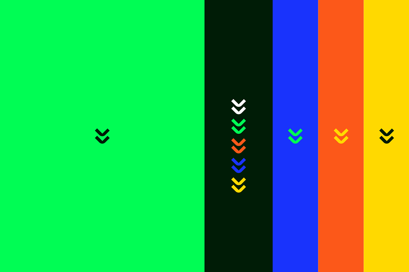
The light and dark green was chosen to pay tribute to the first circuit boards and interfaces seen in the first computers. All the other colors help the brand to look modern and fresh. A combination of new and old is what Larguei is made of.
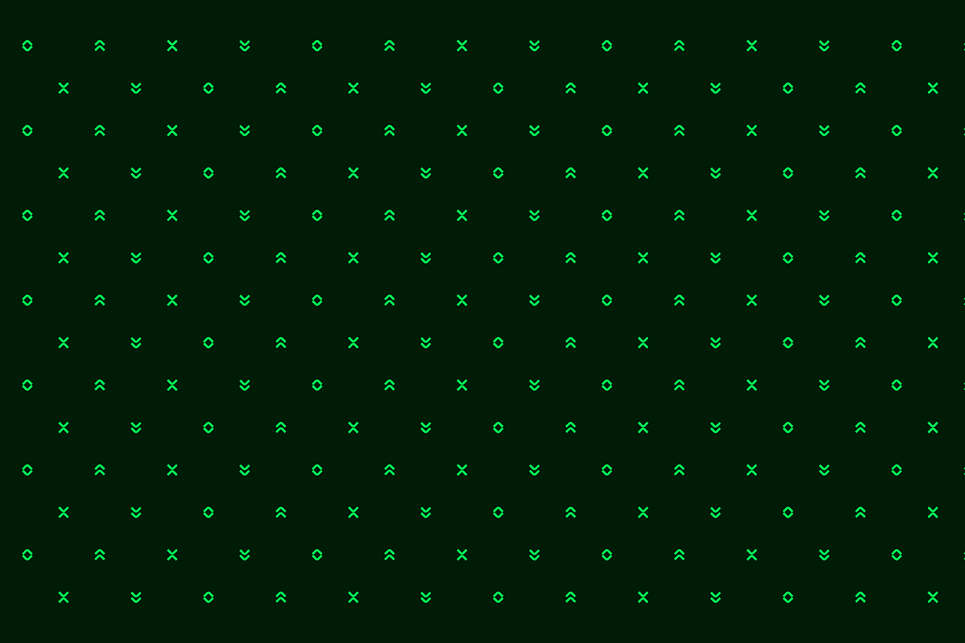
Some patterns and letterings were created to compose the brand look and feel.