

Quarantine days
A style project I decided to make during quarantine. Quite the challenge, because of the lay-out and the limited numbers of colors. Not my usual style, but I took interest because it's quite populair nowadays. Unfortunately it took way longer than I expected to finish up. But no less fun, inspiration comes from big designers I follow on Instagram (see below some of my progress). Though I still continue my style journey, to discover what kind of style suits me and I find pleasure to draw to. Combining it with a nice color palette with a neat lay-out, therefore I still continue to experiment and challenge myself.
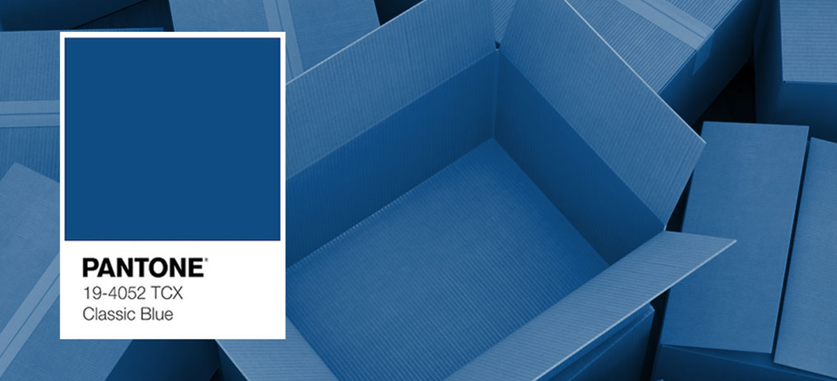
he main colour usage is the pantone color of this year; Classic blue. Blue’s relation to the sky at dusk, something we see every day, it maintains a perception of dependability and constancy. A color we respond to viscerally as being trustworthy, Classic Blue is an ideal shade for many applications in graphic design. This is especially true for packaging, where Classic Blue conveys the message of credibility and reliability that today’s consumers are connecting to. Classic Blue is a poised and self-assured blue hue, elegant in its simplicity. Genderless in outlook and season-less in endurance, this foundational anchor shade enables color mixes throughout the spectrum, yet at the same time, makes a strong statement on its own.


One of the great illustrator that influenced me was Zwarte Koffie (Timo Kuilder), some of his big works took my attention
(New York Times and the 150 anniversary year of Bijenkorf).

The design didn't go according to the plan, as I went for the quite more "detailed" illustrations instead of very minimum (simple). But overall I do think I nailed the style.

The finishing artwork


