
.
©
Studío Lé
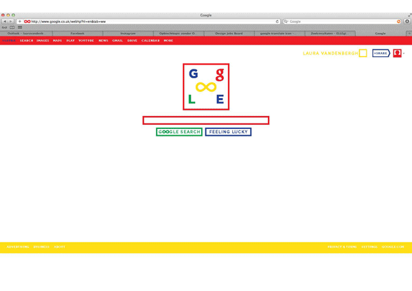
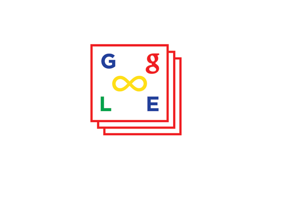
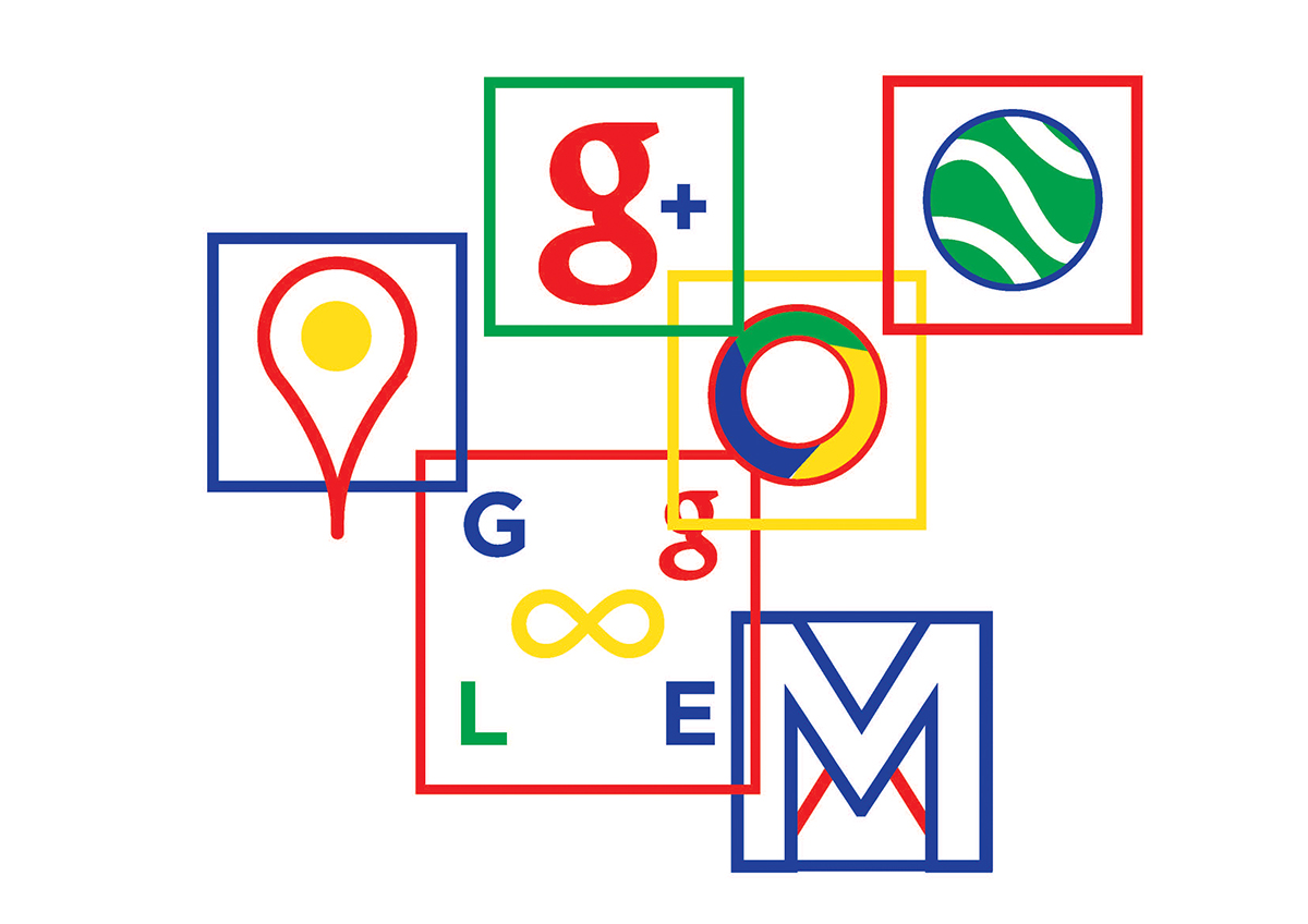
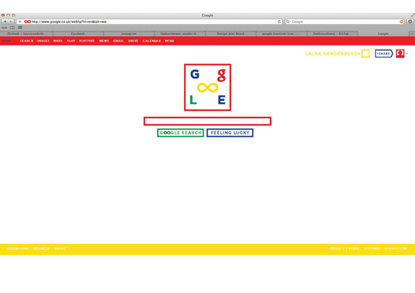
| GOOGLE REBRAND |
Project visualising how I would re-brand Google
I still want to emphasises their playfulness/childish character as Google doesn't want to be seen as "corporate and cold" I did this by keeping their iconic colour way and explore them more as a graphic device.
I replaced the O letter forms in the logo by an infinity symbol to symbolise their infenite amount of information.
I wanted to create a more playful Google world, that still shows there is an infinite amount of information out there, and there is still building up more.
-work in progress -


.
©
Studío Lé
.


