


Scottie Dog is a chain of cafes from British countryside established in Scotland. The identity deriving inspiration from the locale (British countryside), its people, culture and fashion. The Brand has been positioned as a local brand for a mass audience and is positioned in a way that the audience has a sense of belonging to it. It isn't an aspirational brand but instead a place which is welcoming and comfortable both in terms of the positioning and the pricing. It is a Personal Branding Project.
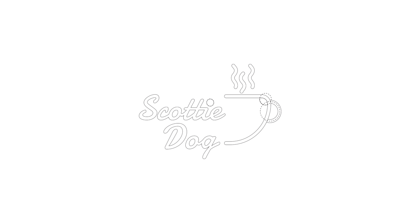
The logo is based on Golden Ratio. The eyes, nose and tongue of the dog has a ratio 8:13:21 The line weight of the logo-mark is 6.45 throughout. The major colour is Green and the minor colour is Yellow. Both the colours complement each other and portray playfulness.
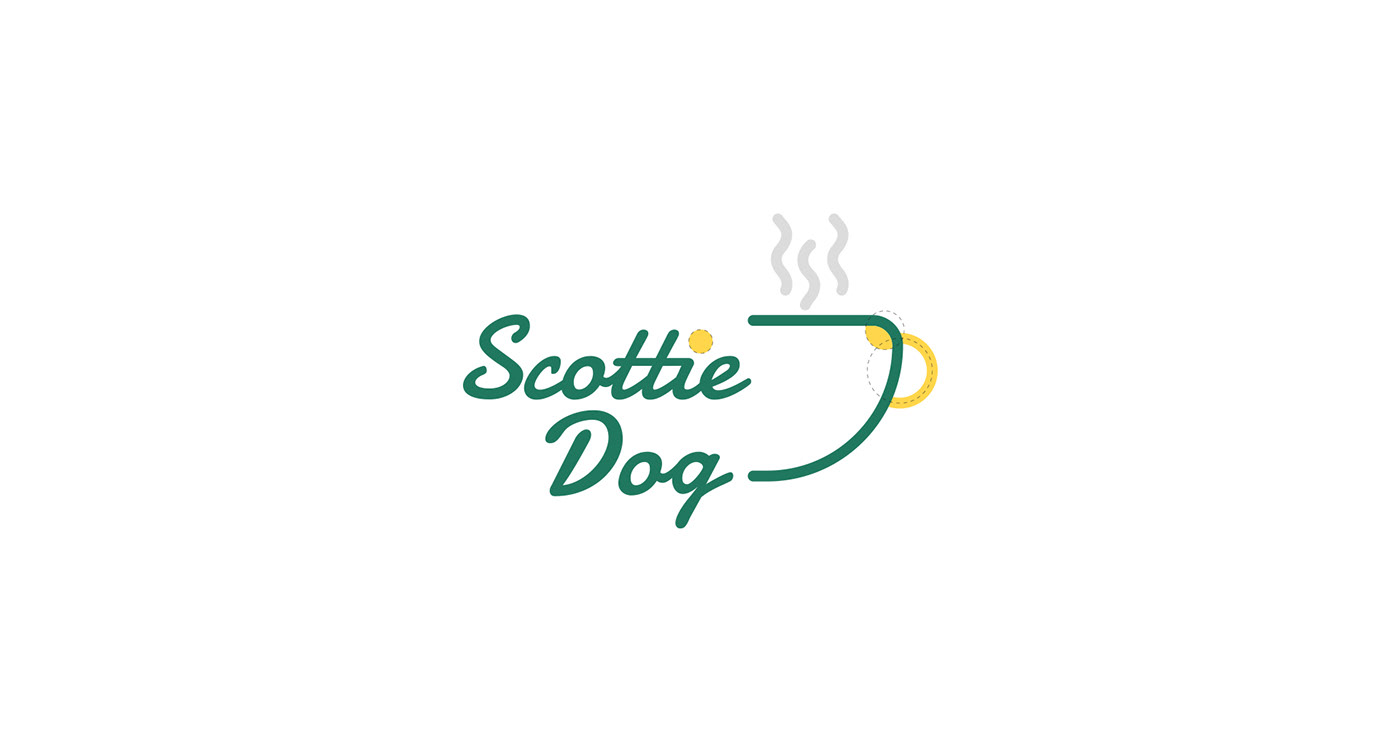


The inspiration to the pattern comes from the steam of a hot coffee.
The wave always have signified smell and vapours of a freshly brewed coffee.


The Illustrations on the menu cards and billboards has been designed using line icons.
The minor colour may be used to highlight individual elements.

Thanks for watching


