


1/8
Visual communication system, principles and the rules
of its scaling in the advertising environment.
Simplicity relieves the brand of excess, leaving only the most important.
Variability allows you to be flexible and quickly create layouts from
existing style constants.
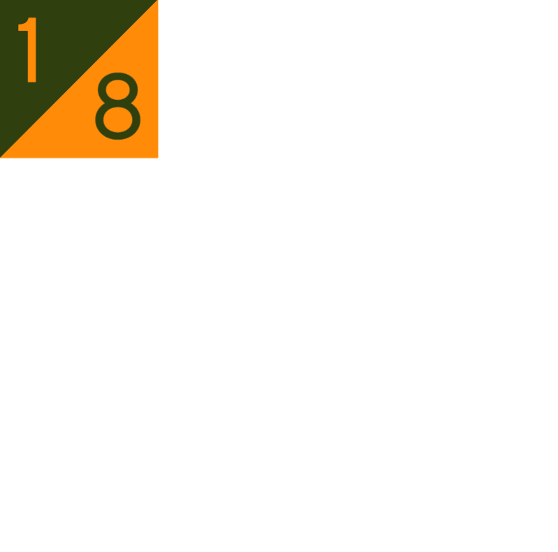
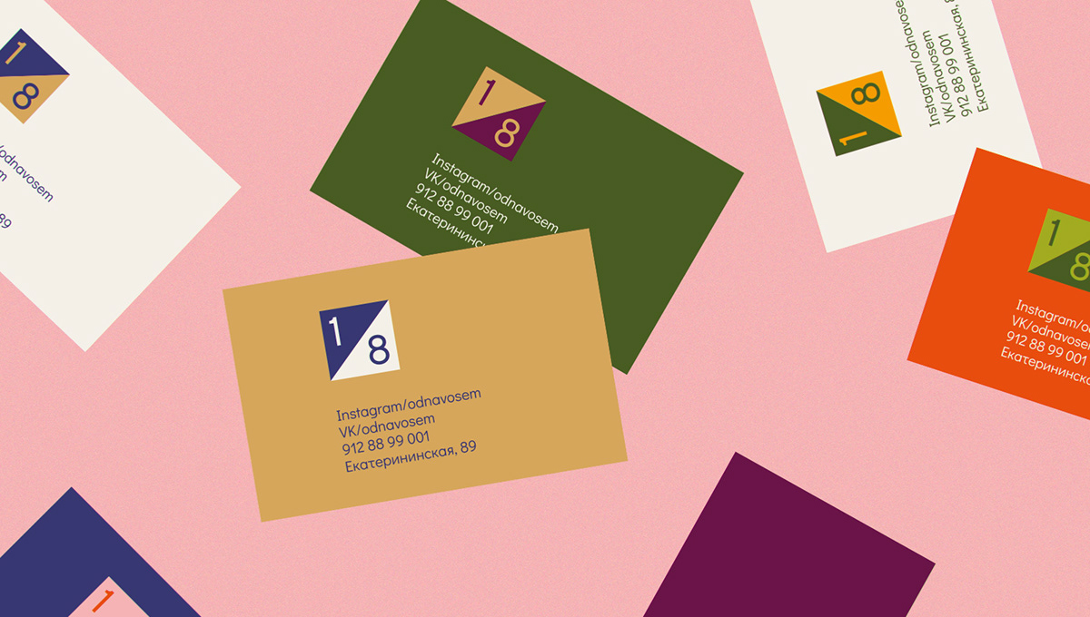
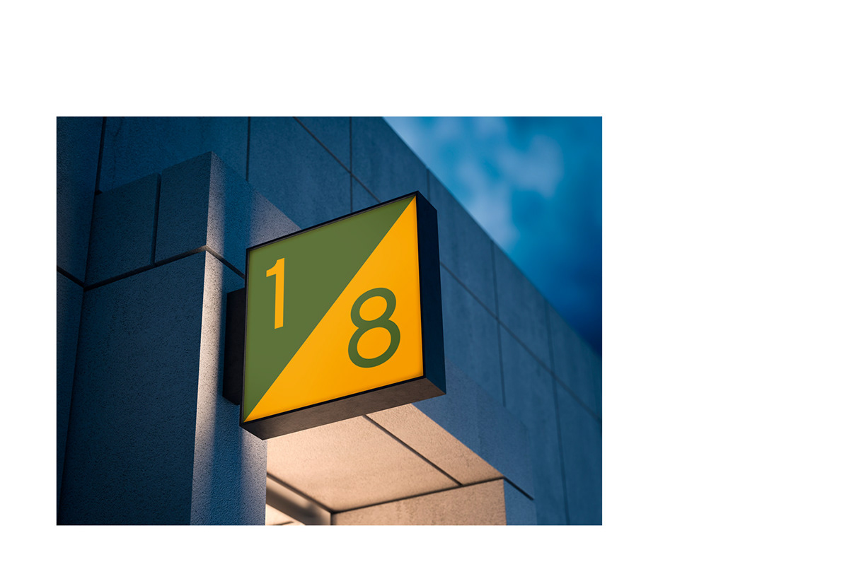
Dynamic logo —

The main color coding of the logo is pumpkin and spinach.
Recommended to use as a leading version of the logo.
The logo is variable, it can be adjusted to the advertising environment,
the color of the photo or graphic content — it's convenient.
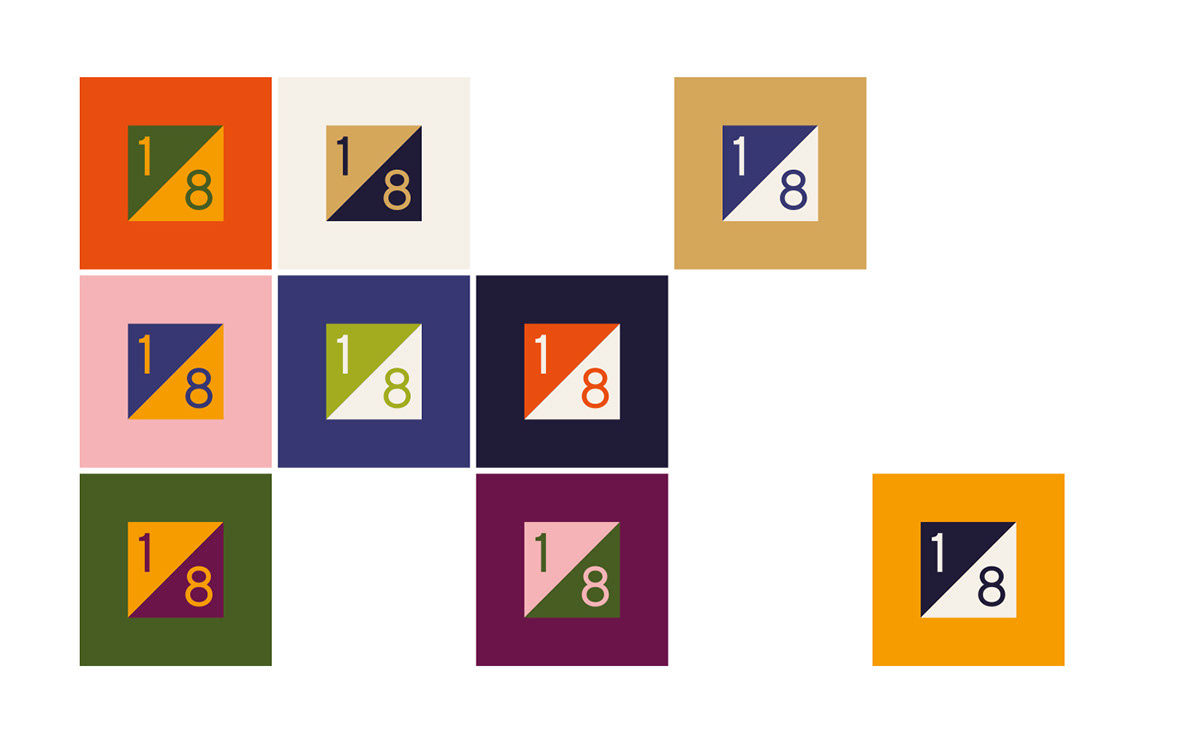
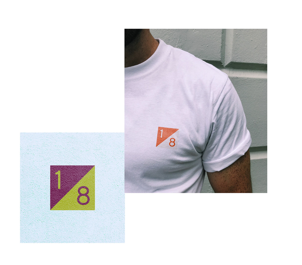
The logo has a simple scaling system. If necessary, the logo
can be zoomed in, without losing the size of the digits.
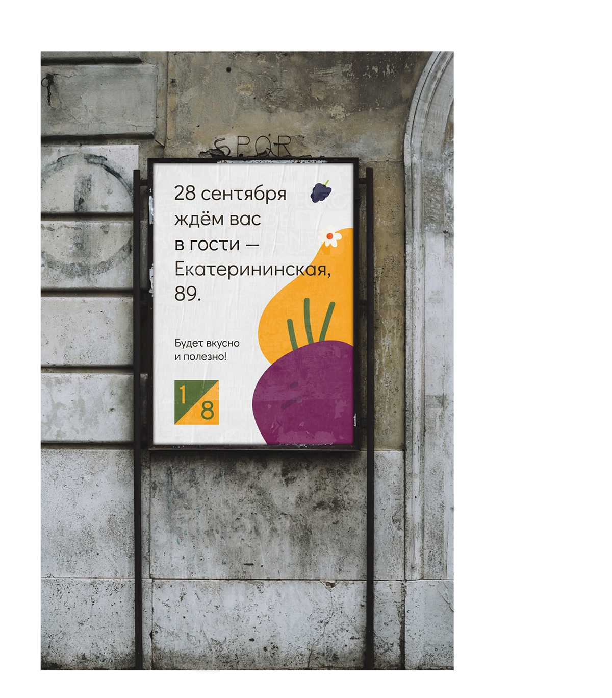
The logo can be located on the entire surface of the advertising field.
The logo can be located on the entire surface of the advertising field.
In this case on it it is possible to place the text information and reasonable
quantity of graphic elements.
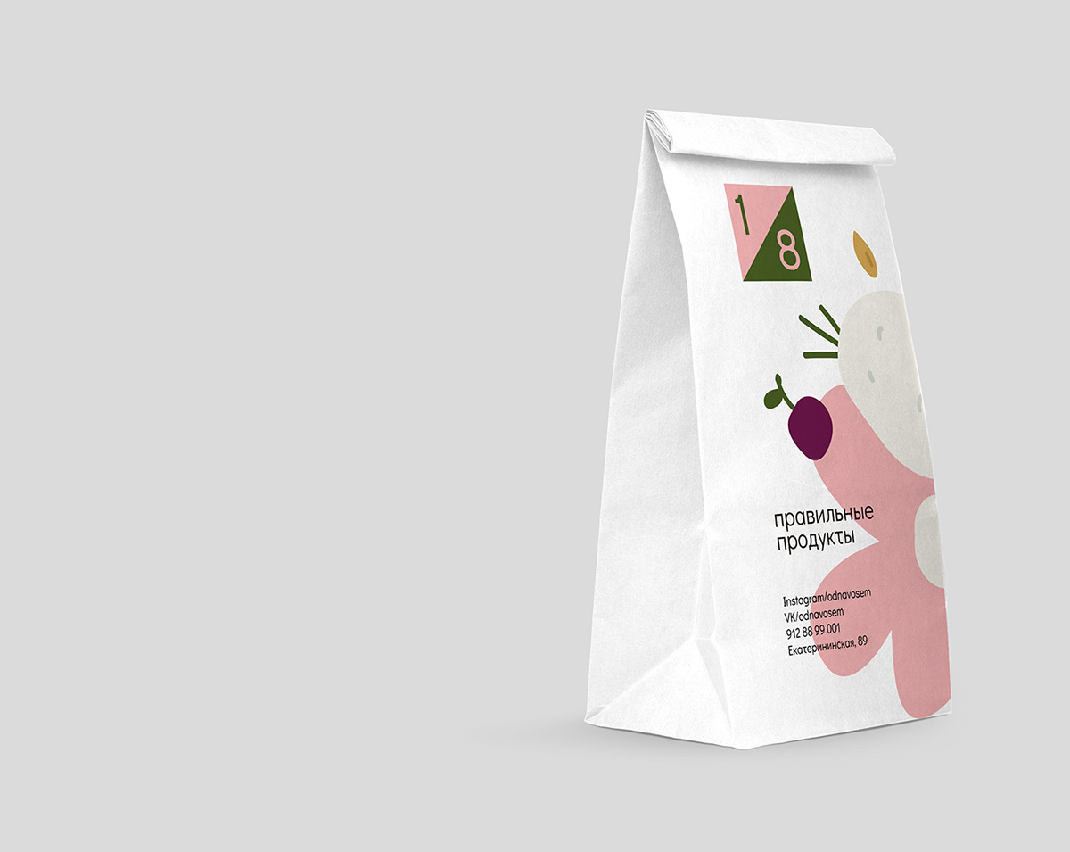
Color variations of the logo on a different background —
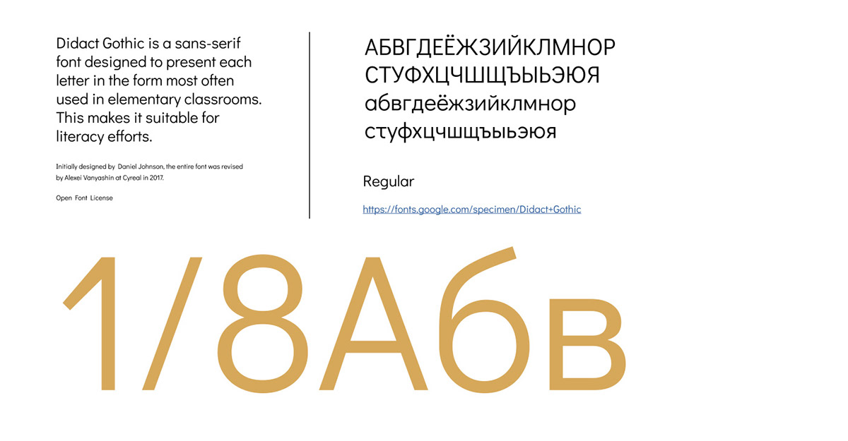
Font — Didact Gothic by Daniel Johnson
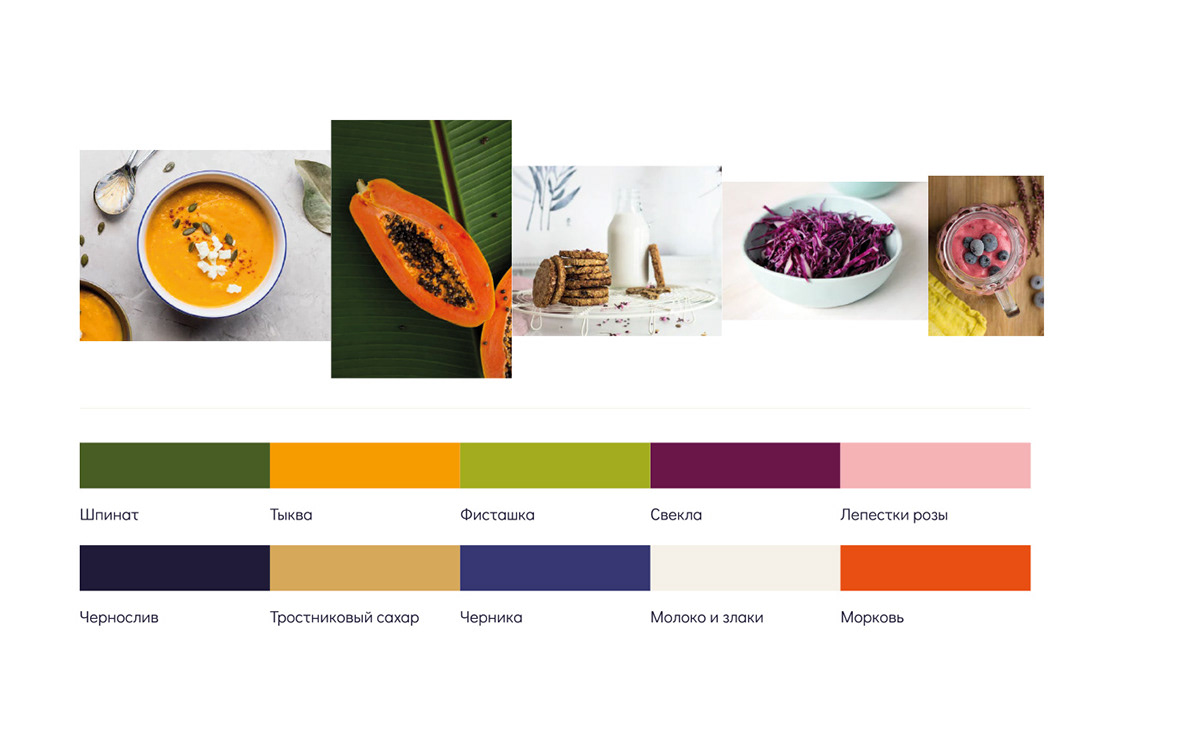
Colors and references —
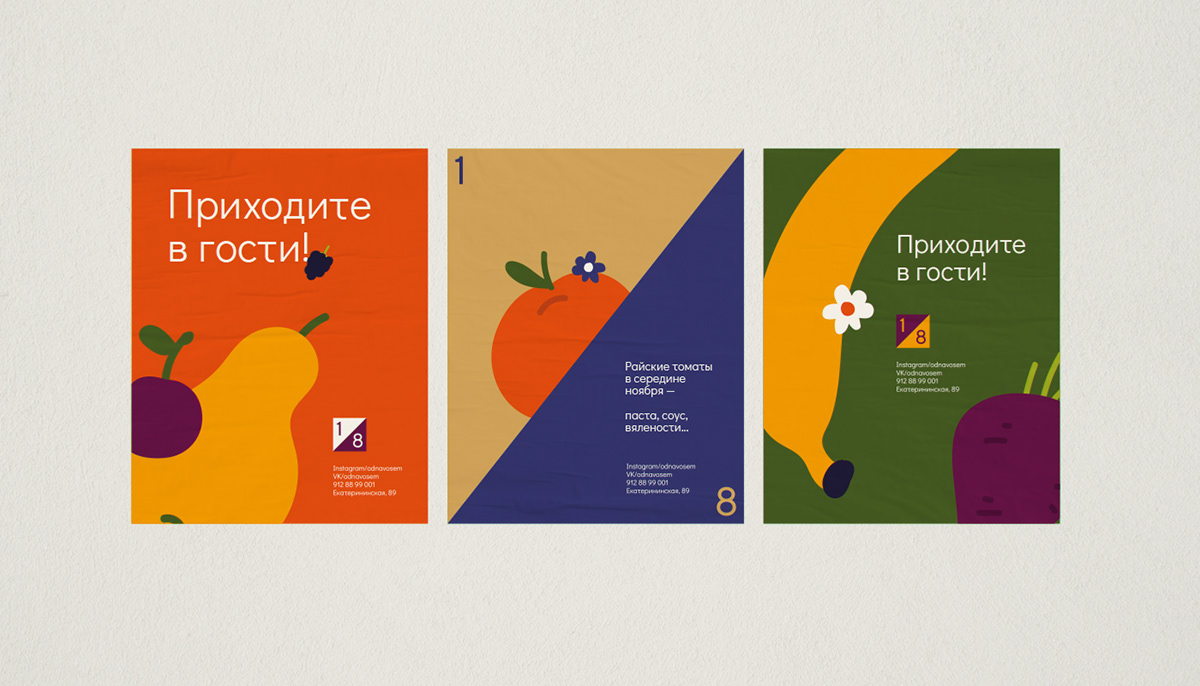
A simple system for constructing icons is based on inscribing
graphics in a square and a certain thickness of lines that are
slanted by 45 degrees in corners.

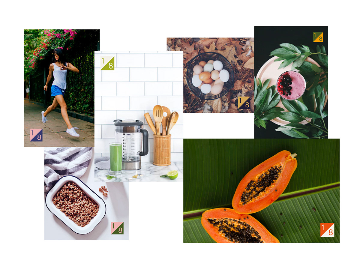
Illustrations complement the advertising layouts and saturate
their health, an atmosphere of intense ease.
Create new illustrations is simple — you need to adhere
to the necessary thickness of lines and softness of shapes.


let's see how it looks in life —


____________
Client — 1/8 food store
Services — Visual identity, Guidelines
Art direction & design — Dima Kolchanov
Animation & design — Vika Baida
Producer — Sasha Solovev
Client manager — Valentina Aristova


