KIT SWEET Brand Packaging
"A delicious tempting small dough" This is KIT SWEET's slogan, for the first time to give people a lively Sentimental taste.
“一颗美味诱人的小面团”这是KIT SWEET的口号,第一次听到给人一种活泼青涩的味道。


Yes, this is a vibrant dessert brand, devoted to the development of handmade desserts, focusing on the quality of the ingredients, is the taste of ordinary desserts, has been greatly improved.
是的,这是一家充满活力的甜品品牌,致力于手工甜点的的研发,专注食材的的品质搭配,是普通的甜品的口感,得到很大的提升。


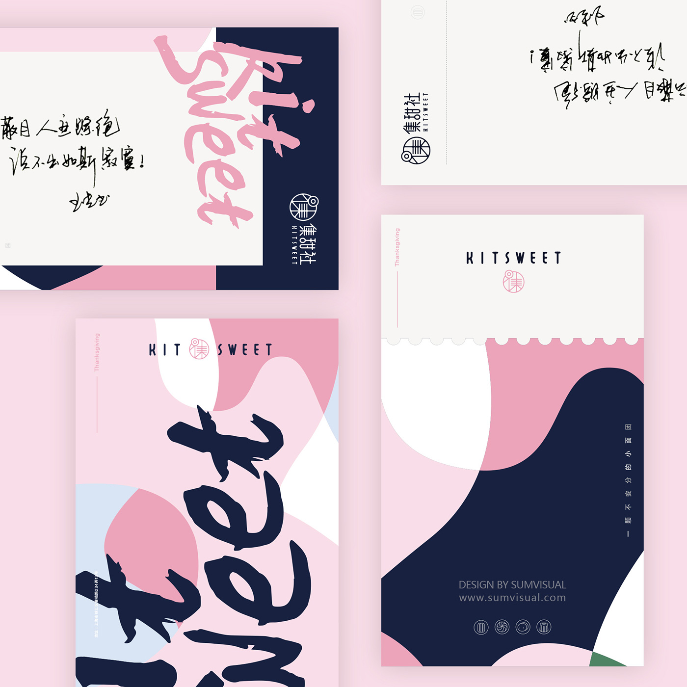
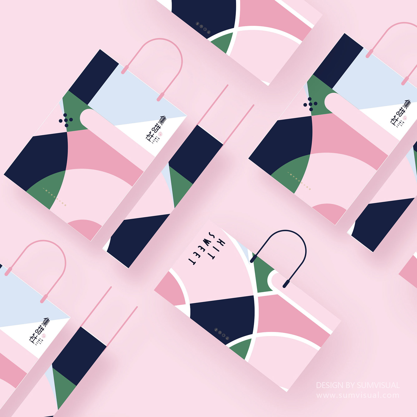
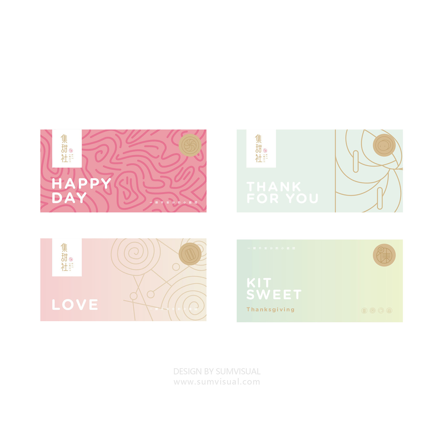
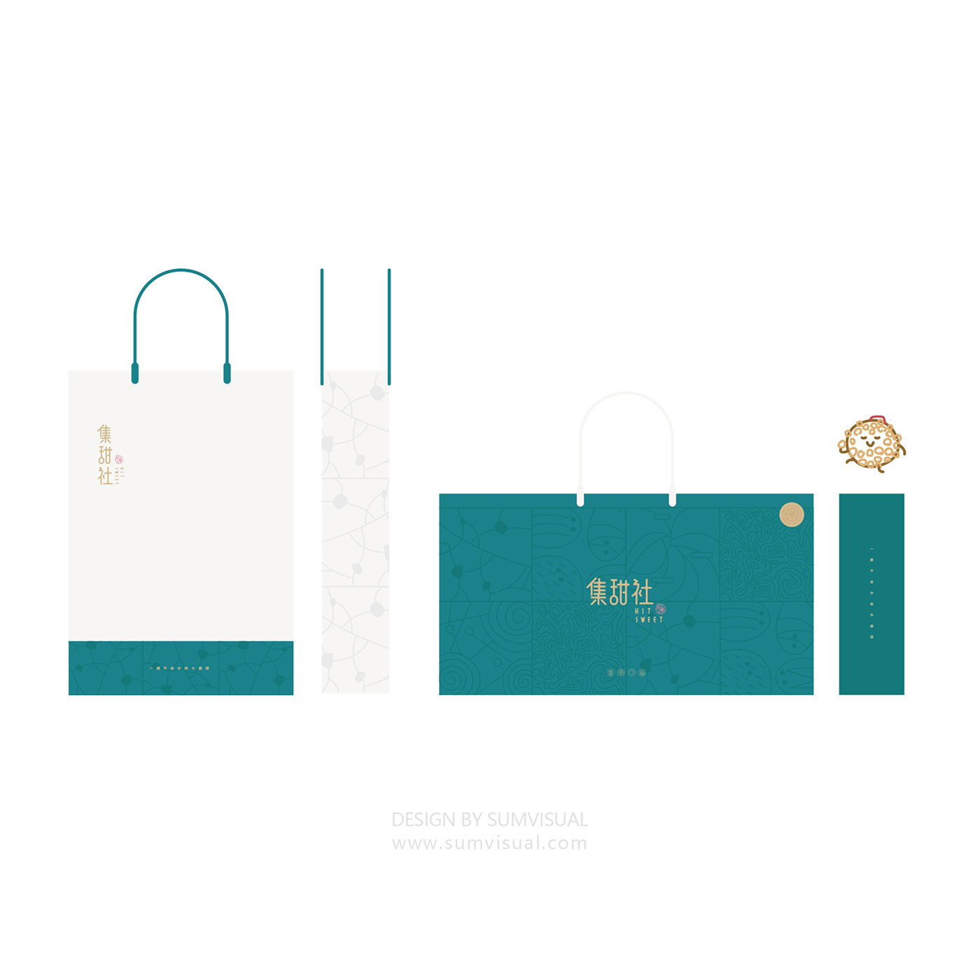
KIT SWEET positioning of the product is a light luxury dessert brand, we do brand design done when using two sets of colors, one is bright pink with blue soft colors, the other is dark green with gold. We think these two colors are very good to express the texture of light luxury.
KIT SWEET对产品的定位是一个轻奢甜品品牌,我们在做品牌设计的时候做了采用两套色彩搭配,一套是亮粉配蓝的柔感色彩,另一套则是墨绿配金。我们认为这两种色彩都能很好表达出轻奢的质感。
KIT SWEET对产品的定位是一个轻奢甜品品牌,我们在做品牌设计的时候做了采用两套色彩搭配,一套是亮粉配蓝的柔感色彩,另一套则是墨绿配金。我们认为这两种色彩都能很好表达出轻奢的质感。


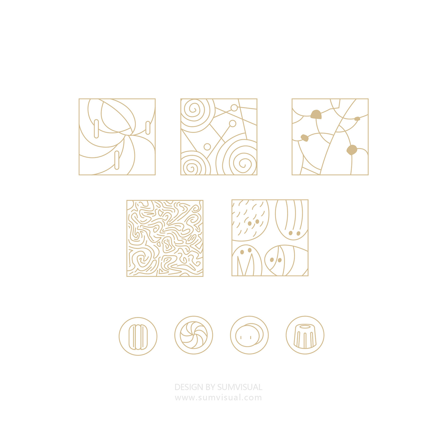
We use the Chinese brand logo on the main form of flu. Coupled with split interspersed, and then into a number of dessert elements. Let the brand in the tone to be unified.
在品牌logo上我们采用了中文汉子为主形式感。配上分割穿插,再融入了一些甜品的元素。让品牌在基调上得以保持统一。







We are a design company from Shanghai, China, for more cases, please visit www.sumvisual.com
我们一家设计公司,来自中国上海,更多的案例请点击网站 www.sumvisual.com


