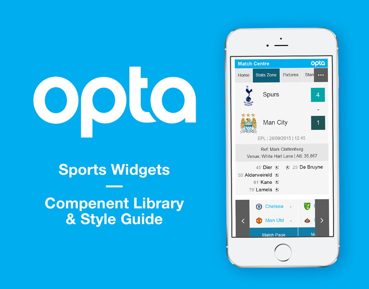
What is the Opta Widgets Suite?
Each Opta Widget is a snippet of embeddable code that visualises a specific set of sports data. When combining many widgets together you can create customised sports centres across all the major global sports.
The Challenge
We were challenged to create a universal language that works across every widget for every sport. All widgets needed to be fully responsive, something never considered before. The code needed to be really easy to customise and still be functional on older browsers. This meant that the visual design for all widgets needed to be as basic as possible, allowing customers quickly build their styles on top of our exising framework.
The Outcome
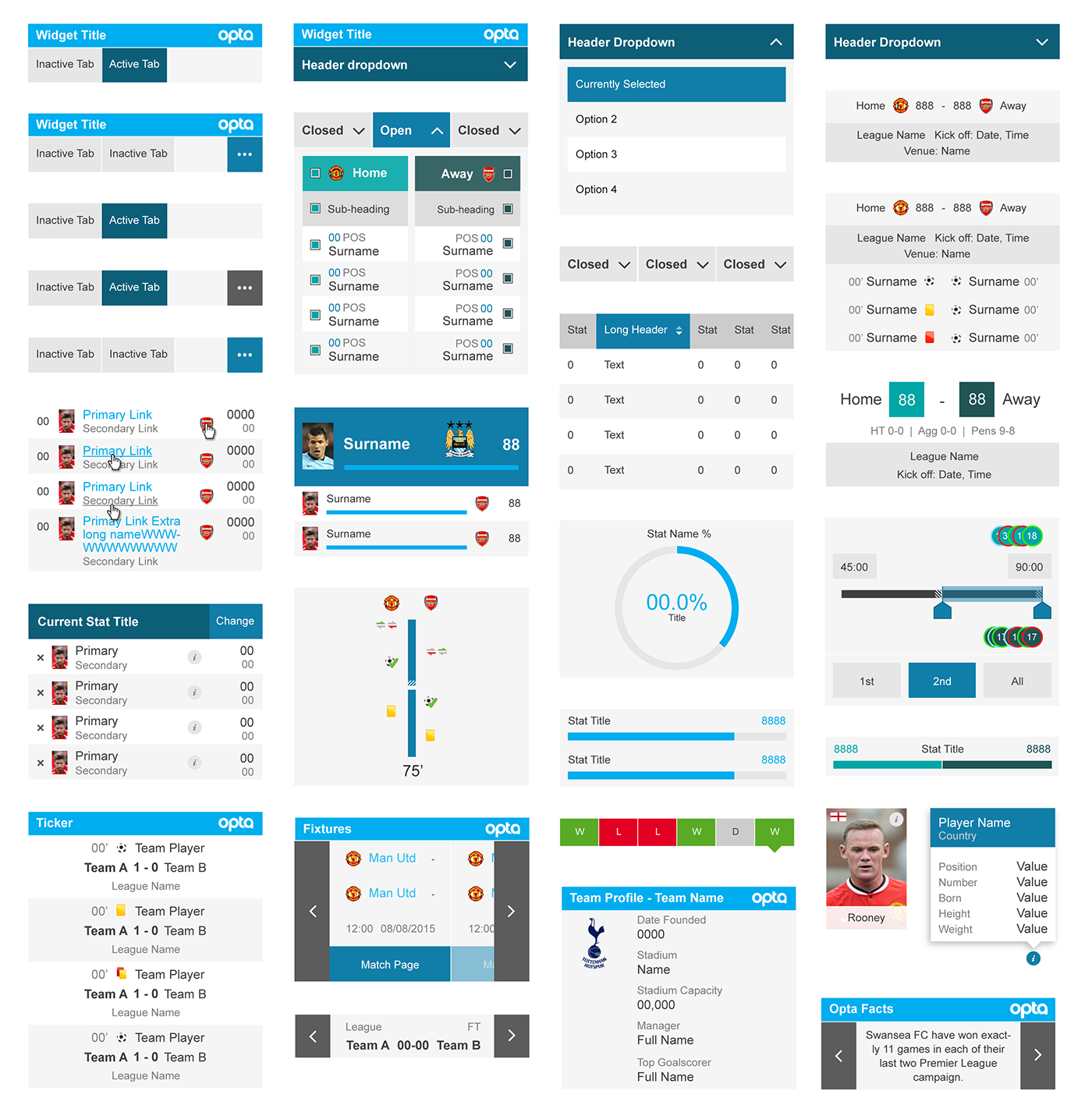
We rethought the entire widget suite. Approaching the task by considering all the widgets at the same time, this had never been possible before. We finally summarised all our efforts into a Style Guide and a Component Library.
Widget Style Guide: Fundamental design rules that all widgets must follow. Ensuring consistency across the whole widget suite.
Widget Component Library: Every component across the whole widget suite visualised. Showing all elements separately across 2 different breakpoints (desktop and mobile).
UX and UI by Asis Patel and Rob Gill
Old vs New Version

Basic CSS Rules
In order to keep the CSS to a minimum we designed the widgets with the basics in mind. Anything that adds extra unnecessary CSS was avoided. We chose to leave out the frills so our customers can build on top of our simplistic designs. This means they don’t have to overwrite lots of rules that don’t match their brand. Here are some core principals:
- No rounded corners, simple square edges.
- No drop shadows
- No custom fonts, arial, san-serif only.
- No capitalised text, keep it the same as the feed provides it.
- Avoid borders, light background colours instead.
- Limit the colour pallet, only use our limited colours.

Simplifying the Colour Pallet
We’ve evolved the colour pallet by simplifying the range of colours. Bringing meaning to the use of colour and standardising each hex value. For example the old hex, #F1F2F2 now became #F2F2F2.
Where possible we’ve considered the WCaG Compliance Ratings. Ensuring all text is at least AA compliant. Here is our reference tool: http://snook.ca/technical/colour_contrast/colour.html
However there are some instances that colour compliance is ignored. We needed to make the Widgets feel like part of the Opta brand. If we were to be fully colour compliant, the entire pallet would become a lot darker, moving away from the core brand colours. As a compromise, we use the WCaG Ratings as a guide and have limited the main colours to shades of Opta blue, and shades of grey only.

Mobile and Desktop Style Sheets
For the first time, the customer now has the ability to choose if they’d prefer to use the Mobile Style Sheet or the Desktop Style Sheet. The intention of the Mobile Style Sheet is to apply minor changes to the widgets. Clickable elements increase in height. Ensureing they're large enough to be tapped with a finger. Text is also increased in size so it’s easier to read on smaller screens.

Mobile & Desktop Match Centre

Designed for Multiple Sports

Opta: Widget Style Guide
Opta: Widget Component Library
Conclusion
The Opta Style Guide and Component Library is a living product. It is constantly evolving as additional widgets get introduced. As it stands, these docs explain everything our design and development teams need to know about the suite. By using them anyone will have the ability to make new additions feel like part of the existing product. The time and effort required to do so is now reduced to a minimum.
UX and UI by Asis Patel and Rob Gill


