
Challenge
The primary challenge in designing the branding for MEMU Coffee Shop was to create an inviting and memorable identity that encapsulated the theme of cuteness, using pink and brown as the main color palette. The design needed to appeal to a diverse audience, creating a warm and playful atmosphere while maintaining a professional and cohesive look suitable for a competitive market.
Approach
Our approach focused on balancing cuteness with sophistication. We aimed to integrate playful elements that would attract a younger crowd, while ensuring the overall aesthetic remained polished and inviting for all age groups. This involved creating a harmonious blend of colours, typography, and visual elements that aligned with the cozy and charming theme of MEMU.


A harmonious combination of pink, beige and warm brown, used consistently across all branding materials to create a cozy and inviting atmosphere.


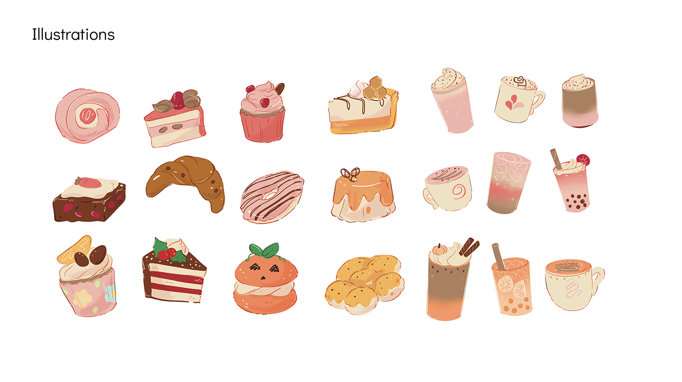
Custom illustrations of cute coffee beans, pastries, and character mascots that add a fun and charming touch to menus, packaging, and signage.

Eco-friendly coffee cups and takeaway bags featuring the brand's logo and illustrations, designed to delight customers and encourage brand loyalty.


Conclusion
The branding design for MEMU Coffee Shop successfully captures the intended theme of cuteness through a thoughtful blend of colors, typography, and playful elements. The cohesive design not only attracts a diverse audience but also creates a memorable and delightful customer experience, ensuring that MEMU stands out in the competitive coffee shop market.


