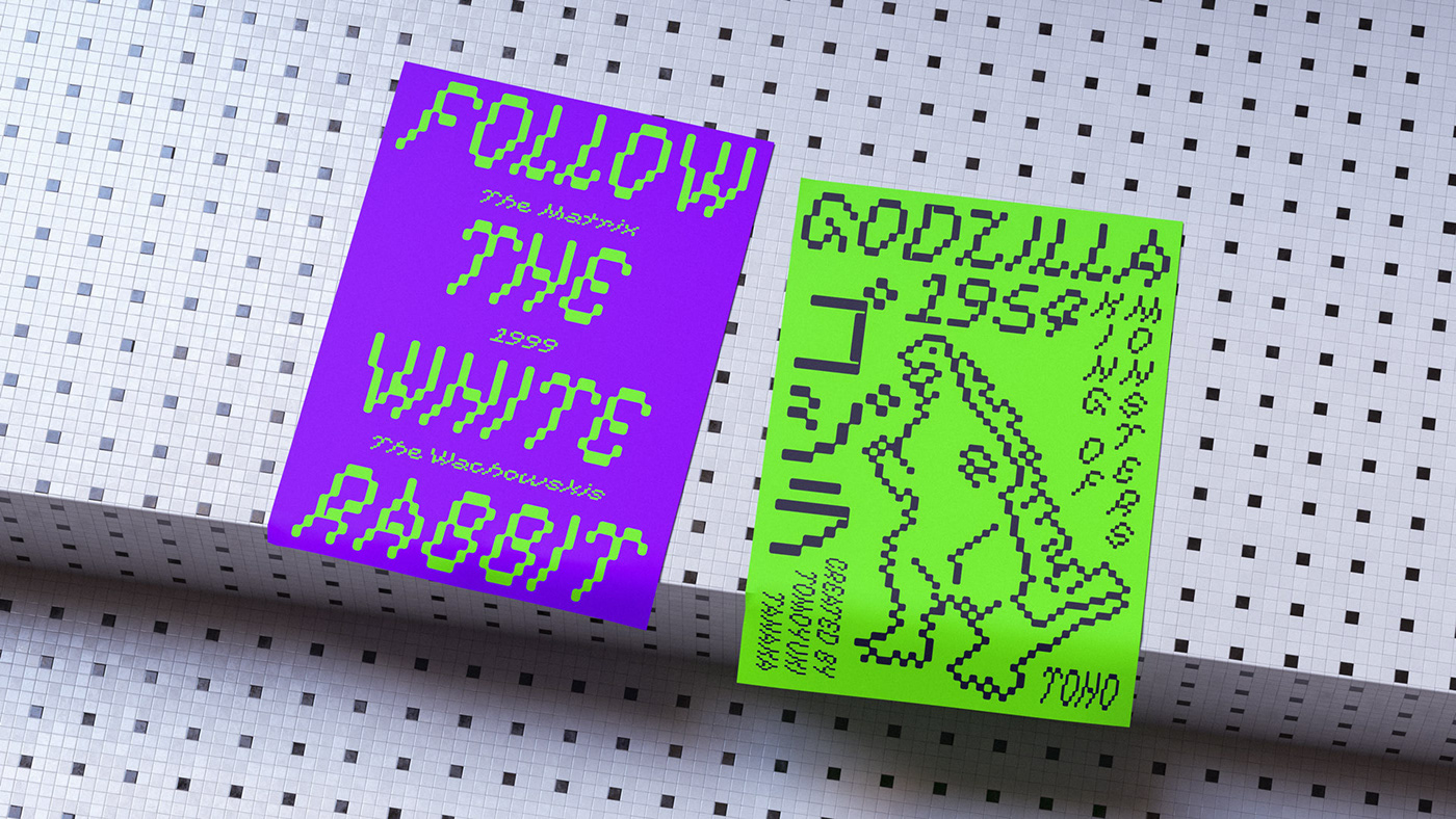
Low Def, short for Low Definition, is inspired by fonts displayed on old CRT monitors, sometimes with quirky characteristics. From video game consoles to the dim & noisy arcades. With it's lower resolution analogue signal shown through scanlines, it created a smoothened look that blended together the pixels.
Brokstad.Studio
Type Design & Creative Direction: Daniel Brokstad
Design Assistance: Nika Belskaia
Design Assistance: Nika Belskaia


