
BLUE. BOLD. AUTHENTIC.
The unmistakable visual appearance
of Bosch Power Tools Professional
strengthens the brand at all touchpoints.
The unmistakable visual appearance
of Bosch Power Tools Professional
strengthens the brand at all touchpoints.
With the aim of being perceived more strongly in the international market and standing alongside the competition as a strong "blue" brand, we optimized the communication design of Bosch Power Tools Professional. "BLUE. BOLD. AUTHENTIC." and the "Leading by Brand" approach were used as an opportunity to revamp all touchpoints.
The result: a distinctive look for the visual presence of Bosch Power Tools Professional.
The result: a distinctive look for the visual presence of Bosch Power Tools Professional.

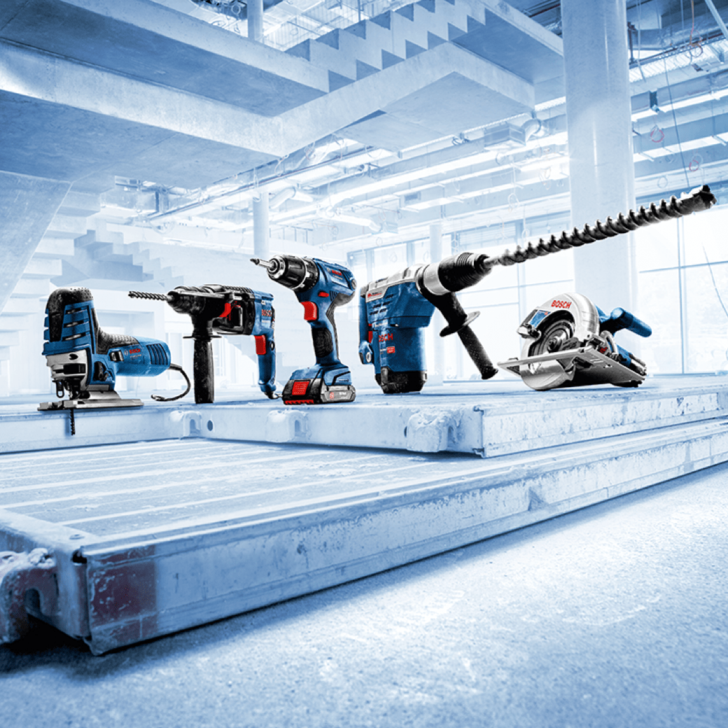
IMAGE STYLE
The Blue Tint
An important part of the revision of the communication design is the implementation of the "Blue Tint". The concise image style visualizes the brand's values and strengthens differentiation from the competition.


DESIGNPRINCIPLE
Flexible, simple, cross-media
The design principle is based on that of Robert Bosch GmbH. The design elements have been made more flexible and simplified. The "PRO Blue 100" is used two-dimensionally, giving the brand its characteristic look.
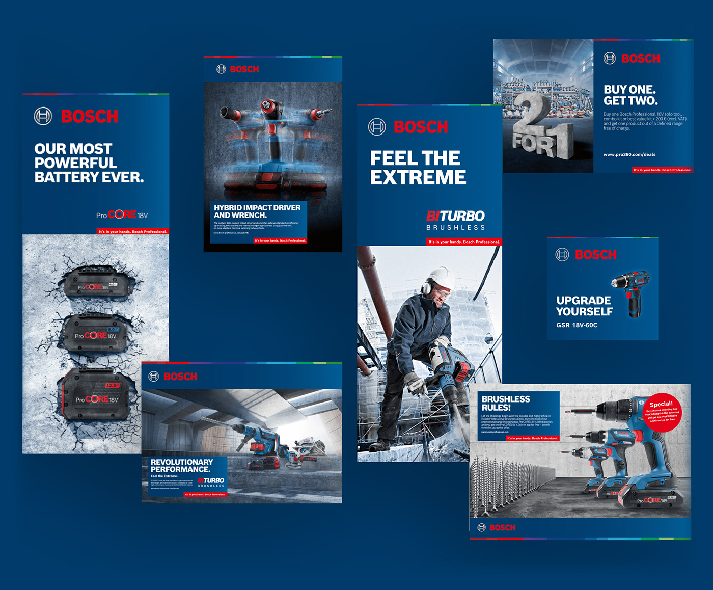


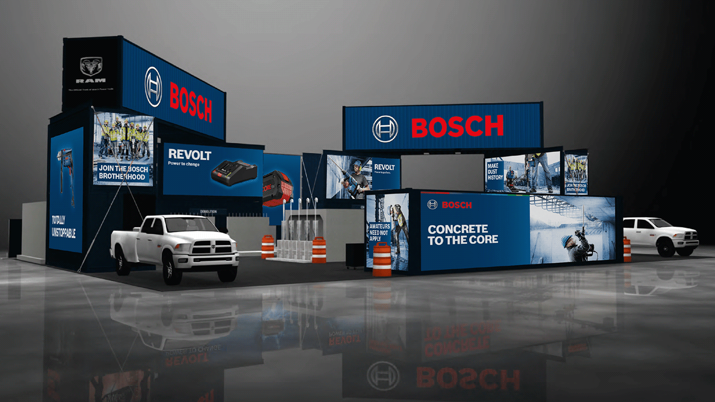

ILLUSTRATION LIBRARY
With recognition value.
A concise illustration style, based on the illustrations of Robert Bosch GmbH, was adapted to the motifs of Bosch Power Tools Professional.


BRAND GUIDE
Guidance instead of guidelines
Guidance instead of guidelines
In addition to revising all touchpoints, we have built up our own comprehensive Brand Guide for Power Tools within the Bosch Brand Guide and are constantly expanding it.

Creative Direction: Nicole Kuderer, Stefano Conzatti
Art Direction: Dorothee Lindlar
Design: Lisa Schenkel
Illustration: Lea Warren
Media Operation: Oriana Seidel, Marc Friederici
Project Management: Deborah Brachwitz
Photography: Bosch Power Tools
More: wirdesign.de


