


Taking Burgundy to the next level
In December 2020, I was invited by the CEO of Burgundy consultants to participate in a discussion to create the planning and design of the agency’s new visual identity and they wanted me to redesign burgundy’s entire brand identity with new positioning and new art direction more in line with the evolution of the international design industry. The work was amazing, started with a research and teamwork very well conducted by the CEO. At the end, we created a new fresh look for the agency to match with the international market standards.
👇

.
The logo they have used earlier was a handwritten text logo with a symbol and I decided to make it more minimalistic by removing the symbol and continue with the text logo. It uses the characters which connected to each other, and it reflects the strength of the impact generated by Burgundy for the client or the team. Lastly, the end of the logo has a line and a dot which symbolizes that Burgundy is always moving forward.

.
.
.


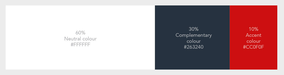
The 60-30-10 rule
During a review session, we identified a couple of issues on the website and one main issue was the colour imbalance and it made the screen look cluttered and this seemed to be widespread across the pages of the website.
As the solution for the colour issue, I have followed the 60:30:10 rule which helped me create a proper and well-balanced colour application for the burgundy website and the brand identity. The idea of this rule is simply dedicating the 60% of the palette to one colour (usually, it’s a neutral colour), another (complementary) colour makes up 30% of the palette, and a third colour (accent) is used for the remaining 10% of the design.
Typography
Typefaces were carefully selected to give the best expression of the brand. I have chosen two main font families to express the minimalistic yet strong and trustworthiness feeling of the agency. we have chosen a Sans serif font family and a serif font family will complement each other, for this rebranding process. For the headers, titles, and all types of huge text areas we used the Sans serif font Circular and for body text, quotes, descriptions and etc we have used the serif font named Domine.to create contrast, different weights of the same font were used.

Website
after a profound analysis of the old website, we have found following issues with the website. The website seems to be outdated. There is no proper CTA (call to action) on the website. It is more like an information website. When the user saw it for the first time, there was no confidence. The company’s brand value is not clearly visible on the website.
-The website seems to be outdated.
-There is no proper CTA (call to action) on the website. It is more like an information website.
-When the user saw it for the first time, there was no confidence.
-The company’s brand value is not clearly visible on the website.

The New Look


As a solution for the above issues, we have designed a brand-new minimalistic website for Burgundy.

Methodology
This project was executed using two main paths, one was the brand development and the other one was the development of the website. The allocated duration for this project was 12weeks.


