


PROJECT NOTES: Some brands only require a simple design solution. Especially brands who specialise in clear and concise writing, editing and proofreading – their thing is their words.
The clever Editor Group logo (inspired by a proofreading mark) and bright blue/grey colour palette was designed by Billy Blue. Originally the brand had a cool retro look to it, but as Editor Group expanded and became more digitally orientated, the brand required a refresh and further development. The focus needed to be on the power and clarity of their words, and creating the perfect balance between their corporate cyan, and clean white space.

Redefine brand elements and usage requirements to create Editor Group's 'The Essentials Brand Guidelines'.
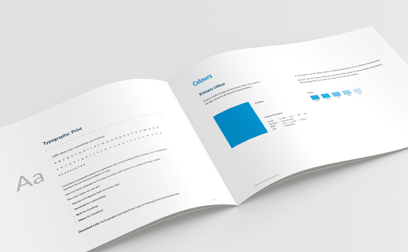
We selected a web-friendly humanist san-serif brand font (Lato) to ensure readability and consistency throughout all print and digital communications.
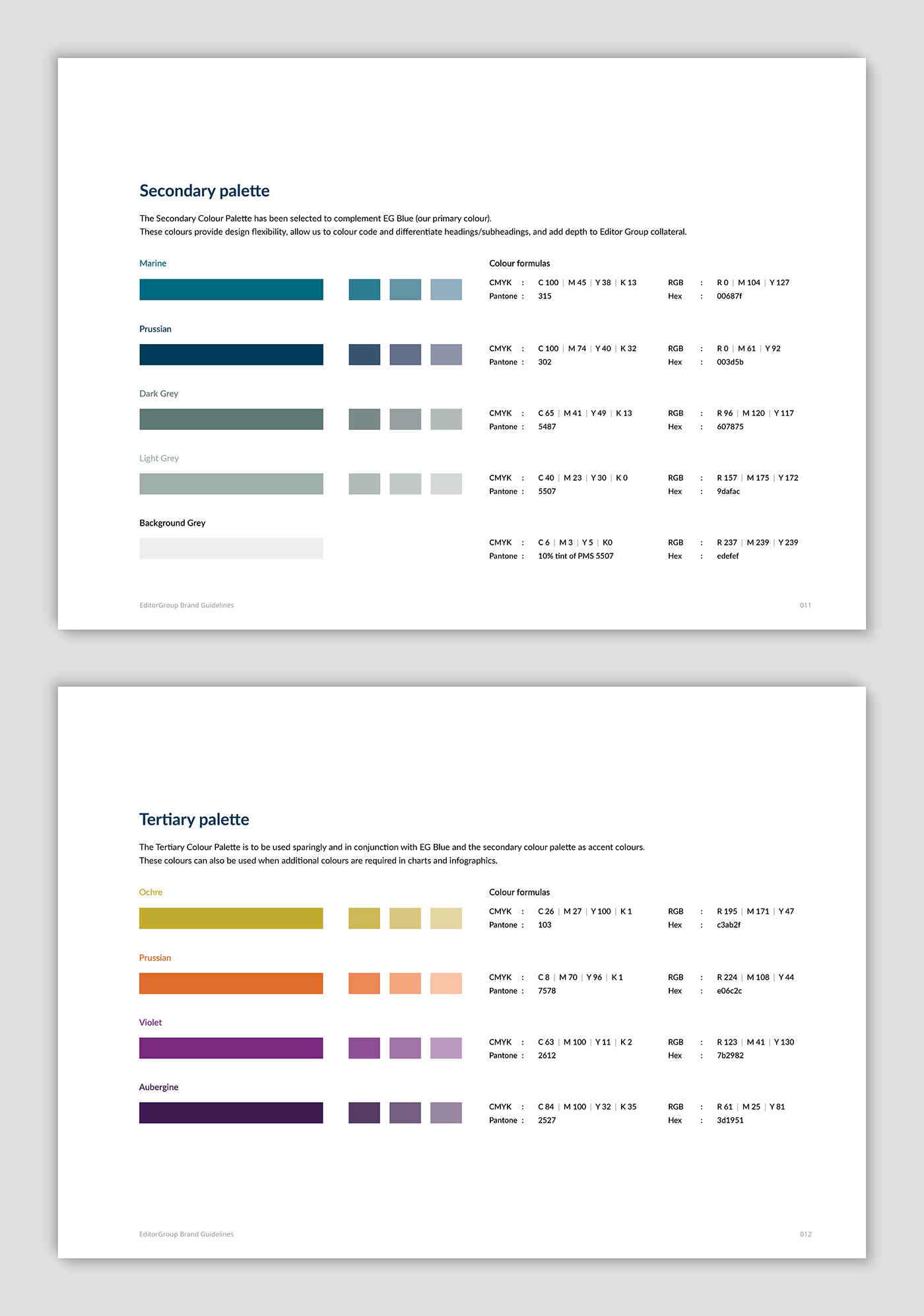
Introduction of secondary and tertiary colour palettes to add extra depth to brand graphics and text differentiation.

Brand photography style sample. Photography by Graynoise.

Double-sided business card design – 'We do words well'.

Design of simple brand letterhead.

Design and production of corporate communications template suite in conjunction with Melanie Archer from Netspin.

Design of corporate presentation folder.

Editor Group postcard highlighting new location – 'Make every word count'.

Ex libris stickers designed for Editor Group's library.

Design of corporate proposal template.

Final Word template for internal use, created by Netspin.

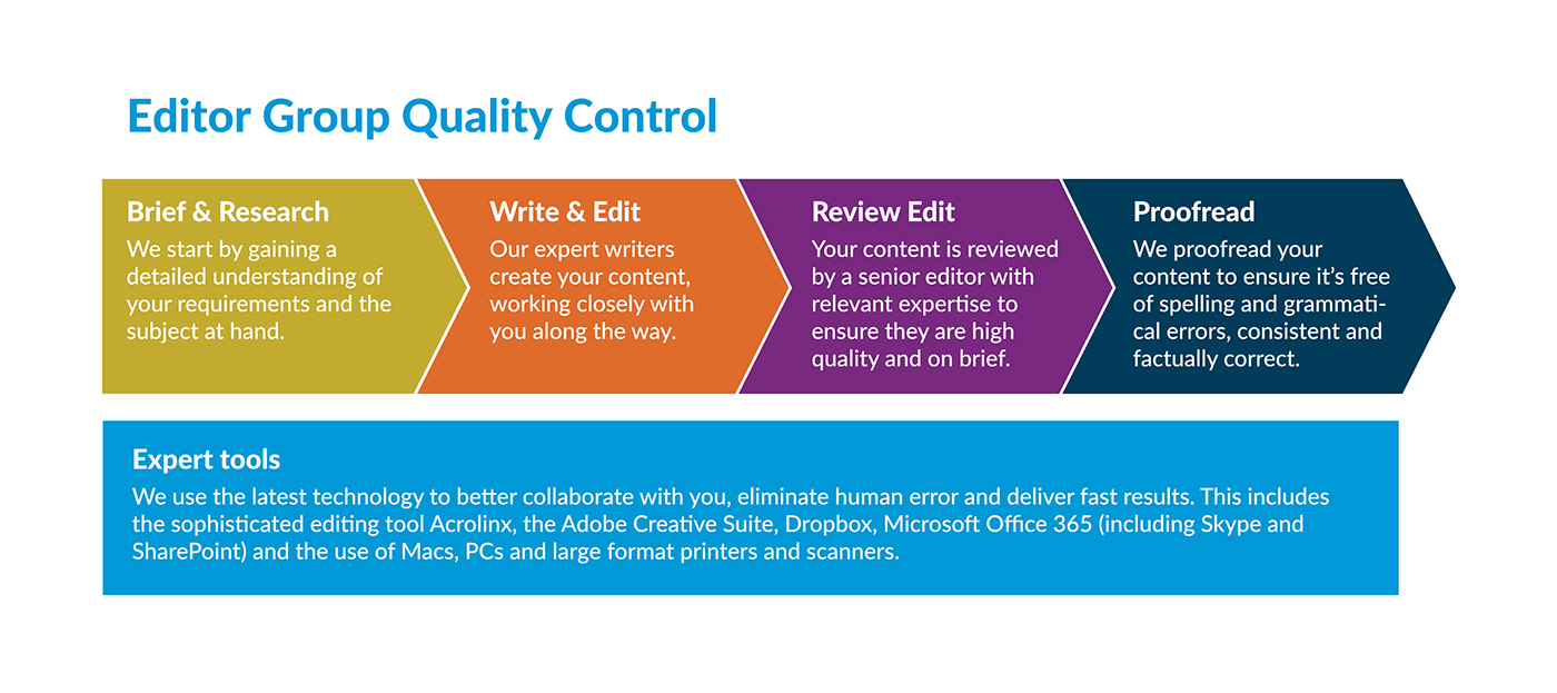
Editor Group Quality Control diagram options for use on different platforms.

Set of training manual covers.

Brand image style sample – Reading glasses.

Brand graphic style for editorial tabs using tertiary colour palette.

Design of Editor Group 'About Us' corporate flyer – Our services. Our clients.

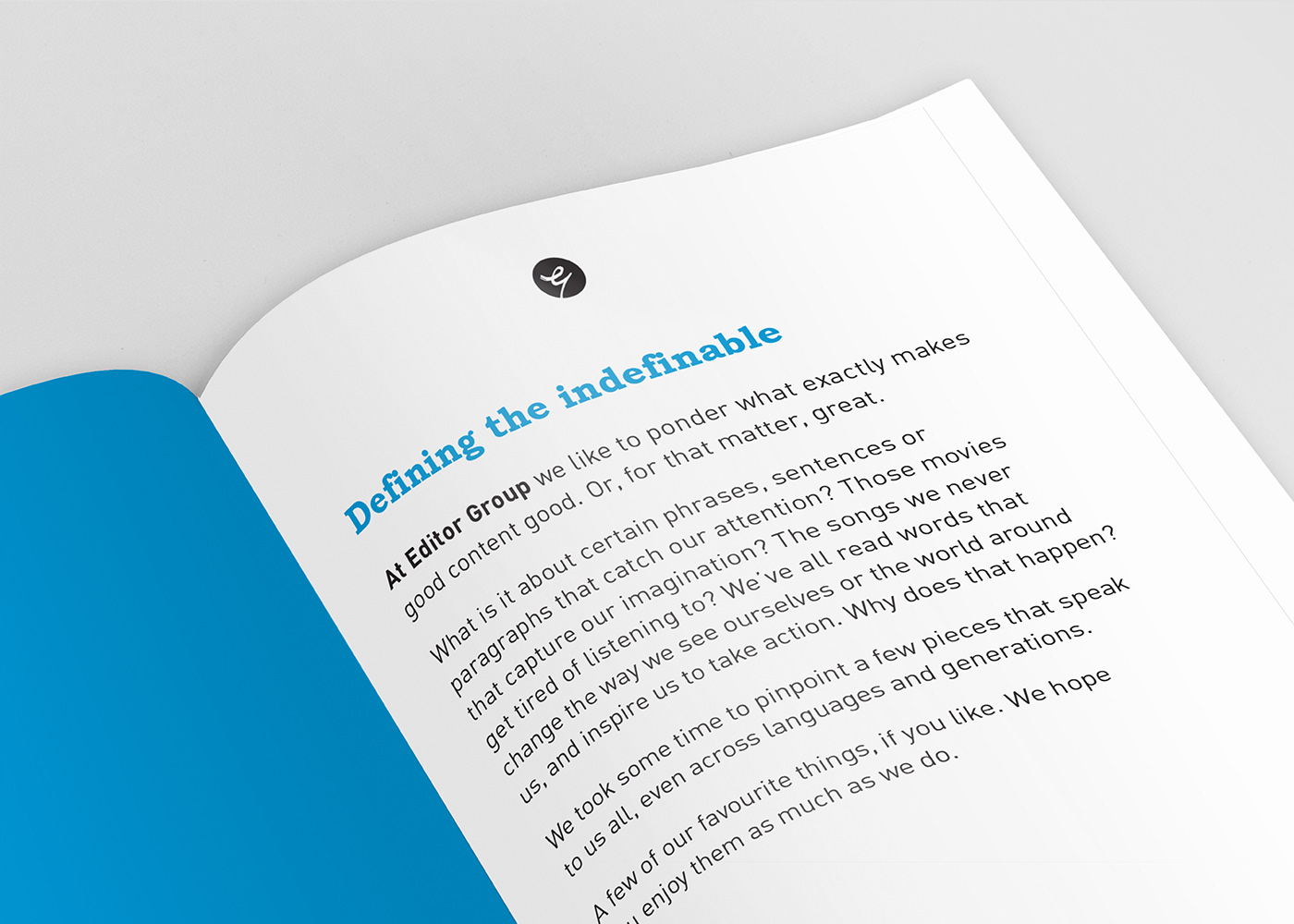
Design and layout of Editor Group's 'The Essentials of Great Writing' book.

Brand image style sample – Scrabble tiles.

Website promotional banner options.

Branded office space. Photography by Graynoise.

New EDM newsletter template design – 'Words on Words'.

PowerPoint template background designs. Programming of final corporate PowerPoint template by Netspin
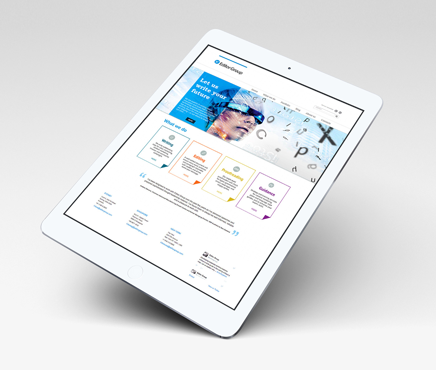
Proposed multi-platform website design

Conceptual design and production of 'These are a few of our favourite things ...' promotional booklet


Internal spread designs for 'These are a few of our favourite things ...' promotional booklet. 'Why we love it' and 'The lesson' paragraphs outlining each memorable word moment. Graphics easily identify the book, movie or speech depicted.
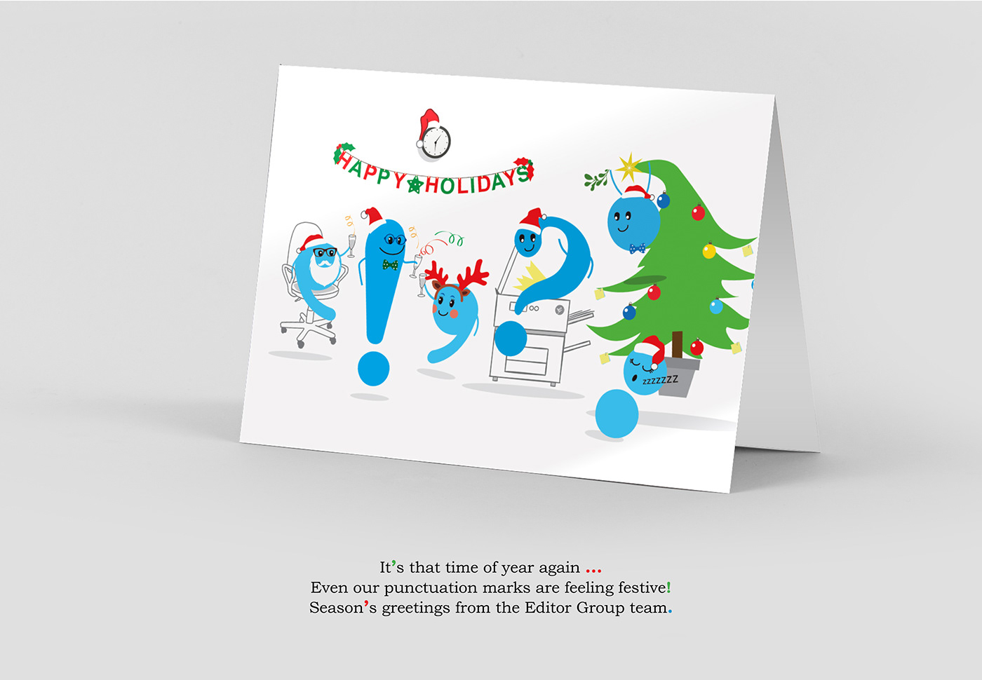
Happy Holidays company card design with festive punctuation marks.


