HAWKERPRENEUR: Tang Kay Kee
Hawker Culture in Singapore is an integral part of Singaporean way of life with a unique local culture and lifestyle, where people from diverse background gather at hawker centres to dine over meals prepared by the hawkers.
The hawker trade is facing a dying future and must be saved. Many young, aspiring hawkerpreneurs in their early 20s and 30s are stepping up to the plate, sacrificing comfortable hours and steady paychecks to keep this dying trade alive.
This was a pair project which required us to pick one hawker stall and create a well thought-out Brand Ecosystem for them. We had to identify the possibilities of expanding and innovating their current operations. The brand experience should be cohesive across all channels.

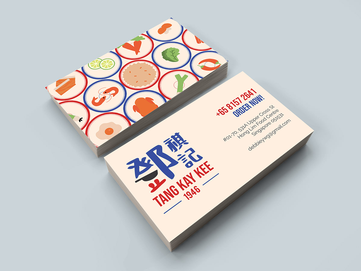
We chose to do Tang Kay Kee, a zi char stall which marries the best of both traditional zi char and modern zi char lunch bowls into one stall. They have been “wok-ing” since 1946 as a humble cart along Upper Hokkien Street before moving to Hong Lim Food Center.
Zi Char is one of the most traditional forms of Chinese food in Singapore. It reminds many of home cooked food that is lovingly made and shared around the table. Hence, the main component - the Chinese characters - is displayed in a handwritten font to represent this aspect.
Tang Kay Kee does not just sell regular Zi Char to be shared amongst groups, we also create personalised bowls with modern twists. Hence, the overall look is kept simple, and is kept in a square shape to represent this modernised aspect.


We started sketching ideas for our logo with a few concepts in mind that we wanted to try out. We wanted to play with typography for the chinese letters. In the traditional chinese of Tang, 鄧, we realized the top part of the character looked like a roof of a house.
So we wanted to incorporate that in our logo which also aligns with our concept of being wholesome and comforting like home feels. We also tried using shapes to make up the character, to make it more graphical. We tried the logo with a wok element as well, to replace the bottom stroke of the character and have the two dots look like elements that makes the wok look like it’s moving.
We also tried a logo where the wok is the main graphic and the words are in the flame that comes out of the wok, to show the action of cooking with a wok, lively and dramatic.

These were our final 14 sketches.
1. Wok + flame element
2. TKK chinese characters morphed into the shape of a bowl to represent their USP; the tze char bowls
3. Just a normal logo but stamp style
4. Play on the chinese typography, replacing the strokes with a roof graphic to represent family and home
5. Similar to 4) but added a heart to emphasize on the love and warmth element
6. Replaced one stroke with the wok, along with the roof graphic
7. Similar to 6) but experimented with layout of the logo
8. Supposed to look like a puzzle piece where the cut out is from a heart, to represent wholesomeness
9. Supposed to look like a house, with the words inside
10. Used only the wok element for this sketch
11. Similar to 10) but coloured in the strokes to make the shape more obvious that it’s supposed to look like a house
12. The top view wok
13. Emphasizing on the Tang, which is their great grandfather’s surname (the one who first started the stall)
14. The wok + heartshaped flame
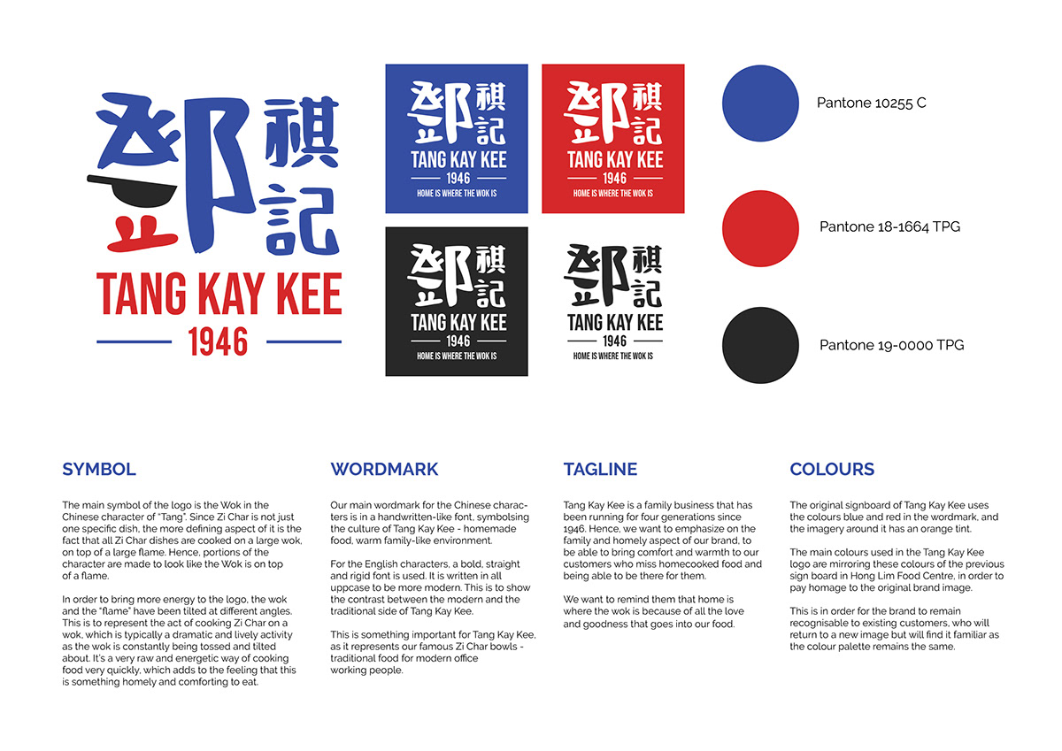
After sketching, we decided to go with the wok concept for the logo.
The main symbol of the logo is the Wok in the Chinese character of “Tang”. Since Zi Char is not just one specific dish, the more defining aspect of it is the fact that all Zi Char dishes are cooked on a large wok, on top of a large flame. Hence, portions of the character are made to look like the Wok is on top of a flame.
In order to bring more energy to the logo, the wok and the “flame” have been tilted at different angles. This is to represent the act of cooking Zi Char on a wok, which is typically a dramatic and lively activity as the wok is constantly being tossed and tilted about. It’s a very raw and energetic way of cooking food very quickly, which adds to the feeling that this is something homely and comforting to eat.
Our main wordmark for the Chinese characters is in a handwritten-like font, symbolsing the culture of Tang Kay Kee - homemade food, warm family-like environment. For the English characters, a bold, straight and rigid font is used. It is written in all uppcase to be more modern. This is to show the contrast between the modern and the traditional side of Tang Kay Kee.
This is something important for Tang Kay Kee, as it represents our famous Zi Char bowls - traditional food for modern office working people, since we were targeting office workers who don't have enough time for lunch and just want to get something filling, quick yet comforting.