

HONEY COMB CEREAL
PACKAGING | 2019

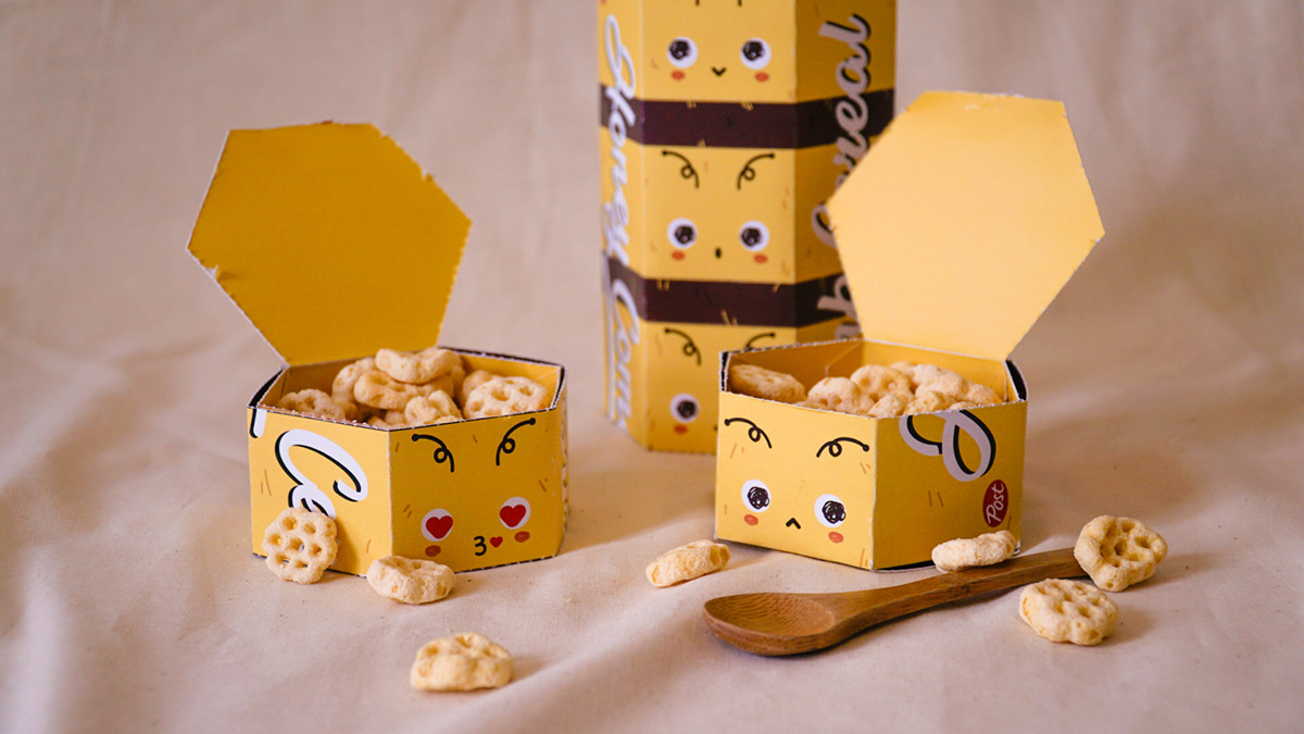
THE CONCEPT
This is a cereal packaging for children, with 5 separate portions for them to bring to school everyday. All they have to do is pull a tab resembling a bee’s tail to reveal a pun to start their day right.
This is a school project, in which we had to repackage a product that we use in our morning routine. This brand of cereal used to have an appeal more towards children with its mascot - Crazy Cravings, but in its newest repackage, it appears to be geared more towards a general audience. I decided to make the bee, honey theme stronger, based on the name of the cereal, and bring back its appeal to children.


THE PROCESS
I started out by doing some research on what the common pain points of regular cereal packaging is. Through this, I obtained a list of things I wanted to solve with my packaging.
1) Uninteresting shape
2) Inability to reseal
3) Inability to put the plastic bag back into its box


I knew from the beginning that I wanted to do a bee and/or honey concept, so I based the shape of my packaging around that. After awhile I realised that the most obvious shape would be a hexagonal container. I then measured out the necessary templates and calculated the volume based on one regular serving size of cereal (140g). Afterwards, I made a few test runs with regular paper and drawing paper


PROBLEMS FACED
1) Top container had to be faced upside down in order to let the lid open. This meant that the cereal will spill out - Change the template of the hexagonal box
2) Perforated tab didn’t pull cleanly. Perforations on exterior sleeve should be closer together. Paper should be thicker
I tried to make another template in which I glued the lid down to the box, and had perforations on the sides. This wasn’t a good idea as I wasn’t sure how strong the glue could be, and it felt very fragile and flimsy


This template felt a lot better as it meant the cereal was sealed and safe from spoiling. I bought thicker paper, tried the template and tested out perforations on the lid as well as for the exterior box. I wanted to see what gsm I needed to print my final packaging in and as a first attempt, this gsm felt good.


After making the graphics for the exterior, I did a test print to make sure that the graphics made sense in 3D.


I perforated the tabs and the lid of the container with a perforating tool. This made the perforations very clean and easy to pull.
Putting it together, I had to put a weight on the container so that it would close as tight as possible. I then glued down one side of all the containers on, before covering them in the sleeve completely, thus finishing the packaging.
Bonus - I did a matte lamination on all of the inside containers so actual water/milk can be poured inside!
END PRODUCT


Thank you for reading!


