BRIEF
BKOOL is a sports company creating and facilitating unique indoor cycling experiences. As well as offering a platform for collective training, they are also content creators, designing a variety of immersive training experiences. BKOOL wanted to highlight the potency of their software and widen their target audience from professional cyclists to the broader community of the health-conscious. With these objectives in mind, they counted on Erretres to undertake a rebranding project with a heavy strategic component.
STRATEGY
To raise awareness and widen the reach of BKOOL, and position the brand as a relevant player within the indoor cycling market, we defined the brand's strategic context and definition. Rather than focusing on the tangible value, we worked on the intangible side of the brand: a lifestyle, a mindset, a personality, a community. The aim was to create a brand culture that would attract new members to both their team and their user community. After an exhaustive process, we defined the brand idea for BKOOL as “Team Unlimited”, and their positioning as “The immersive sports company”, as well as the purpose, mission, vision, values, tone of voice, and attributes.

VISUAL IDENTITY
To visualise the brand idea, we focused on two main strategic pillars: the immersive nature of BKOOL’s offering, and the “Team Unlimited” concept. When working on the logo and symbol, we modified the B to resemble an infinity symbol, representing both the route and the unlimited character of the brand. We chose FONTNAME and FONTNAME as the corporative typefaces, and selected a third typeface for the many digital touchpoints. For the colour palette, we maintained the yellow and black as the main colours and added three secondary colours to distinguish the different types of cycling experiences.


GRAPHIC SYSTEM
The idea of infinity is also present within the graphic system. Taking three routes representing each of the cycling experiences and extracting their outlines, we created an immersive pattern that would be applied to all digital and communication touchpoints.


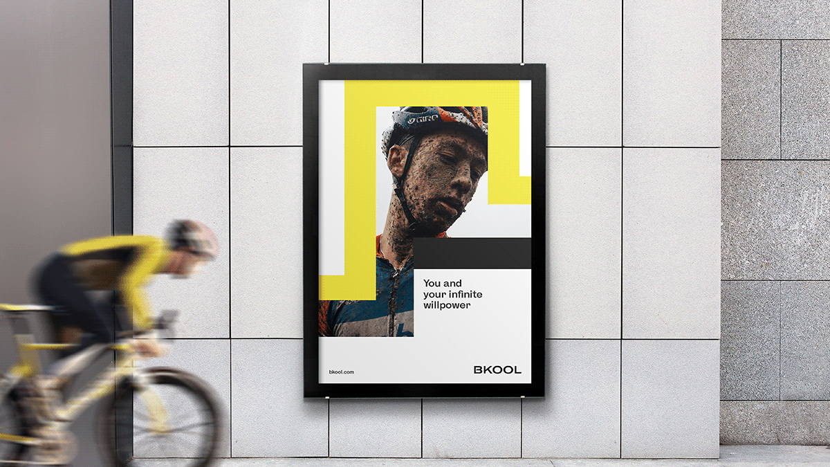
COMMUNICATION
BKOOL’s communication had to transmit the strategic idea and positioning. The graphic system allowed us to combine the different elements (logo, symbol, layout, and photographs) on diverse contact points such as labels, packaging, physical products, exterior advertising, digital advertising, social media, and digital media.


DIGITAL PRODUCT DESIGN
BKOOL is a digital brand with a complex ecosystem of two apps (cycling and fitness) and a corporate website. To structure their ecosystem within the digital context and apply the rebranding to these main touchpoints, we carried out a full UX process that ultimately led to the visualisation and application of the brand to UI.


