INTRODUCTION
Nasza-klasa (also known as nk, nk.pl, Nasza Klasa) is one of the most famous (and biggest) social networks in Poland.
I had mixed feelings about this project. It was in my head for weeks and I was thinking: how redesign a page with classy design into something modern/minimal and maintain similar user experience?
When I finally decided to give a try with this project I planned to modularize each section of the original page.
I noted the following:
- main menu at the top of the page, with links to each subpage of the portal,
- side menu with quick access to account settings,
- latest photos, uploaded by your contacts,
- status update,
- couple adverts,
- timeline,
- guests notification,
- footer.
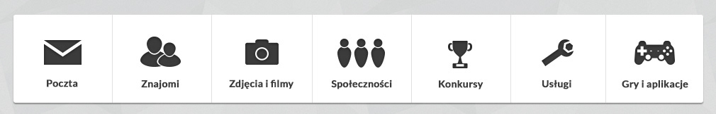
MAIN MENU
I decided to make the buttons bigger, as long as they are the main navigation of the page. Each button also acquired proper icon.
SIDE MENU
This menu has two forms:
- short, with only basic options (profile avatar, name, localization, no. of uploaded photos/contacts),
- long, with additional options (e.g. item shop, but also adverts etc.)
To switch between forms, just click at the bottom of the menu.
This menu has two forms:
- short, with only basic options (profile avatar, name, localization, no. of uploaded photos/contacts),
- long, with additional options (e.g. item shop, but also adverts etc.)
To switch between forms, just click at the bottom of the menu.

LATEST PHOTOS
Each photo is displayed separately. It has no. of comments notification (it is hidden if there is no comments). When user hover on image then photo title and uploader name are displayed.

STATUS UPDATE
This module has textarea where user can update his/her status with very basic (border, underline, italic) wysiwyg editor features.
You can also in this module upload new photo or video. There is no submit button, I decided to automate this with Enter button.

TIMELINE(S)
Current timeline at NK site is divided into two parts: status updates and notifications. The problem with this section is that it is placed one above another.
I decided to position them in the inline wrappers, with additional scrolling so the page is not that tall as original one (which is really annoying).
Users can discuss about every activity at the timeline - their comments are indented with respect to the parent comment (only once, multiple indentation is not possible - users comment only main status, not its child elements/comments). If someone wants to comment on someone else's comment he/she can mention him/her by using @user-name syntax (which is pretty common solution).

GUESTS NOTIFICATION
The last section (excluding adverts and page footer) is a bar with information about profiles, who visited your profile lately.

SUMMARY
Adoption of the original page as a mockup made things easier and saved from couple usability problems (but there was a lot to improve according to the original design).
For even better user experience I decided to save the decision about page background to the user (e.g. to use own color/pattern or choose one from http://subtlepatterns.com/ site.
DEFAULT VIEW #1
Default page view, with bright, (subtle) pattern background:

DEFAULT VIEW #2
Same as above, but with bright background only: (without pattern)

DEFAULT VIEW #3
This is the same as the previous two, but this time with dark background.

WEBSITE VIEW WITH HOVER STATES
You can compare it with DEFAULT VIEW #2 but now there are hover/click states (example for every section/element) presented:

LINKS TO FULL-SIZE IMAGES
Website view with hover states: https://docs.google.com/file/d/0B_cTyXW8TpQjTzdhQWxpYklFUDA/edit?usp=sharing


