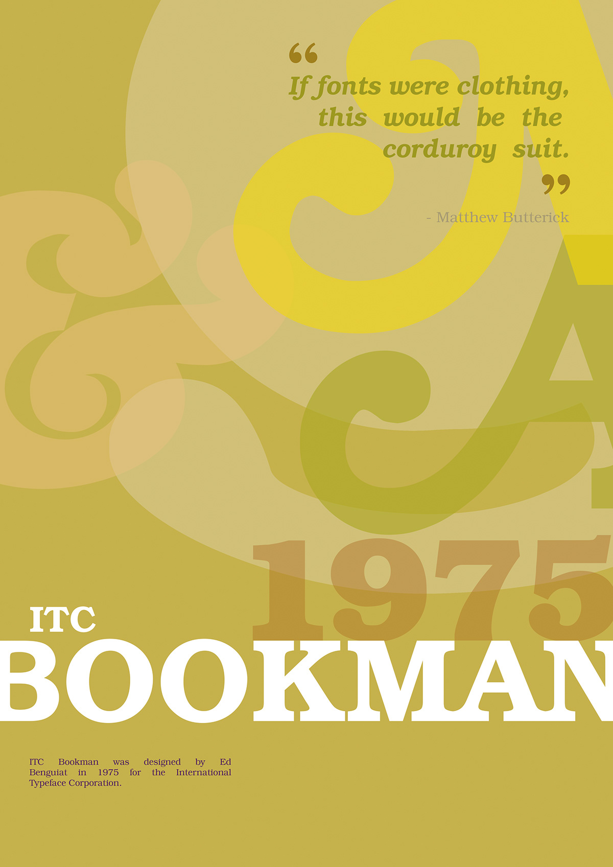
This is a second version of Bookman typeface poster I did for a course project recently.
Researching Bookman, it seemed to me there was not much to research really. Bookman was originally designed in 1858 and wasn't widely used or popularised up until the middle of twentieth century. There was so little of Bookman shown in use, other than Wikipedia stating it was mostly used as display typeface, and less common for body text. It seemed like a classic and rather dull type to begin with.
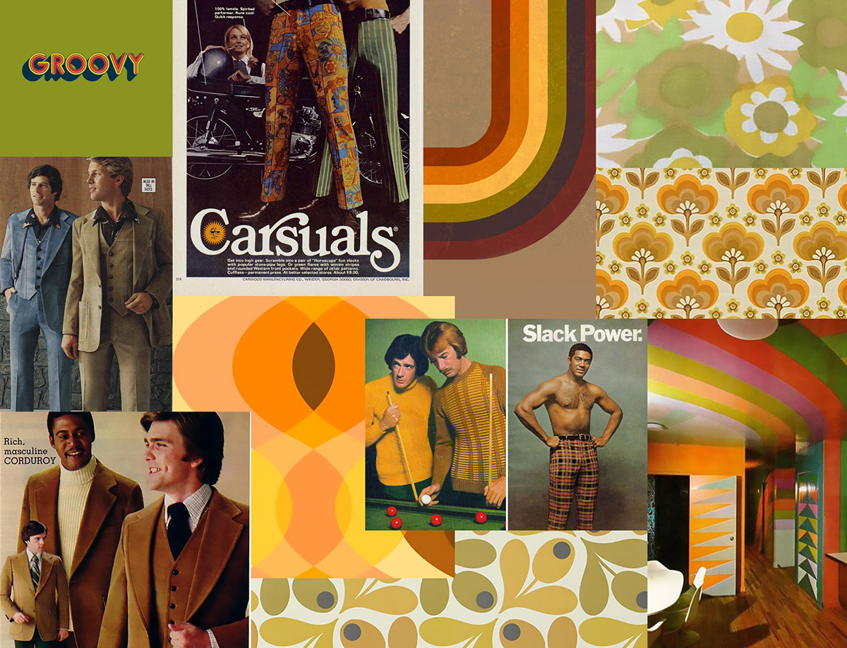
But then, I found that particular interest had developed for this font during '60s and '70s and many revival types were designed, which I found quite amusing. I love that retro feel. I found ITC Bookman, designed by Ed Benguiat in 1975, and started my research there.
Nowadays, it seems like this typeface and all its derivatives, with their lavish swashes and
enlarged lower cases, epitomise bad style or poor taste. This I found reflecting in Matthew Butterick's quote 'If fonts were clothing, this would be the corduroy suit.' Well, that was just perfect. I personally love corduroy, but what do I know... :-D
I have to admit, building a moodboard and researching the influences, all this did evoke some long lost memories of all the floral bathroom ceramics, brown and mustard sofas and mossy carpets... That '70s... Did I forget something?
It seems like everything comes back again, so as for corduroy and floral wallpaper comebacks, we should also expect a great revival of the grooviest type out there!