When two formerly merged Chartered Accountancy firms parted ways to allow for more growth, the need arose to rebrand one of the firms to usher in the new season.
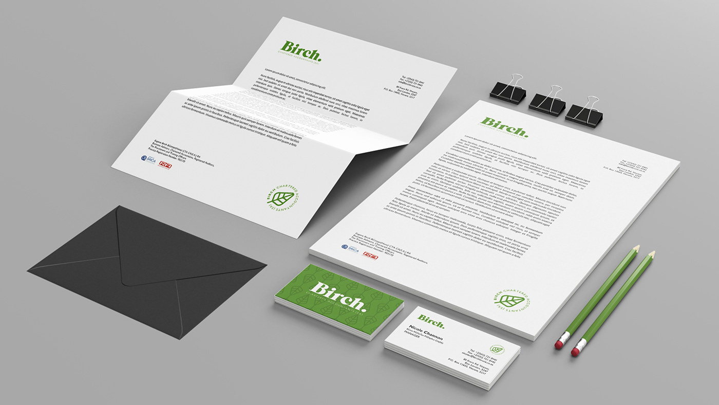
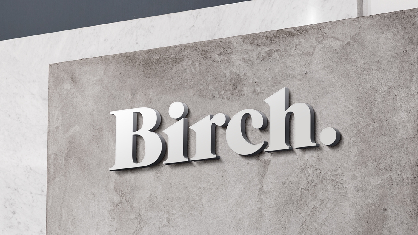
Needing a brand new logo that was still firmly rooted in the professionalism and tradition of the financial sector, and communicated the strength of the firm in it's new form, I developed a strong serif wordmark, punctuated by a period to denote their strength going forward alone.


I developed a secondary mark, modeled after the birch leaf, for use as a stamp of approval on some of the corporate stationery. The leaf mark was also developed into a seamless pattern.


Thanks for viewing!

