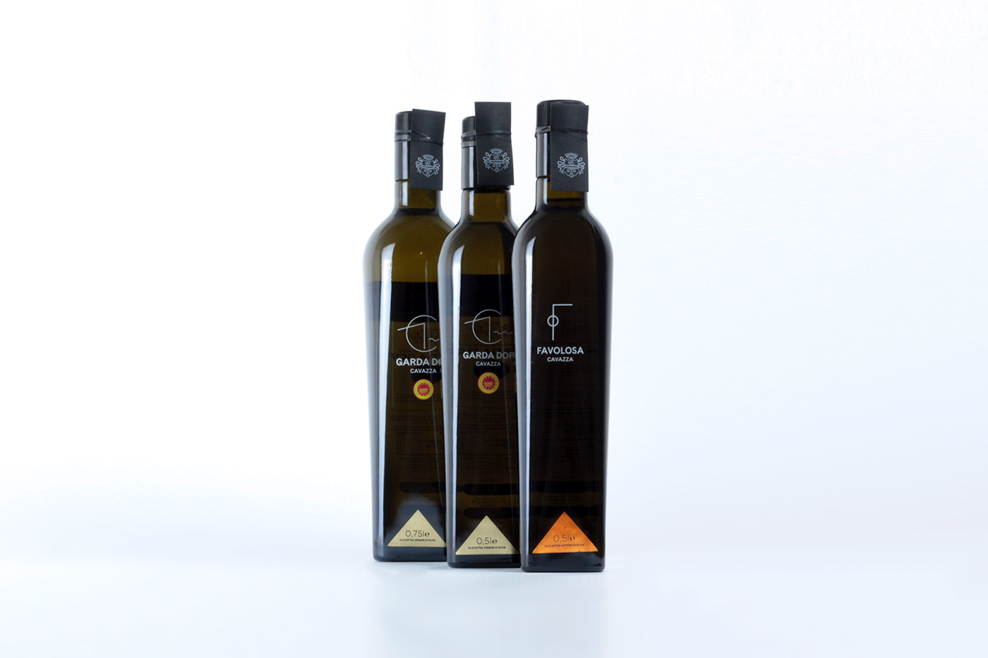
Three were the guidelines of this olive oil package design for the Cavazza: defining a recognizable design, minimalistic, able to express the identity of the product.
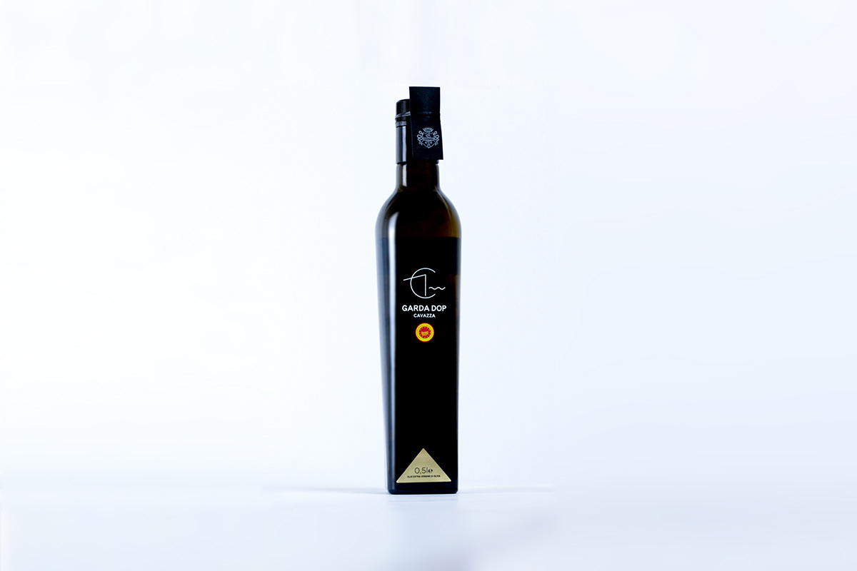
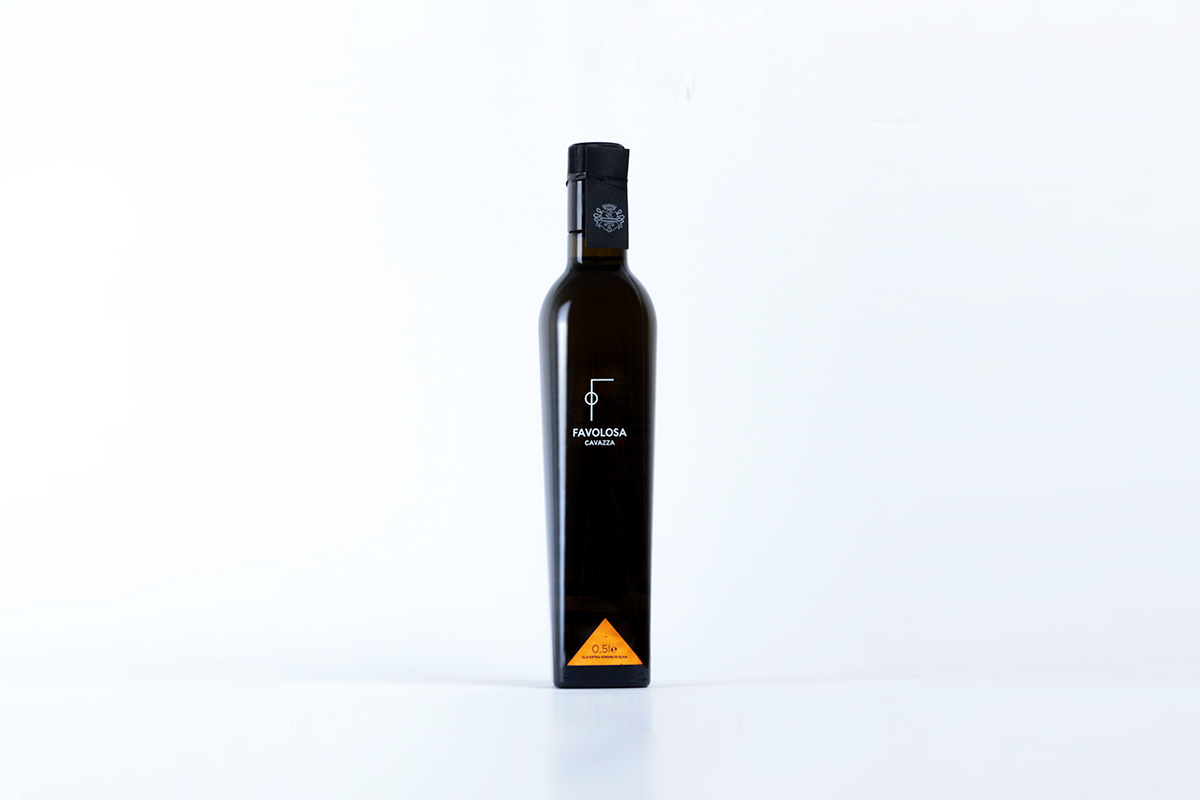
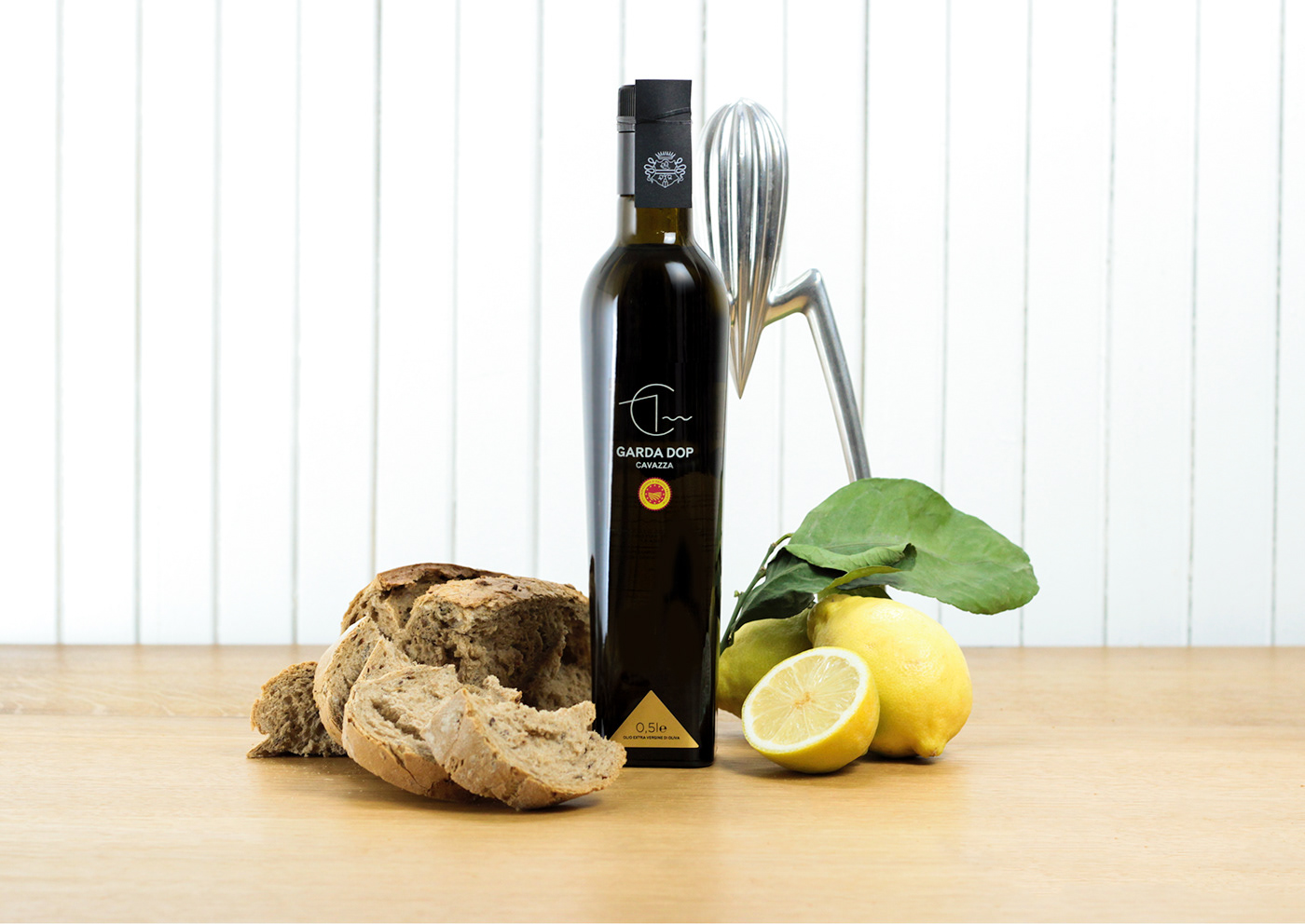
The bottle has an essential aesthetic: logo and the type of oil are located in the center of the bottle, capacity and product color (to recognize its quality) in the lower part and on the cap a black paper sheet hand-placed and tied with a rope during the bottling phase.
The icons have been conceived by combining aesthetics and meaning: the Garda d.o.p oil certificate mark is contained in the C, initial of the brand, the promontory of Manerba del Garda, and a stylization of the lake.
L’olio favolosa, monocultivar, draws an F but also a single olive, highlighting the peculiar quality of each single squeezed fruit.
In 2018 this refined package allowed the customer to receive the Amphora Olearia award as the Best Design Bottle among those that contribute to the Ercole Olivario, the national competition dedicated to Italian territorial olive oil excellences. In Minimal We Trust