We are always thrilled to work on projects related to food and restaurants, we are even more so when the subject is related to Japan.
Japo restaurant asked MinimalDesign to completely renew its identity to find styles capable of communicating its high-end gastronomic proposal, in a sector that, in Italy, offers too often a cheap product.
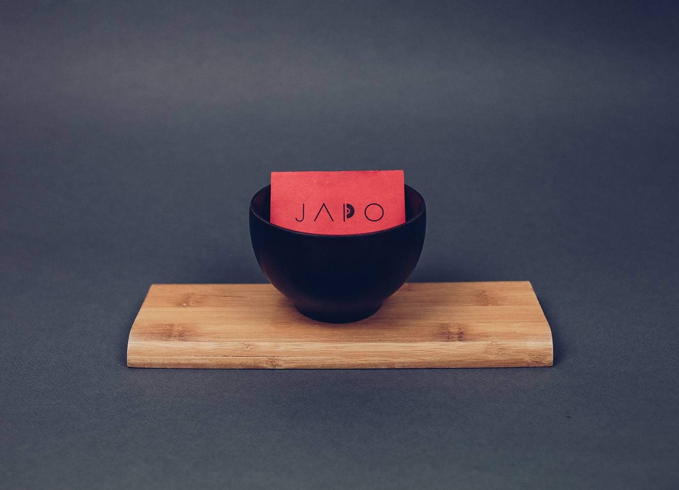
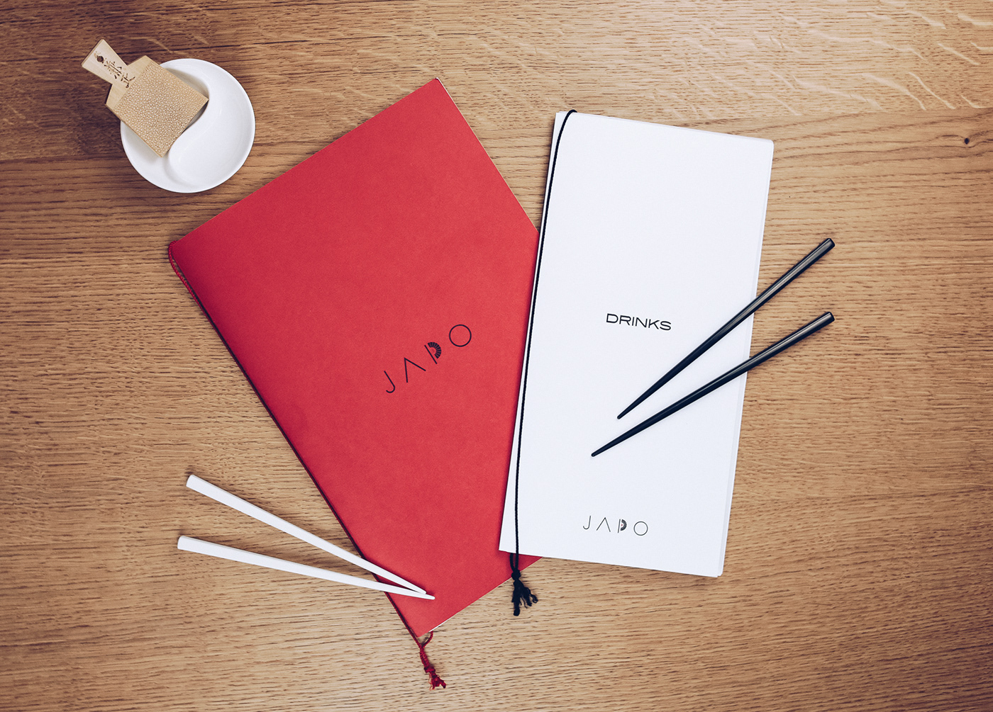
For this reason the brand identity realized is far from the oriental clichés, in favor of a sober, minimal and luminous design.
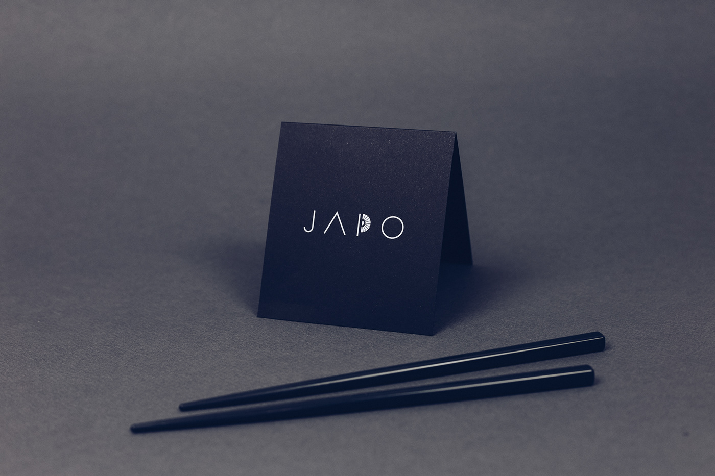
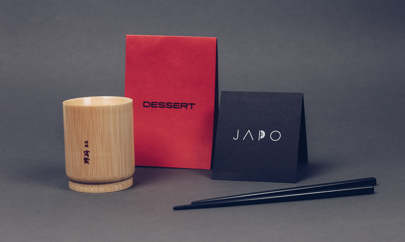
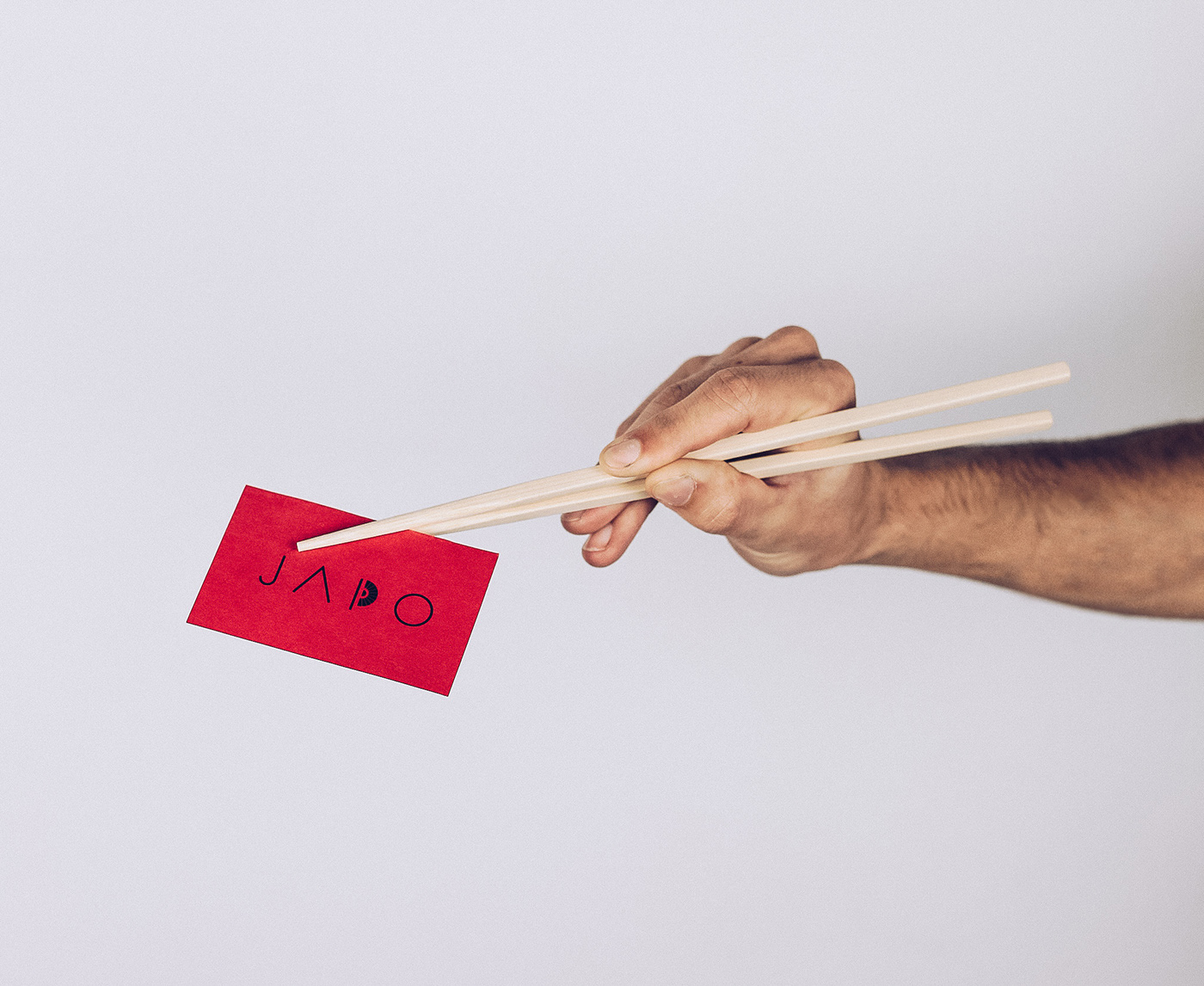
The logo, with a simple thin font, includes the stylization of an umbrella, a typically Japanese handcraft product as well as a red dot to recall the rising sun.
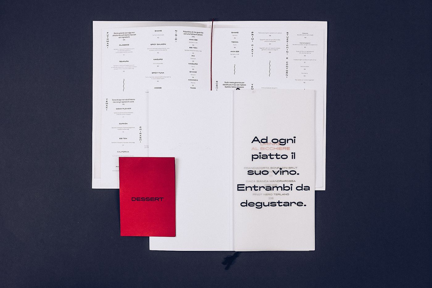
Paper materials repeat the red and white color choice with contrasting black, business cards offer the same fan folding.
The materiality of the elements (the grain of rice paper, Japanese binding) is digitally transferred on the website, equally minimalistic.
The one-page-site was awarder as Best Website on One Page Love.
Japo restaurant asked MinimalDesign to completely renew its identity to find styles capable of communicating its high-end gastronomic proposal, in a sector that, in Italy, offers too often a cheap product.
For this reason the brand identity realized is far from the oriental clichés, in favor of a sober, minimal and luminous design.
The logo, with a simple thin font, includes the stylization of an umbrella, a typically Japanese handcraft product as well as a red dot to recall the rising sun.
Paper materials repeat the red and white color choice with contrasting black, business cards offer the same fan folding.
The materiality of the elements (the grain of rice paper, Japanese binding) is digitally transferred on the website, equally minimalistic.
The one-page-site was awarder as Best Website on One Page Love.