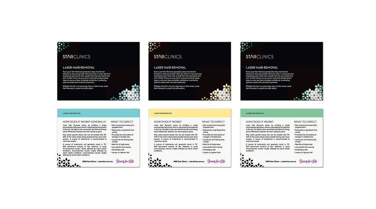
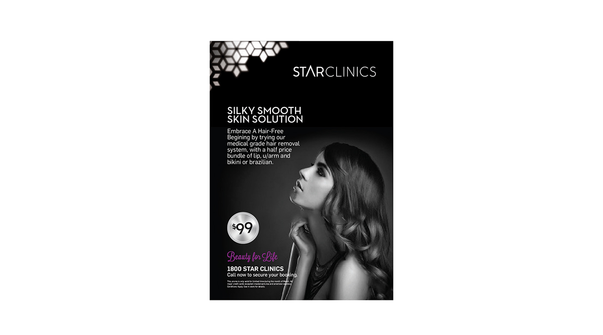
It started with a star... although, it didn't take long to find the star is an overdone and clichéd logo so we needed a fresh way to represent an old icon.
Star Clinics is beauty and cosmetic clinics which operate by offering memberships, similar to a gym, so the we needed to communicate a prestigious and sophisticated brand.
There are two main brand elements that make up the Star Clinics brand:
The wordmark is a custom designed typeface that is simple and elengant. The 'A' is derived from the top point of a five pointed star and stands proudly above the other letters.
The star pattern is a versatile device which can be cropped to suit the collateral. The pattern is the life of the brand which adds vibrance and sophistication.