Context I Contexte
—
EN
Stade Rennais Football club is one of France's oldest football club.
The club has been playing in the highest league for 25 consecutive years. In spite of this achievement, the club has had a "doomed" reputation due to its lack of trophies.
This fan-made rebrand comes right after the club ended this losing streak by becoming the unexpected winners of the 2019 French cup. Along with this new trophy, could a modernized visual identity help the club enter a new era?
This fan-made rebrand comes right after the club ended this losing streak by becoming the unexpected winners of the 2019 French cup. Along with this new trophy, could a modernized visual identity help the club enter a new era?
FR
Le Stade Rennais Football club fait partie des plus anciens clubs de foot français. Cela fait 25 ans qu'il évolue en première division. Malgré cette performance, le club a une réputation "maudite" dû à son maigre palmarès.
Ce rebrand fictif a lieu après la fin de presque 50 ans de disette, en devenant les vainqueurs de la Coupe de France 2019. En plus de ce titre, une nouvelle identité visuelle pourrait-elle aider le club à entrer dans une nouvelle ère ?
Approach I Démarche
—
EN
Stade Rennais' visual identity has remained untouched for over 16 years and is therefore not adapted to nowadays communication mediums. This rebrand will focus on modernizing its overall image while deepening its links with the Brittany region, its culture, and its people.
FR
L'identité visuelle du Stade Rennais n'a pas évolué depuis plus de 16 ans, et n'est donc pas adaptée aux moyens de communication actuels. Ce branding se veut de moderniser son image globale tout en renforçant les liens avec la Bretagne, sa culture et ses habitants.


EN
Over the years, the club has strengthened its links to the region and its celtic heritage. For instance Brittany's anthem Bro Gozh ma Zadoù resounds before each home game since 2009. This initiative seems fully embraced by the fans as well; when the club organized a poll to rename the club's stadium in 2015, over 43.000 people (out of 60.000) voted in favor of a name using the region's language: Roazhon Park. This redesign follows this logic and will attempt to capture key elements of the Celtic visual culture.
FR
Au fil des ans, le club a affirmé son lien avec la region et sa culture. On entend par exemple l'hymne breton Bro Gozh ma Zadoù résonner avant chaque rencontre du club à domicile depuis 2009. Cette initiative semble faire l'unanimité auprès des fans ; en 2015, le club a organisé un sondage afin de renommer le stade. Plus de 43 000 votants (sur un total de
60 000) ont opté en faveur d'un nom breton : le Roazhon Park. Ce travail suit cette logique et tente de capter les éléments clés de la culture visuelle Celtique.
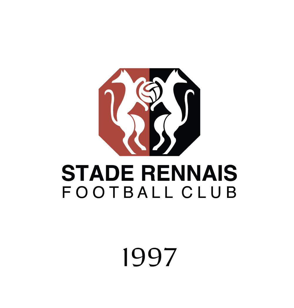
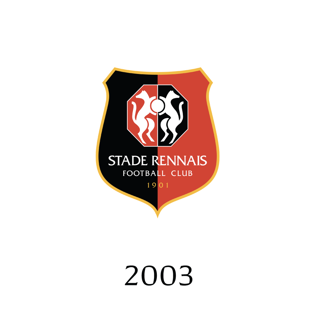
Crest evolution I évolution du blason
—


EN
I. Components
The club has gone through 6 (major) different crest redesign since its creation in 1901. Since 1970, the crest has been using the following elements:
• 2 symmetric white stoats (the region's symbol) protecting a ball
• red and black as dominant colors, side-by-side
• a golden/yellow border
II. Issues with the current crest
The current crest is a logo within a logo. While the stoats are tightly encompassed in an octagon, the octagon itself floats inside a shield and above the –quite long– name of the club. These aesthetic choices result in legibility issues.
FR
I. Composants
Le club a connu 6 évolutions majeures pour son blason depuis sa création en 1901. Depuis 1970, les blasons sont pourvus des éléments suivants:
• 2 hermines symétriques (symbole de la région) protégeant un ballon
• le rouge et le noir comme couleurs dominantes
• une bordure jaune/dorée
II. Les problèmes du blason actuel
Le blason actuel est un logo au sein d'un logo. Alors que les hermines sont compactées dans un octogone, l'octogone lui même flotte dans un écu, au dessus du long nom du club. Ces choix esthétiques induisent des problèmes de lisibilité.
Proposed redesign I Proposition de blason
—
EN
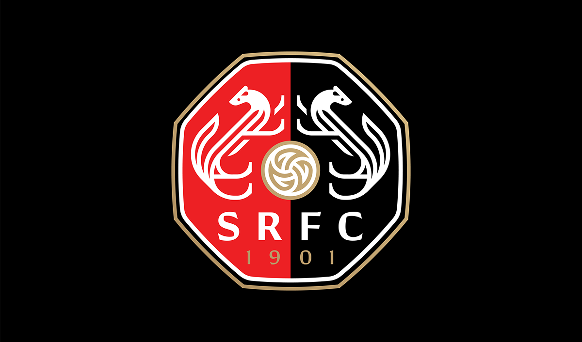
I. The main crest
This proposal is an attempt to synthesize the crest's components in order to achieve legibility while improving the mark's recognition.
a. The octagon
While the shield is a recurring element in the football domain, Stade Rennais' crest hasn't kept a consistent shape over the years (unlike clubs like FC Barcelona), and is therefore not a strong visual element. The octagon is given a more prominent place, as this unusual shape makes the overall crest more recognizable.


b. Acronym
Not only the long name of the club is hardly legible when the crest is displayed at small scale, it is also more difficult for non french speakers to identify the club.
c. The imagery
The redesigned stoats are loosely based on celtic knots in an attempt to strengthen the region's heritage while making them more unique. The ball follows the same logic and is inspired by the triskelion, a symbol used by the celts.

FR
I. Le blason principal
Cette proposition est une tentative de synthèse des différents éléments du blason dans le but d'améliorer leur lisibilité et d'améliorer la reconnaissance de la marque.
a. L'octogone
Bien que l'écu soit un élément récurrent dans le domaine footballistique, la forme de l'écu du Stade Rennais a constamment évolué au fil des ans (contrairement à l'écu de clubs comme le FC Barcelone), et n'est dont pas un élément visuel fort du club. L'octogone (présent dans le logo de 1997) est désormais prépondérant, comme sa forme inhabituelle dans le domaine le rend plus facilement identifiable.
b. L'acronyme
Non seulement le long nom du club devient difficile à lire lorsque le blason apparaît à petite taille, il est aussi plus difficile pour les non-francophone d'identifier le club.
c. Les symboles
Les hermines sont inspirées librement des noeuds celtiques dans le but de les rendre plus uniques tout en renforçant le lien avec l'esthétique celte. Le ballon suit cette même logique et est quant à lui inspiré par le triskèle, un symbole utilisé par les celtes.
EN
II. Small scale crest
In spite of the redesigned and synthesized crest, it hasn't been conceived as a logo per se. An additional version is therefore necessary for small scale purposes.
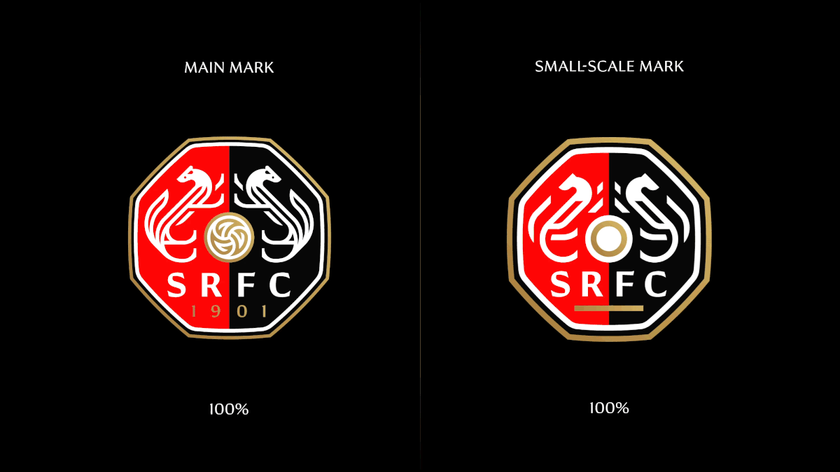
II. Échelle réduite
Concevoir l'identité visuelle d'une club de foot – son blason en particulier – peut devenir un parcours du combattant. Alors que la plupart des designers et marketeurs opteraient pour plus de simplicité; les fans ne partagent pas forcément cette approche. Attachés aux blasons complexes de leurs équipes, un nouveau blason peut s'apparenter à une perte d'identité et le début d'une ère axée sur le marketing. (cf. Juventus F.C. rebrand)

EN
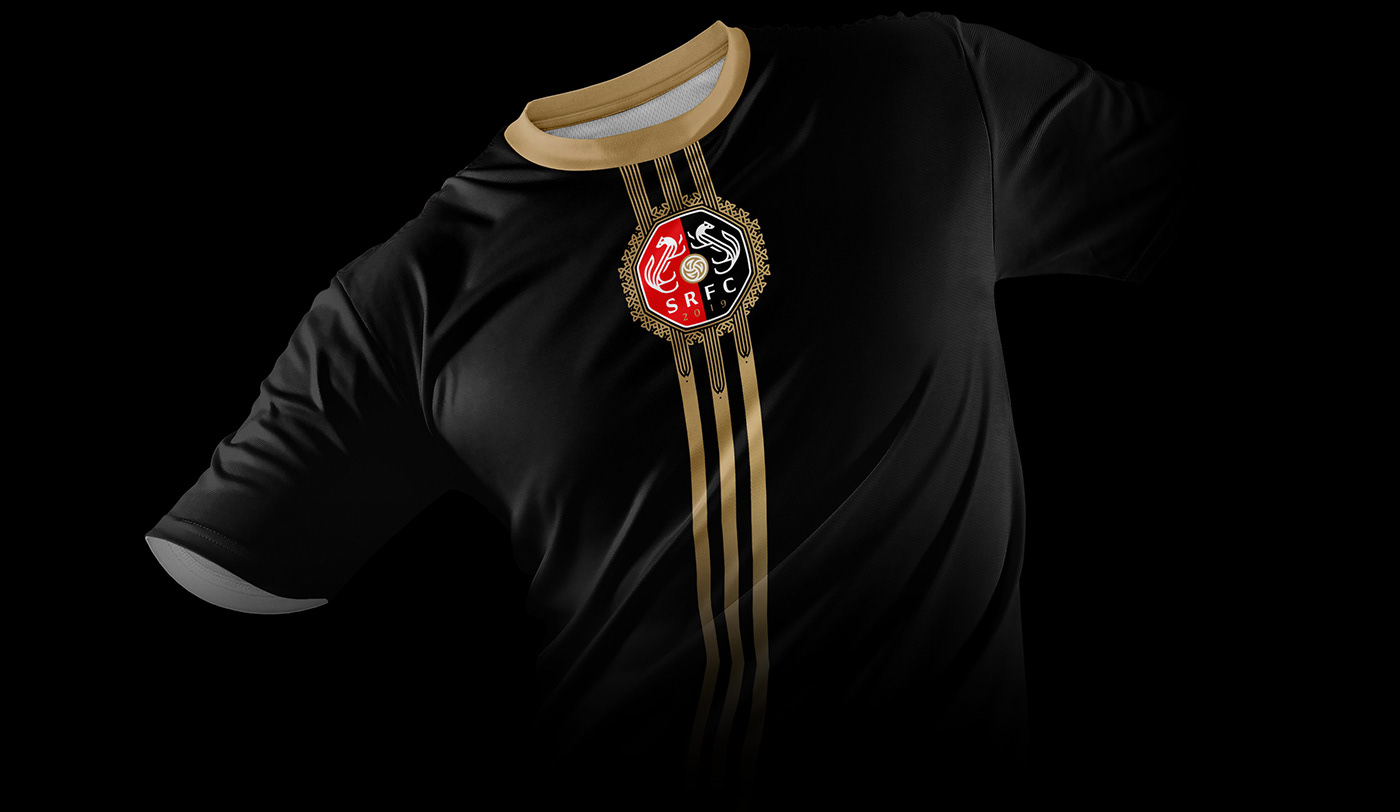
II. Commemorative crestThe Celtic inspired graphic language allows some flexibility. Important wins or events can be celebrated by adding ornaments.

FR
II. Blason commémoratif
Le langage visuel celtique adopté permet une certaine flexibilité. Les victoires ou évènements importants sont célébrés par le biais d'ornements.

Typography I Typographie
—
EN
Conglomerate is a typeface developed by Gregory Shutters in 2014. It is half serif, half sans, squared yet rounded. These hybrid characteristics make it a unique typeface. Its details make it a great display font while remaining highly legible at small scale.
FR

typeface overview

type / imagery similarities

custom numerals

weights
Jerseys I Maillots
—

Home

Away

Third
EN
A co-branding with the "3 stripes company" and a local marketing strategy would allow design possibilities to reinforce the Celtic feel of the overall identity.
FR

Third long sleeves alternate