GoEuro icon system
GoEuro (since 2019 Omio) is a service to sale tickets for a train, plane or bus.
The GoEuro team asked me to develop a set of icons for the website and mobile application according to the new corporate identity.
My goal was to think through the visual style and make new icons on its base.
The GoEuro team asked me to develop a set of icons for the website and mobile application according to the new corporate identity.
My goal was to think through the visual style and make new icons on its base.
Shape
To begin with, I’ve highlighted the key shapes on the basis of which new icons will be built:

Grid
One of the GoEuro team's requirements was the condition of readability of icons in a small size (16x16 pixels).This condition dictates the modular grid where the system of icons is built.

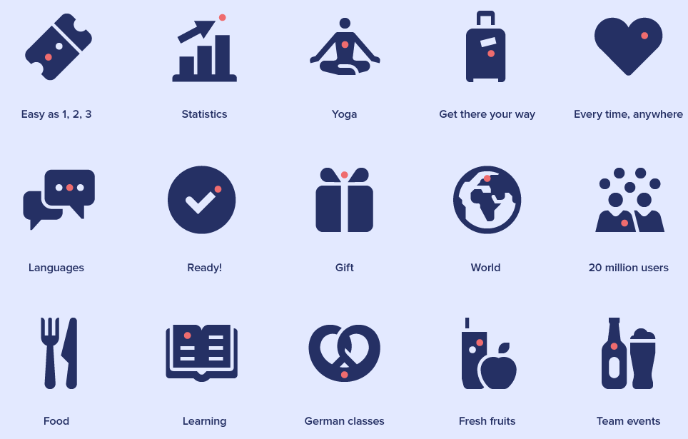
The branded red circle appears on the icons where appropriate. For example, in the user icon, the circle represents the heart.


In total I made about 70 icons for GoEuro.
Each icon is a shape searching corresponding to the rules of set building and consonant with the character of the brand.
Here is how, for example, the search for the shape of the train looks:
Each icon is a shape searching corresponding to the rules of set building and consonant with the character of the brand.
Here is how, for example, the search for the shape of the train looks:


The minimum size of icons for the site is 40x40 pixels. Therefore, these icons are based on 20x20 grid.


