


· D E S C R I P T I O N ·
"La granja" is a familiar bar in Sant Pau zone (Barcelona) with decades of tradition where families from the neighborhood come to have breakfast and a snack with their children.
· P R O J E C T ·
The main requirement was to preserve the logo because of its long history.
The design wants to reflect tradition of bars in Catalonia (red & white pattern of table cloths in that places) and to develop a direct graphic to be seen in a quick time lapse. Although the Sant Pau neighborhood is a residential and traditional neighborhood, it has also become a very tourist area due to its interesting architecture.
Art direction | Branding | Icon Design| Menu Design

Icons: The menu must be very visual and easy to read by adults, children and tourists.
The icon system makes it easy to read and also adds dynamism to the design.


Main Menu: A folded menu in which the red vichy pattern (very present in traditional catalan restaurants) takes center stage. The blue and yellow colors complement the composition and help to provide contrast.

Secondary Menu: Due to limited capacity, single-sided menus in each language are placed at the entrance door.
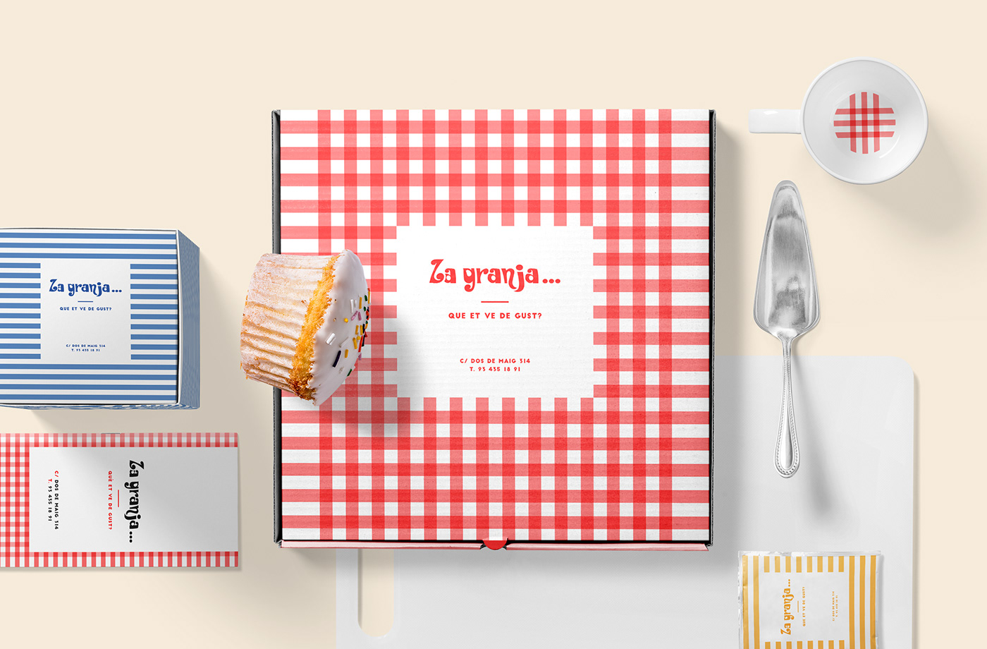
Other materials: Small variations in the print and the use of colors allow different items to be personalized, creating a fun and joyful experience.
Fun note: There was a lot of menu theft (which didn't happen with the previous design). I'm sorry but I'll take it as a compliment :)

If you loved the project you can click like,
comment and/or share it!
comment and/or share it!


