Inspired by the Natural and Cultural Heritage
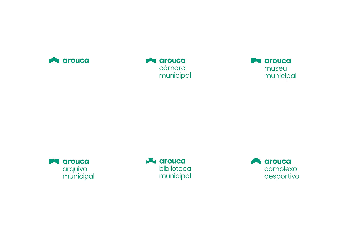
Creating the visual identity for the municipality of Arouca was a complex challenge. Summarizing the identity of a municipality, made of culture, history and surrounded by natural landscape, in a single symbol was the starting point for the process of identity creation. The objective was the construction of something dynamic, collective and representative of all the surrounding aspects. A new graphic image has been developed that constantly shapes itself without losing its identity, according to the corporate needs of the municipality.
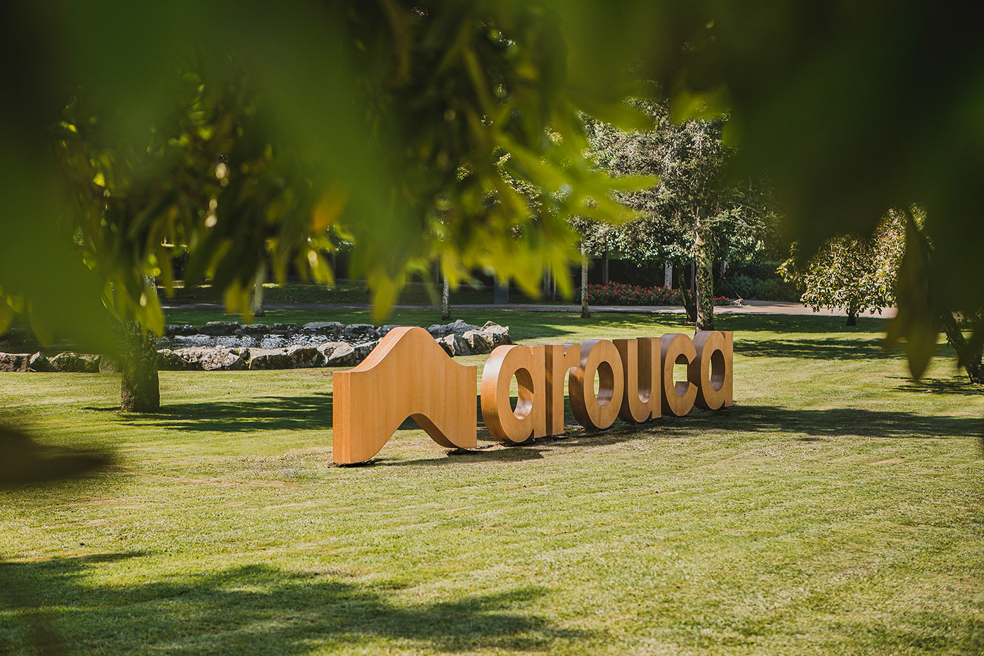
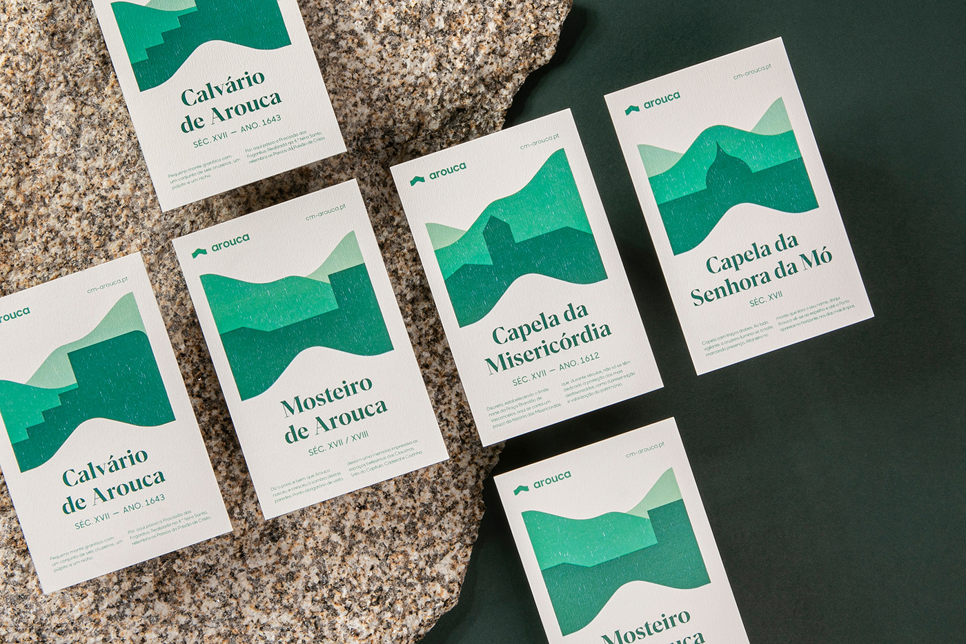
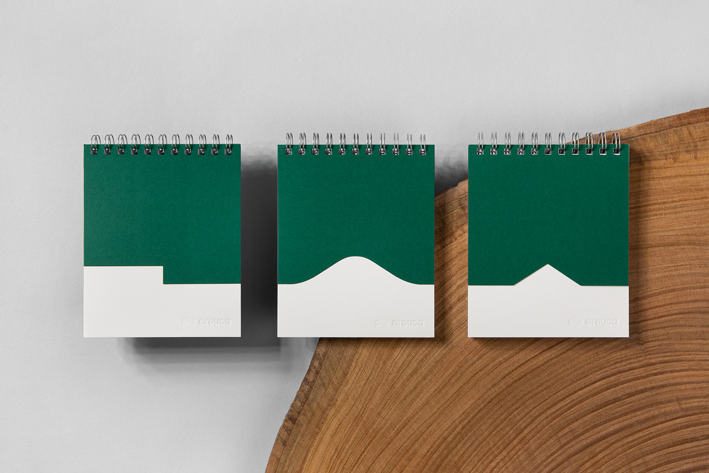
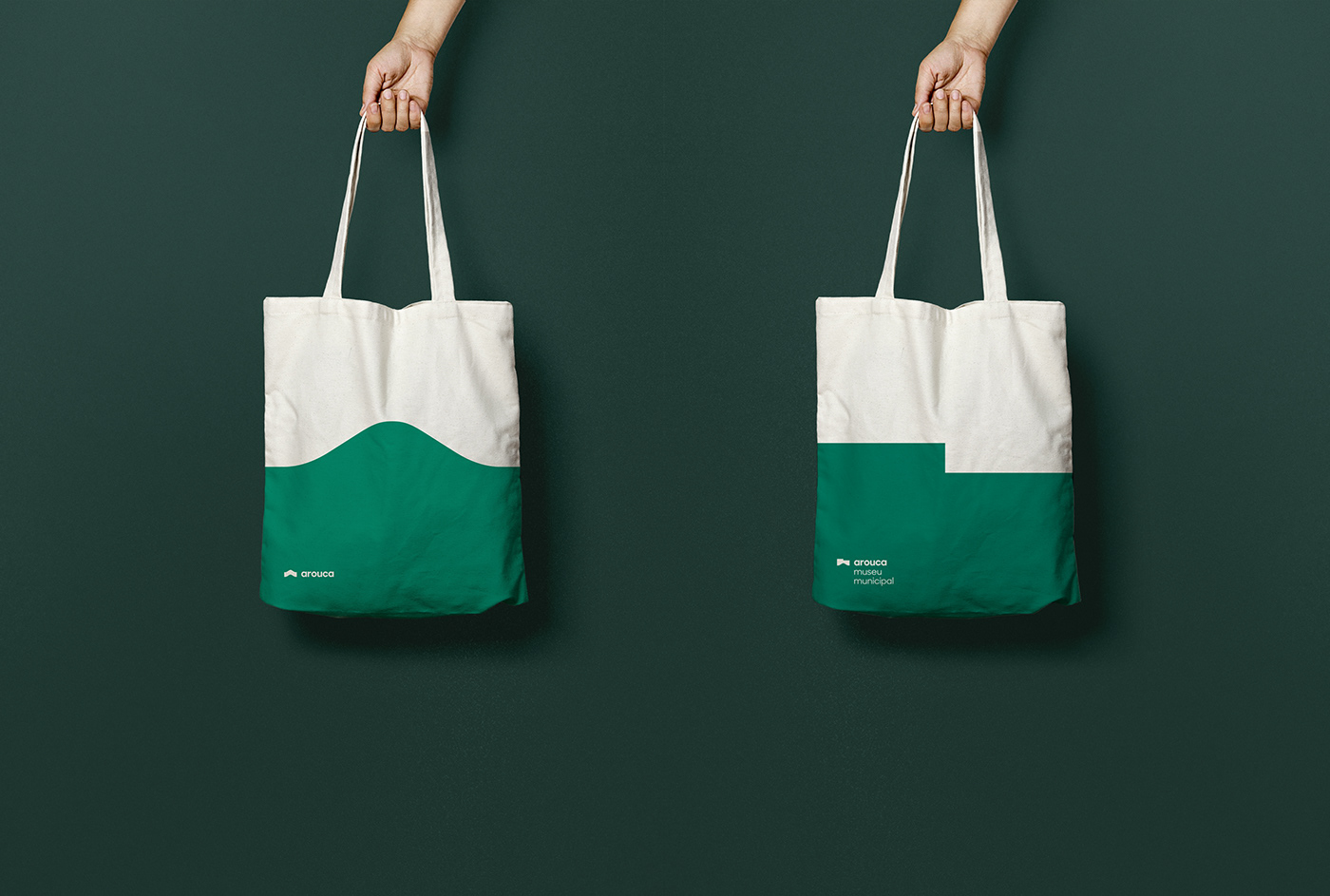
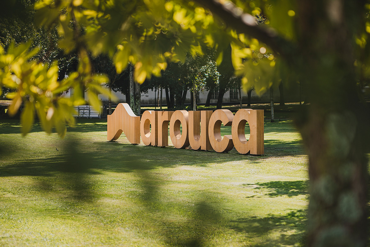
This project started with the historical and cultural investigation of the municipality of Arouca, in a trip that led us to the discovery of the village. The image of this village, surrounded by the mountains of Mó and Freita, was the starting point that gave rise to the creation of the new image of the municipality. The mountains that welcome this land are the symbol that visually characterizes the municipality and that brings in its deep meaning the coexistence of its citizens with nature.
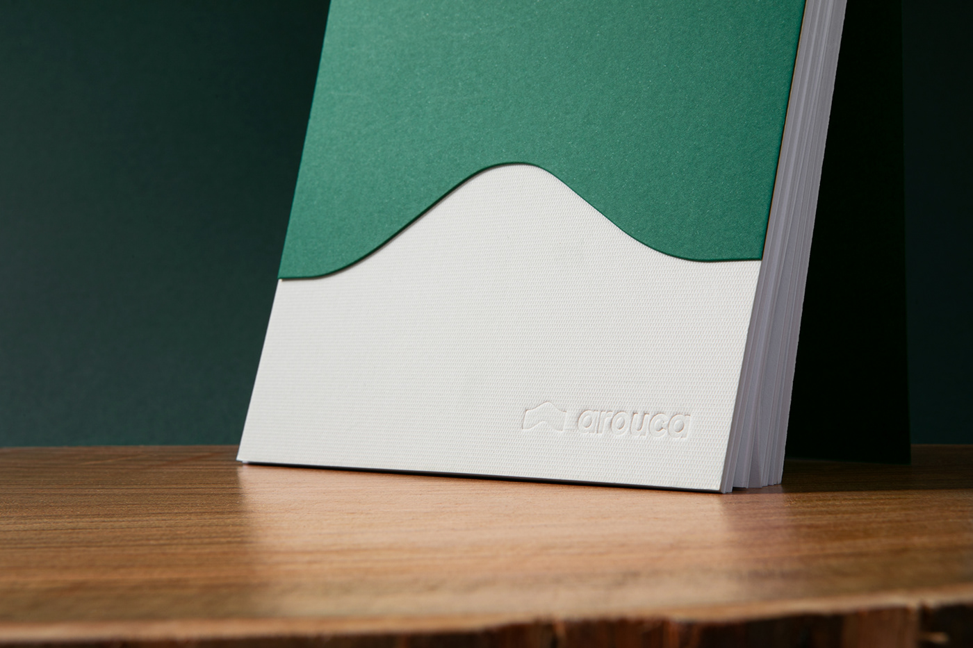
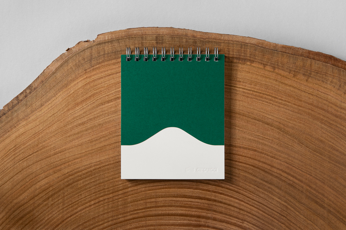
The Arouca brand is characterized by its simplicity. The curve of the mountain thus becomes the representative symbol of the municipality. This element, so present in the history and image of the village, brings with it all the essence of the environment that surrounds this land. -The organicity, clarity and aesthetics of pure and modern lines is the mark we want to leave.
Inspirada no Património Natural e Cultural
Criar a identidade visual para o Município de Arouca foi um desafio complexo. Resumir a identidade de um Município, feito de cultura, história e rodeado de paisagem natural, num só símbolo foi o ponto de partida para o processo de criação da identidade. O objetivo foi a construção de algo dinâmico, coletivo e representativo de todos os aspetos envolventes. Desenvolveu-se uma imagem gráfica nova que se molda constantemente, sem perder a sua identidade, conforme as necessidades corporativas do Município.
Este projeto iniciou-se com a investigação histórica e cultural do município de Arouca, numa viagem que nos levou à descoberta da vila. A imagem desta vila, rodeada pelas serras da mó e da freita, foi o ponto de partida que deu origem à criação da nova imagem do município. As serras que acolhem esta terra são o símbolo que caracteriza visualmente o município e que traz em seu profundo significado a coexistência dos seus cidadãos com a natureza.
A marca de Arouca é caracterizada pela sua simplicidade. A curva da montanha torna-se assim no símbolo representativo do município. Este elemento, tão presente na história e imagem da vila, traz consigo toda a essência do meio ambiente que envolve esta terra. A organicidade, clareza e estética de linhas puras e modernas é a marca que queremos deixar.


Client: Câmara Municipal de Arouca
Stúdio: Unformal
Graphic Design: Rafael Gilde e Raquel Peixoto
Photography: Ricardo Röseler
Motion Graphics: Gabriela Araújo
Year: 2019
—


