Play Me, I'm Yours - Street Piano Project - Week 5 - #oneperday18 - Colours (QUT DXB202)
For this week, we were tasked with creating our own piano design based off the provided brief and templates, with a focus on colour.
I don't have too much of my own experience with colour, so I stuck with traditional colour pencils and went with a look reminiscent of "Angel Island Zone" from Sonic 3 & Knuckles (1994) on the SEGA Mega Drive. Worth noting is that it's my favourite game of all time and I love all of its aesthetic details.
I felt that a kind of landscape shot with a bright blue sky and clear horizon line would allow for a nice wrap-around design for the piano. It also featured a similar colour scheme to what I designed in-class, when we made a quick colour palette based off our favourite movie (mine was Jurassic Park, which takes place on a tropical island very similar to what I've drawn below, so I wanted to stick with it).


Planning
These are the original plans I had for the piano, along with testing the colours.

Overall, this was designed more with practicality in mind, rather than super complex imagery. I think this bright look that follows around the entire look is rather eye-catching, but I know for sure that other students in this unit will have made some incredibly creative detailed designs. I used a fairly analogous colour scheme, with the related colours of yellow, green and blue all together. This creates a really natural, tropical feel, which is the exact mood I was aiming for.

The Top
Process -
The simplest one overall. I contemplated on doing a strange perspective thing, with a birds-eye-view of the island on the top, but since I doubt many people will even see it, I decided against it.
Also, I wanted the back and sides to feature the same landscape scrolling around, rather than offering a side view of the same environment (like a fish tank). I don't know if that makes sense, but basically, if I was to make the top show the top of the island, I would need to have the other side of the island visible on the back, and the sides of it visible on the sides, if that makes sense. Again, think of a fish tank. That's not the look I was going for, hence the mostly empty sky here.
Reflection -
This is the most simple of all the drawings, so there's not much for me to say. Maybe the colours could be stronger, and my ability to create the clouds against the blue sky could see some improvements.
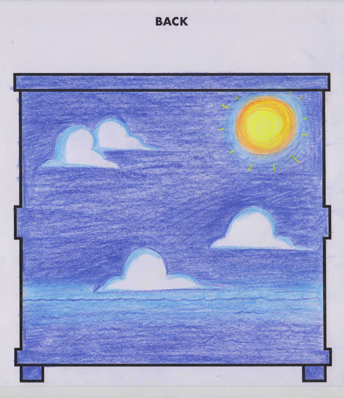
The Back
Process -
This is the 2nd angle I did. With a fairly simple horizon line of the ocean and some clouds, I wanted to add the sun to this angle as a bit of extra detail and colour variety. I used my ruler to help keep the lines straight, and practised with blending colours together for the sun colours, and the water.
Reflections -
The clouds were something that continued to be a bit tricky, since they mostly required an absence of colour (white). I think these look "good enough" but obviously by colouring abilities could be far better. I was following visual references while working on these in terms of the kinds of shapes and colours I wanted to be using, and that certainly helped.

The Front
Process -
Clearly the drawing with the most variations in colour and complexity. It's still not anything extravagant, but I think it came out looking alright. I did lots of practice for this one beforehand (as seen at the top of the page) to make sure I got the perspective right. I tried to make sure I was using the thicker lines at the foreground to signify the distance better.
Reflections -
The part I had the most issues with was conveying the sense of change between the grass to the sand, and the mountains/volcano to the forests of trees across them. Looking at real image reference from Kauai, real mountains are a mix of dirt/earth and trees, so I didn't just want large brown hills. This is why it looks a bit vague, and the sand is also hard to see thanks to how light the yellow and greens are.
I thought about having smoke coming out of the top of the volcano, but I still wanted the nice, cloudy blue sky, so I decided not to.

The Sides
Process -
The last drawings I did were designed to show the coastline of the island, stretching back around to the back and front of the piano. Unfortunately, as seen in the image featuring them all together (at the top of this page), they didn't end up correctly lining up 100%, but at least the idea is still there.
Reflections -
The hardest part of this image was making the water appear believable at the sand, with the lighter blues fading to darker ones, and the white foam at the very edge. I think in the end, it came out looking alright, but having more shades of blue to work with would have helped me a bit, along with simply drawing better shapes and understanding coloured pencil techniques.
So overall, I'm fairly happy with how this turned out. I guess it's better than what I was originally expecting, since I haven't used colour in so long, but having lots of good image references was really what made it work better for me.
