


This is a legacy version of the typeface. Agrandir has been significantly improved and updated. Download link is on the new page.
The update includes:
☻ lots of curves and letter shapes are improved;
☻ much better and tighter kerning and spacing;
☻ cleaner naming system;
☻ rethought style sets.
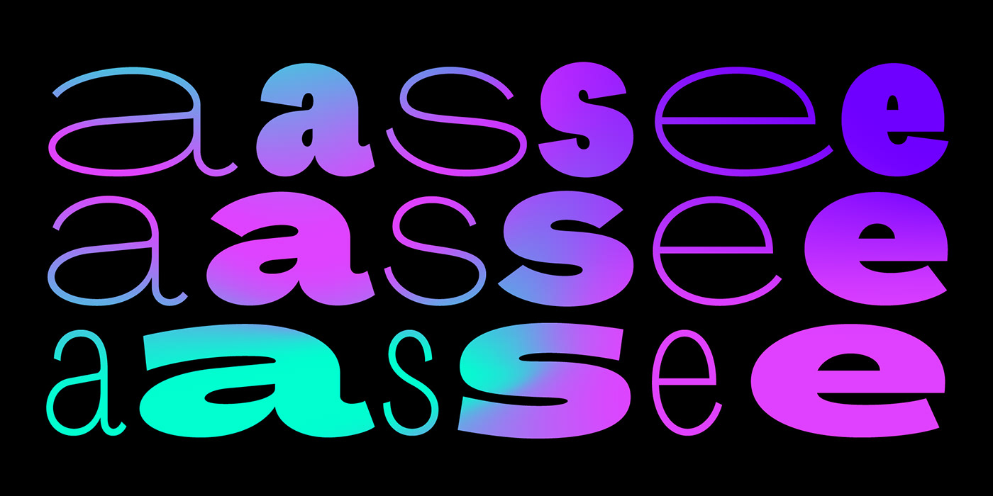
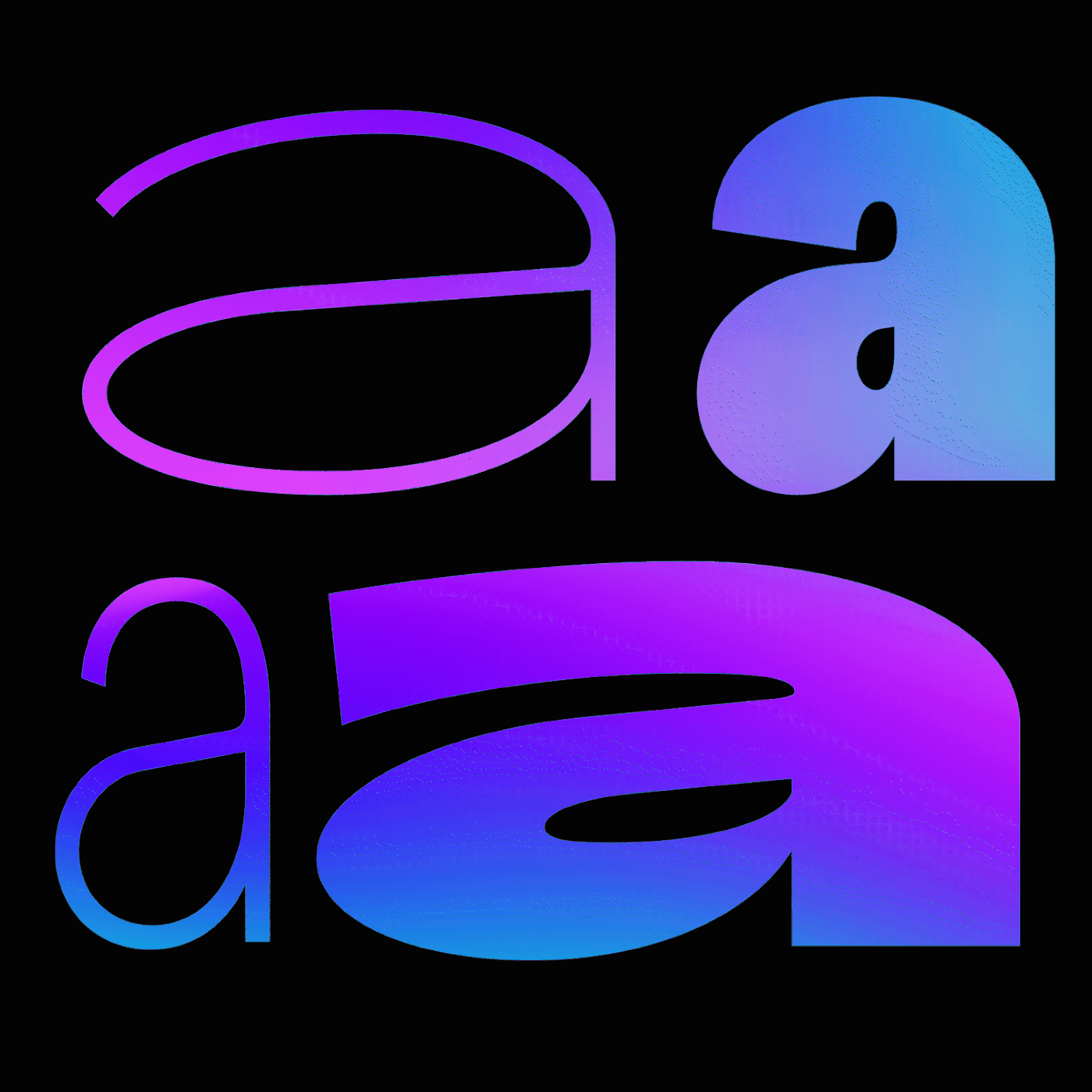
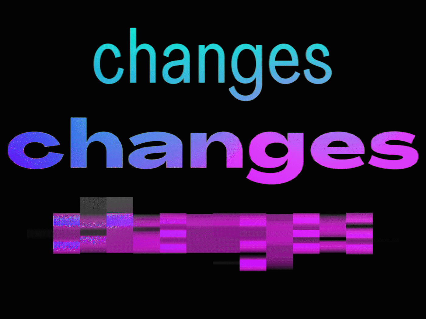
Agrandir is a contemporary serifless type family based on geometric yet humanized and imperfected shapes.
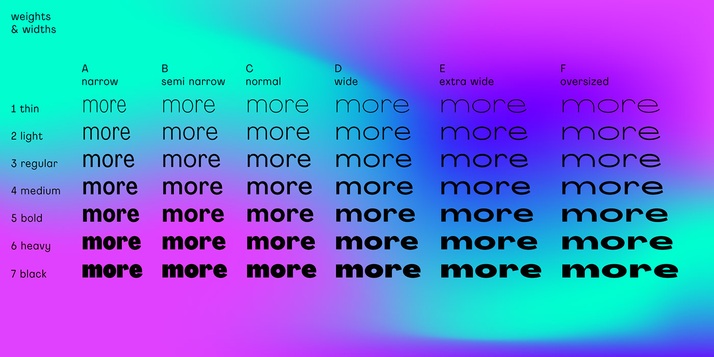
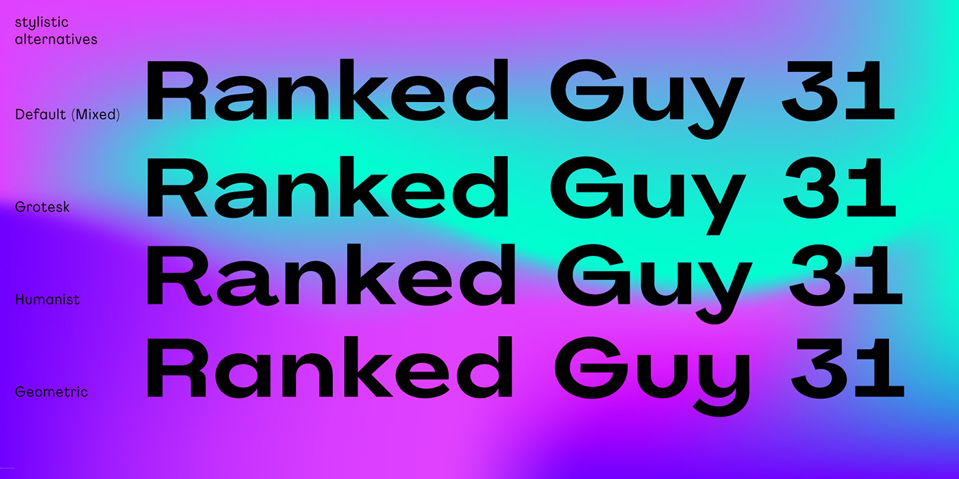
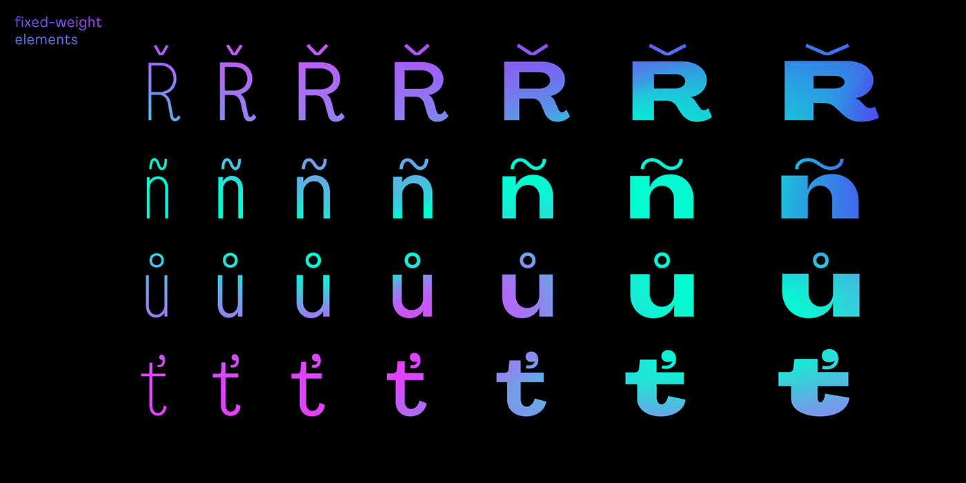
The typeface consist of 42 fonts: 7 weights × 6 widths, from very thin and narrow to extremely black and oversizely wide. There’s a fairly good number of OpenType stylistic alternatives in Agrandir, which can be turned on individually or as style sets: Default (Mixed), Grotesk, Humanist and Geometric. Another feature of this type family is fixed-weight elements, such as diacritical marks, some punctuation and math symbols – those stay thin even in bold fonts, adding some contrast and modern look.
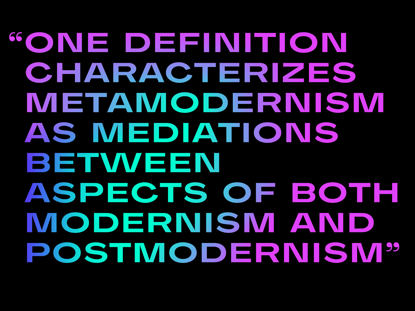
This huge type family is suitable for anything: logotypes, posters, editorial design, web design, body text, headlines and so on.
Agrandir’s smart naming system makes it easy to use. In addition to usual font names, you’ll find a letter-digit system: 1-Thin, 2-Light, 3-Regular, 4-Medium, 5-Bold, 6-Heavy, 7-Black; A-Narrow, B-Semi Narrow, C-Normal, D-Wide, E-Extra Wide, F-Oversized. Once you get how the system works, it’s intuitive to use just by typing “D6” (or whatever) in the font menu instead of scrolling through the whole list.
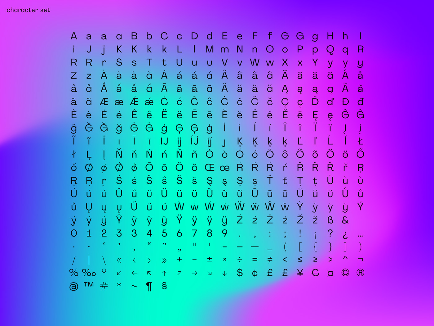
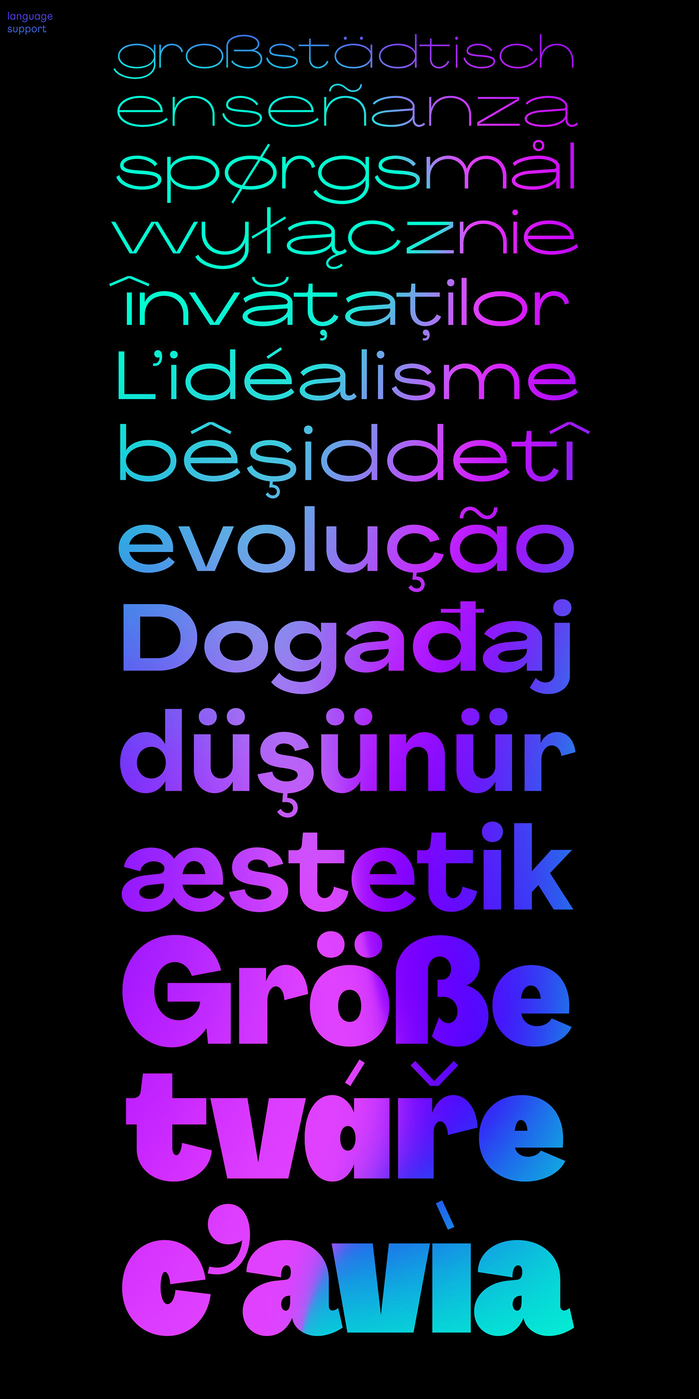
Agrandir supports 192 latin-based languages:
Abenaki, Afaan Oromo, Afar, Albanian, Alsatian, Amis, Anuta, Aragonese, Aranese, Aromanian, Arrernte, Arvanitic (Latin), Asturian, Aymara, Bashkir (Latin), Basque, Belarusian (Latin), Bikol, Bislama, Bosnian, Breton, Cape Verdean Creole, Cebuano, Chamorro, Chavacano, Chickasaw, Cimbrian, Cofán, Corsican, Creek, Crimean Tatar (Latin), Croatian, Czech, Danish, Dawan, Delaware, Dholuo, Drehu, Dutch, English, Estonian, Fijian, Filipino, Finnish, Folkspraak, French, Frisian, Friulian, Gagauz (Latin), Galician, Genoese, German, Gooniyandi, Guadeloupean Creole, Gwich’in, Haitian Creole, Hän, Hawaiian, Hiligaynon, Hopi, Hotcąk (Latin), Hungarian, Ido, Ilocano, Indonesian, Interglossa, Interlingua, Irish, Istro-Romanian, Italian, Jamaican, Javanese (Latin), Jèrriais, Kala Lagaw Ya, Kapampangan (Latin), Kaqchikel, Karakalpak (Latin), Karelian (Latin), Kashubian, Kikongo, Kinyarwanda, Kiribati, Kirundi, Klingon, Ladin, Latin, Latino sine Flexione, Latvian, Lithuanian, Lojban, Lombard, Low Saxon, Luxembourgish, Makhuwa, Malay, Manx, Māori, Marquesan, Megleno-Romanian, Meriam Mir, Mirandese, Mohawk, Moldovan, Montagnais, Montenegrin, Murrinh-Patha, Nagamese Creole, Ndebele, Neapolitan, Ngiyambaa, Niuean, Noongar, Norwegian, Novial, Occidental, Occitan, Oshiwambo, Ossetian (Latin), Palauan, Papiamento, Piedmontese, Polish, Portuguese, Potawatomi, Q’eqchi’, Quechua, Rarotongan, Romanian, Romansh, Rotokas, Sami (Lule Sami), Sami (Southern Sami), Samoan, Sango, Saramaccan, Sardinian, Scottish Gaelic, Serbian (Latin), Seri, Seychellois Creole, Shawnee, Shona, Sicilian, Silesian, Slovak, Slovenian, Slovio (Latin), Somali, Sorbian (Lower Sorbian), Sorbian (Upper Sorbian), Sotho (Northern), Sotho (Southern), Spanish, Sranan, Sundanese (Latin), Swahili, Swazi, Swedish, Tagalog, Tahitian, Tetum, Tok Pisin, Tokelauan, Tongan, Tshiluba, Tsonga, Tswana, Tumbuka, Turkish, Turkmen (Latin), Tuvaluan, Tzotzil, Uzbek (Latin), Venetian, Vepsian, Volapük, Võro, Wallisian, Walloon, Waray-Waray, Warlpiri, Wayuu, Welsh, Wiradjuri, Wik-Mungkan, Xavante, Xhosa, Yapese, Yindjibarndi, Zapotec, Zulu, Zuni.


This is a legacy version of the typeface. Agrandir has been significantly improved and updated. Download link is on the new page.
More works
brand identities
typography
typefaces
Let’s keep in touch
instagram
youtube
slobzheninov@gmail.com
brand identities
typography
typefaces
Let’s keep in touch
youtube
slobzheninov@gmail.com
Thanks for watching!


