Tenke
Branding & web design
On the strength of the work completed for Parker Joinery, Frank! Communications came to me to work on the branding and website for this new startup.
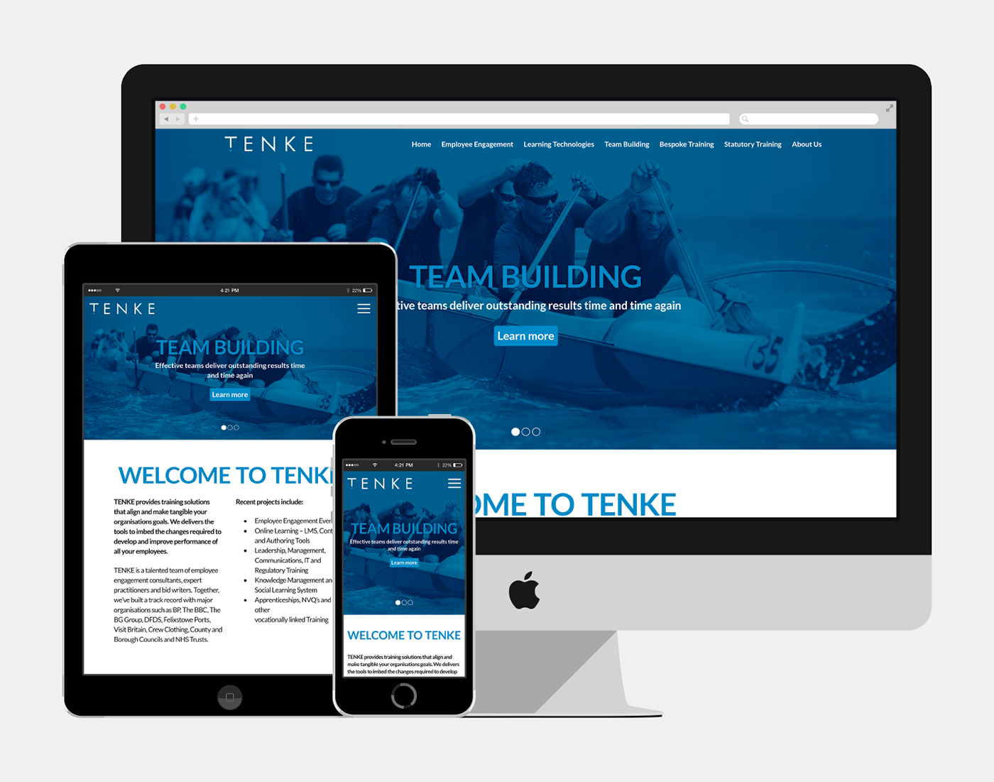
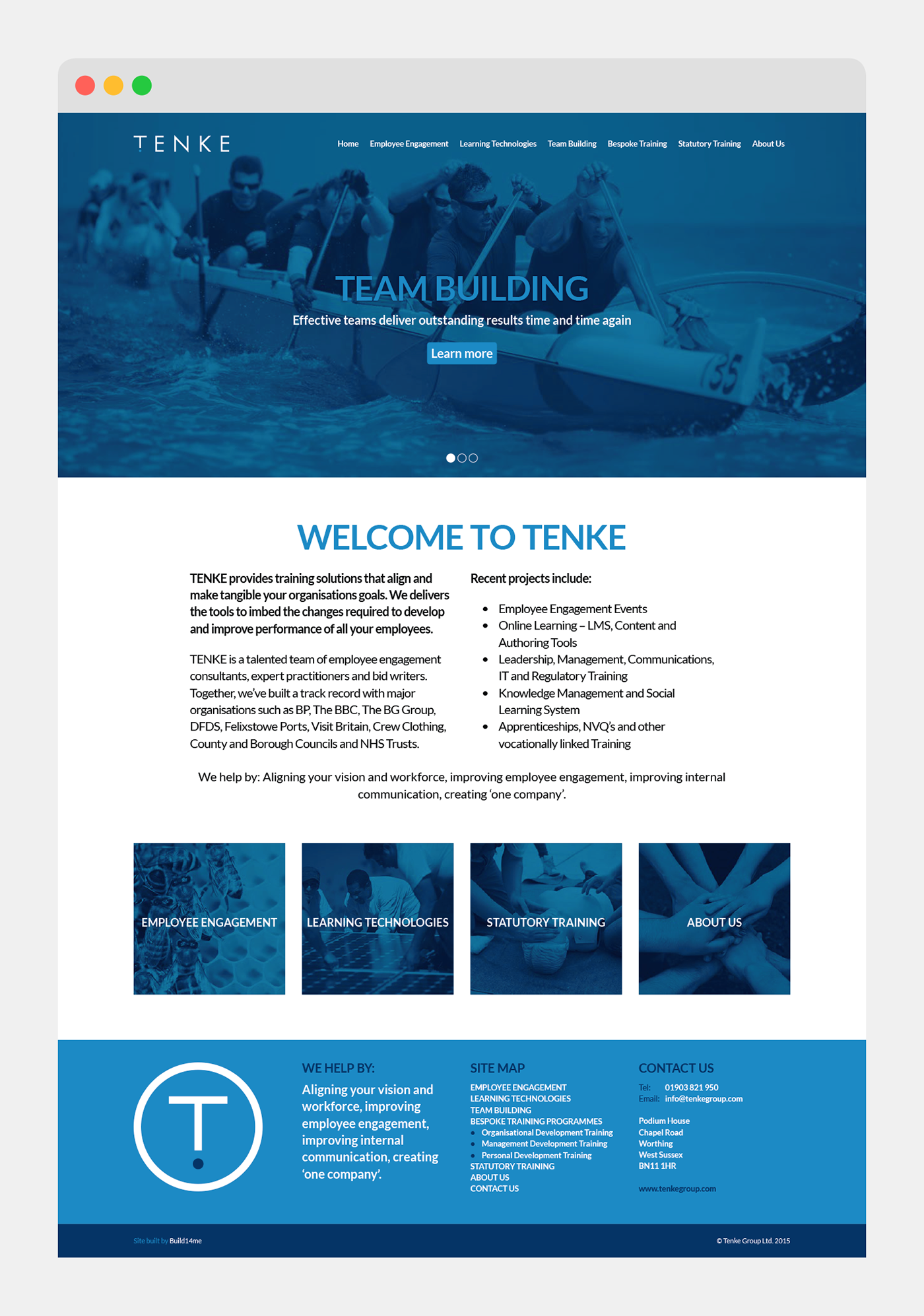
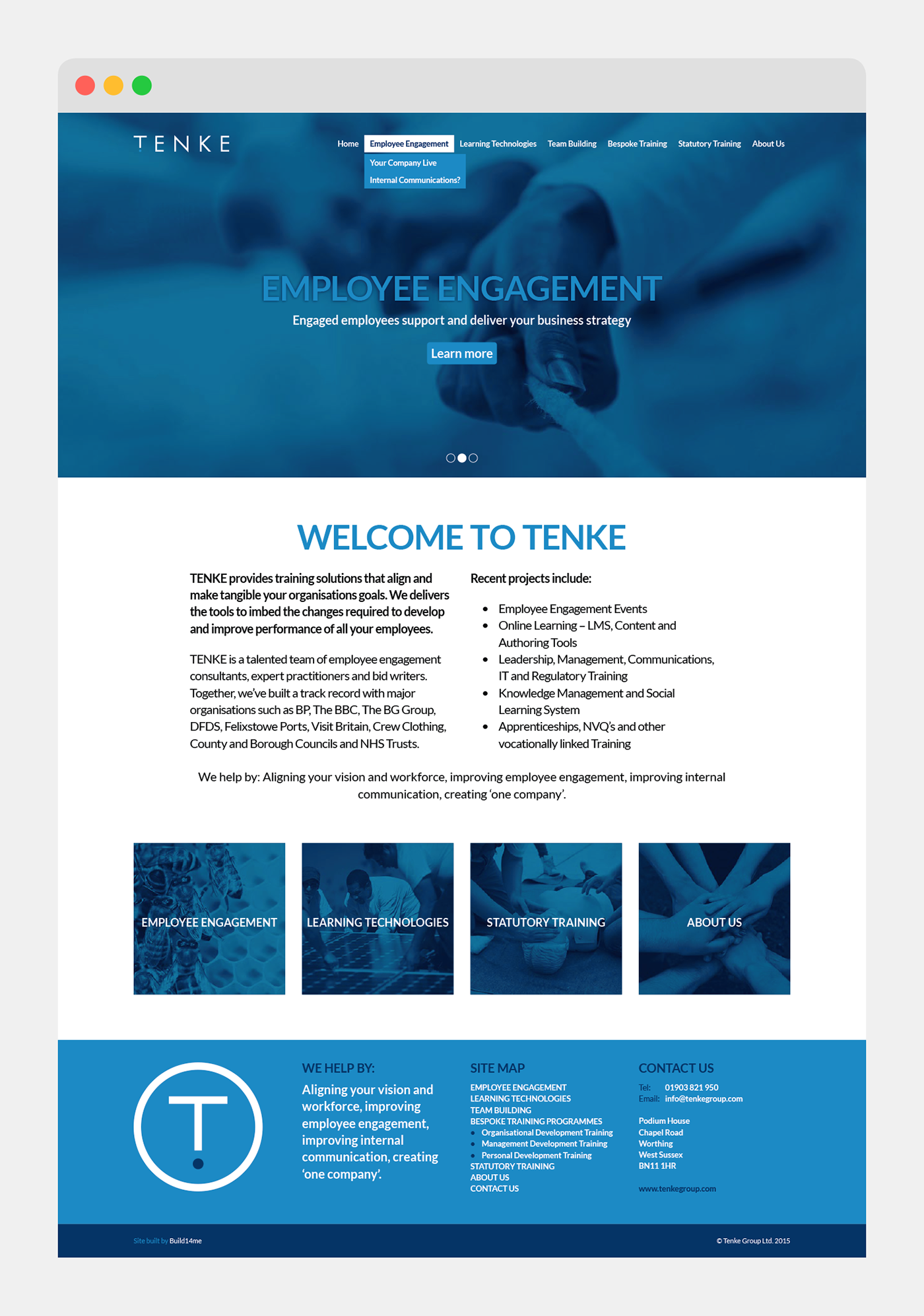
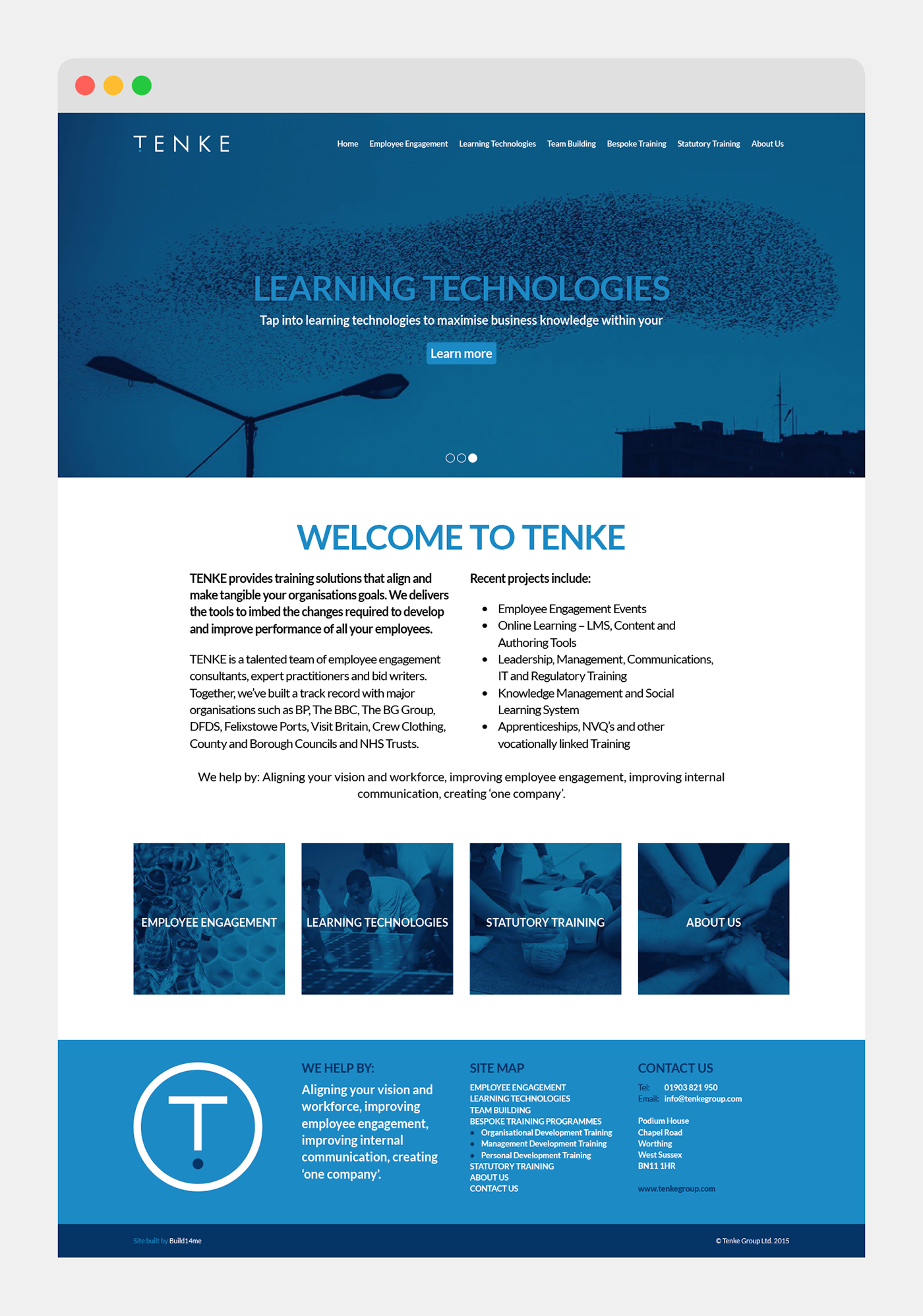
Tenke are a new startup providing high-end professional training solutions to organisations to help them improve employee engagement and internal communications.
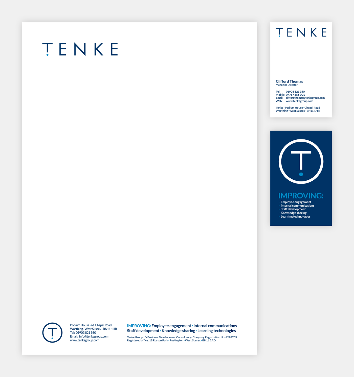
The brief was to create a brand that was professional, refined and understated, sit comfortably with the corporates and feel like an established company from the very outset.
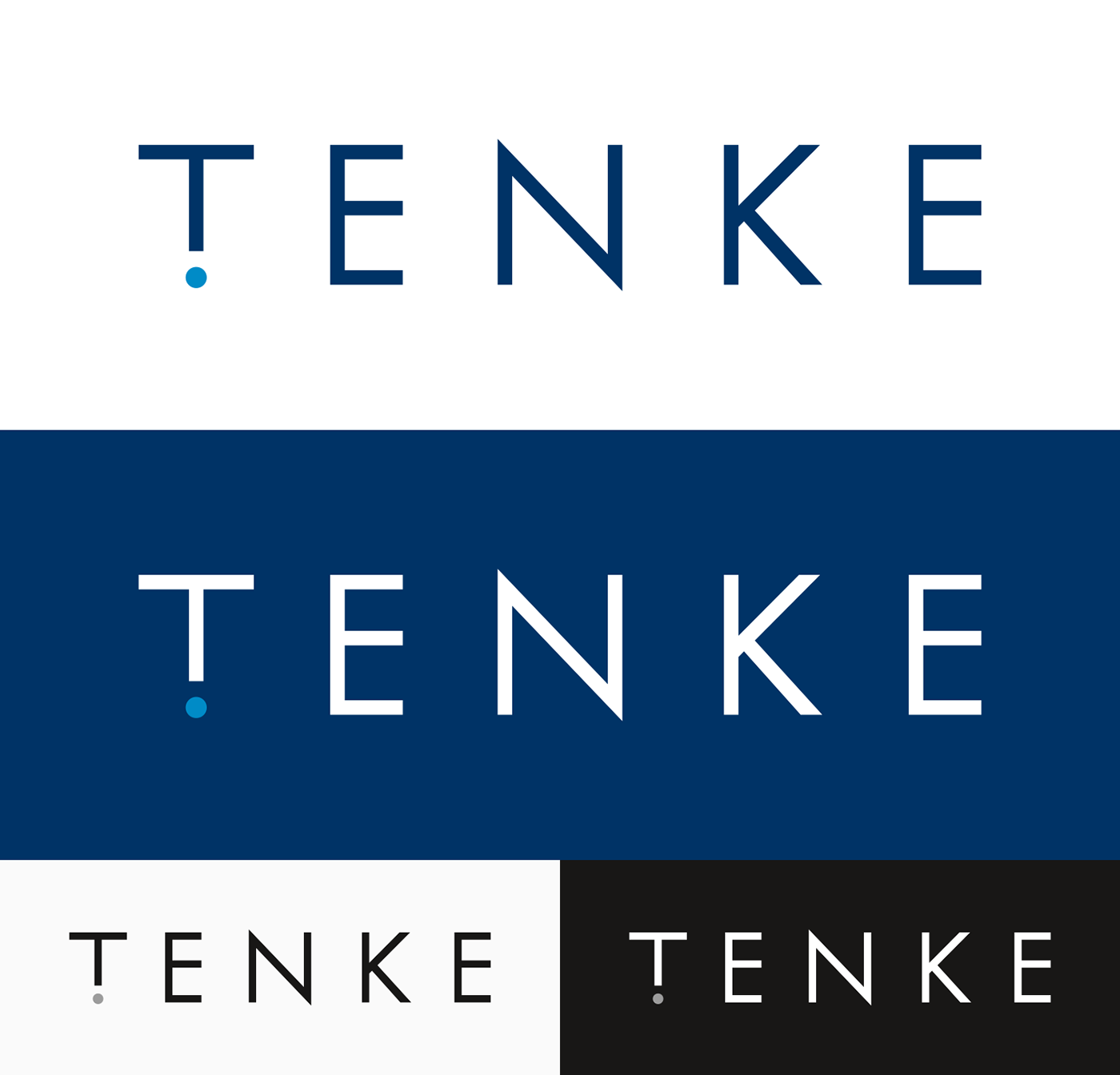
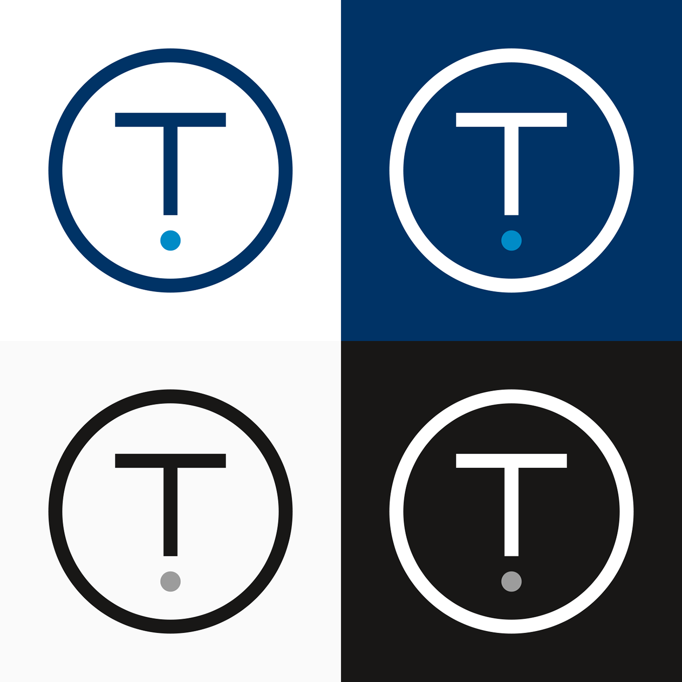
Tekne is a Norwegian word, which translates into English as ‘to think’. While researching this, I came across some little known punctuation marks. One of them was Bazin’s authority point, which ‘shades your sentence’ with a note of expertise and indicates advice that should be taken seriously. This lead me to create my own take on this mark for the T of Tenke.
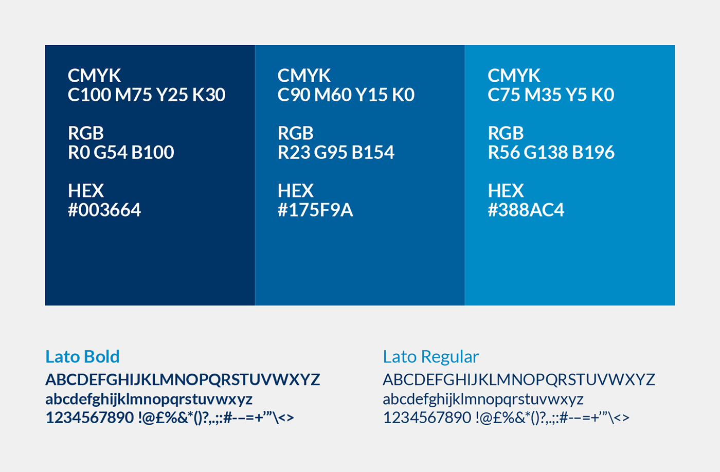
The selected blue tones give the brand a reassuring, established feel and has been paired with bold duo-toned imagery to add to the professional look.