
Honda Research America Rebrand
Hypothetical Project
Identity system for Honda Research America done by a team of three, Angela Chu, Jonathan Shi, and myself.
Honda Research America is about being inspired and carrying your idea through development, design, and production. It's about using the IRL racing circuit as your own personal testing ground. It's about making the air cleaner for you and future generations and making more efficient use of energy. It's about tackling any terrain with your four-wheeler. Whatever your inspiration is, find a way to make your dream come to life. At Honda Research America, we make people's dreams reality.
CHALLENGE
To create a brand for Honda's internal team, getting the employees excited and proud to be working at Honda Research America.
SOLUTION
We created a bold, black and white colored identity system with a logo that was inspired by imprints, tire tracks, and footprints. It showcases the dynamic movement, progressive attitude, and the agile velocity that Honda Research America represents.

Imprint.
The visual language of the logo started off as a notion of leaving imprints: the footprint of explorers, tire track of vehicles, and legacy of pioneers. The idea is that the mark you see is what has been lead by HRA, just like the footprint in the snow, you can trust and follow, and get ready to be amazed by where it will take you.

Logotype
This graphical and typographic approach showcases the dynamic movement, progressive attitude, and the agile velocity. The six bold stripes forming the logotype captures the sleek motion yet retaining sophistication and balance. With its sharp angles and dramatic edges, the mark has a strong visual strength and can stand on its own.
This logotype is the most important visual element of HRA’s identity system and should be used consistently and repetitively throughout different media platforms


Tagline
The duality of this tagline is the spirit HRA holds, we evoke the viewer by asking what’s next? What possibilities reside in the future? And simultaneously, we answer the viewer by a solid statement: “We are what’s next.”


Typography
Vaud is the typeface chosen for this visual identity. The letterform retains sharp edges and corners, but at the same time, full in its body. With tapered details, it is the best companion to the bold HRA logotype.


Graphic Element A: The Tire Track
The logotype is lined up in sequence to emulate the idea of imprints left on the floor by the tire.
It can be used in the absence of the logo. It is the most important element of the brand. The entity is moving forward on the ever-changing, cutting edge technology, whereas motor vehicle design is the root of all excellency. It grounds the brand, yet illustrates the idea that the imprint you see is the mark that led by HRA. Much like footprints left in the snow, you can trust to follow and be amazed by where it will take you.

Graphic Element B: The Pattern
While the Tire Track is lined horizontally, the Pattern is vertical with no space in between.
It is to be used for packaging, apparel, or other secondary brand experiences to create another level of visual interest. It must not be used in cases that overpower the primary identity.

Collateral


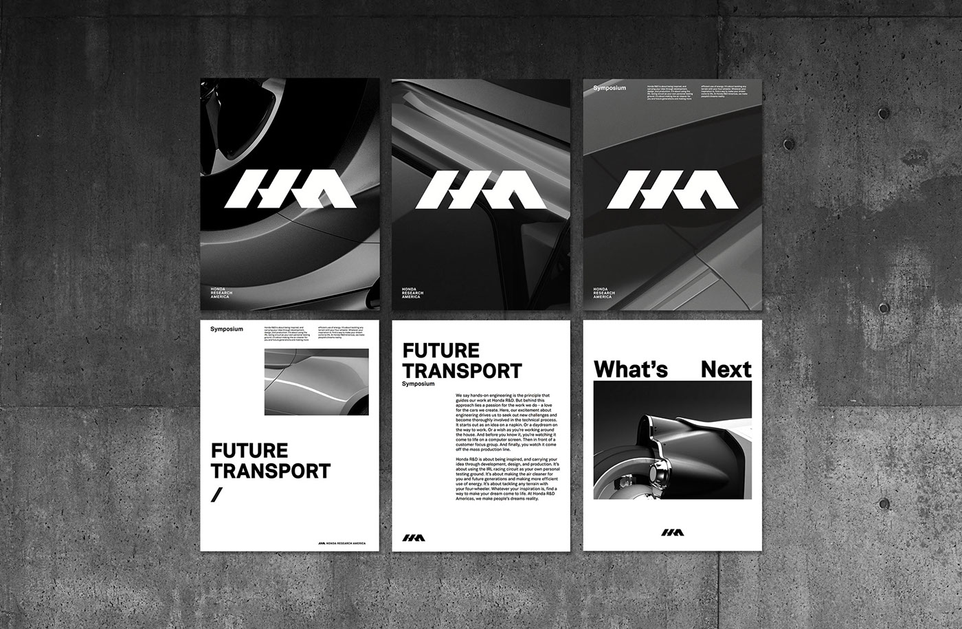
Posters
Promotional pieces are sneak previews of a project ready to be revealed. Informational posters are for events and have more information. They can either contain an image or no image at all.

Flashing Impact
Flashing impact is cut to demonstrate how visual elements frame the brand and effortlessly bridge the new identity with its target audience.

1,2,3,4
1, 2, 3, 4 is an upbeat, humorous example illustrating how HRA can elevate materials by editing music and footage meticulously.

Website
The website is based on the idea of a wheel. All the contents live on one page. As the user scroll to the bottom of the page, they will cycle back to the beginning of the page.
Signage
Signages in the buildings at Honda research America use slashes in the brand colors: black, red, or white. The slashes can be used in both larger and smaller scales. Numbers of individual room numbers are placed in the upper left a smaller scale compared to the slashes or tire track. Numbers for zones are larger in scale overlaid on top of the slashes.


Miscellaneous
Apparel and office supplies for sale or internal use at the gift shop uses either the logotype or one of the graphic elements listed in the graphic elements section.
Employees can get an HRA packaging tape, stamp, tattoos, or cups. They all use elements of the logotype or the graphic elements.


