

YOO Fitness | packaging for entry price products
YOO's price point focus with these particular products was that of an "impulse buy" position, so the concept was to present the product almost like you would candy at the check out aisle. We used the OLD YOO/NEW YOO graphics from their phone/web app and really pushed the playfulness of the color selections and branding.
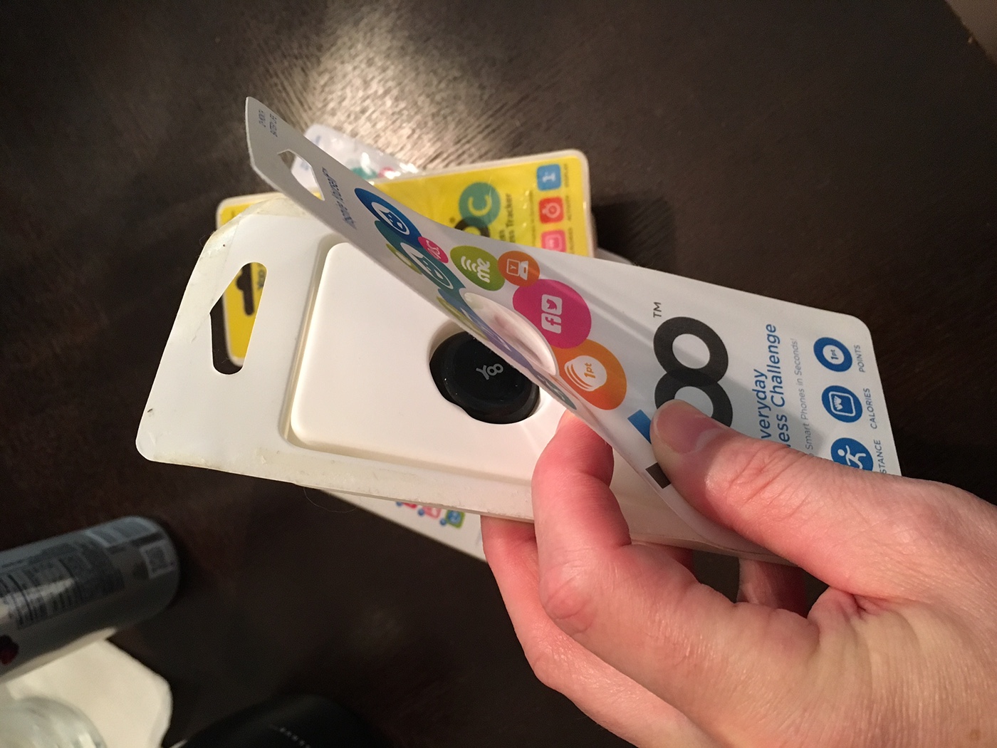
Originally we went with a printed acetate sheet with backing adhesive attached to a vacuum try (white & cyan packages), but we found the product sat too deep in the package, so we switched to a back-printed heat-sealed vacuum form on the front as well so we could create a larger recess for the product to be presented (see YOO C package...the yellow one). This solved the problem of the recessed product, but it had to give up some of its "candy-wrapper" feel as the heat-sealed packages tend to be much more brittle and take more effort to open.
All packaging was designed to stand upright on its own or to hang on a hook. Retail prices vary from below $10 to just under $50, so the packaging had tight finances to work with....but sometimes (as in this case), its actually more satisfying to design something that does what it's intended to do & looks cool on a razor thin budget.
All packaging was designed to stand upright on its own or to hang on a hook. Retail prices vary from below $10 to just under $50, so the packaging had tight finances to work with....but sometimes (as in this case), its actually more satisfying to design something that does what it's intended to do & looks cool on a razor thin budget.

adhesive backed front panel....the idea was to make the package like opening candy.
another shot showing the internal and the backing vacuum trays
the original "flat" package

another version of the original "flat" package


cyan version of the original package


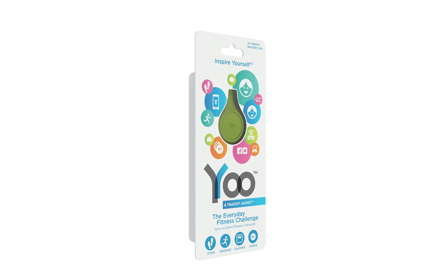
final concept for second generation package.
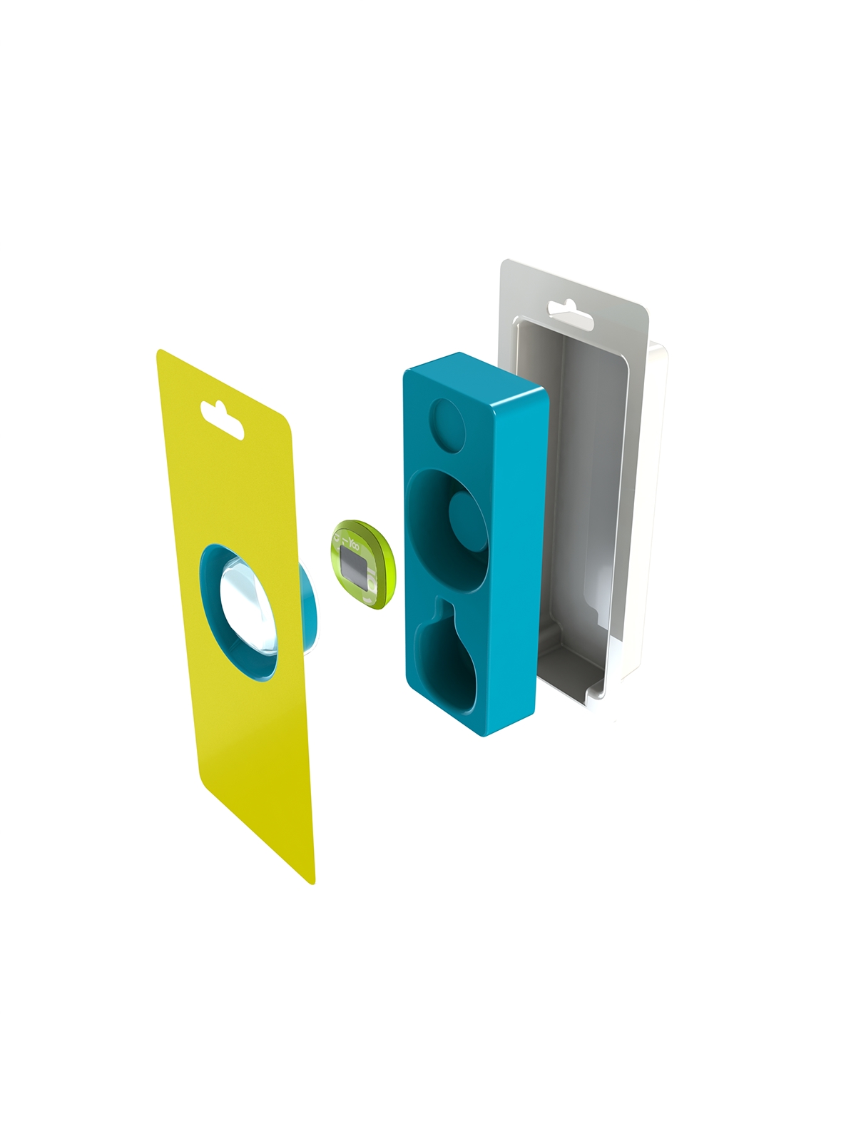
exploded view showing internal vac tray (which was actually white in production) and shaping of front vac form.

final packaging sample.


