
CLIENT
Epic Lion
BRIEF
I was asked to name a brand, design a logo, and build a website for a new web development agency. The client insisted, “the branding must be epic, and it has to look technical but not corporate.”
SOLUTION
The brand and its channels were created in stages. The client and I came up with the idea of a lion as the symbol after the clients birthday in August (Leo). Thus, Epic Lion was born.
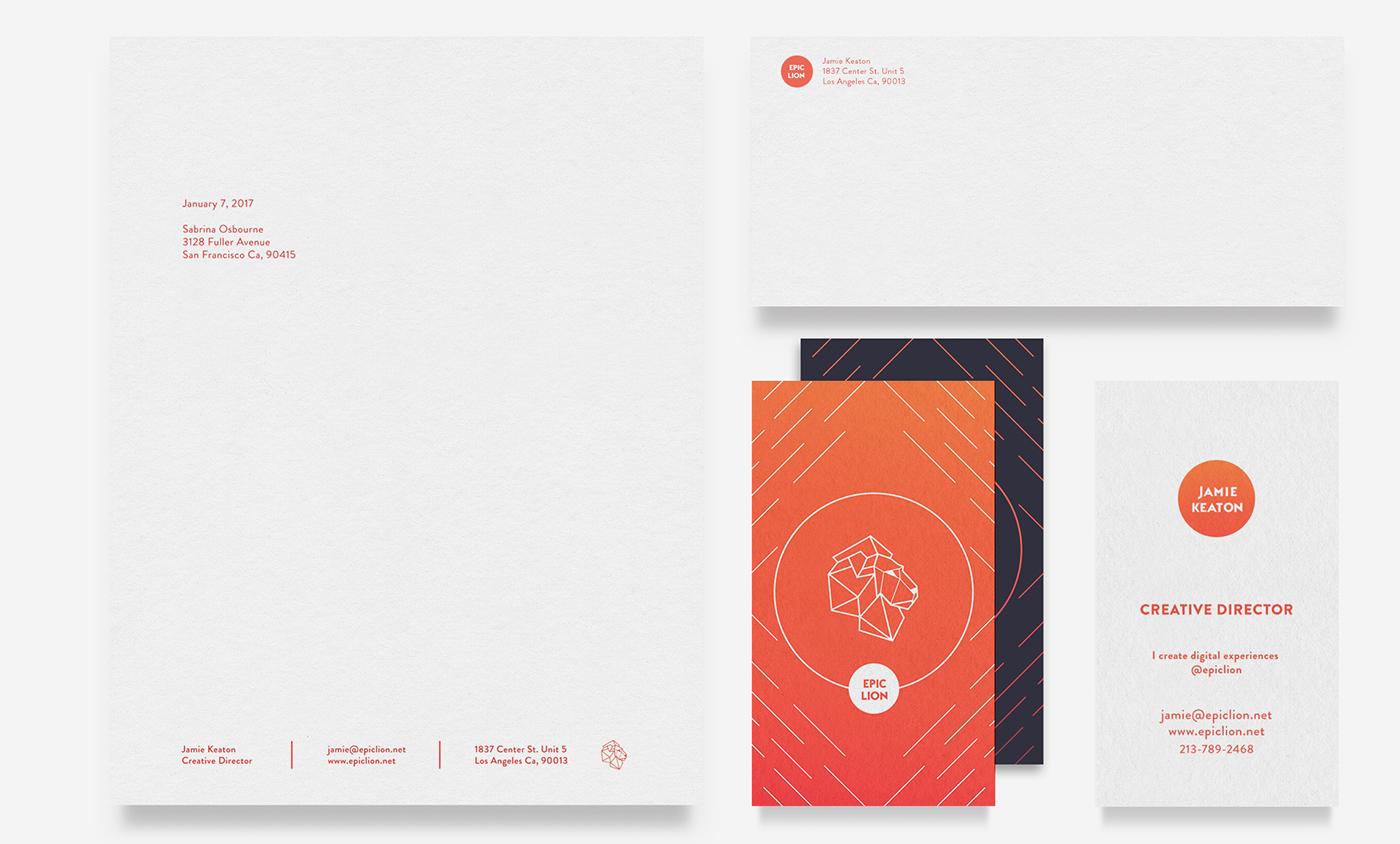
After creating the logo, I thought of how to add a color palette to the identity. The solution was relating it to its organic origin, the Lion. Research included sampling from photos of the great plains of Africa and mimicking the natural gradients of the climate.
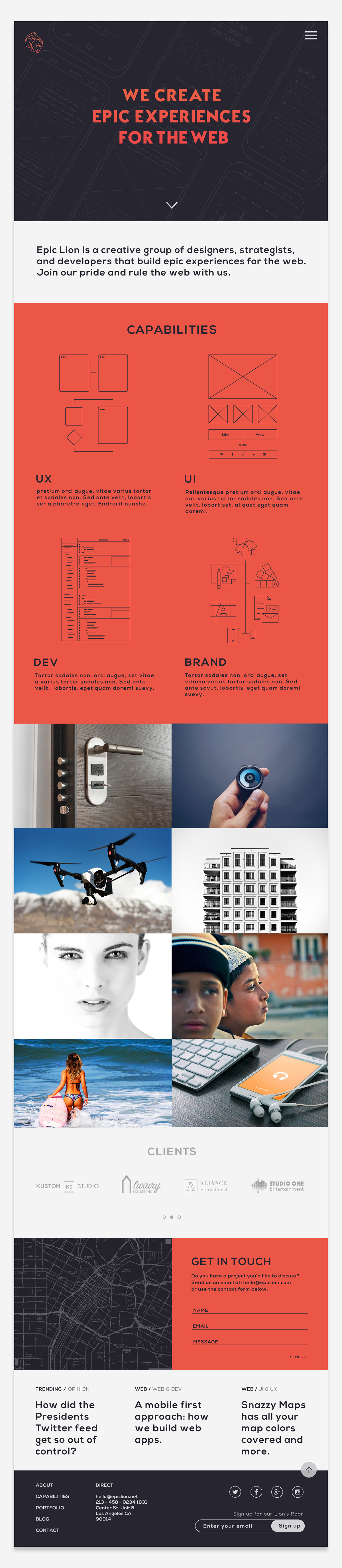
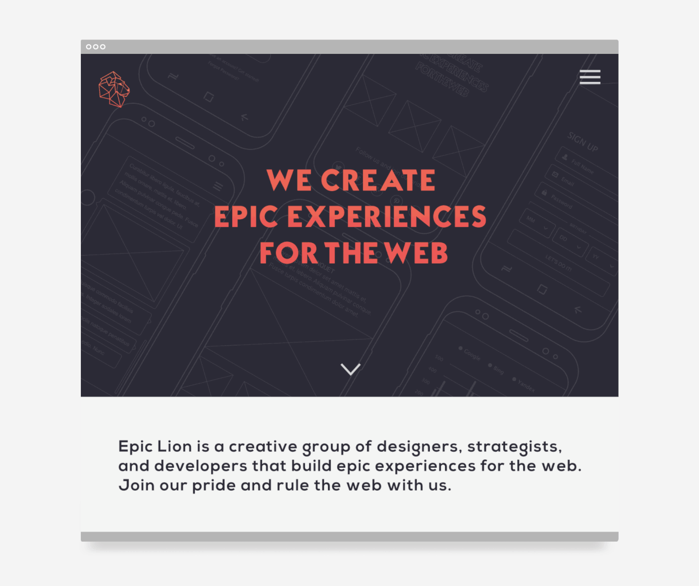
I then created graphics and layouts for collateral and used a mobile first approach for the website to create a one page theme that could be rendered in dark or light colors (I created two themes, they went with the dark theme).
Other points of influence for this project was the process of UI, UX, and code (the companies product). The dark and light themes are inspired by Integrated Development Environments (IDEs), showing off what the company is capable of doing.
RESULT
Though this agency did not end up launching, the team loved the well thought out branding and design incorporated into the identity. The agency may launch at a future date.

Thank you for scrolling :)
Please give a thumb up if you like this one!


