Below I am reproducing verbatim an interview conducted and posted by Seth Rosenthal in his blog Posting and Toasting. It was originally posted in two parts over two days, but I have condensed it here on Behance into one longish post:
This is the current Knicks logo. This is what the Knicks logo looked like in 1992. Little has changed, y'all. They added a little "New York" and modified the colors recently, but have done nothing else to alter a design that's been the primary logo for over twenty years. That emblem has been a constant symbol of the team, and its distinctive big, block lettering echoed throughout several other teams' redesigns in the '90s, some of which are still in place today. So, where did this logo-- which has persisted through multiple Knicks regimes-- come from? With the help of P&T citizen normanhathaway, I had the pleasure of corresponding with Michael Doret, the man who made the Knicks logo.
Doret is a New York-raised, Los Angeles-based designer and lettering artist with a rather extensive resume. When the NBA approached him in Spring of 1991, he'd already done some work for the league, as well as designs and design ideas for the MLB, the NFL, TIME Magazine, the band Kiss(!), and a lot more. So, the league felt pretty confident in his abilities and gave him pretty much free reign to try out different logos and letterforms:
"Before starting on this design project I didn't receive that much input from the NBA other than the directive that they wanted to have something symbolic of New York CIty incorporated into the logo. After discussion we eliminated several options (such as the Statue of Liberty), and settled on the iconic Empire State Building as the only viable alternative that might work in the new logo. So in the beginning stages that was the given which, as we all know, they ended up deciding against as the logo development progressed. I think other than keeping the original blue and orange from the old logo, there wasn't that much else given me in terms of requirements. The directions I took were mostly left up to me."
It was a fairly open-ended task and, as Michael notes, the only specific request made of him didn't even make it to the final product. So, with that dearth of instruction in mind, he set about producing a variety of design concepts. In Part 1 of our magical journey through Michael's old files, he'll show us some of the concepts the Knicks didn't end up picking.
To generate ideas, Michael began with some rough sketches, examples of which are below.


With the Empire State Building icon relatively unchangeable, Michael focused his imagination on the lettering:
"At that time (and even still) my work was all very lettering-oriented. I was trying to open up new areas of letterform design that, up until that point, had tended to be a bit stodgy and traditional. I was just trying to do something different for the time. In actuality I was picking up a lot of cues from bygone eras, from when lettering was really in its heyday-like in the 1930s and '40s-only this time around with a slight twist."
Some of the sketches and elements of others eventually made it into color concepts which, before the widespread use of computer design programs, Michael rendered in colored pencil (the '90s were a dark time).


Any of these could have ended up as the Knicks' primary logo (and, incidentally, Michael loves all his logo babies, but told me the first of those color logos was his favorite), but alas, they could only pick one.

Here's more from Michael:
"The development of this logo lasted about six months, and during that time there was a lot of back-and-forth in terms of which designs were developed further and which designs were shelved. I was hired by NBA Creative Director Tom O'Grady, who was great to work with. He was very open to all the ideas I presented to the league. In the one idea they ended up selecting, I had pretty much taken many of my design cues from their old Knicks logo. I had thought "I know they're telling me to shoot for the moon on this, but I know that the way these things work—they'll get scared and won't want to make a big change". So, I gave them that one as a sketch, which was kind of like an updated, contemporized and cleaned up version of the old logo."
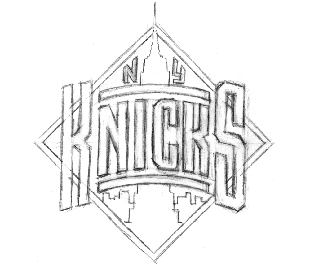
With that in mind, here's a look at the metamorphosis of the logo with which we're familiar today:
"The development of this logo lasted about six months, and during that time there was a lot of back-and-forth in terms of which designs were developed further and which designs were shelved. I was hired by NBA Creative Director Tom O'Grady, who was great to work with. He was very open to all the ideas I presented to the league. In the one idea they ended up selecting, I had pretty much taken many of my design cues from their old Knicks logo. I had thought "I know they're telling me to shoot for the moon on this, but I know that the way these things work—they'll get scared and won't want to make a big change". So, I gave them that one as a sketch, which was kind of like an updated, contemporized and cleaned up version of the old logo."
With that in mind, here's a look at the metamorphosis of the logo with which we're familiar today:


A couple of things:
1. You can see in that third-to-last sketch where Michael started experimenting with the color scheme (which is different from the final one).
2. Recall from Part 1 that one of the initial design requests was the inclusion of the Empire State Building, so some of these look just like the familiar logo, but wearing a building hat. Obviously, that element got cut from the final logo.
Ultimately, this was the design of Michael's that the Knicks chose heading into the 1992 season. A few years later, Michael was asked to design and integrate the "New York" line above the "Knicks". Recently the logo has undergone a minor color makeover, but it's otherwise the same as it was back in '92, not unlike my voice.
Now, that wasn't the only thing Michael was working on for the Knicks project. He also presented them with a series of monogram sketches-- more compact, initial-based logos that could be used for other purposes. Here are some of those sketches:


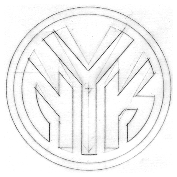
The league ended up setting for just the main logo and none of Michael's monogram designs. But wait-- that last one looks familiar, doesn't it? Indeed, it's the token insignia the Knicks have been using as a secondary logo in 1995. It's graced equipment and merchandise since then, and was featured on the back of the uniform until recently. Michael's design drew its inspiration from the old MTA subway tokens, and, if you look back at yesterday's post, elements of it crept into early concepts of the main logo. New York's adoption of the design has a bit of a story behind it:
"Being a New Yorker and growing up riding the subways, I always had that image of the subway token with the Y cut out of it somewhere in the back of my head. I just saw an opportunity to somehow use that iconic NY image for an iconic NY team. Using it for a secondary Knicks logo was something I wanted to push for. When we started discussing a secondary logo—"a monogram or something". I gave them quite a few different ideas, but at the time, they decided not to use any of them. I thought "okay, that's fine"-- I was being paid fairly for the logo development work that I was doing. That whole secondary logo/monogram thing was dropped, and I got paid for the work I had done on it (but not for finished art or usage). Then, several years later, after this whole project was done, an old friend of mine called and said "did you know the Knicks are using that token logo you did for them in your sketches?". I had had no idea-and more importantly, I had not been paid for any usage fees for that design. No one from the organization had informed me, so I contacted the people at the NBA. I don't think Tom O'Grady was there anymore, or maybe he wasn't in the same position—at any rate I don't remember speaking to him about this. I tried to discuss it with some people there, and they informed me that no, the token monogram was their idea—they had created it, and I had had nothing to do with it.
A couple of years had gone by before I found out about this infringement, and In the meantime some of my work had been published in a book called "Design In Progress - What Happens Behind the Scenes", which was about how design projects are developed. I had picked the Knicks logo as a case study of how I develop a logo design, and so in the book were printed many of the sketches seen in this blog. It was just one or two pages in the book, but among the material published was one of the sketches that had included the NYK token monogram. This book was published just after I had completed the Knicks project, and well before the Knicks had started using the token logo. So when they said to me "well, you didn't do it, and if you're going to insist on this and say you did, you're going to need to prove it", I just pointed them towards the book, which had a copyright date of 1992. Realizing they were caught with their pants down and wanting to avoid any kind of legal entanglements, they begrudgingly told me "well, okay we'll pay you for this", and then to punish me said "but you'll never work for the NBA again". That, of course, has been borne out by history.
I felt like I was there at the beginning helping to create a look that a lot of sports teams have picked up on, and from which a lot of other designers really benefited. After that debacle it wasn't me that was being consulted for my design expertise—but other designers who took their cues from what I had begun—and you can see that in a lot of the team logos these days. I feel like I should have been part of that. But if I had to do it all over, I would still stick to my guns and fight for what's right."
Cool. Thus concludes our journey through the history of the Knicks logo(s). Huge thanks to Michael for sharing all this with us, and to P&T's normanhathaway for helping to set it up. Once again, I encourage you to check out Michael's website and blog.


