We designed a consistent, new brand identity to celebrate the 50th anniversary of Antwerp’s photography museum.
Sector: Cultural
Services: Art Direction, Book design, Campaign, Logo Design, Print design, Rebranding, Signage, Stationary Design, Visual Identity, Wayfinding

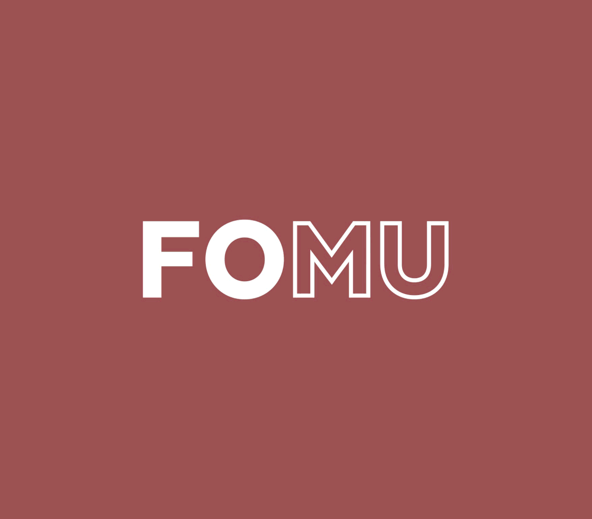
‘FOMU’ became the main moniker, elevating the museum to a class of renowned institutions, and showing international ambition. In the logo, full and outlined caps represent content, frame, and reflection. A lowercase, informative ‘fotomuseum’ expresses accessible character.
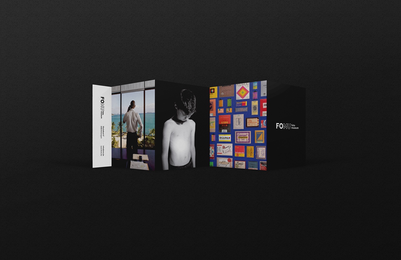
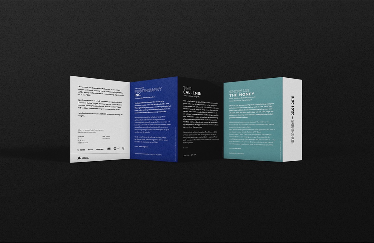
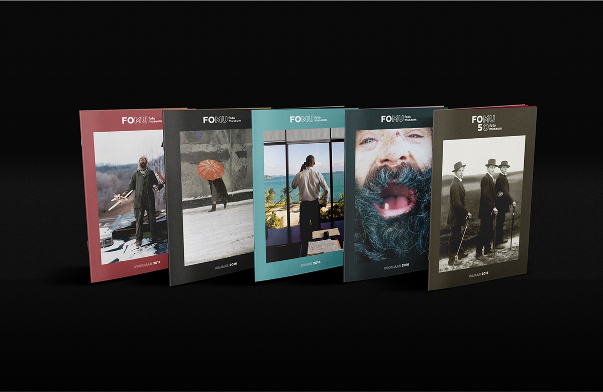

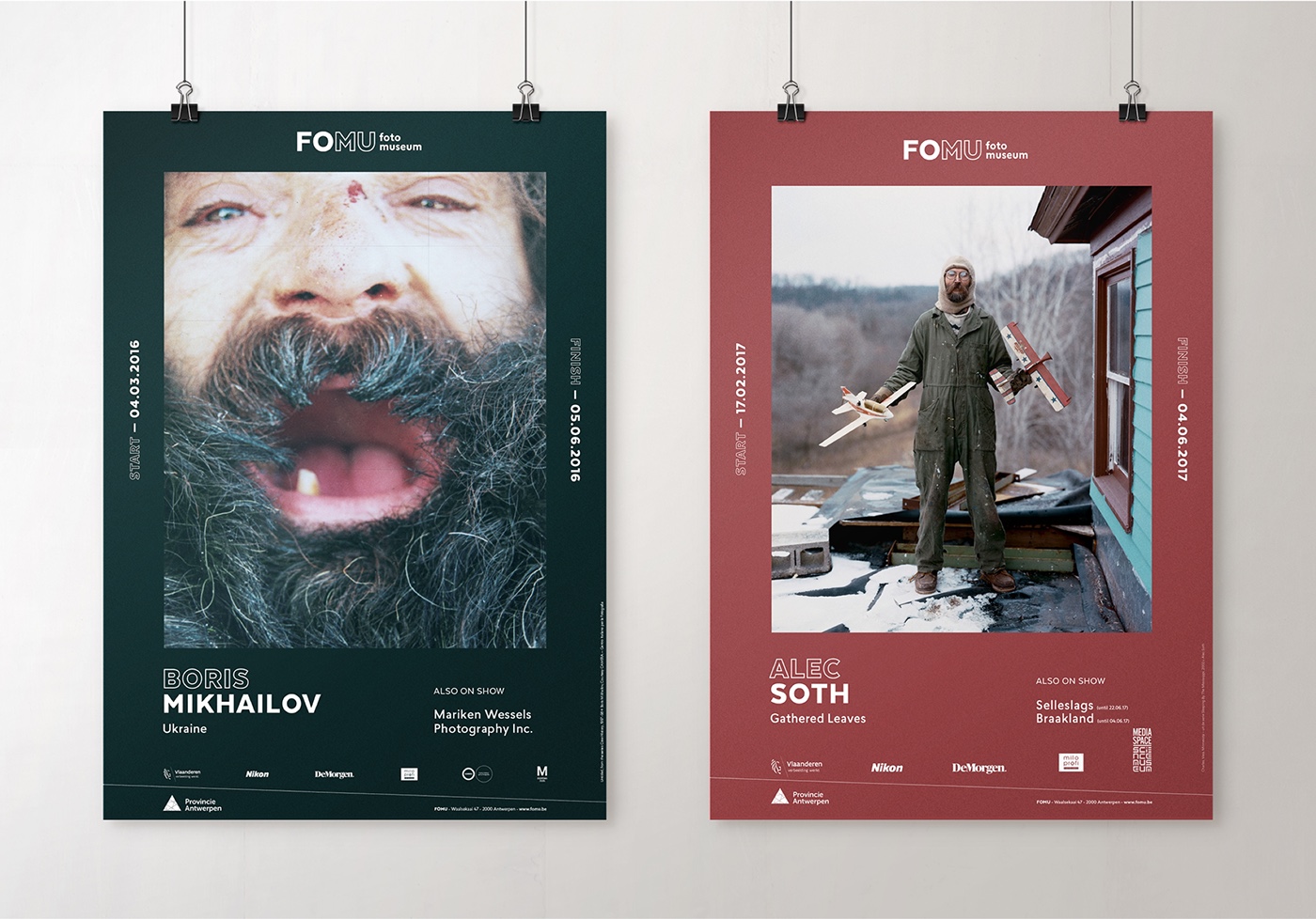


Translating FOMU’s vision to recognisable posters and programme booklets, we let strong images determine the frame that best supports them.
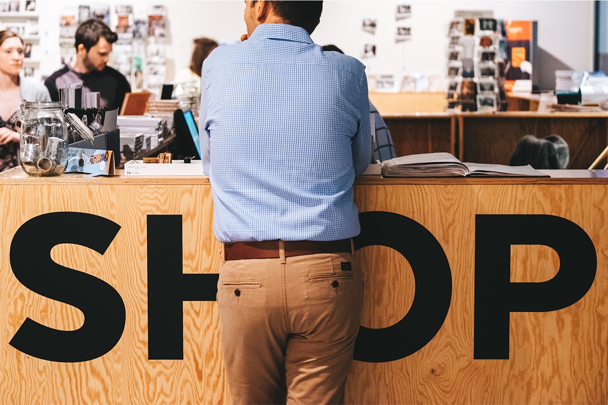

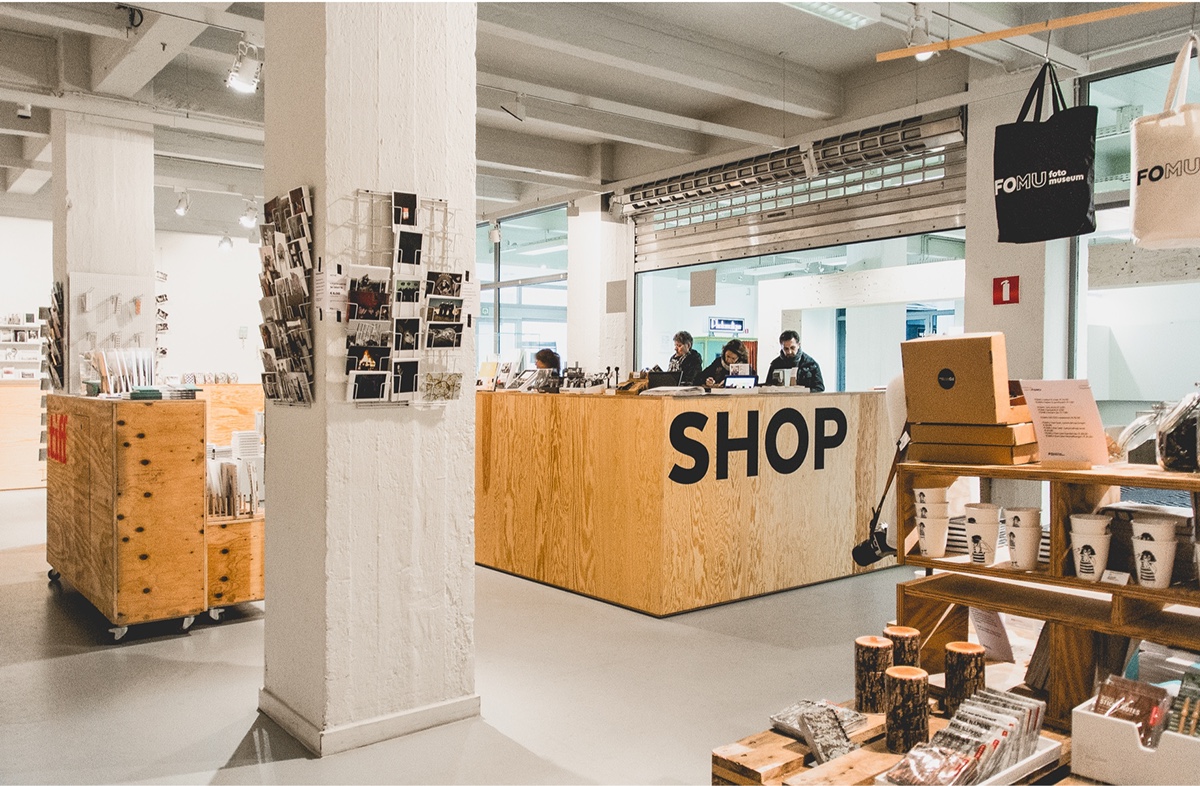
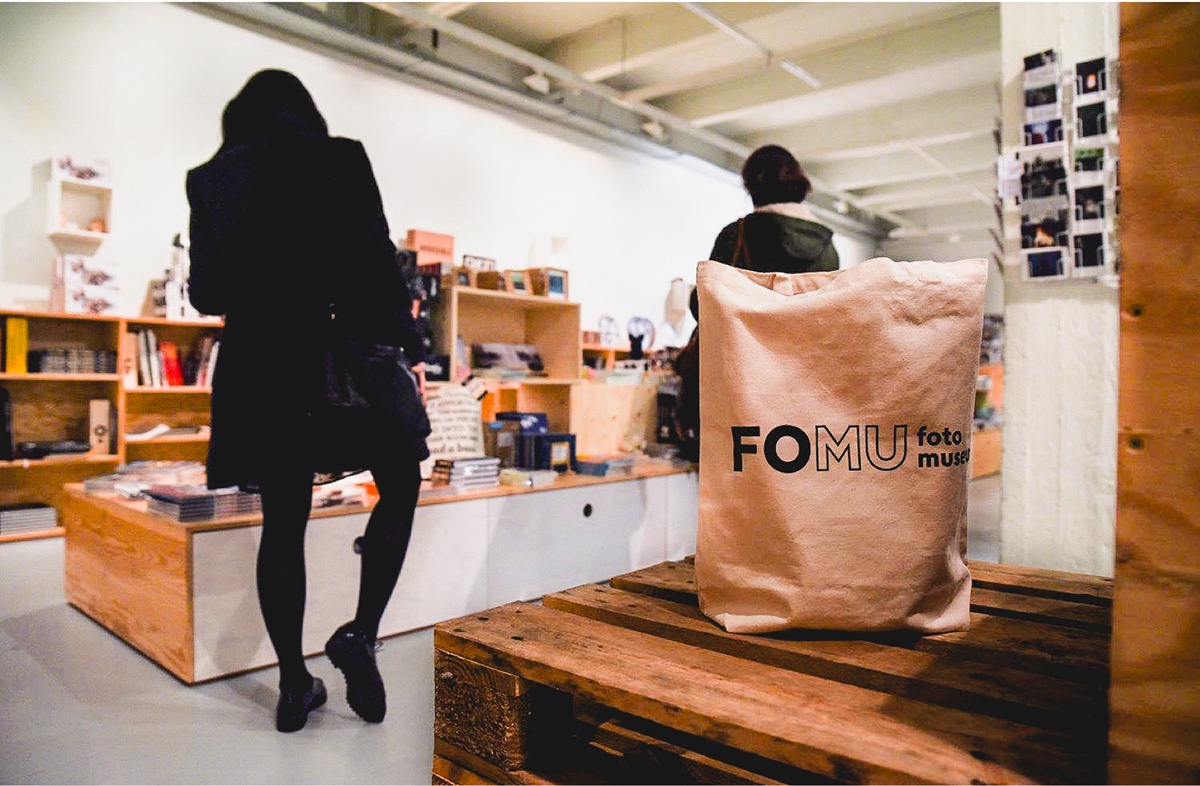
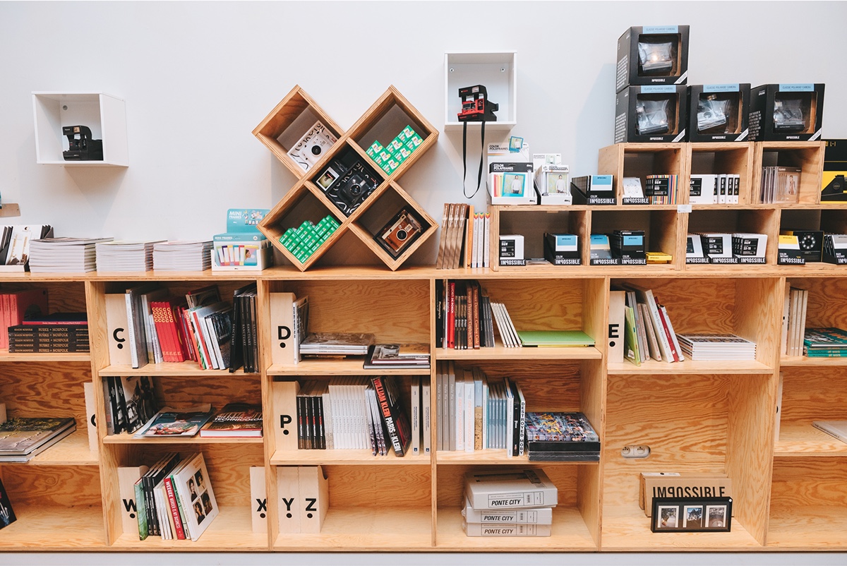
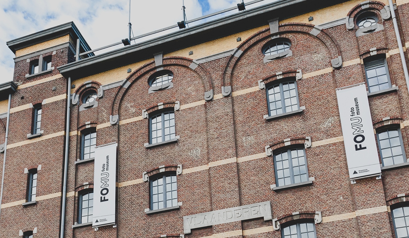
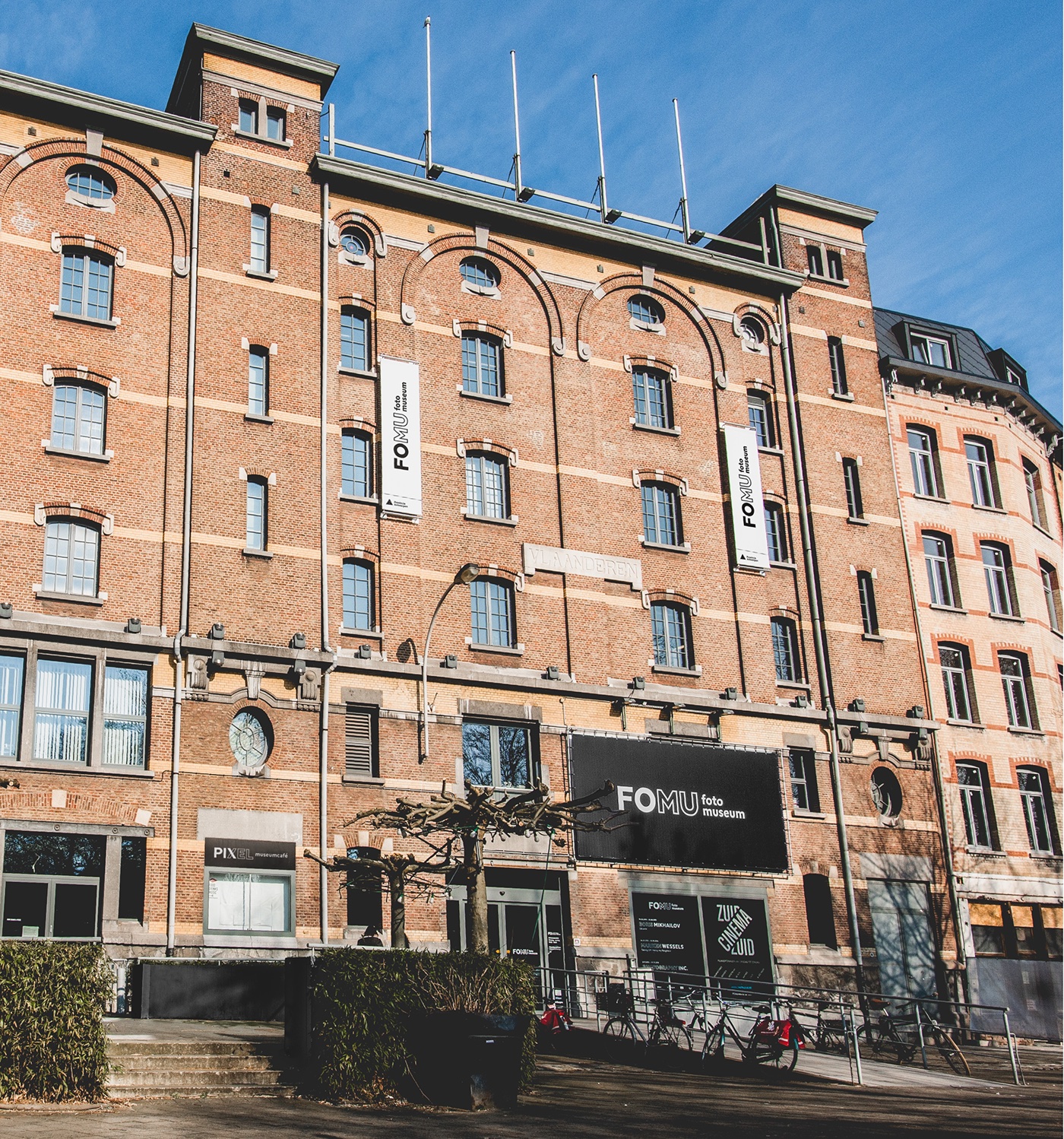
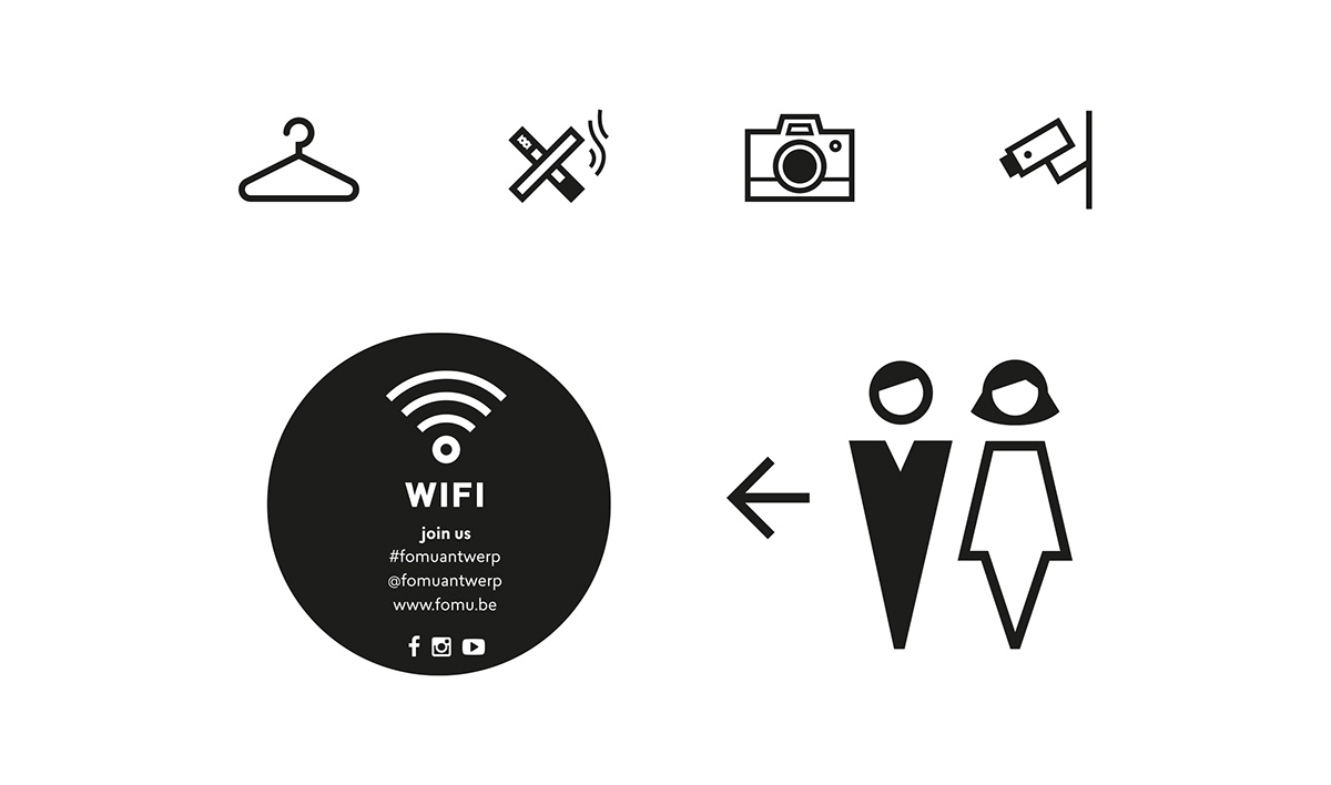
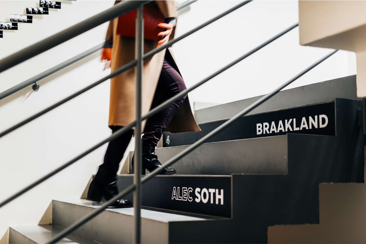
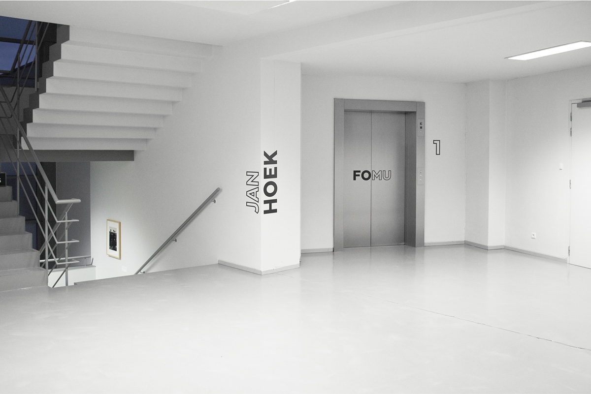
Inside, the museum’s shop, library, educational department, and foyer now carry the same visual identity, and no longer appear to be independent entities. Clear signage follows suit with uniform typography and icons


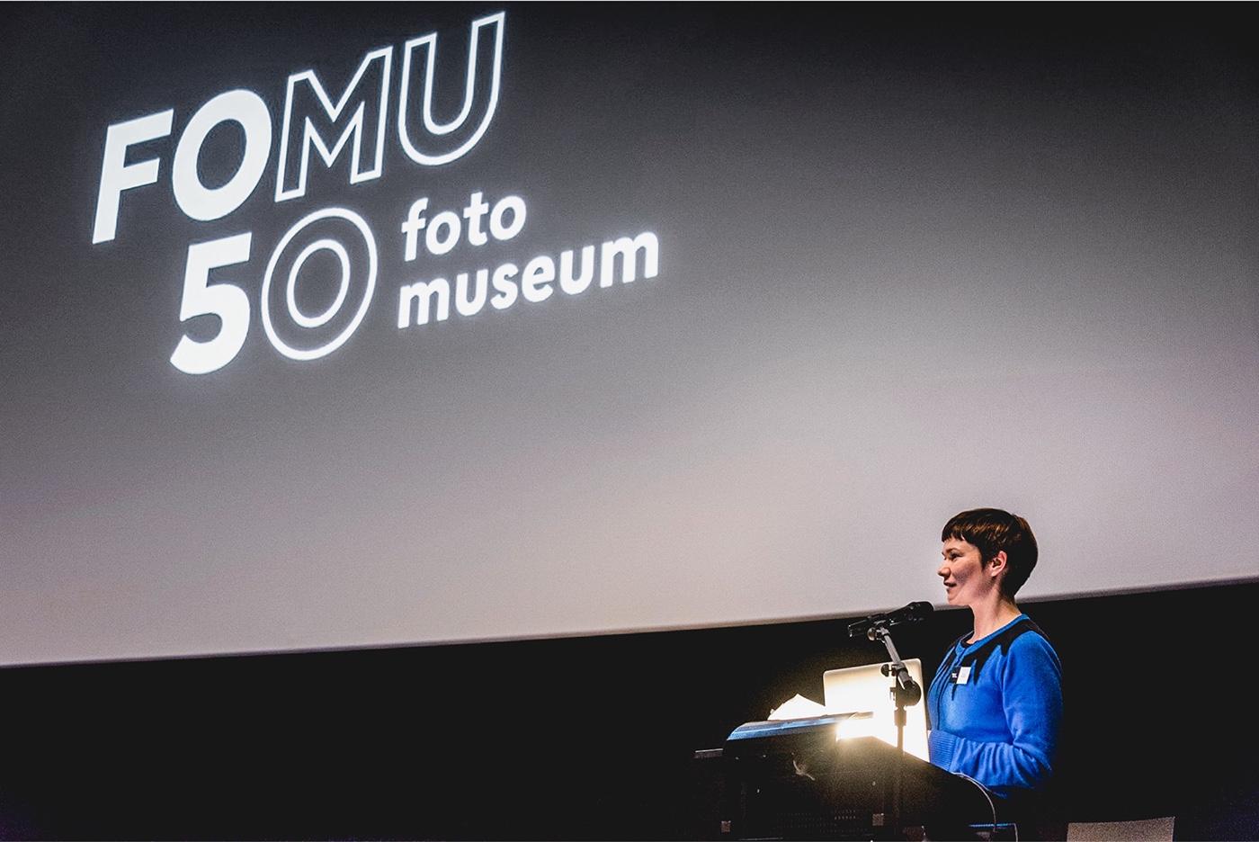
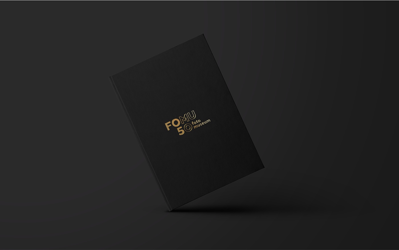
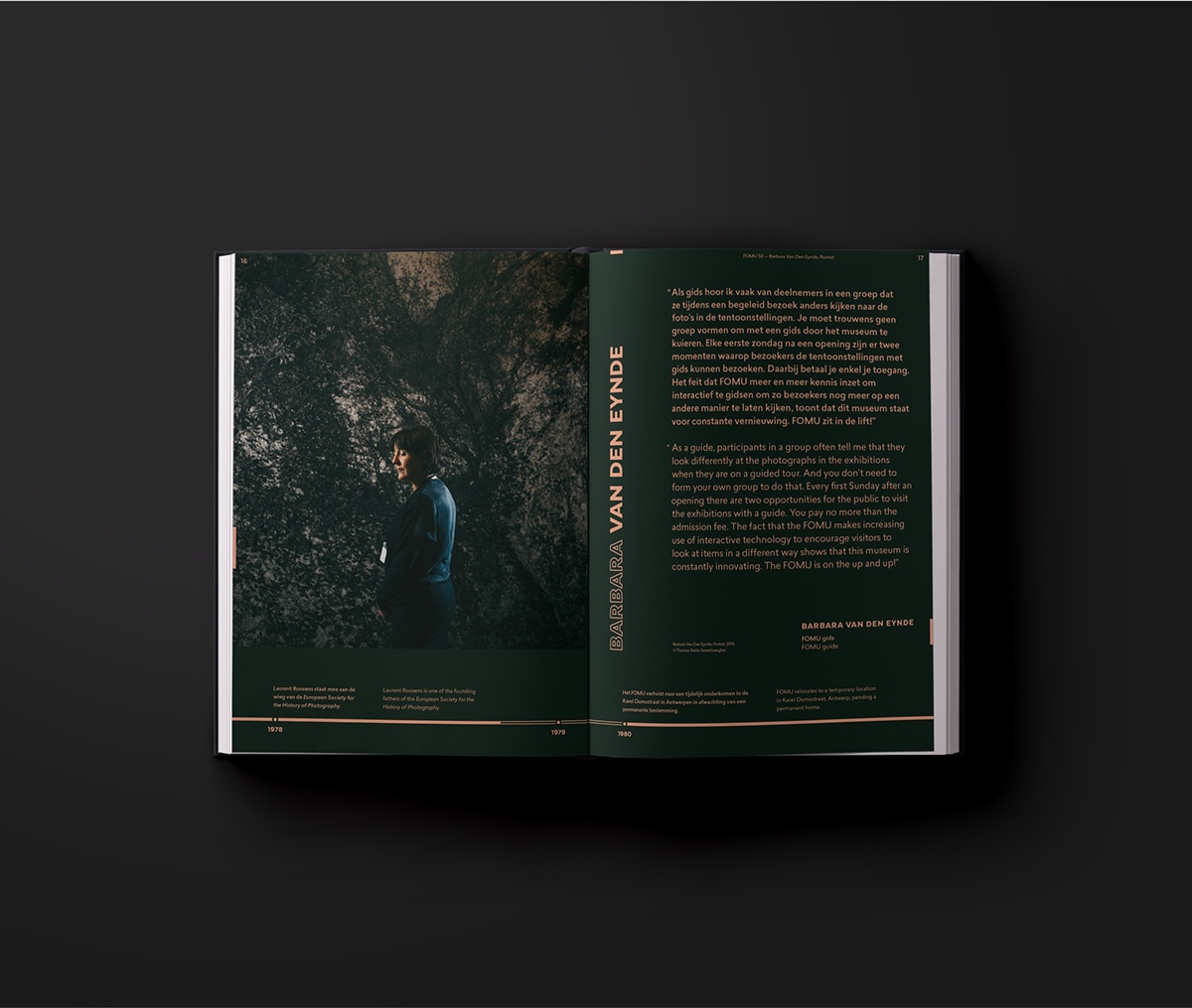
Featuring a gilded version of the new logo to mark the occasion, a retrospective book was handed out to special guests during the invitation-only 50th anniversary event. ‘FOMUmaton’, a mobile photo booth, gave back to the general public by offering free pictures at various summer events in Antwerp.


Thanks for watching.
View more work on wemake.be


