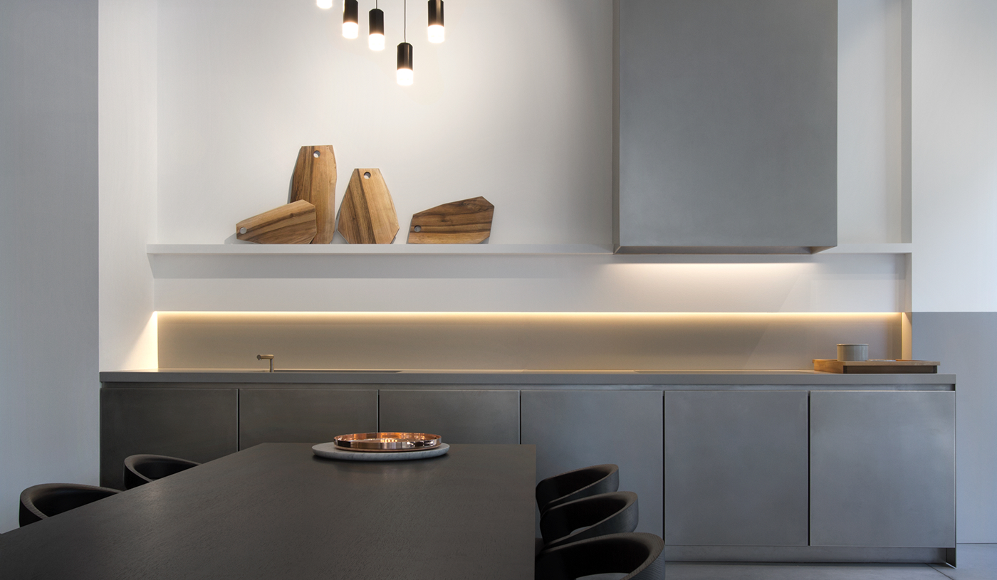
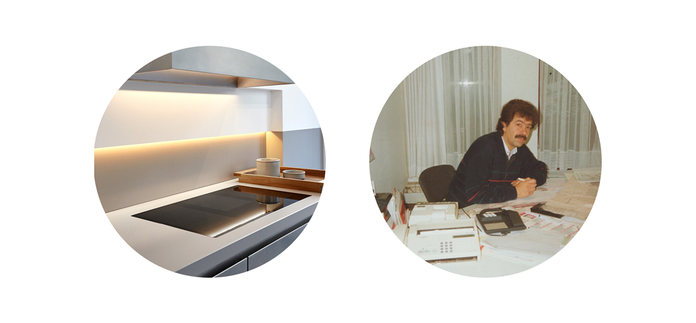
After 25 years of producing kitchens for architects and kitchen stores, Interpoint decided the time was ripe to cater to end users directly. The former manufacturer joined forces with two renowned designers, and came to us for the brand identity and website that would introduce their new concept to the high-end kitchen market.
Sector: Interior
Services: Logo Design, Print Design, Stationary design, Visual Identity, Website

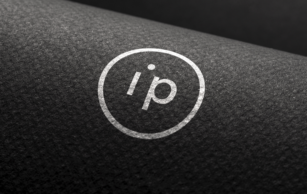
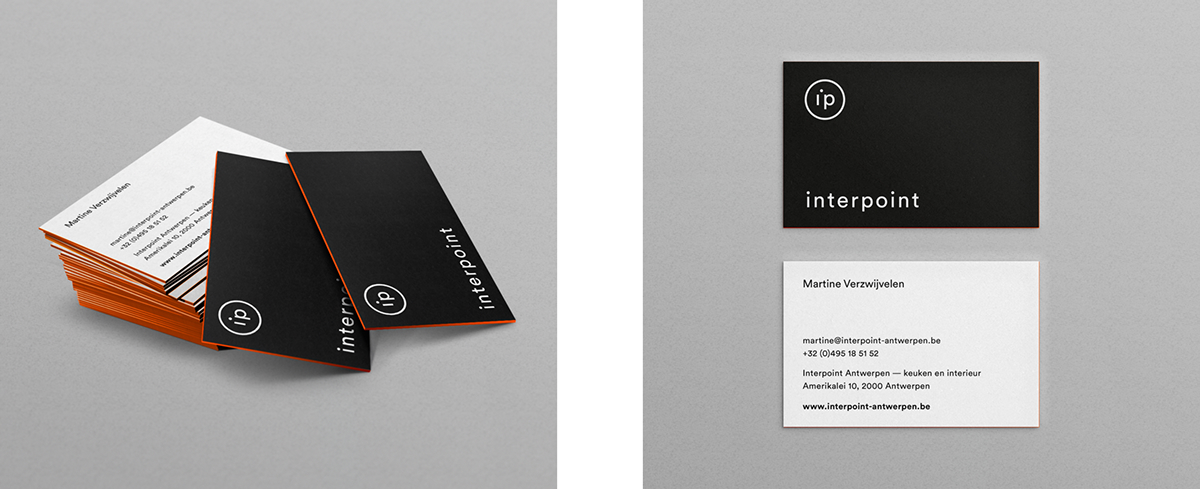

Famed for manufacturing that dots the i’s, the company now offers a one-stop shop experience, inspired by the kitchen as a central element of each residence. The new logo and visual identity reflect this vision. Black and white complemented by orange accents express a highly personal approach to sleek design.

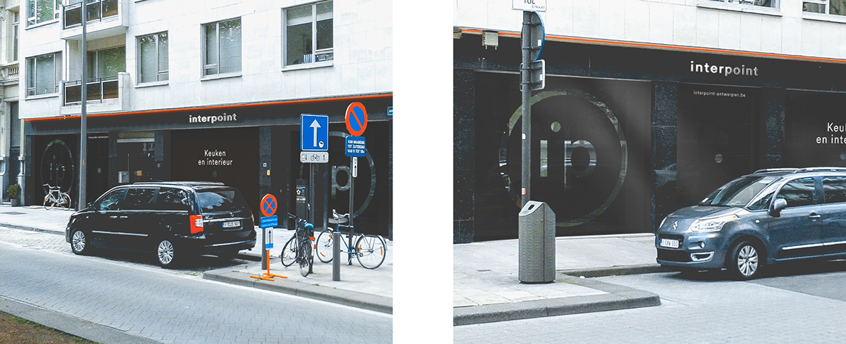

Matte black window stickers covered Interpoint’s new high-profile Antwerp storefront during construction. Die-cut logos acted as peepholes for curious passers-by.


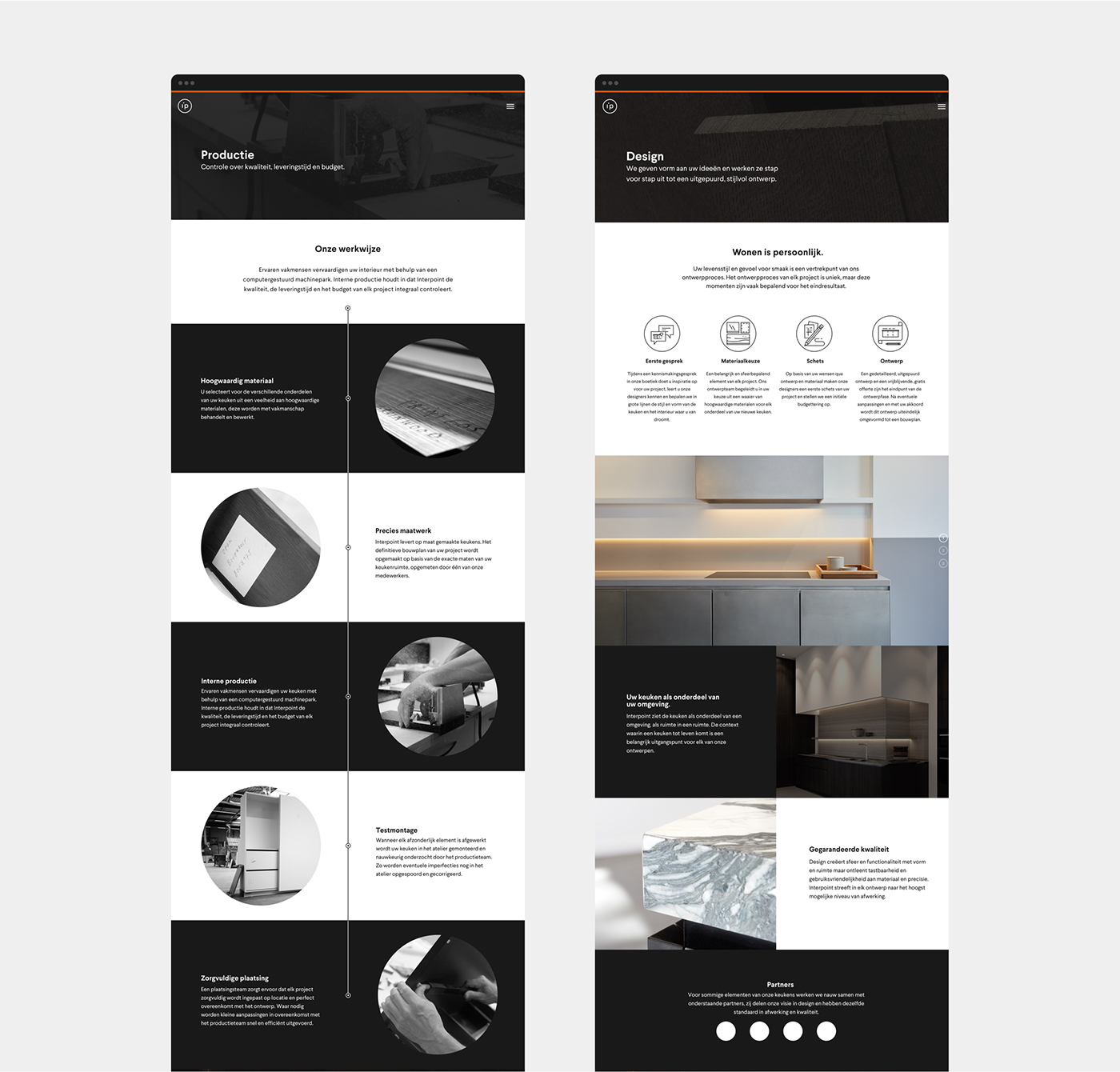
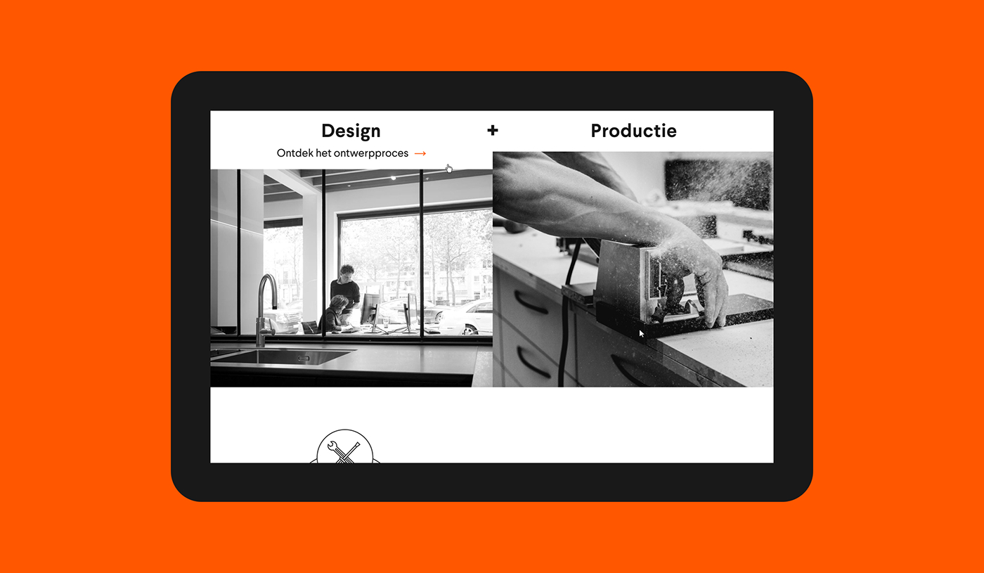
Highlighted by the same orange, the black and white website outlines design and production as the two pillars of Interpoint’s expertise, and guides visitors through the company’s history, vision, and process.
Thanks for watching.
View more work on wemake.be

