"Dídac, from the Greek 'Didachos', latinized to 'Didachus', means 'instructed, educated'."
The choice of name Dídac for our son was for personal reasons. Although once I knew its meaning, it could not be more accurate to use as the name of this font. With it, I have learned and grown up as a type designer. From the first workshop with Andreu Balius & Eduardo Manso, the time I spent on the Type@Paris program (and the decision to start Dídac again from scratch after a chat with Jean François Porchez) and till now, Dídac has spent over 4 years by various phases that coincided with my level of learning.
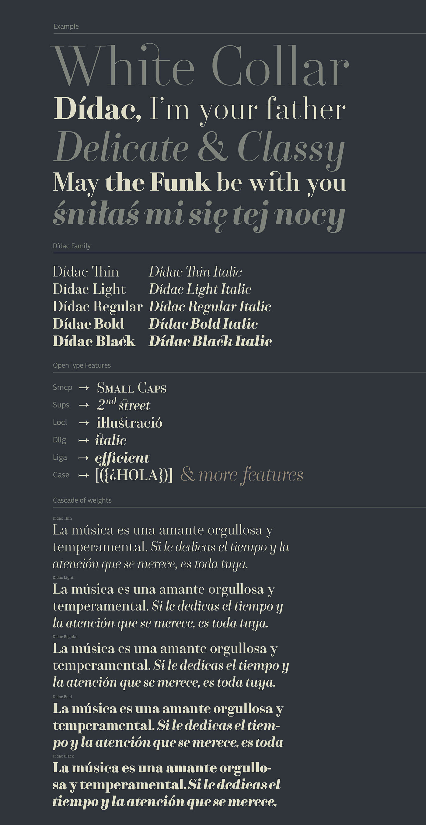
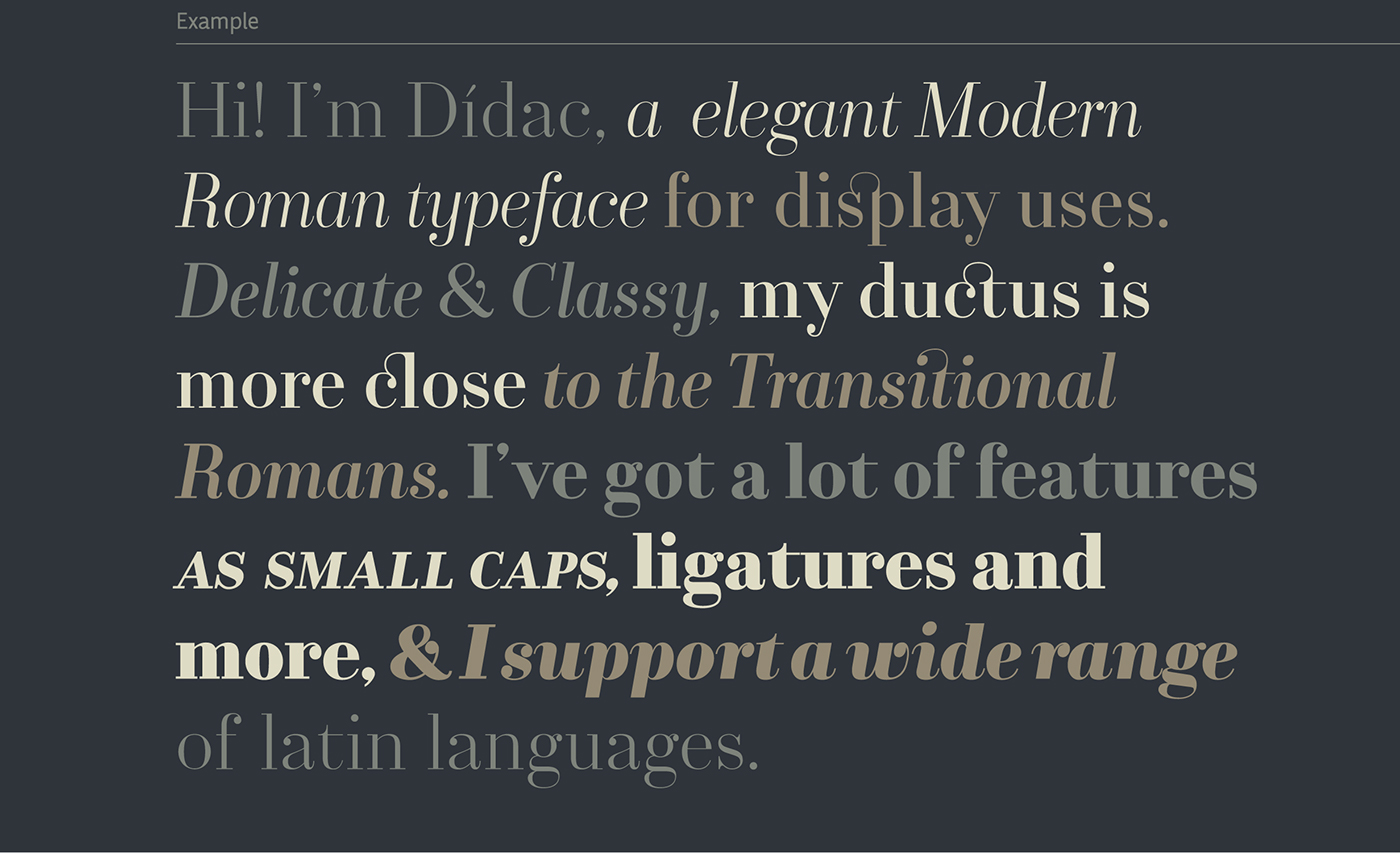
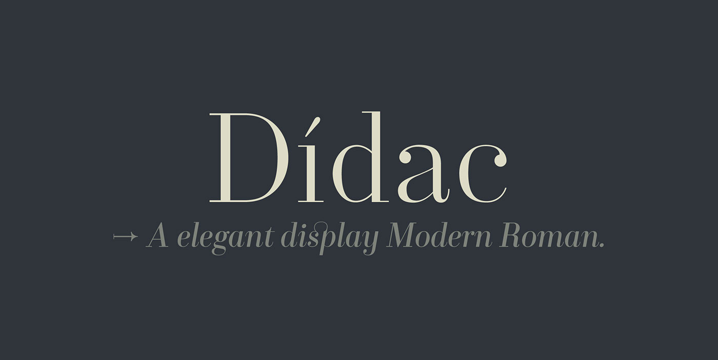
Dídac follows the archetype of Modern Romans for its vertical axis, mechanical ends and a high-contrast shapes. But at the same time, its structure has a different ductus, more humanist and closer to the Transitional Romans typefaces as Baskerville. So, we may locate it in a missing link between Transitional and the Modern Romans typefaces.
Dídac is a typeface family of five weights, plus their respective italics, for displays purposes as headlines but it shows efficiency in short texts. Dídac also is the name of our first child, who is only a few months old and to who I dedicate this font with all my love. I designed it thinking about you even before we were expecting you.
We love you so much Dídac.
→ Available on Fontstore ←