Las Naves Condensed is a typeface designed under the art direction of Sebastián Alós for "Las Naves" foundation.
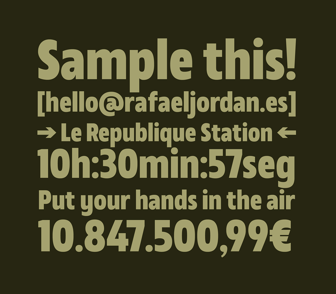
The typography was designed based on the base that should be a sans serif font stripped of ornamentation, which would have a clear display purpose although fully functional too. Inspired by the classics "grotesk" and with a certain touch of geometricity, its structure is condensed and robust besides soft and open at the same time, which gives the system its own and recognizable character despite its apparent simplicity.
Efficiency is also a determining value that is present in its high readability, given the multitude of variants, sizes and supports in which it would be applied. Following the same principle, the character set covers the functional and linguistic needs of the project, including diacritics of the main Latin languages, as well as a special attention in the two vehicular languages of the institution. Creating, for example, a solution for the correct representation of the "ela geminada" in texts in Valencian.