


Taking its label from the old nickname for the region, Tri City Brewing launched in 2007 as the area’s first independent brewer in more than five decades. Inspired by the historic brewers of Mid-Michigan, the company ties its major beers to local history and features.
The logo itself is a combination of elements. The triangle and banner are a simplification of their original logo. The building is a representation of one of Bay City’s major landmarks.

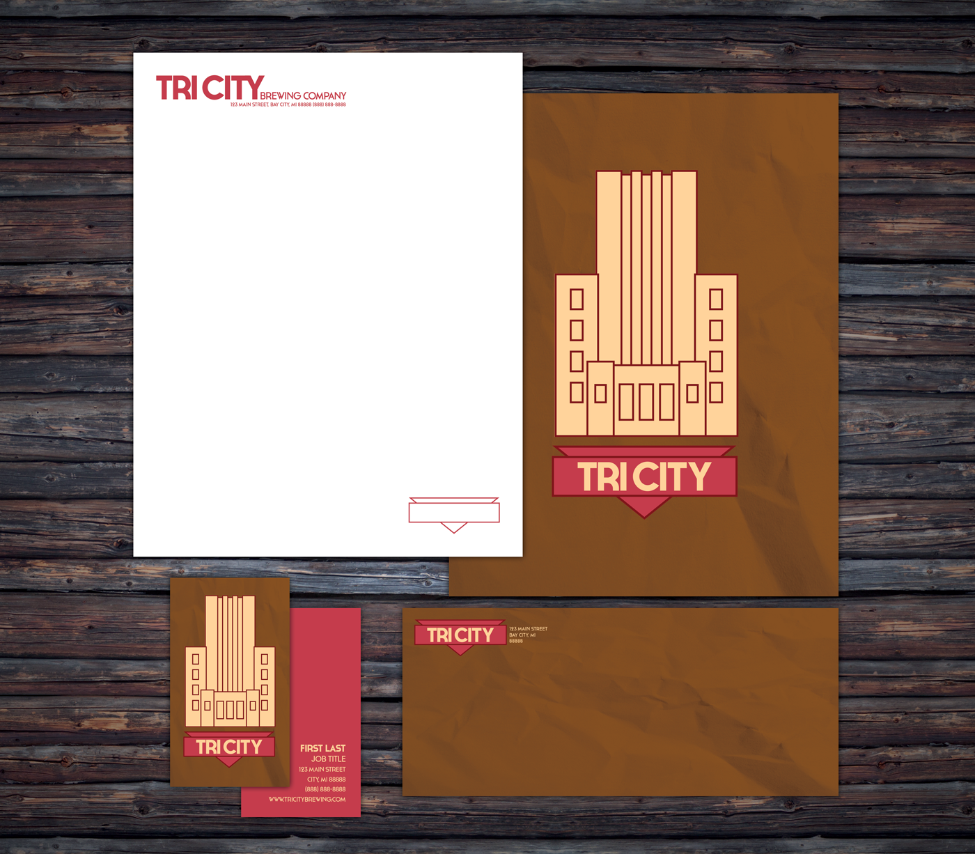
The packacking is simplified and unified into one look, making it easier to stand out from the highly illustrative packaging that other craft beers in Michigan use.


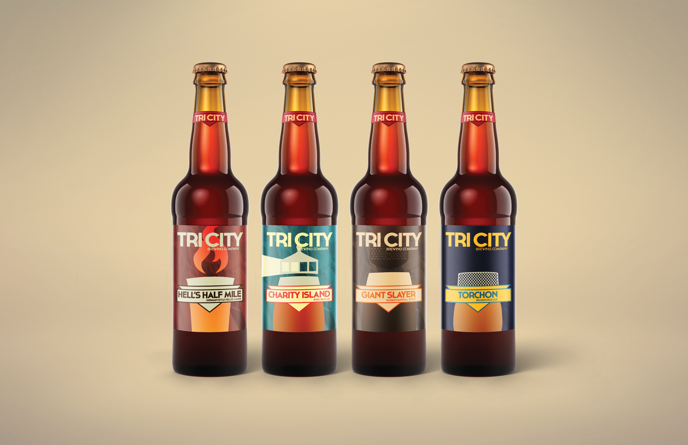
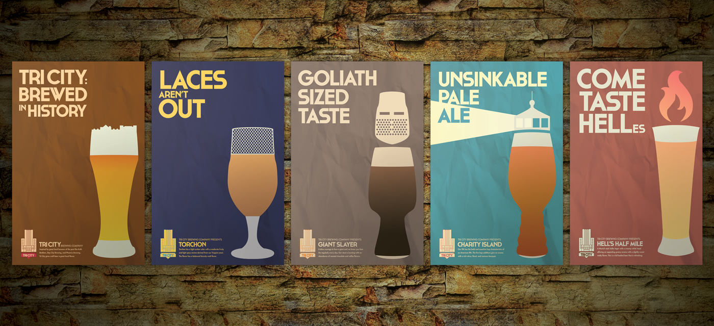
All of Tri City’s beers tell a story. Whether it’s a tale about the lumberjacks of old in “Hell’s Half Mile” or connecting encouraging people to fight their harsh workday in “Giant Slayer,” the company uses their brews to connect to their audience. The “Brewed in History” concept ties that storytelling aspect of the company to its advertising. Each promotional poster illustrates part of the beer’s story while displaying the type of drink in a glass.

Point of sale signage.


