Brand identity / Website / Stationery / Internal coms
What we were asked to do
We were asked by LBB to refresh the brand identity for their established online business. We were initially engaged to develop their exisiting identity but convinced our client that a completelty new brand identity was more appropriate.
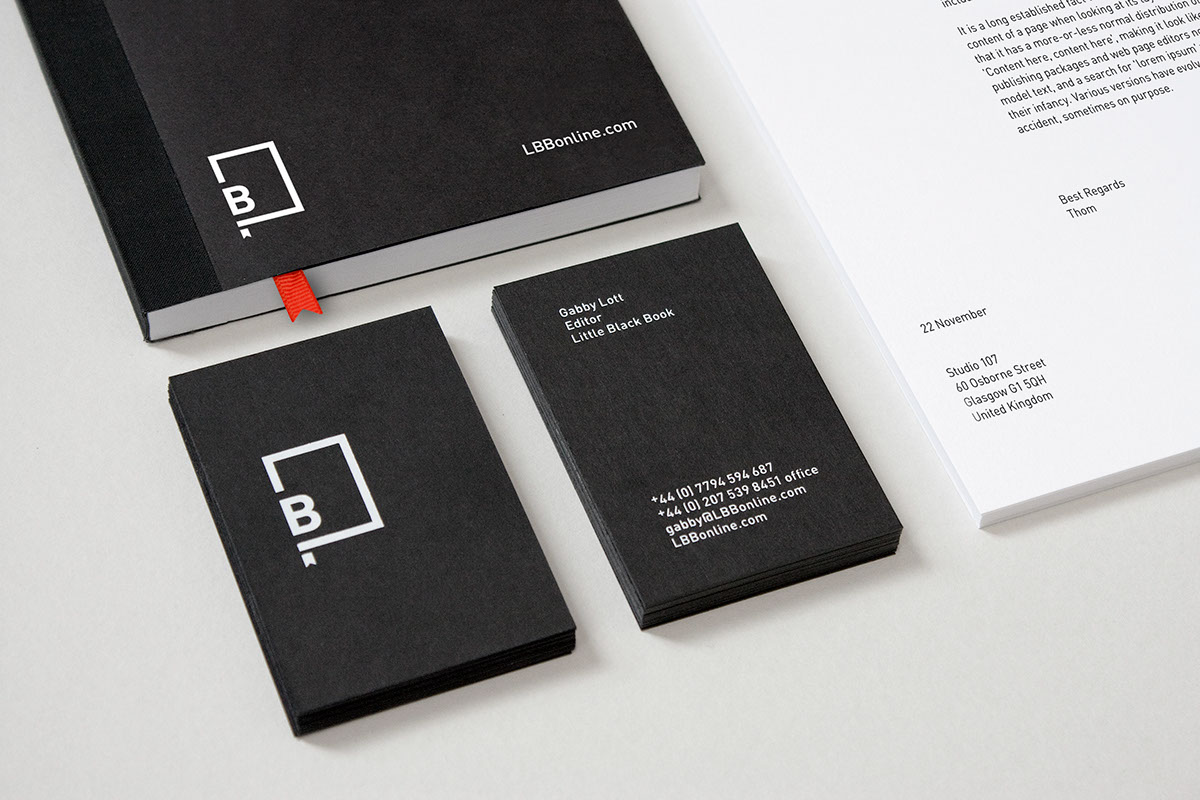
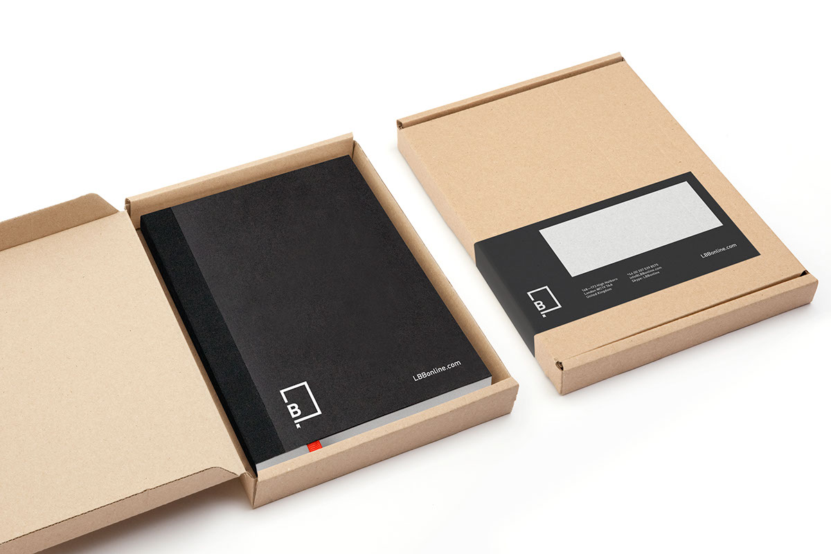
These newly created brand assets were used to 're-skin' an existing website framework. In addition we took this opportunity to reorganise content into clearly defined areas helping create a more fluid and intuitive user experience. We also created a number of printed items including a suite of stationery and user guide. View the website here.
We were asked by LBB to refresh the brand identity for their established online business. We were initially engaged to develop their exisiting identity but convinced our client that a completelty new brand identity was more appropriate.
Our process
We began the project by deciding which assets of the existing brand should be retained. Which held the most brand equity and which should be dicarded. We felt it was important that the identity convey tbe idea of a physical black book. This created an emotive curatorial platform thereby giving the content extra value. Furthermore this physical rendition helped inform the new brand assets such as colour, shape and typography. The dominant use of black lends a premium / exclusive quality to the brand. Whilst a minimal but bold typographic style communicates confidence and authority.
We began the project by deciding which assets of the existing brand should be retained. Which held the most brand equity and which should be dicarded. We felt it was important that the identity convey tbe idea of a physical black book. This created an emotive curatorial platform thereby giving the content extra value. Furthermore this physical rendition helped inform the new brand assets such as colour, shape and typography. The dominant use of black lends a premium / exclusive quality to the brand. Whilst a minimal but bold typographic style communicates confidence and authority.
These newly created brand assets were used to 're-skin' an existing website framework. In addition we took this opportunity to reorganise content into clearly defined areas helping create a more fluid and intuitive user experience. We also created a number of printed items including a suite of stationery and user guide. View the website here.