
Concept
The Gesäuse region has spent the last years in what can only be called a state of slumber, while 100 years ago it was one of
the strongholds of tourism. But in the time of ‘action tourism’ and the competition from the western part of the Enns Valley it became less important. Due to the current trend of experiencing nature in a more puristic way – that is especially appealing to the younger generations – the Gesäuse region being the only national park in Styria positions itself in this direction.
Branding and Logo
The Gesäuse region has been struggling with a lot of confusion when it comes to the different brands.
Several brands and logos exist side by side, the visitor might have difficulties orientatingand is visually overstrained. So one of the first steps we took was to simplify the amount of brands. As none of the brands included the original name of the region ‘Gesäuse’ it became clear that the umbrella brand had to be developed under the name ‘Gesäuse’ as it is also the only accepted denomination for the area from Ardning to Wildalpen.
Our basic philosophy was to use authentic marketing without staged photos and an exaggerated visual language.
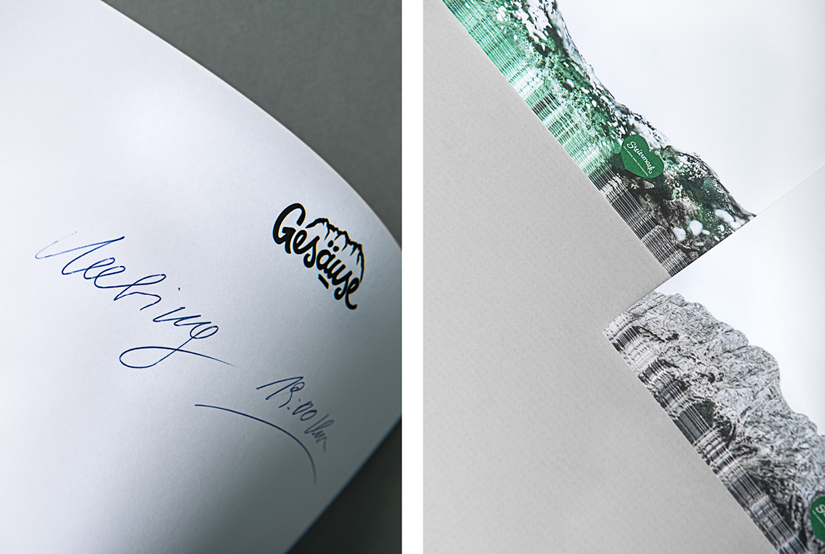
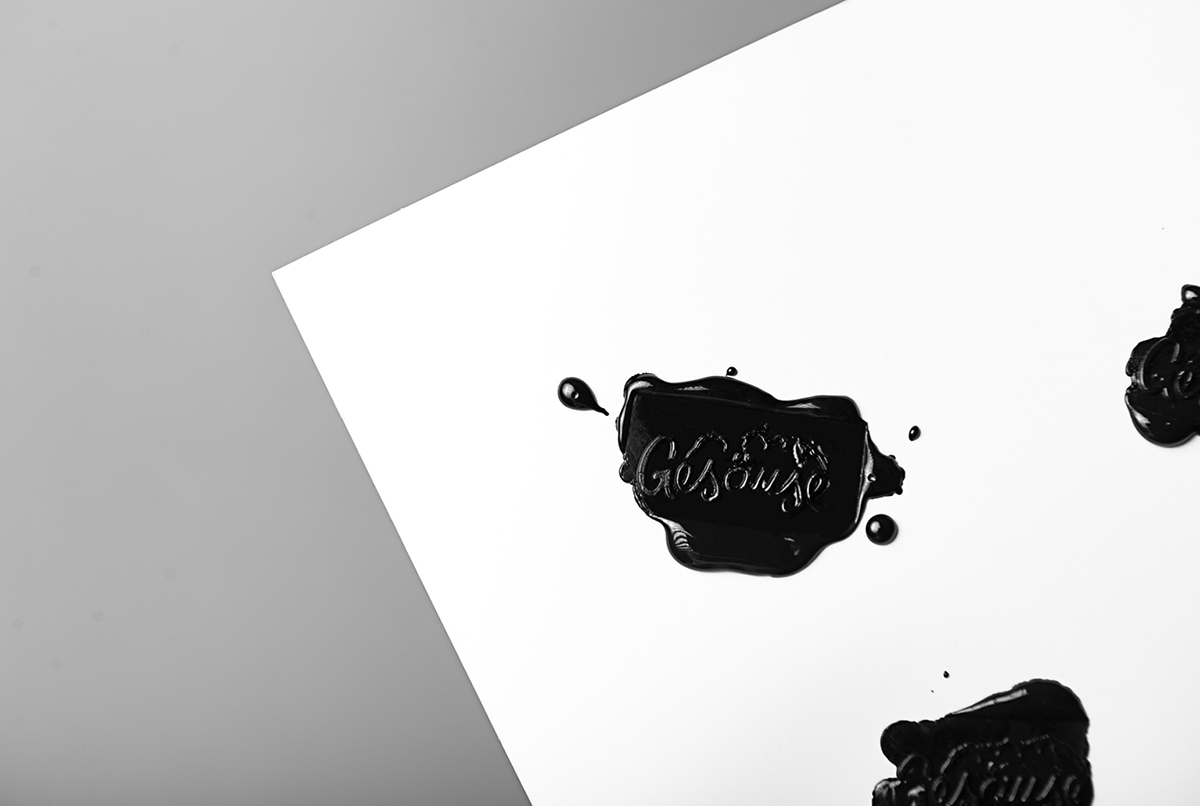
Another main point was to create a unique logo that is timeless and not Zeitgeist. We opted for a hand-made logo, mainly because those are instantly recognizable and because it can be used as a recurring element anywhere in the region.
The hand lettered logo with its loops also represents the two rivers Enns and Salza that flow through the Gesäuse. The
reduced Hochtour Mountains also form part of the logo and epitomize the steep rock faces that can be found in the region. Thanks to a reduced and clear design and the use of black and white the logo can be applied in all mediaand is
clearly readable even when only 10 mm small.


Photography
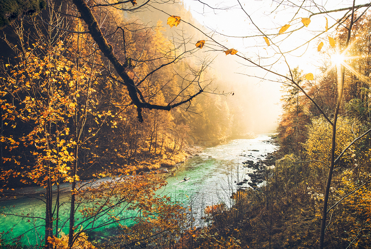
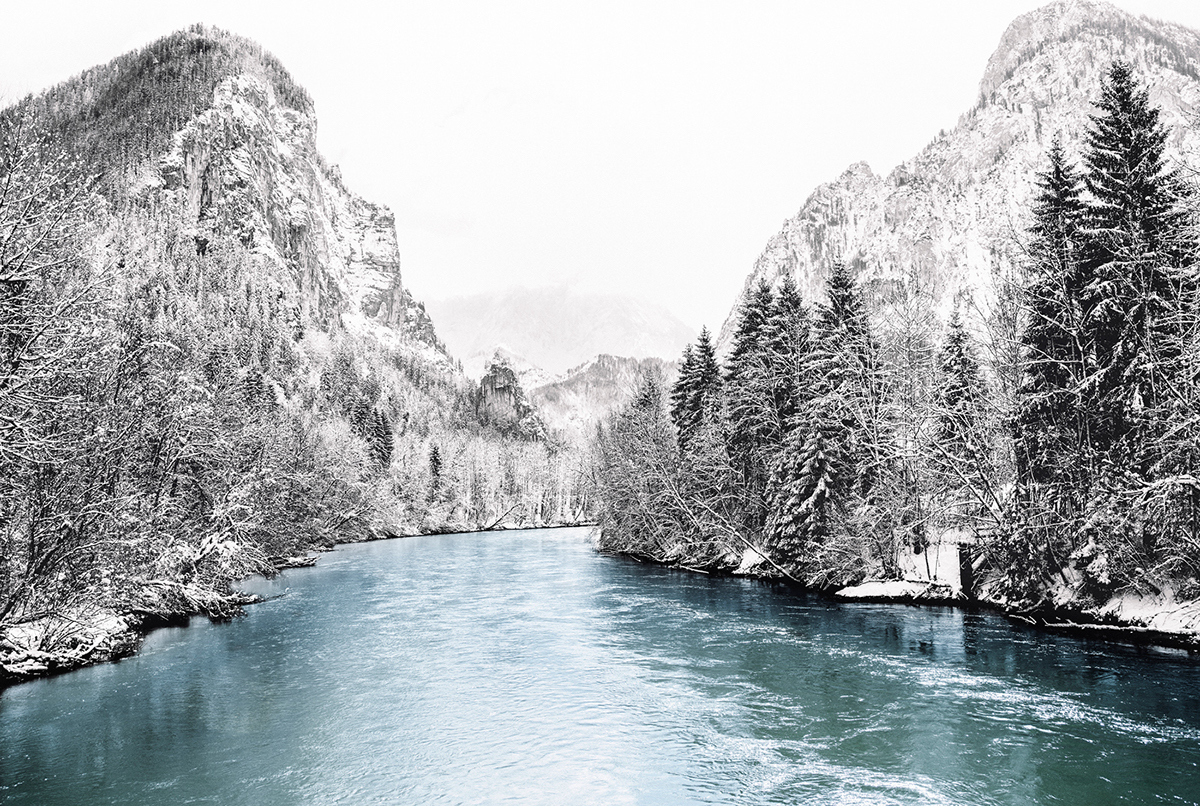
We stuck with the credo of ‘First the image, then the text’. Stefan Leitner developed a photographic concept that supports the authentic marketing strategy. Stefan did not use professional models for his pictures, but he lived and worked in the Gesäuse for over a year and portrayed the locals in their day-to-day environment. The result is a distinguished visual language that shows the impressive beauty of the Gesäuse with its mountains and waters.


Credits
Client
Creative and Art Direction
Photography
Portfolio Photography


