Polyteknisk Forening is the student organization at DTU, the Danish University of Technology. They wanted to organize their visual identity, and asked us for a redesign of their logo as well as a designmanual.
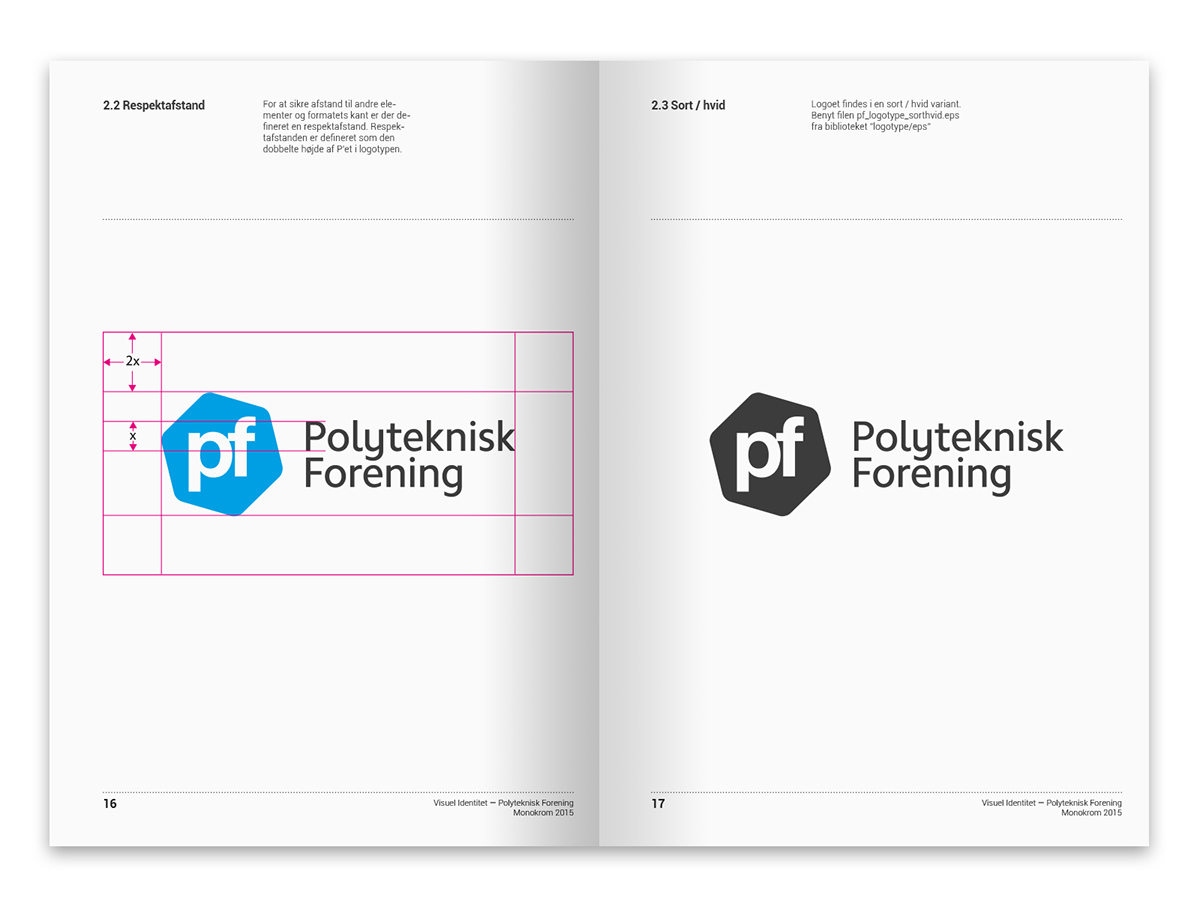
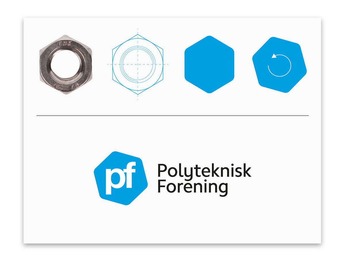
They previously had a "pf" in lowercase type, standing by itself. We wanted to give them a narrative, while keeping the "pf" in the same typeface, in order to refer to the old logo. A bolt is a form that PF had already used occasionally as imagery to their publications, and we thought it was an interesting symbol - a bolt is used to secure one thing to another - and PF is there to form a bond between the school and the students.
They previously had a "pf" in lowercase type, standing by itself. We wanted to give them a narrative, while keeping the "pf" in the same typeface, in order to refer to the old logo. A bolt is a form that PF had already used occasionally as imagery to their publications, and we thought it was an interesting symbol - a bolt is used to secure one thing to another - and PF is there to form a bond between the school and the students.

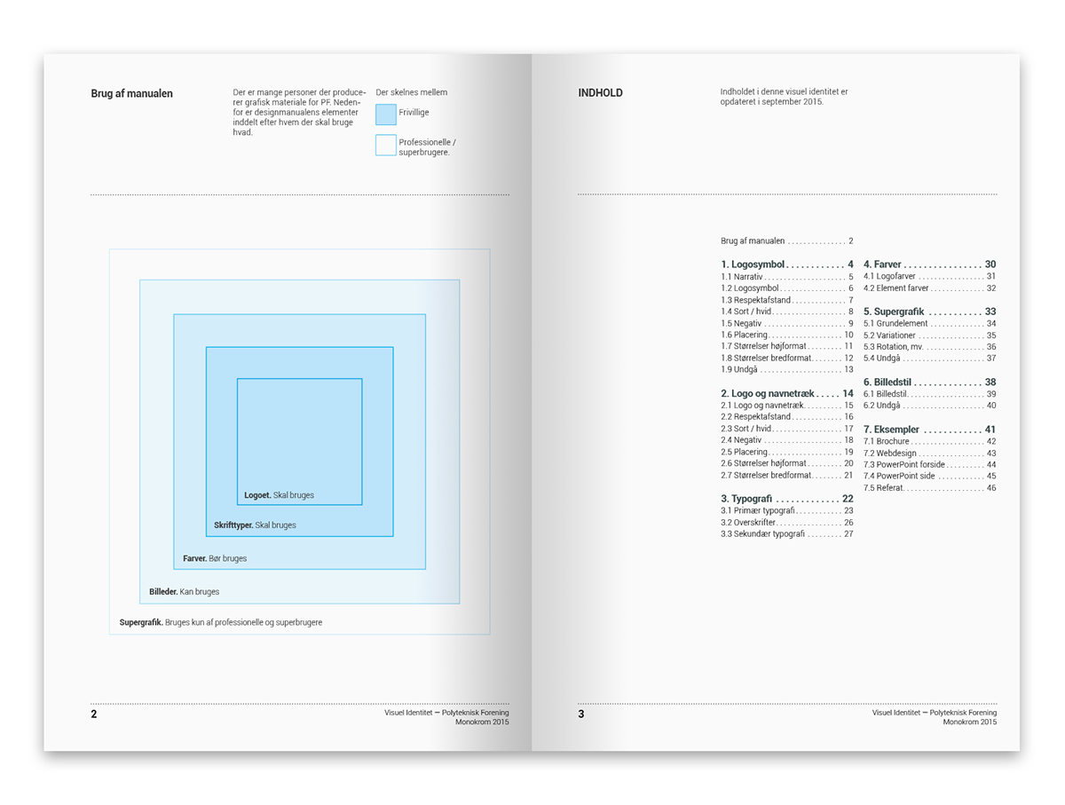
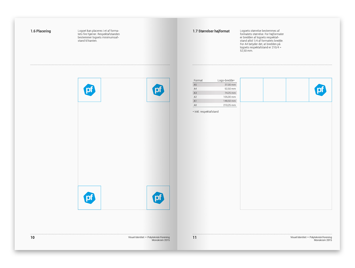
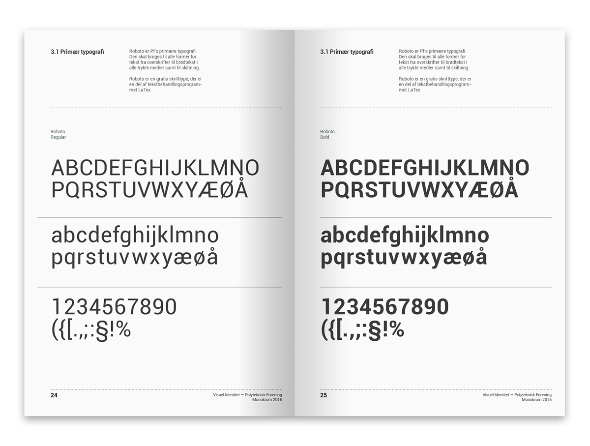
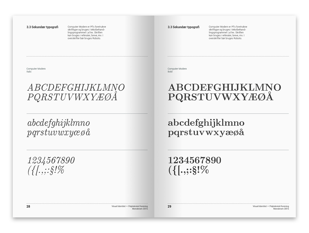
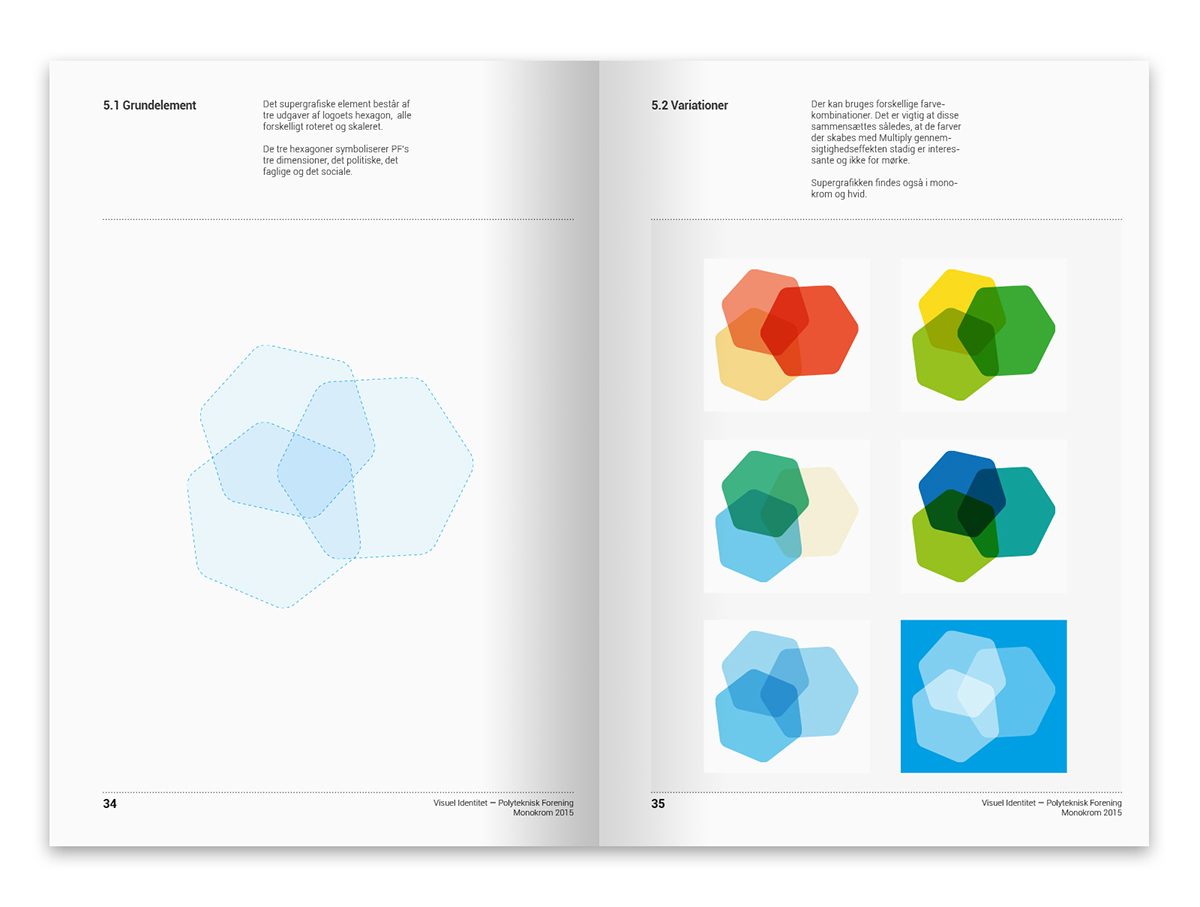
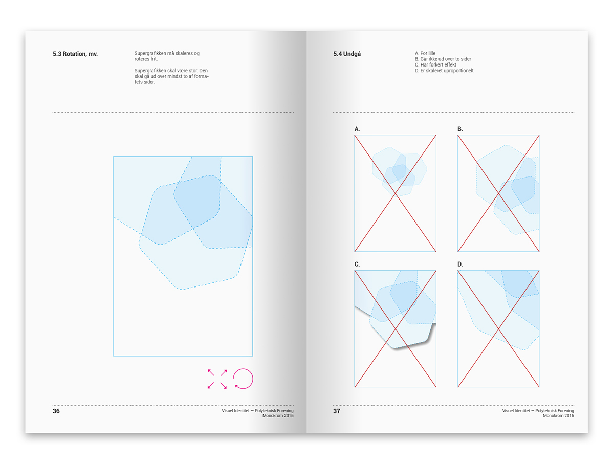
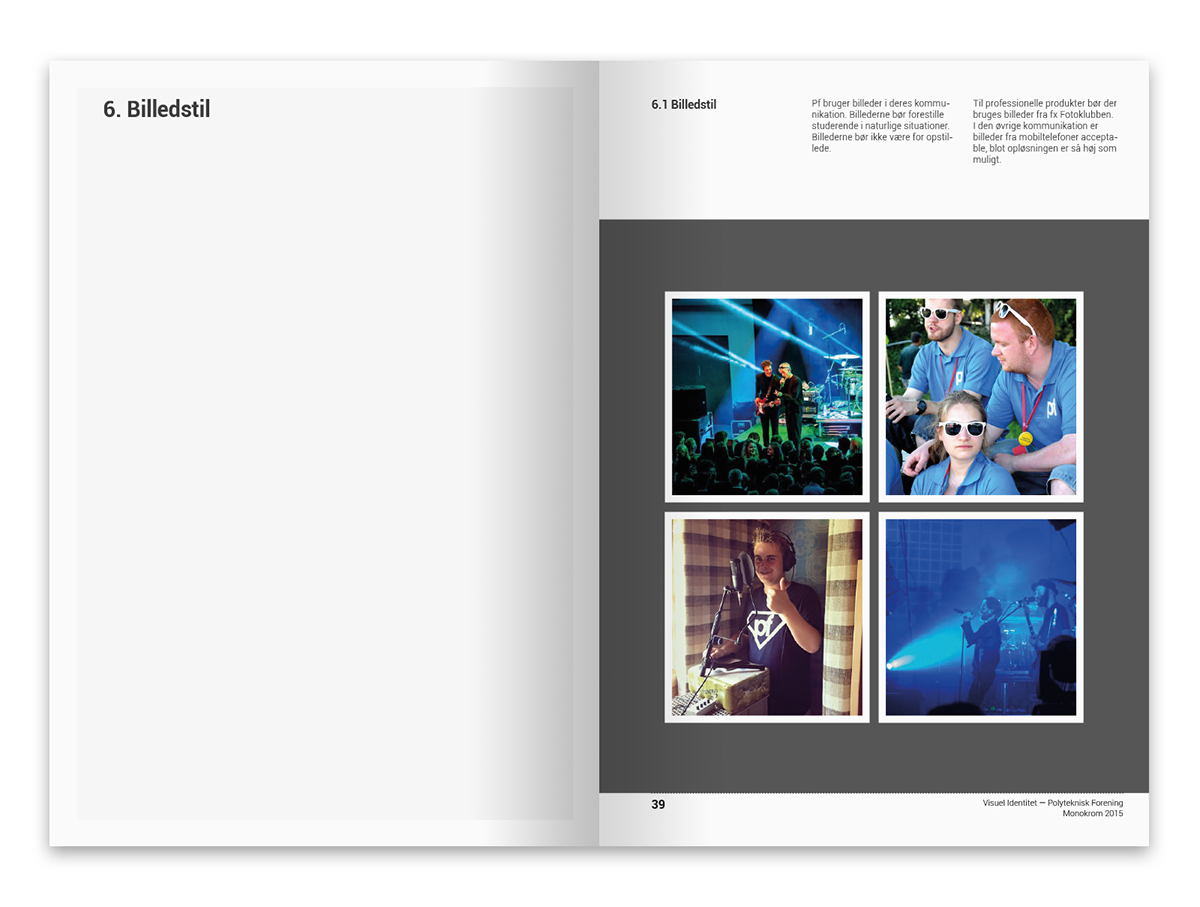
Example pages from the designmanual. Typically, the organization gets graphic assistance from volunteers, so we tried to make the manual very simple and easy to use.