Design of the new logo for the Dutch newspaper Het Parool
The art directors of Het Parool, John Koning and Floor Koop, requested some proposals for the masthead and logo for the redesigned newspaper, released the past 10th of February 2016. My work was based on a clear briefing: ‘back to basics’ and design a logo with a strong and powerful identity.
I presented different ideas, and final solution is based on a combination of the two typefaces that play a lead role in the new newspaper, Quarto (also the typeface for the headlines) and Tiempos. The new logo not only adorns the front page and the homepage, but is also visible in all expressions of Het Parool.
I presented different ideas, and final solution is based on a combination of the two typefaces that play a lead role in the new newspaper, Quarto (also the typeface for the headlines) and Tiempos. The new logo not only adorns the front page and the homepage, but is also visible in all expressions of Het Parool.
If you want t read more about the redesign of the newspaper you can do it at the newspaper online or here (only in Dutch).

The final logo shown in the newspaper. Photo by Floor Koop.
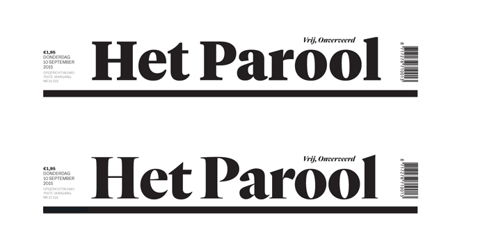
Het Parool, in Tiempos Headline Black (top) and Quarto Black (bottom).

Some of the options for the logotype, based on different typographic styles, and one in capital letters.

The synthetic version for the twitter page.

The Android app.

Some pieces of the launching campaign. Thanks to Orlando and Ermin for the pics :)

A huge logo cut in wood, placed at the entrance of the redaction in Amsterdam.
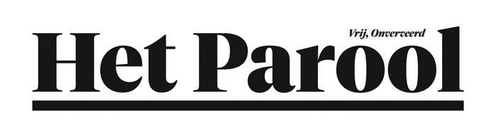
The final logotype with the slogan.
https://vimeo.com/154567598


