Goal Live Scores
iOS & Android App
When we set out to completely redesign Goal.com's Live Scores App our main aim for the project was to understand the existing userbase and improve the app to better serve their needs. We also updated and improved user interface. As well as becoming the fastest match day experience possible.
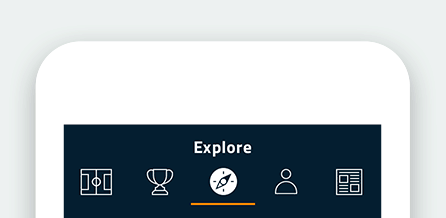
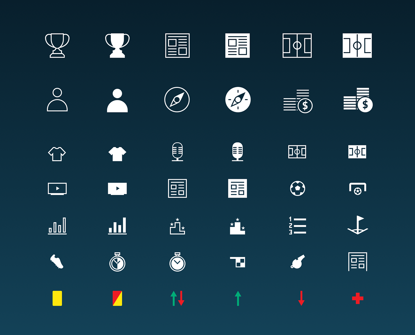
Iconography
With the simultaneous relaunch of several Goal products, there was a new need for consistency. We starting by creating a global icon font (seen above) that was used across all products. The font aligned all icons under one unified style. The key improvements included: consistent stroke widths, filled/stroked versions and ensuring all vertical/horizontal lines align to the pixel grid.
Consistency Is Key
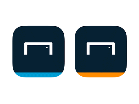
It was clear from the start of the project, the biggest challenge was to bring a consistency to varied set of products. Until now the website, mobile site, News App and Live Scores App had been designed in isolation. Resulting in a set of products that felt individual, rather than part of a family. Above you can see the new consistent app icons for both apps, compared with disjointed past.
Home Page & Main Improvements
Through user research we discovered many issues with the old app. Our initial improvements addressed accessibility issues. Ensure all colour combinations are now AA compliment, where possible and removing any ambiguity of isolated icons, buy adding text labels.

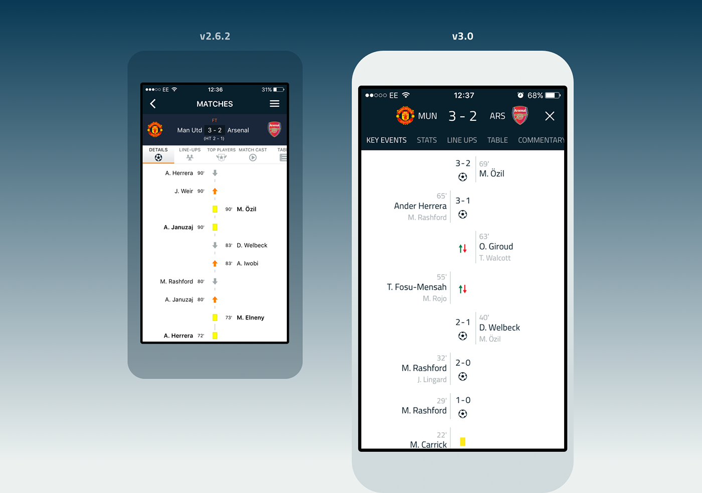
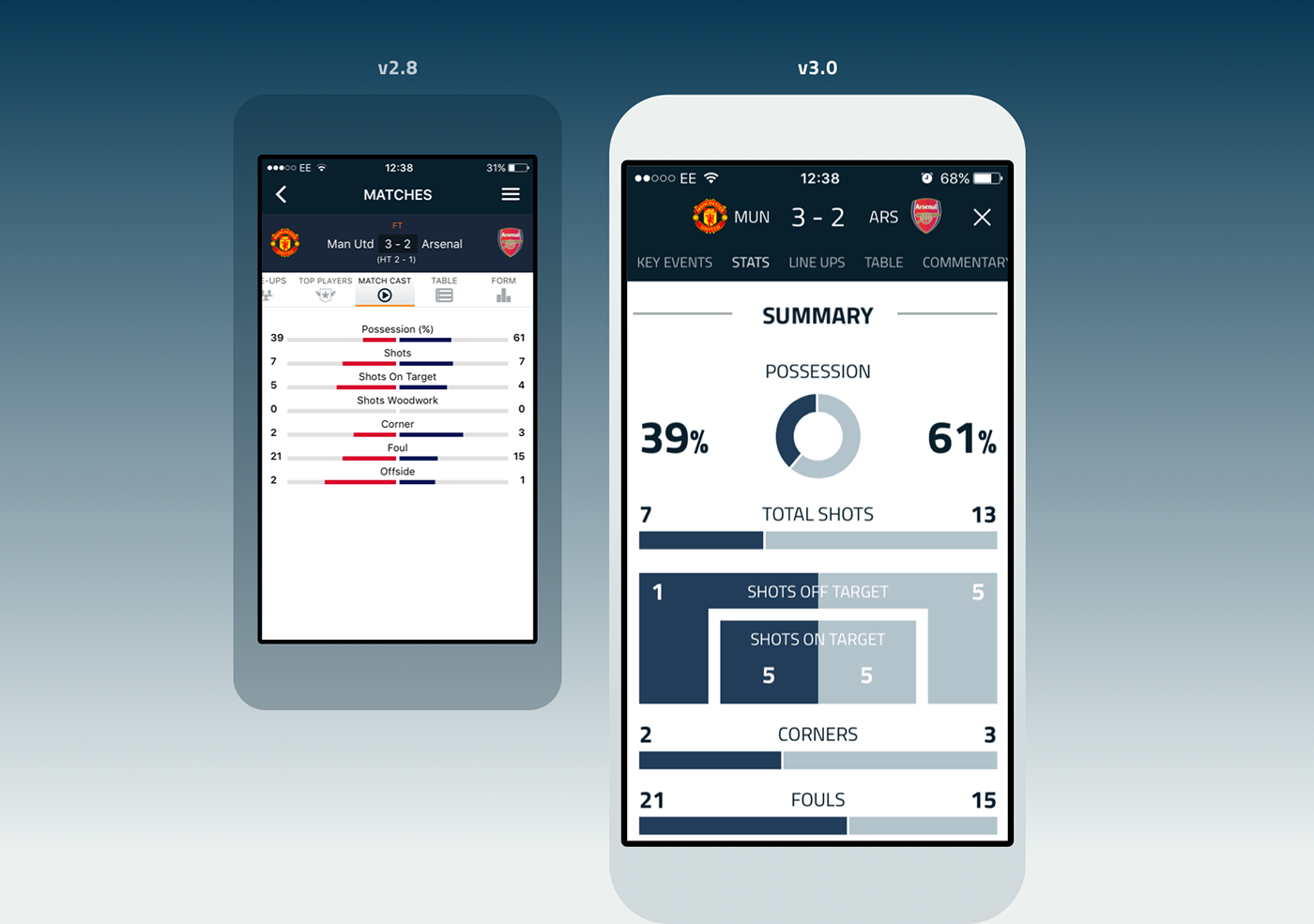
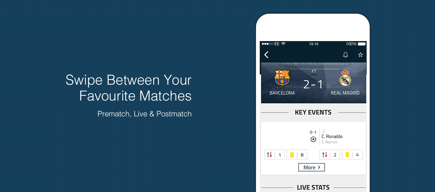
Match Pages Improvements
One of the major improvements in architecture was the redesign of the match pages. We wanted to allow users to scan key information as quickly as possible. Regardless of a pre, live or post match state.
The new design addressed this issue by introducing a dashboard for every game. The components now reorder themselves depending on the 'state' of the match.
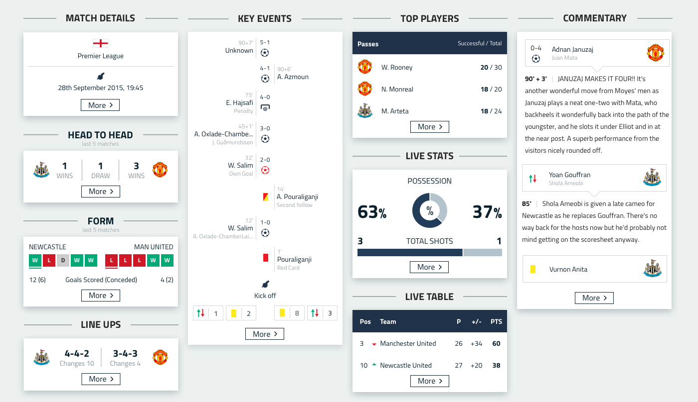
Cards & Papers
The match dashboard introduced a ‘card' approach to presenting data. To accompany this we ensured that tapping on any card would launch a ‘paper’. Retaining the ability to explore deeper if you want to do so. Match papers deliver further information for granular match experience.
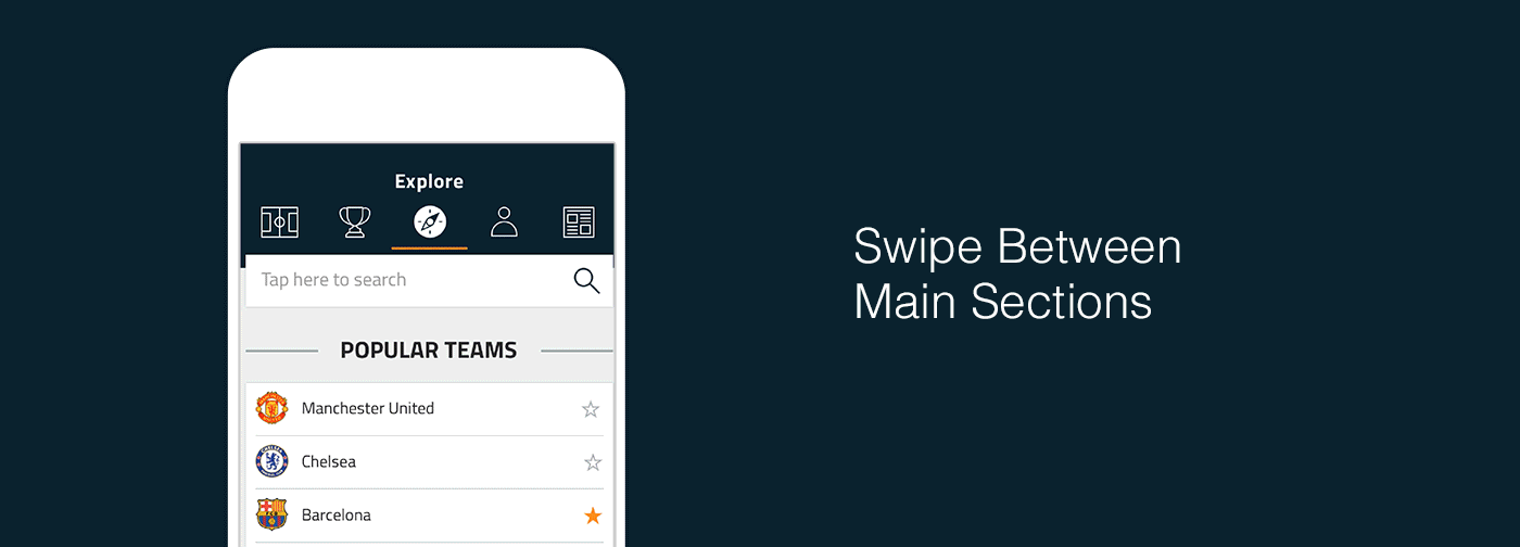
Interactions
We created a set of interaction patterns using swiping as a way to quickly navigating between content. Pages can be swiped down to be dismissed, or left and right to see more information. No matter where you are, if there is more to discover, you can find it easily.
Featured on the iTunes App Store
During Euro 2016 (left & centre images) and after the tournament (far right)
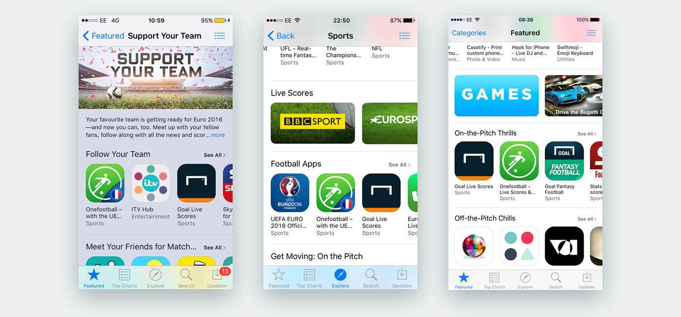
The new redesign was release a few months prior to Euro 2016. During this time we designed a designated area for all Euro news, scores and tables. As a result, we we featured on the iTunes store throughout the tournament. Also before to the new Premier League Season in, “On-the-pitch-Thrills”.
Download Now