

The Brief
Tasked with creating a small family of 27 cohesive icons to be used in a future webinar service. The brief stated that the icons must be highly legible at small sizes, be delivered in Adobe Illustrator format and tie in with the existing look and feel of the webinar.

The Process
Like usual, my icon design projects start with a stage of discovery—exploring different routes for the chosen metaphors. I sketched out these metaphors and made decisions based upon the legibility of the icons. I chose to work up four icon metaphors in three distinct styles to get approval on a specific route. The icons I looked at for each route were: file; user; chat and delete—I felt this covered a nice cross-section of the entire icons needed.
A clearly defined brief meant that the size the icons would be displayed at had already been agreed. This eliminated the deliberation of whether to start small and scale up, or start large and scale down. Each icon needed to fit inside a 26x26 pixel grid. To make the actual design process as streamlined as possible I designed a grid to accommodate various different key shape sizes and promote a consistent visual language.

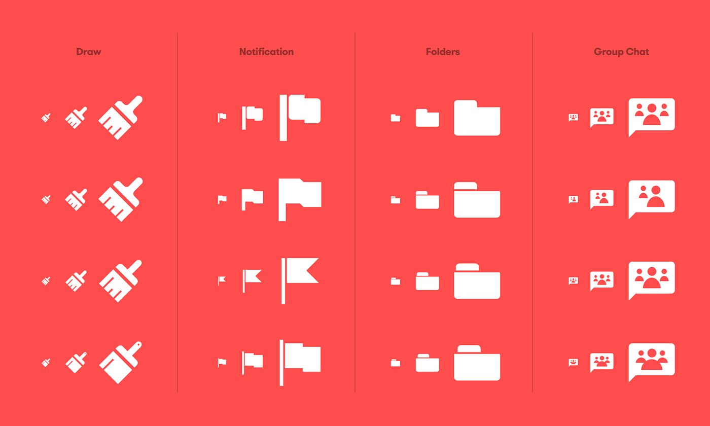

The Outcome
The final result is a coherent and finely-refined set of 27 glyphs to be used in the webinar.ru user-interface. The icons were Implemented using purely SVG’s, allowing crisp and lightweight web usage.

View more of my work—


