


Prompt - Each student recieved a wooden laudry clip and was asked to create a word map. From that map we were expected to pick one word and explore it's meaning.

After choosing the word 'domestic,' I wanted to explore the relationship between the idividual's definition in contrast to the corporate meaning of the word.

I selected Clorox, Windex, Tide, Mr. Clean, & Dawn based off of popular reviews as well as my personal relationship with the brands. I found that these 5 products has a strong precence captured in their advertising techniques (ads, commercias, brand identity, etc.) as well as in the bold typefaces used for their production.
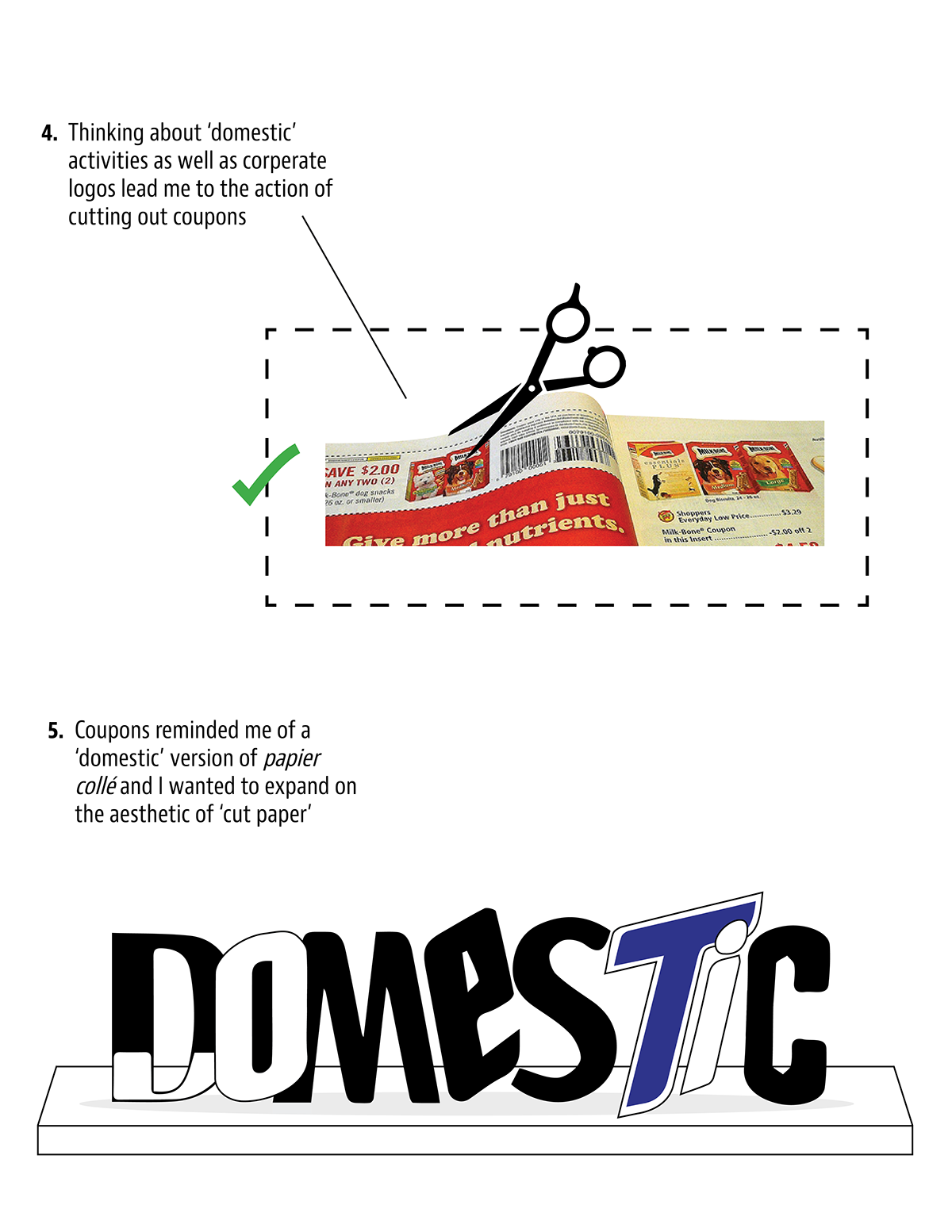
While thinking about the meaning of the word 'domestic,' I ran into the argument of Art vs. Craft - High Art vs. Low Art. I decided to look at the aesthetic and visual representation of cut paper, papier collé, and collage - "high art," in relationg to couponing, scrapbooking, and making photo albums - "low art" - in the hopes of blurring the line between the two through a method of comparison & similarities.

The forms that I was left with were strangely cohesive and I felt like there was something to be said about how similar and widespread branding is.
When stacked, the different letters appear as if they are from different settings or magazines, 'D-O' looks similar to the Dairy Queen logo and 'T-I-C' appears to be stylized like Bic's company logo.

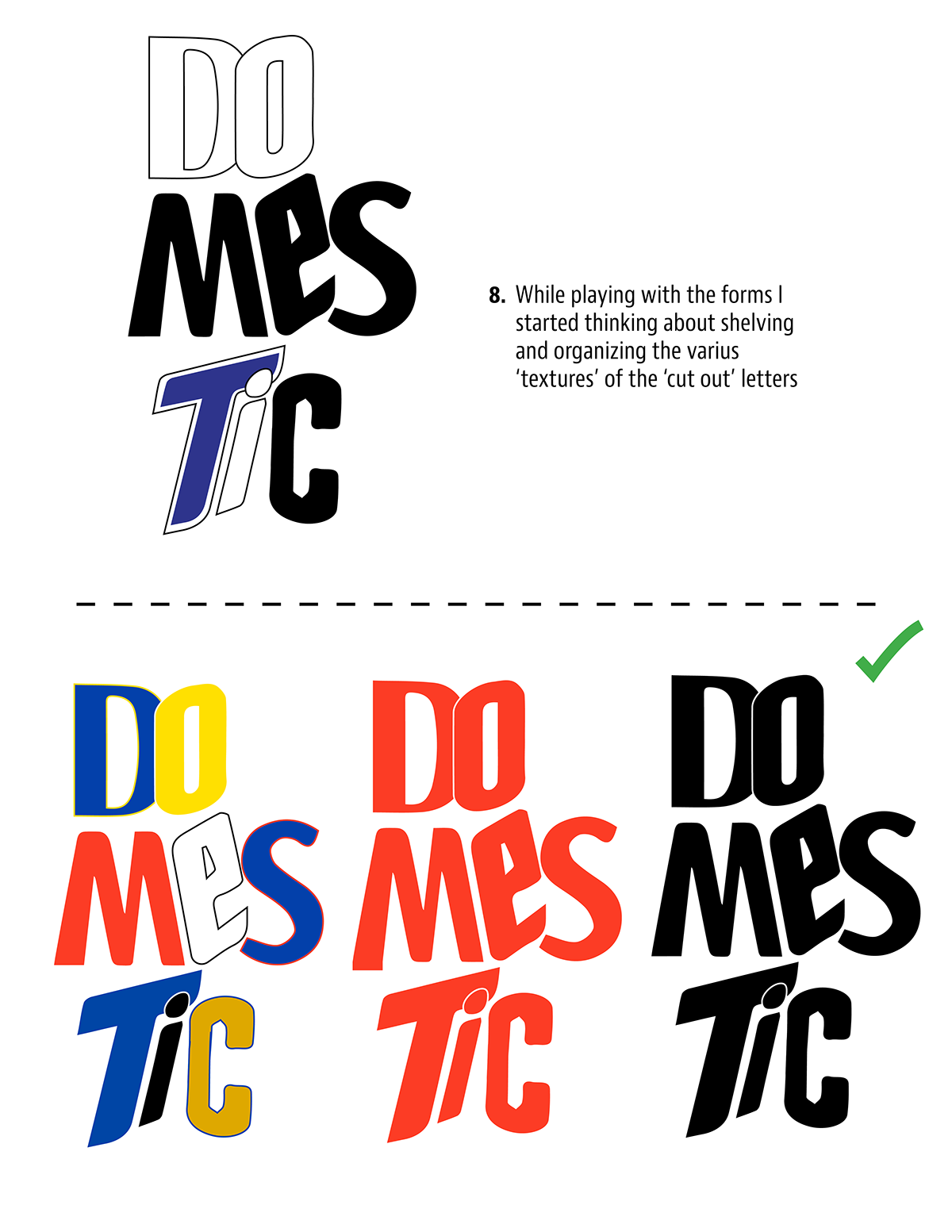
Once the letters looked 'cut out' enough, I felt that exploring letter combinations would be insteresting - 'D-O' becmoes 'D-O-M,' but I realized quickly that the grouping of letters was fundemental to the essense of the word; that when too spread out, the freedom of the letters is in contrast to the meaning of the word 'domestic.'

To protect the definition of the word 'domestic,' I focused on containment, organization, and grouping.

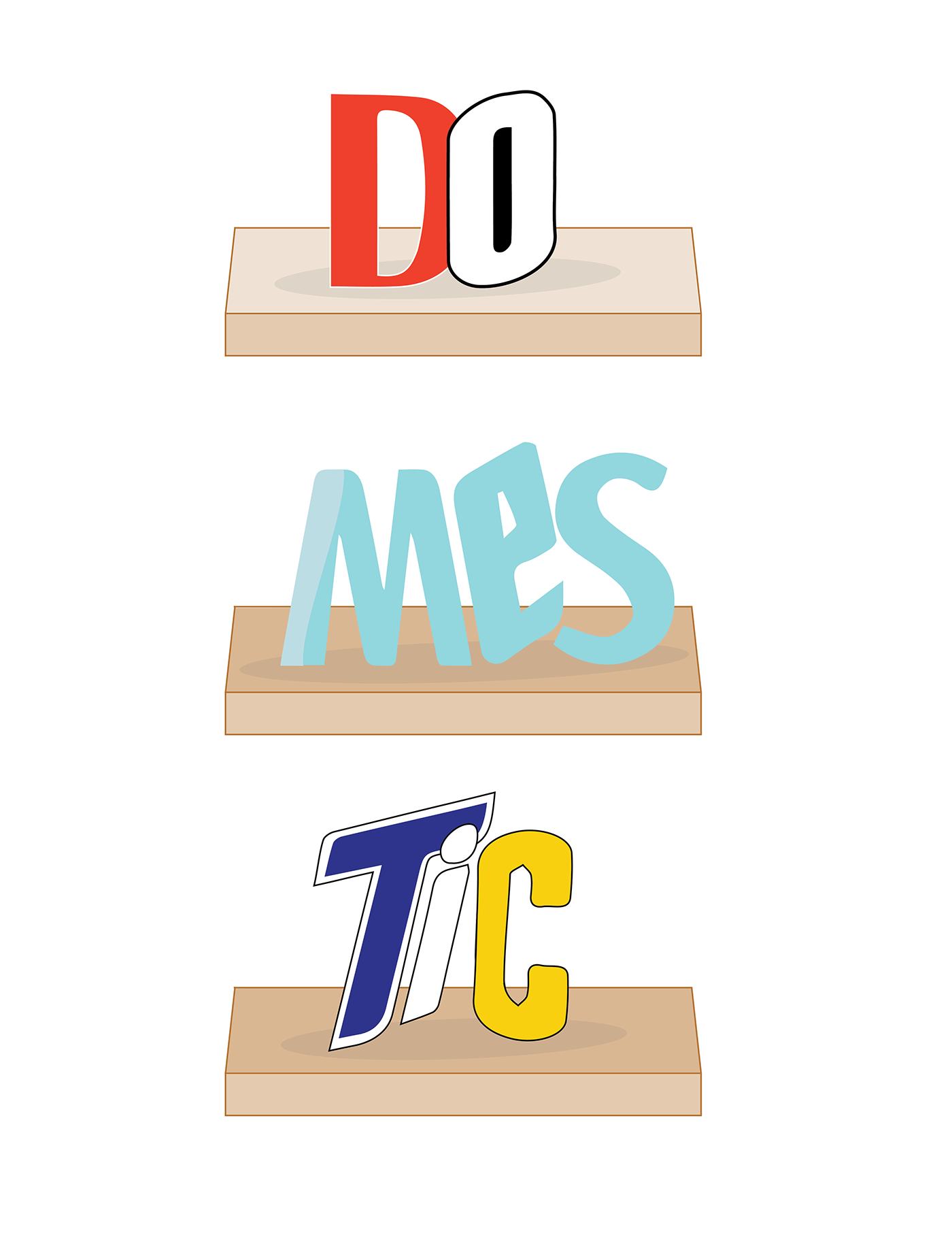
'Domestic' stylized as coupons for Bic and Dairy Queen

After I started thinking about flatness and table tops, I though it would be intestesing to try and mimic the form of many magazines filled with coupons piled on top of each other for storage.
'Domestic' as stacked magazines

Further exploring the idea of storage, I returned to the physicality of the cleaning products and where they exist in the home.
'Domestic' on the shelf
However, after speaking with my peers and professor, I decided to make the shelf more sutble. Instead of illustration, I used the flattened 'table top' template I created earlier to imply the essense of a surface for the word 'domestic' to sit on.


