“The art is the newspaper + the newspaper is the art.”
This lettering project is part of the Anna Schuleit Haber‘s public art project called “The Alphabet”. The Fitchburg Art Museum commissioned artist Anna Schuleit Haber to create a new work for the city of Fitchburg, MA, for which she proposed (and received the permission) to take over the front page of the city’s daily newspaper, the Sentinel & Enterprise, for 26 days. It is a project for the city of Fitchburg, MA (USA), revolving around the daily newspaper, a collaborative alphabet, an embedded visiting artist, a special group of reporters, and 26 typographers from around the world.
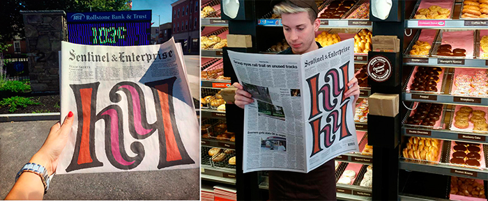
The Alphabet ran from July 13 until August 11 and featured all 26 letters on the front page. My letter appeared on the 21st of July 2015 on the front page of the Sentinel & Enterprise. Along this time I have been sharing the letter of each day, I think all together is simply brilliant! I was invited to participate in the this project thanks to the recommendation of Cyrus Highsmith, one of my most admired type designers. I’m happy about my letter h appearing just after his superb G.

The concept of my “h”
I chose the letter “h” because it has no sound in the Spanish language and because of the graphic possibilities given by the two constructions. The lowercase h has a graceful and lively structure, the capital H is more serious and symmetric. Those opposites gave me a chance to make them speak to each other, instead of being silent, and also play around together visually, as a metaphor of communication. I decided to draw a lowercase h with a strong and dark outline but filled with two different, bright colors. When duplicated and reflected it creates an H, and this duplicated again. It is only discovered when the newspaper is unfolded, creating a magnificent and powerful capital H, but also a strong presence on the page.
The paper has a weekday print run of 14,000 copies and many readers shared their photos of those covers as seen in their daily lives, fact that contributed even more to the purpose of the project.
The paper has a weekday print run of 14,000 copies and many readers shared their photos of those covers as seen in their daily lives, fact that contributed even more to the purpose of the project.
And last but not least:
Creative Review on “The Alphabet”
News article about the project from the Sentinel & Enterprise
Twitter: #FitchburgAlphabet, @schuleithaber and @agreenphotog
Some videos
Creative Review on “The Alphabet”
News article about the project from the Sentinel & Enterprise
Twitter: #FitchburgAlphabet, @schuleithaber and @agreenphotog
Some videos
You can order “The Alphabet” newspapers set at annaschuleit.wordpress.com/contact

The Complete Alphabet Series ©Photo by Ashley Green @agreenphotog


