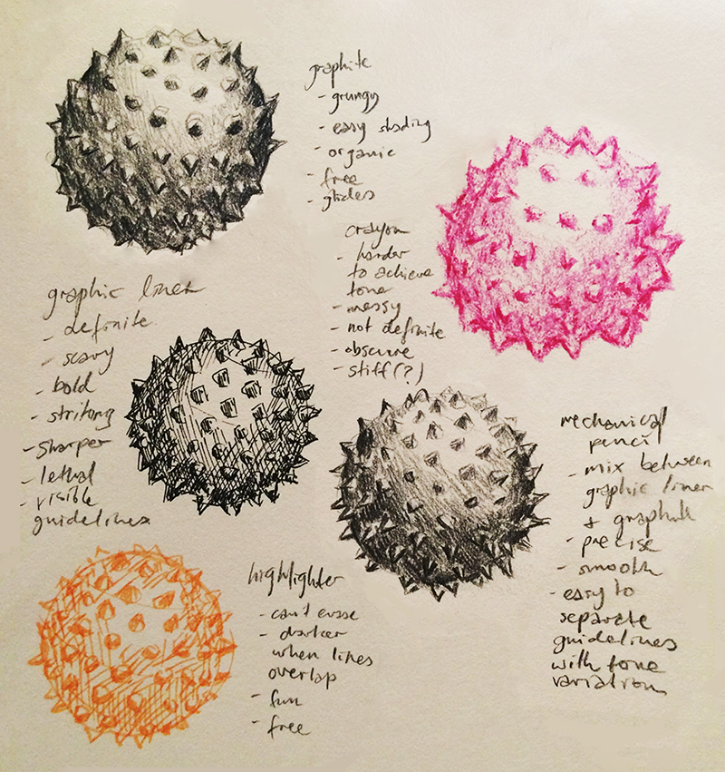
DAY ONE: Range of Mediums
#oneperday
Reasoning: An in-class task, starting off with experimentation with different drawing mediums.
Inspiration + Technique: This is an appropriate way to start off this project -- seeing which drawing mediums work for me and making observations regarding the different aesthetic different drawing utensils grant to a drawn object. Through time, this variation of medium (and more) will be used to portray different images.
Process: I used any drawing utensils near me: lead pencil, crayon, graphic liner, mechanical pencil and highlighter -- all to draw the same model spiked rubber ball.
Reflection: The best looking ones to me turned out to be graphite and mechanical pencil. I can achieve a smoother tone variation with them and I like the fact that metallic graphite makes the ball suddenly look like the spiked sphere of a medieval flail instead of what it really was -- a rubber toy. I like the sharpness of the graphic liner but using it alone is somewhat daunting since I'm unable to erase my lines. It's a tool that should be handled with confidence and practice should achieve that (and I do intend to do more pen drawings in this project!). Crayon, I found, gave the ball more of a fun, childish aesthetic because it's colourful and messy. Children are also known to be more likely to use crayon than other age group. It's not as smooth to handle when drawing and it's definitely not as precise as the liner or pencil, but its smudgy lines hold the charm of youth and actually portrays the model toy ball's fun spirit more accurately than graphite or liner ink. Highlighter is similar to the liner in the way that it can't be erased, however it's also more translucent. Guidelines aren't as noticeable and some tone can be achieved by scribbling several layers of it over an area. Highlighter also looks more youthful due to its colour. This exercise was very efficient for me to see which mediums to use for what purpose and for what emotions I would like to portray in my drawings in future days of this project.
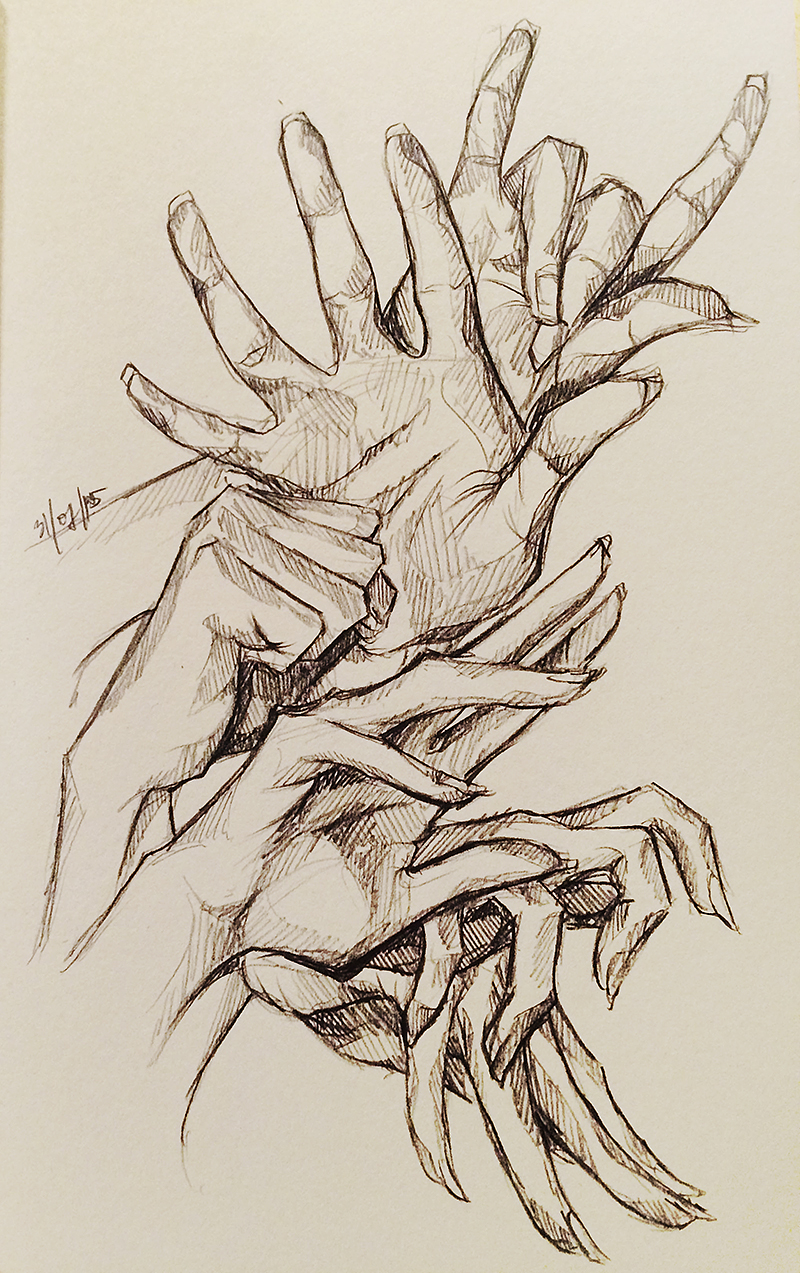
DAY TWO: Going Through the Motions
#oneperday
#oneperday
Reasoning: We use our hands everyday to accomplish what needs to be done, for different purposes, all the time.
Inspiration: I was stretching my hands in breaks between drawing and liked the shape of them.
Technique: Traditional drawing.
Process: Mechanical pencil on paper, shading with lines and challenged myself by not erasing. I took pictures of different poses of my own hands with my laptop's camera and drew them as reference -- this was easier than just glancing at my actual hand because I could achieve different perspectives.
Reflection: I like its sketchy aesthetic. I used line shading because it was quick and efficient, as are hands with the many things they handle. All the hands come from one main point on the page, implying that this could be a time-lapse of one hand going through several motions. Consistency of style lapsed towards the bottom of the page, where fingers are sharper the overall hand doesn't look as soft and organic as the rounder fingers at the top. Shape, I find, is a great contributer to an aesthetic too. Sharper fingers hint at something darker, like that of a villain. The hands toward the top are rounder like normal hands would be, and look more technical since they're more true to life. Even though this difference in style was accidental, it serendipitously adds to the theme of 'through time', as a kind of transition of 'good to evil'.

DAY THREE: ... The Tighter Grasp You It, The Faster It Runs Through Your Fingers
#oneperday
#oneperday
Reasoning + Inspiration: Inspired by the quote "Time is like a handful of sand," and its imagery.
Technique: Traditional drawing.
Process: Graphic liner line art and tonal values achieved with a mechanical pencil. I took a picture of my own hand as the model again with my laptop's camera.
Reflection: Graphic liner is excellent at making bold, loud lines, but it's difficult to control on its own. When I use it again, I'll have to do a sketch in pencil first before going over in pen and erasing the pencil because the lines here aren't as sure as they could be (which is why some of the fingers look awkward in their shape). I initially wanted to make this purely an ink drawing but I felt it lacked depth and I know already (from day 1's drawing) that I personally don't like the aesthetic of graphic liner shading. I opted to shade with mechanical pencil since it's precise but also allows for gradual tonal variation, since I wanted to create soft shadows around the image. It achieved this gradation, ensuring that the eye's focus wouldn't stray from the bold lines of the main subject.
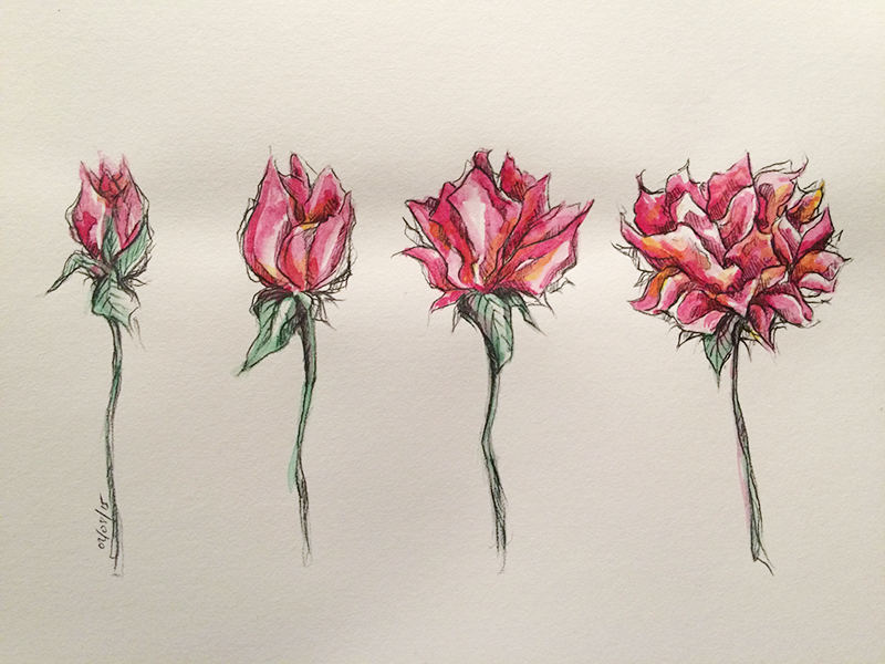
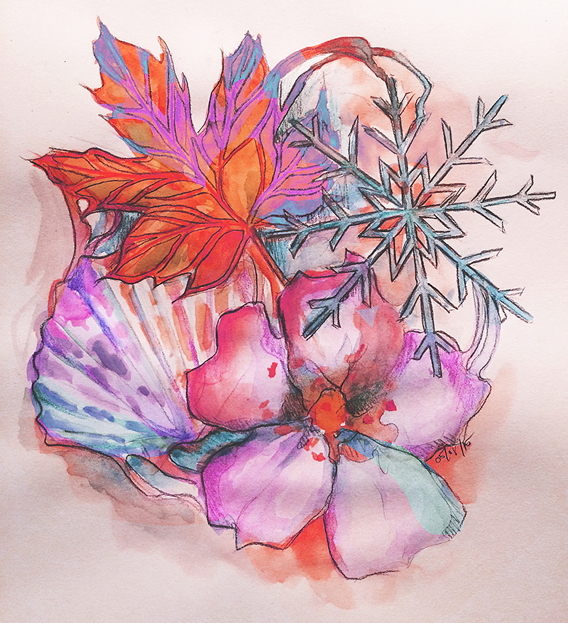
DAY FOUR: Efflorescence
#oneperday
#oneperday
Reasoning: Portraying time through the growth of nature.
Inspiration: Flowers outside and thinking about the time lapse of their blooming.
Technique: Traditional painting and drawing.
Process: Light sketch of flowers with a mechanical pencil, then laying down base colours with watercolour paint and then another layer in some areas to give them depth. Then finally, I went over with mechanical pencil again to outline the petals and shade with lines to add more dimension and detail.
Reflection: Using pencil was appropriate to go over the flowers since it's not as harsh as the black ink of graphic liner. Graphite is sheerer than ink, so it was cohesive with the flowers' soft aesthetic. I didn't use a reference for this drawing -- although this flower is no specific type because of this, I found it surprisingly freeing to not rely on a model. I know that flower petals open out from a central point like an explosion, and that's all I thought about when painting them.
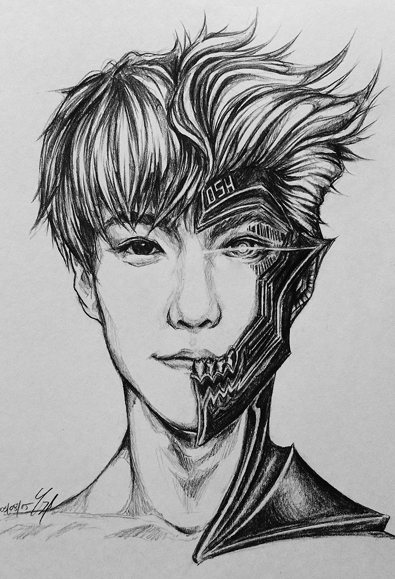
DAY FIVE: We Are the Machine
#oneperday
#oneperday
Reasoning: The passing of time has gone -- the future is already here. It is us.
Inspiration: Technology's rapid advancement, and 'Terminator'-esque ideas of machines taking over human life.
Technique: Traditional drawing.
Process: Used a reference picture of a portrait and altered the facial features to suit my idea: half human, half machine. Drawn entirely with mechanical pencil, I started with a light sketch and gradually filled in the details of the face, hair and metallic components.
Reflection: To view this drawing, close one eye and cover either half of the face: on the left is a smiling person, and on the right is an emotionless, steely machine. As a whole, the half-and-half contrast of this portrait is effective in portraying the idea of an quick passage of time, signifying the speedy pace of technology's progress. I also intended for the drawing to serve as commentary regarding how technology is a part of us; consuming us like the machine metal and barcode (symbol of materialism) are doing to this person's face. I kept shading rough around the face to draw less attention outside of the facial area -- but this wasn't really a main focus since human portraits inherently draw the eye to the face first. I also made use of different types of lines to portray each side: soft for humanity, sharp and angular for machine.
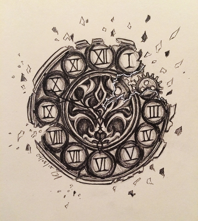
DAY SIX: Decay
#oneperday
#oneperday
Reasoning: Time breaks everything down.
Inspiration: Grandfather clocks, their antiquity and therefore their age. I 'broke' the clock face to further emphasise the passage of time.
Technique: Traditional drawing.
Process: I searched up grandfather clock faces and observed common features: ornate appearance, clock numbers often were made up of Roman numerals, monochrome/metallic. I was inspired by all these features and designed my own clock face. I started with a light sketch and gradually went over darker with my pencil and filled in details.
Reflection: I drew this freehand because I usually don't like using measuring instruments like rulers or compasses. Because I'm portraying time's course of decay, there is leeway for imperfections. I personally like the faults of this drawing: how the circles aren't perfect and how the numbers aren't perfectly aligned. That being said, I still used freehand measuring techniques to gage where things were meant to be whilst doing the sketch (like drawing a light circle and sectioning it like a pizza to work out where the clock numbers should've been situatted). Freehand is difficult too, however, because I often found myself struggling to fit in details I did on one side, and then found I couldn't do the same to the other because I had drawn circles/details too big or small. If I were to do this again, I would compromise and make use of a ruler to make my alignments more accurate, and therefore fit details in symmetrically. But I wouldn't use a compass because, there are a lot of circles that make up this drawing, and I feel the compass would be doing my work for me, rather than letting me practice my own technique.
DAY SEVEN: Four Seasons
#oneperday
#oneperday
Reasoning: Seasons are an endless cycle, signifying the constancy of time.
Inspiration: The four seasons and cycle diagrams (i.e. as of animal/plant growth stages)
Technique: Traditional painting and drawing.
Process: Using watercolour paints, I gave each seasonal symbol their colour washes and another layer of details. I used colour pencils and graphite afterwards to add more tone and dimension to them as well since watercolour washes alone washed the image out and therefore no focus was established in the image. I found colour harmony difficult since I didn't plan a colour scheme beforehand, and I instead coloured each element as they would be alone. I ended up with analogous elements with the exception of the bright autumn leaf, which was a brilliant orange in contrast to the other elements' blue and purples. After importing it into Photoshop, I chose to colour correct the image, especially the leaf, so that the whole image's colour would pull together.
Reflection: Watercolour is a hard medium to control. Whilst I wanted colours to bleed into one another, there were several occasions throughout drawing this where the colours bled over where I didn't want them to. Overall, I ended up liking this 'messy' aesthetic and find it organic, which suits the theme of seasons and time. Previously, I mentioned that colour harmonisation was a problem for me, so next time I work with watercolour, it is best to establish a colour palette first. Aside from it being more aesthetically pleasing, I wanted this image to be analagous in colour to pull each element together into one unit -- this is to represent that they are all a part of the year, yet are still different, which is further portrayed by how each seasonal symbol 'bleeds' into the next.
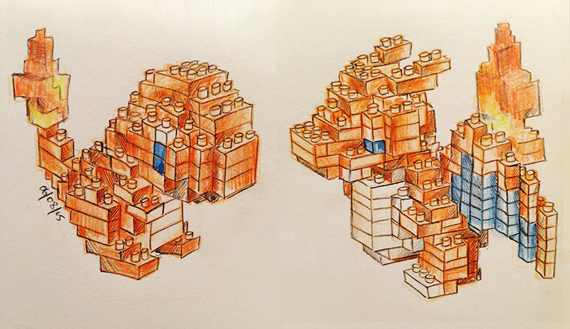
DAY EIGHT: Evolve!
#oneperday
#oneperday
Reasoning: After some time and great care of your Charmander, it will evolve into a stronger Charizard!
Inspiration: My Pokemon Nanoblock figurines, and the first in-class sketching activity of the semester.
Technique: Traditional drawing and colouring.
Process: I started lightly sketching with coloured pencil this time, instead of using graphite. I coloured in lightly with the same coloured pencils so I could still see my line art. Because the figurines were fairly detailed, it was getting difficult to differentiate the different planes of each part, so I opted to go over my lines with a thin graphic liner.
Reflection: I did originally want this to be entirely done in coloured pencil, but it didn't work out as the overall image seemed too washed out -- as was pure watercolour from yesterday. Even darker coloured pencils didn't seem to layer on easily on top of lighter coloured pencils, and they weren't sharp enough to make the drawings look relatively clean. Graphic liner was initially too 'risky' for me to use (as seen on day one), but it was much easier to use this time as a lighter line art was already established beforehand.

DAY NINE: Eagle to Lion Metamorphosis -- WORK IN PROGRESS (1/5)
#oneperday
#oneperday
DAY TEN: Eagle to Lion Metamorphosis -- WORK IN PROGRESS (2/5)
#oneperday
#oneperday

DAY ELEVEN: Eagle to Lion Metamorphosis -- WORK IN PROGRESS (3/5)
#oneperday
#oneperday

DAY TWELVE: Eagle to Lion Metamorphosis -- WORK IN PROGRESS (4/5)
#oneperday
#oneperday

DAY THIRTEEN: Eagle to Lion Metamorphosis -- WORK IN PROGRESS (5/5)
#oneperday
#oneperday

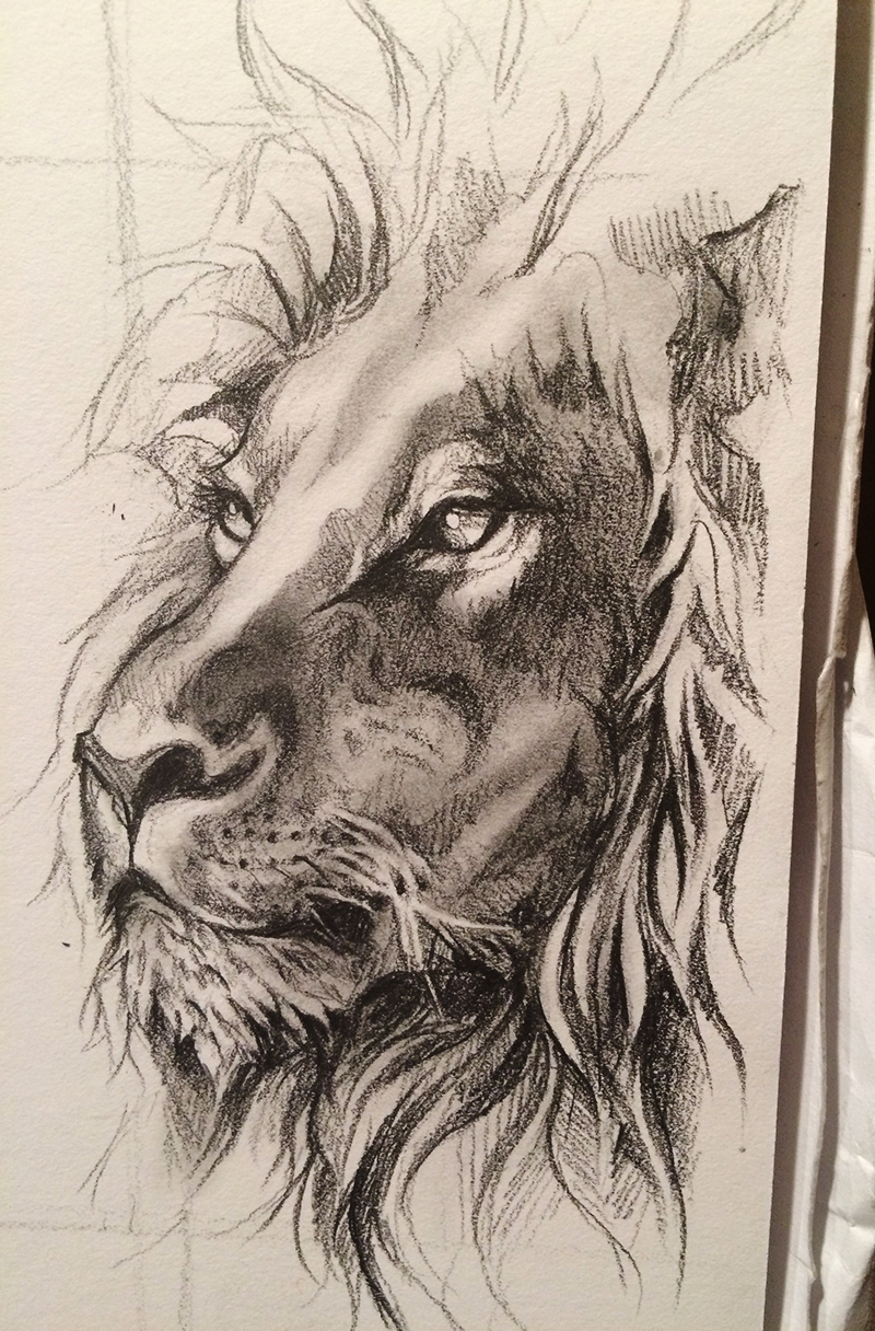
DAY THIRTEEN: Eagle to Lion Metamorphosis (FINISHED)
#oneperday
#oneperday
Reasoning: Transformations take phases through time.
Inspiration: Metamorphoses of animals, particularly of catterpillars to butterflies, but I wanted to portray something more surreal and unique.
Technique: Traditional drawing, blending with a q-tip.
Process: I began with drawing the eagle and the lion on either side of the page from reference pictures I found through an online search. I made sure the angles of the animals' heads were similar so that there'd be consistency and so the 'transformation' drawings would be easier to draw. I then drew the middle phase which represents the 'median' appearance of both these animals, and should consist of even amounts of features of both the eagle and the lion. After that, I took the eagle and the median, and the median and the lion, and drew the second medians/the in-betweens of those drawings.
Reflection: For the topic's sake, I really wanted to portray the transformation in chronological order, but the context of what I had in mind wouldn't allow for that. I needed to know a firm start and finish in order to work out just how it transforms from point A to point B. This is also why the order of the drawings on this project page are out of order. So, after working out an order of operations (process above), the actual drawing of it was quite straightforward. However it was very time-consuming and required a lot of detail, and it did test my patience, especially during the last couple of drawings because there was no solid references to look at. When it came to the in-between drawings, it was based more on 'feel' and the freedom (thus uncertainty) about how much of which animal goes where and how to integrate it into the hybrids without skewing the drawing into something unrecognisable.

DAY FOURTEEN: Earth vs Metal
#oneperday
#oneperday
Reasoning: Over time, nature has been overrun by us and machine.
Inspiration: A class activity where 'time' was to be encapsulated in images, and QUT's campus.
Technique: Photography (iPhone 5S), retouching alignment in Photoshop CS6.
Process: Walking around the block, I searched for points of interest. I particularly looked for straight lines in nature since contrasting ideas like this are interesting to me in images. I found the divide between foliage and concrete as a great place that exemplified my intent, and the fact that motorbikes were parked on the concrete really emphasised the idea as well. I took a picture but found the divide was slightly slanted, so I fixed this in Photoshop CS6 with rulers and the rotate tool.
Reflection: I really like portraying contrast using half vs half, as seen as well on day five in the portrait drawing. This shot was found mostly serendipitously but I like the outcome. The image was originally flipped the other way (motorbikes on the left) but I decided to flip it to portray a cohesive 'story' in the image: nature came first, and man overrun it after -- this is 'read' from left to right like any piece of text.

DAY FIFTEEN: Intentions
#oneperday
#oneperday
Reasoning: Are we to help or hinder nature?
Inspiration: A class activity where 'time' was to be encapsulated in images, and QUT's campus.
Technique: Photography (iPhone 5S).
Process/Reflection: In the same class activity as yesterday's post, I was walking around the block and searched for points of interest. Again, this is another image using straight lines as a divide between nature and man except the divide is cleaner and wider which leaves the question of the intention of man (represented by the pair of shoes on the right). Like the 'reading' from left to right idea in yesterday's image, the shoes begin on the left, acting as an arrow-like figure, pointing the eye's focus to travel right along. Are we going to help nature or stomp over it?

DAY SIXTEEN: Journey to University
#oneperday
#oneperday
Reasoning: It takes a lot of time for me to get to class.
Inspiration: This was an in-class task -- using ideograms, and strictly no emotion, to portray a story. I chose to tell the story of how I get to university since I live an hour and a half away. I took some inspiration for some symbols from the Noun Project website, which highlights and celebrates the 'world's visual language'.
Technique: Traditional drawing, scanned and coloured in Photoshop CS6.
Process: I went through the sequence of my morning in my head and listed each main event. I came up with keywords for each event and the symbols I first thought of when it came to mind (i.e. morning = sun, waiting = clock). Some were more straight-forward, such as the modes of transport. I drew each symbol in chronological order, and scanned the sequence into Photoshop. Using curves, I was able to remove most of the unevenness of colour in the paper, but I also needed to use gradients and white overlay layers to even out dark edges, as well as paint over with white for tighter areas. I started using coloured blocks and layer masks to apply colour to the symbols, but I found that just changing the colour blocks' layer setting to 'lighten' worked just as efficiently because the background was a hard white.
Reflection: The story reads (left to right, top to bottom) as waking up, having breakfast, getting dressed, driving, parking, catching the train, waiting, exiting, catching the bus, arriving at QUT, walking, meeting up with friends, having lunch, waiting till 3 o'clock and then finally sitting in class. I used different colours to experiment with colouring techniques but also to portray the surrounding mood for each event. Colours can have different connotations (like red can portray anger but it also portray love), but in this case, the yellow represents vivacity in the morning after waking up, green is used for transport like the commonly known 'go' of a traffic light, and blue is calmness -- of waiting and of learning in class.

DAY SEVENTEEN: What's In My Life
#oneperday
#oneperday
Reasoning: These things shape my identity today.
Inspiration: Popularised 'what's in my bag' pictures and videos online, except adapted to my creative motivations. I was also inspired by the colouring style of one of my friends and artist online: http://routexx.tumblr.com/
Technique: Digital drawing and painting in Photoshop CS6 with a Wacom Intuos Pro tablet.
Process: In Photoshop CS6, I roughly sketched the things I use most when I create things. I created another layer on top of that one and lowered the sketch's opacity so I could see what I was doing. I had a rough image in mind of a dynamic and bright design. So I chose to go over the sketch with clean, bold lines. I then created a layer underneath the lines and deleted my sketch (as I didn't need it anymore), and did the colour flats (base colour) to give me more of an idea of where the overall picture would look like. After that, it was trial and error with layering on colours until I became confident with which colours to put where.
Reflection: This was a drawing that really challenged me, mostly with colour. At first, it was difficult for me to colour without the colours looking too muddy. I started out with analagous colours next to each other, and although they do suit each other, the image turned out too bland and uninteresting for the eye to look at. I incorporated complimentary colours and then found that this was much more efficient as it brought out the colour much more efficiently and turned out to be overall more aesthetically pleasing. The brush choice also added to this as well -- since the strokes don't blend together, it's easy for the intended image to be striking instead of soft or muddy.

DAY EIGHTEEN: Self-Portrait
#oneperday
#oneperday
Reasoning: The me that is physically seen.
Inspiration: Portraits and the theme of identity.
Technique: Digital drawing and painting in Photoshop CS6 with a Wacom Intuos Pro tablet.
Process: I used a self-taken picture of myself as reference. In Photoshop CS6, I drew a rough sketch first before filling in flat colours and adding dimension and detail all in black and white to achieve the values I was happy with. Then I used gradient maps to colour the majority of the image, then used the selection tool to draw around certain features and change their hue to be more of an appropriate colour (like lips, whites of eyes and teeth).
Reflection: I put much more detail in the face since that's supposed to be the primary focus of the image, which is also why I've added blur around the edges. More brush strokes and blending were used in the face area, whereas toward the outside, the brush strokes are clear and rough -- but I like this aesthetic since it looks more organic. Speaking of which, I drew this all on the background layer, which was an accident by the time I realised I was doing it (it's not preferred because it's harder to edit specific elements in the image), but it didn't cause me that much trouble because I could 'organically' paint over any mistakes again like I would on a physical canvas. Unlike day seventeen where I needed the lines in front and therefore couldn't paint over them to achieve a bold and clean aesthetic, it was fine for me to draw over my lines on one layer for this more painterly image.

DAY NINETEEN: Lookout
#oneperday
#oneperday
Reasoning/Inspiration: A class task revolving around portraits (identity) and lighting. This activity focused on spontaneous photography in natural lighting.
Technique: Photography (DSLR) and editing in Photoshop CC.
Process: My group and I took random portraits of each other with a DSLR around an area on campus. I selected the ones that looked best and imported them into Photoshop CC. For this photograph, I desaturated it and played with curves so it'd bring more contrast forward. I also added a subtle vignette, sharpened the focal point of the person (since this is a portrait), and further blurred the image toward its borders to create more depth.
Reflection: I chose to desaturate this picture because I wanted the focus to be on the composition and the values (light and dark) of the image.The pattern on the balcony is bolder and more interesting in black and white (since, in the original photo, it was red and yellow of a playground). The posts either side of the subject are dark in comparison to the lighter surrounding and serve as a border for the subject as well and leads the eye to the subject. The image also follows the rule of thirds and is therefore a balanced image. The image in black and white instead of colour, and the subject looking out and over gives the overall photograph a feel of nostalgia and memory.

DAY TWENTY: Keep Calm
#oneperday
#oneperday
Reasoning/Inspiration: A class task revolving around portraits (identity) and lighting. This activity focused on spontaneous photography in natural lighting.
Technique: Photography (DSLR) and editing in Photoshop CS6.
Process/Reflection: My group and I took random portraits of each other with a DSLR around an area on campus. I selected the ones that looked best and imported them into Photoshop. For this photograph, I altered the colour balance of the image and manually selected some areas so that the overall colour palette was harmonious (since there were places that were red, complimentary to green and therefore stood out, and distracted the eye). The face wasn't lit well enough, even after I played around with curves of the whole image so I manually selected the face as well (with the selection tool) and altered the curves of just the face. I also filled another selection of the face with white and set it to overlay with a low opacity just to brighten the face more and pull more focus into it. The wheel in the bottom right was also further to the right initially as the image was longer horizontally, but I moved it more to the left and partly behind the portrait subject because the space between the subject and the wheel originally 'broke' the image as they were separate. With moving the wheel to where it is now, it looks more cohesive, and its yellow with the yellow on the subject's left side also frames the subject well.

DAY TWENTY-ONE: Direct
#oneperday
#oneperday
Reasoning/Inspiration: A class task revolving around portraits (identity) and lighting. This particular activity focused on studio lighting.
Technique: Photography (DSLR) and editing in Photoshop CS6.
Process/Reflection: In a studio environment, there is much more control over lighting and situations when doing photography. For this shot, we experimented with split lighting, with the light source from the left (whilst facing the subject). We also tried bounce light, bouncing the main light source off of a reflective umbrella, which is why the other side of the subject's face is dimly lit. When it came to editing, the black and white photograph seems more dramatic. Split lighting inherently conveys more of a dramatic feel than clarity, but when the image is void of colour it portrays more of a feel of mystery or nostalgia. For the coloured image, I altered the curves slightly but mainly altered it through colour balance. I altered shadows to be bluer and I was already satisfied with the result. The colours are harmonious with the subject's more orange/pink complexion as the colours are complimentary. The coloured image looks more honest as the face is clearer and the overall feel of the image is soft.

DAY TWENTY-TWO: Bashful
#oneperday
#oneperday
Reasoning/Inspiration: A class task revolving around portraits (identity) and lighting. This particular activity focused on studio lighting.
Technique: Photography (DSLR) and editing in Photoshop CS6.
Process/Reflection: For this shot, we experimented with diffused light, using a translucent umbrella directly in front of the light source so that light and shadow wouldn't appear so stark on the subject's face. The light source is at a 45 degree angle (opposed to split lighting which is directly beside the subject/90 degrees) so that more of the face is illuminated and is therefore a clearer shot. Because it isn't like beauty lighting (lighting that fully showcases the subject from the front) and the fact that this was a candid moment captured between shots, the photograph portrays a more honest image. For the coloured image, I played with curves slightly and used colour balance to add more blue like yesterday's coloured shot. The coloured shots from this task had more of a yellow tinge to start with, so I neutralised it with a blueish purple, yellow's general opposing colour. There's a nice complement of the red hair and blue shirt, and it frames the subject's face well for it to be the instant focus. For black and white, I altered curves mainly and found that there is more focus and weight on the subject's eyes. The expression of the subject looks bashful and happy, and combined with being in black and white, the image gives off nostalgis of mellow memories.

DAY TWENTY-THREE: Cast
#oneperday
#oneperday
Reasoning: The night comes quickly and the lights come on.
Inspiration: My late route back home from a day of classes.
Technique: Photography (iPhone 5) and editing in Photoshop CS6.
Process/Reflection: The night transforms places, granting an instant air of mystery to the subject. I took this picture because I liked the subtle lighting from the sprinkle of multiple light sources around this area. There was already a great sense of depth in this image since the background was darker than the foreground, but I darkened the shadows and brightened the light with curves in order to enhance this depth. The background is almost pitch black now and looks ominous, especially with the dim lighting that doesn't consistently light the way through the back. In the foreground, the multiple small light sources are enough to lead the eye around the image, whilst the tree trunks assist in balancing the image with symmetry. Symmetry can sometimes make an image boring though, so I've offset the perfect symmetry by keeping more space on one side.

DAY TWENTY-FOUR: Vacant
#oneperday
#oneperday
Reasoning/Inspiration: A class task revolving around textures.
Technique: Photography (iPhone 5S) and editing in Photoshop CS6.
Process/Reflection: I found this spider home during the task at where we were to take pictures of textures around us. I found this to be one of the most interesting images I've taken since it's not an actual surface but it still proved to be a texture because of the web's pattern. It's an unusual type of web and it looks like it's sagging with the rain droplets weighing some of it down. No spider was anywhere to be seen though, so I think the spider must've escaped to a drier place. There's a good sense of depth in this image too. Since the web was on the outer-side of a vent, it was darker further inside and it created great natural lighting for the photo. Unfortunately, I had to stand quite close in order to capture the image because the web wasn't big at all, and in turn I've lost quality and gained some grain. But there's a good contrast between web and backgrouns so I'm overall satisfied with the image. Of course, a DSLR would've been a greater tool for this activity, but I didn't have one on me at the time.

DAY TWENTY-FIVE: What Was Here
#oneperday
#oneperday
Reasoning/Inspiration: A class task revolving around textures.
Technique: Photography (iPhone 5S) and editing in Photoshop CS6.
Process/Reflection: When collecting textures in this way, walking around snapping pictures of different surfaces, I found I really liked unusual ones like this. It's not a continuous texture like a brick wall would be, this surface has a bigger story to it held in its decayed, grungy aesthetic. This notion sums up the theme of home, since the idea of home is somewhere stories are made and where people grow old with them.
In the image, despite it being a manmade object (a metal pole), the intricacies of the weathering and chipping paint, ripped paper and old tape look really organic because they're not straight or predictable. I also like that, although it's grungy and worn, the overall image is quite soft in the way the colours are analogous. The printed text on the small piece of tape is another nice touch; its typewriter-ish font further portrays the dated feel to the texture.

DAY TWENTY-SIX: Veins
#oneperday
Reasoning/Inspiration: A class task revolving around textures.
Technique: Photography (iPhone 5S) and editing in Photoshop CS6.
Process/Reflection: This is leaf is another one of my favourites amongst the bunch I took during this activity. The first impression I get from this image is 'nature with structure'. Leaves (and this image) have balanced proportions/composition because of its symmetry. I like how the middle stalk acts as the line of symmetry as well as the base point, a home, for all the thinner stalks and subtle veins to string out from. This naturally leads the eye out and around the picture. There are multiple layers of texture here, the stems, the veins, the water droplets, and the light that reflects off of the water droplets, and it overall makes for an interesting image.
Similar to the idea of home from yesterday's image, the veins and stalks branching out from the centre act like paths and different journeys, stemming from one origin. This is adaptable to families and children finding their courses in life, all the way to how the world has worked from its beginning. We all start from home.

DAY TWENTY-SEVEN: Always Watching
#oneperday
Reasoning/Inspiration: A class task revolving around repeat pattern-making.
Technique: Digital drawing and pattern-making: Adobe Illustrator CS6
Process: This was originally drawn in my sketchbook during the warm-up activity, where we were to sketch basic repeat patterns. But I've drawn them in Illustrator using the arc tool and circle tools. It's easy forming the eye since it's a fairly simple shape, but, because the eye repeats in a bricked alignment, aligning exact quarters of the eye in each corner of the one pattern tile was difficult by eye. Alignment was therefore done mathematically and this gave me a uniform, seamless pattern. I wanted variation in the repetition of the same symbol, so it wasn't a boring image, so I added an eyelid by filling in tile's bottom quarters black. I'm not used to making images in Illustrator, but the results are always very clean and vectors suit graphic design a lot better since they're scalable and alterable without losing quality.
Reflection: I drew eyes, thinking about the concept of home and its privacy, away from the eyes of others. People are different by themselves to when to when they are in public, when people are watching. It's a simple thought, but it's interesting to think about how much effect the eyes have on us and how we interact with each other, even if no words are said.
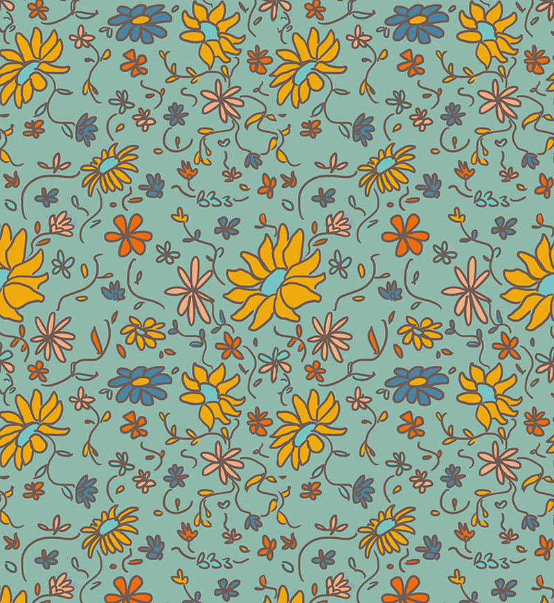
DAY TWENTY-EIGHT: Floral Wallpaper
#oneperday
Reasoning/Inspiration: A class task revolving around repeat pattern-making. Inspired by floral home wallpapers and colour palette and flowy lines inspired by art nouveau artist Alphonse Mucha.
Technique: Digital drawing and pattern-making: Adobe Photoshop CS6, Wacom Intuos tablet.
Process/Reflection: I followed this source (http://www.designsponge.com/2008/05/welcome-julia-and-how-to-make-a-repeat-pattern.html) to follow the process of making a repeat pattern traditionally, however I adapted it to digital drawing since it makes the process (drawing, cutting and pasting) faster and more efficient. Also if I'd make a mistake, it was easier to clean up digitally. I experimented with a more 'doodle' kind of style of drawing since it's a style that's more fun and informal, which is what the definition of home is to me -- somewhere someone can let go and relax.
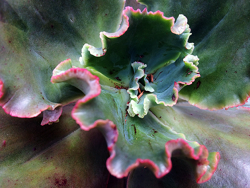
DAY TWENTY-NINE: Frilled
#oneperday
Reasoning: Class task on macro-photography.
#oneperday
Reasoning: Class task on macro-photography.
Inspiration: The little-big world of my home's backyard.
Technique: Macro-Photography (iPhone 5S), editing in Photoshop CS6.
Technique: Macro-Photography (iPhone 5S), editing in Photoshop CS6.
Process/Reflection: I wasn't present in class this week due to sickness, so I took to my surroundings at home. I didn't have a DSLR camera on me but after browsing examples of macro-photography, I've grasped that it's about making smaller objects look larger than life. I went around my garden, taking very close shots of plants and tried to take images that were as sharp as possible. In Photoshop, I sharpened more of the details so that they'd be brought out further since macro-photography portrays the idea of seeing everything in the smallest things. I also increased the saturation so that the plant would feel warmer and lively. I love this image, and it's attributed to what macro-photography is about. People usually don't look at plants like this, so it's interesting to see it up so close, much bigger than what it is.

DAY THIRTY: Follow the Trail
#oneperday
Reasoning: Class task on macro-photography.
#oneperday
Reasoning: Class task on macro-photography.
Inspiration: The little-big world of my home's backyard.
Technique: Macro-Photography (iPhone 5S), editing in Photoshop CS6.
Process/Reflection: I found a tree in my backyard spotted with fungi, and up-close, it looked like a high birds-eye view of a rough trail. I had to crop the edges of the image since it gave away it was a tree trunk, but I think I could use this image as a base for another drawing.

DAY THIRTY-ONE: Scuttle Along
#oneperday
Reasoning/Inspiration: Class task revolving around macro-photography. Portraying the journey home with characters from the inspiring Studio Ghibli animated film 'My Neighbour Totoro'. Also inspired by Slinkachu's body of work of tiny-big worlds portrayed with small figurines: http://www.andipa.com/artist/slinkachu.
Technique: Macro-Photography (iPhone 5S) and digital drawing in Photoshop CS6 with a Wacom Intuos tablet.
Process/Reflection: I was inspired by Slinkachu's work of using small figurines to put a shot in a different perspective -- making little things look big by contrasting smaller things against them. Although I didn't have figurines, I still took yesterday's image and used another technique by drawing small figures myself on top. The original image of the 'trail' gave me a youthful, wonderous feeling of adventure since it's green and the fungi looked almost like flowers, and it reminded me of my experience watching Ghibli's films. I decided to take one of Ghibli's most symbolic characters into the image to put the 'landscape' into context. After the drawing, it looks more like a trail since the figures helped set the scene. It's also quite surreal, having animated characters in a real life environment, but I also like that idea of bringing cartoons to life. It's quite endearing, especially to an audience who are acquainted with the Ghibli works. I also liked working with mixed media in this way -- it's fresh, and it definitely shows in its results.


