


Quasar is MIT Institute of Design’s Annual Design Festival. It’s a student run venture which does not take help from the institute administration.
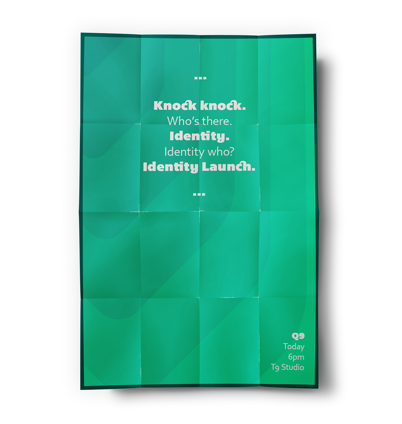
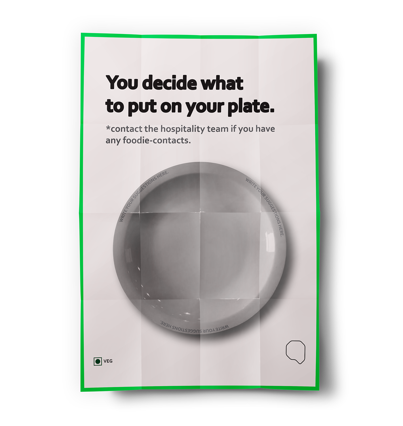
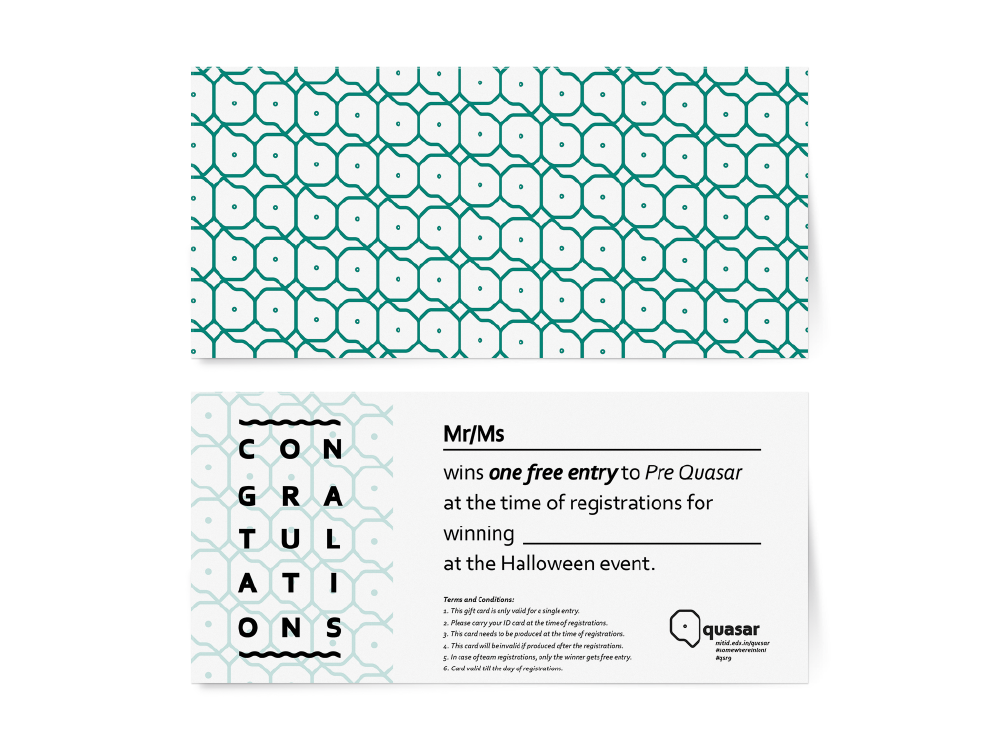
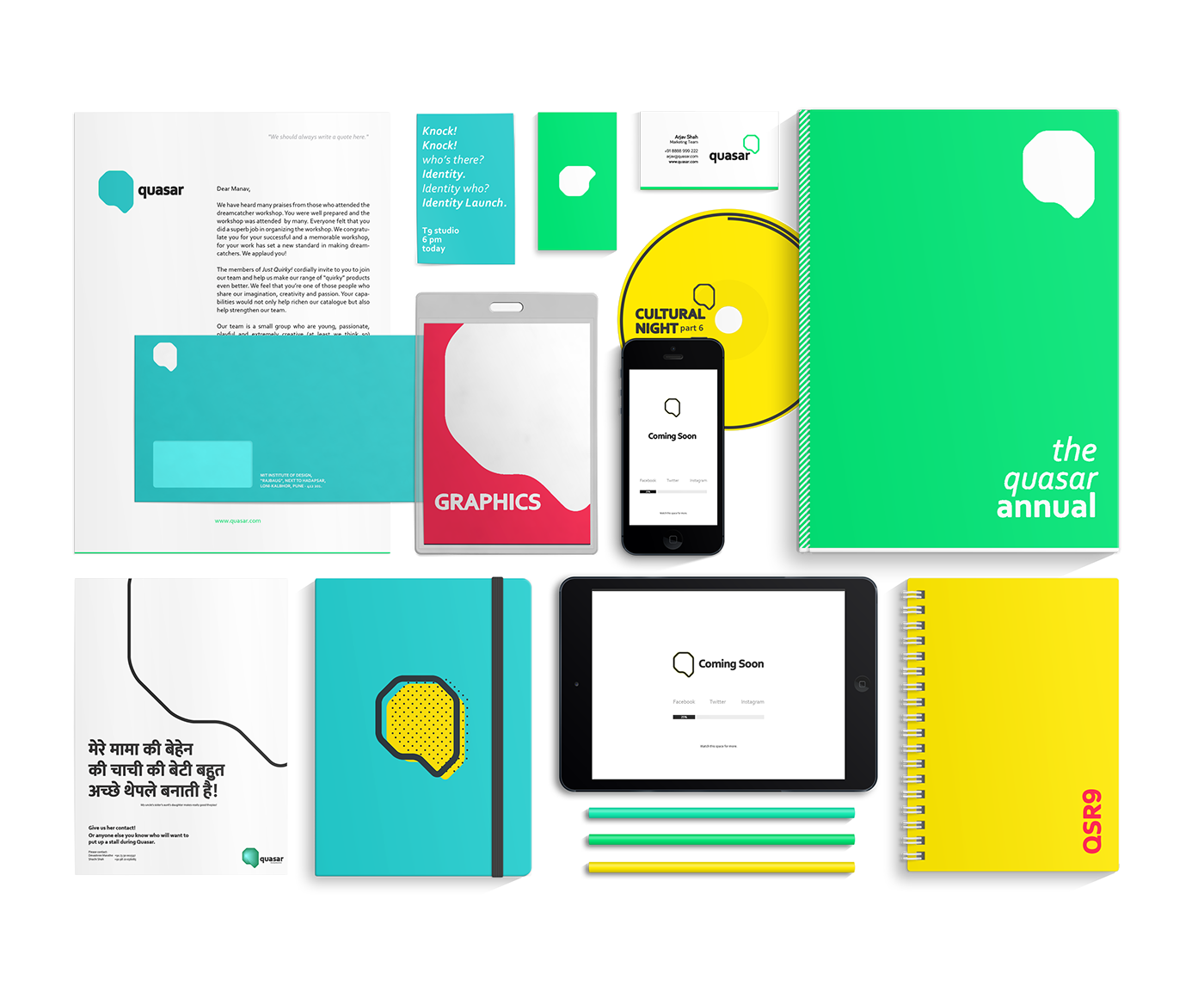
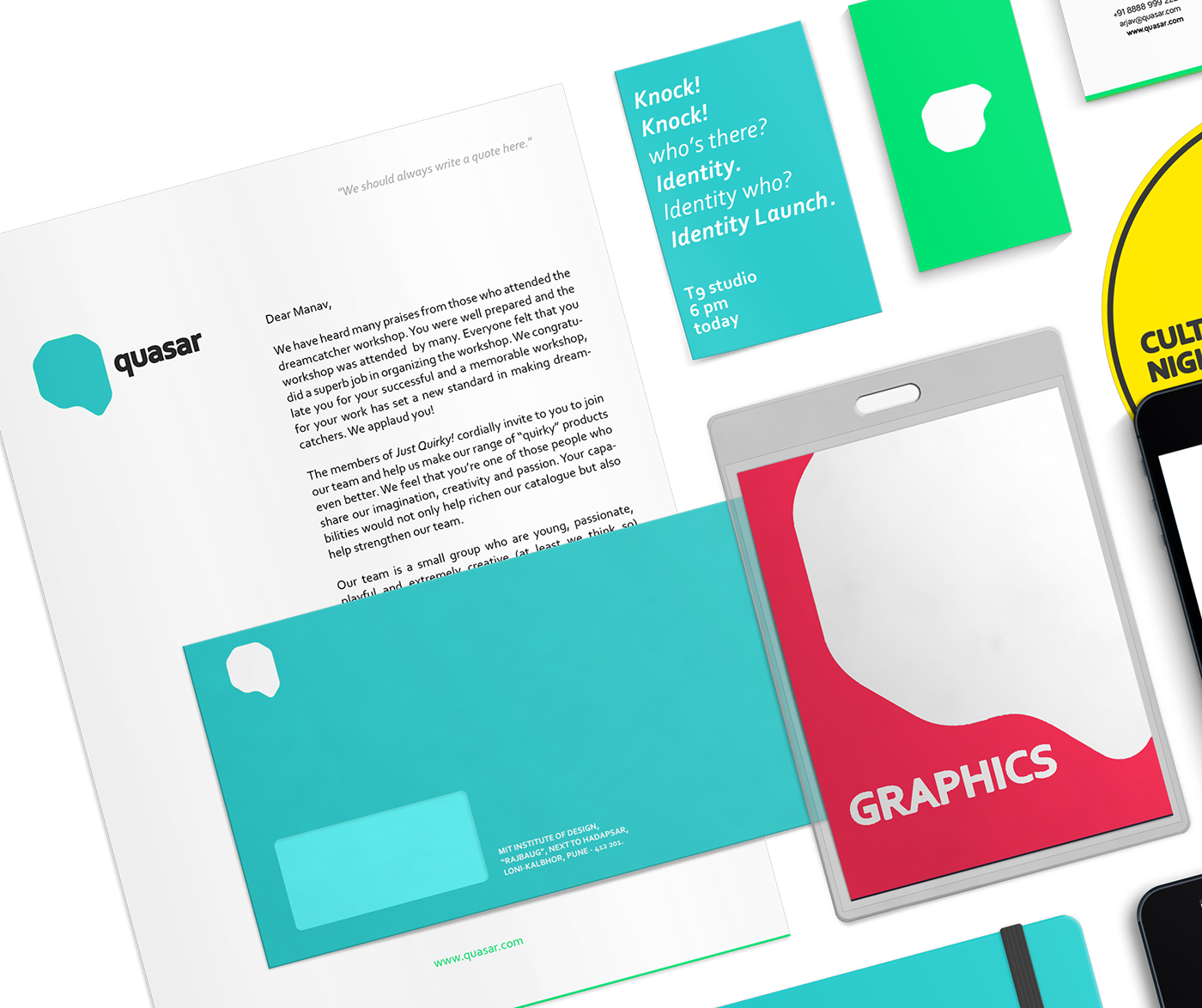
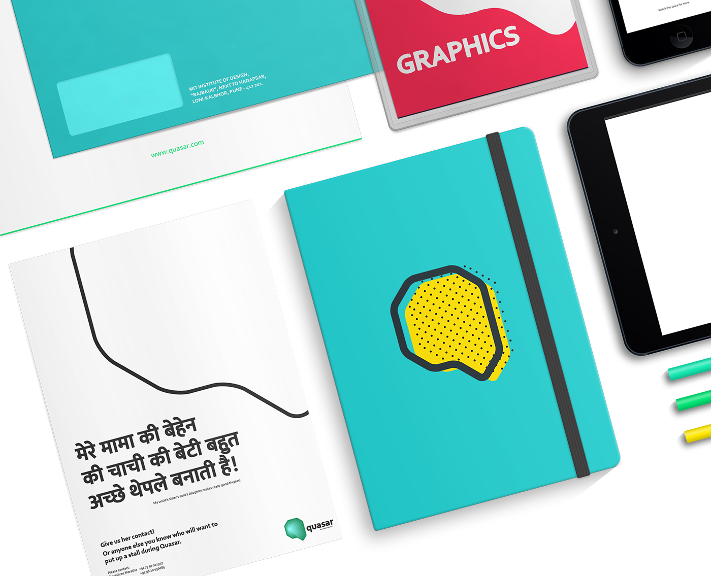
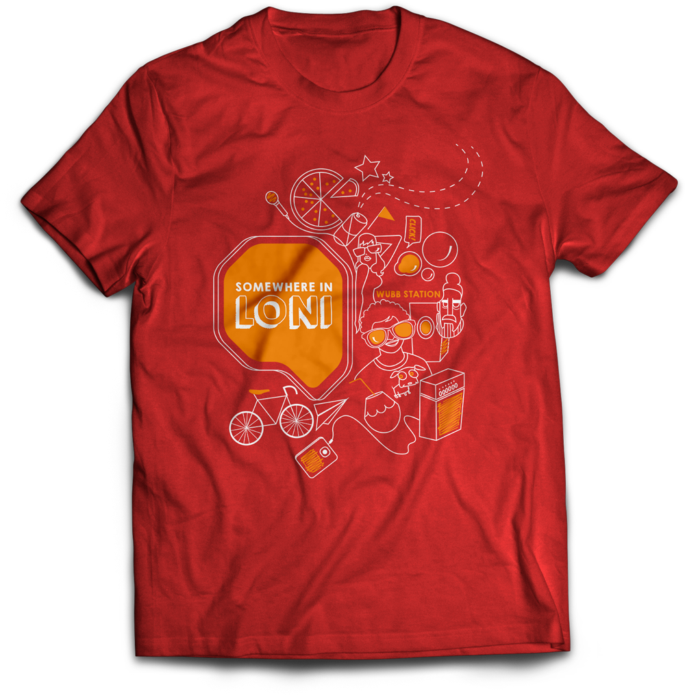
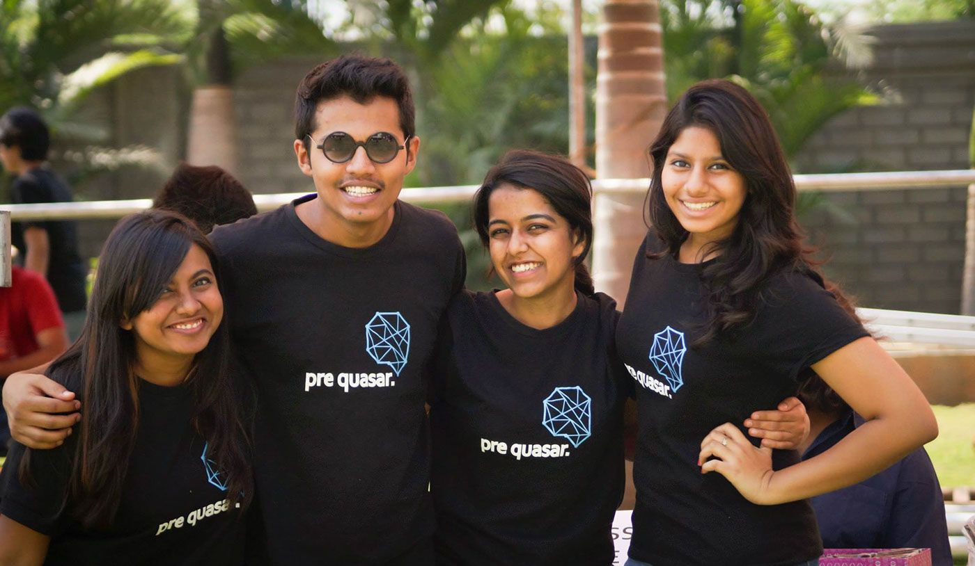
The idea was to create a dynamic and playful identity which could be used digitally as well as on physical materials without losing it's touch. A lot of props were made using the identity with a bright colour palette to create an immersive experience for the students, faculty and the guests who visit Quasar.
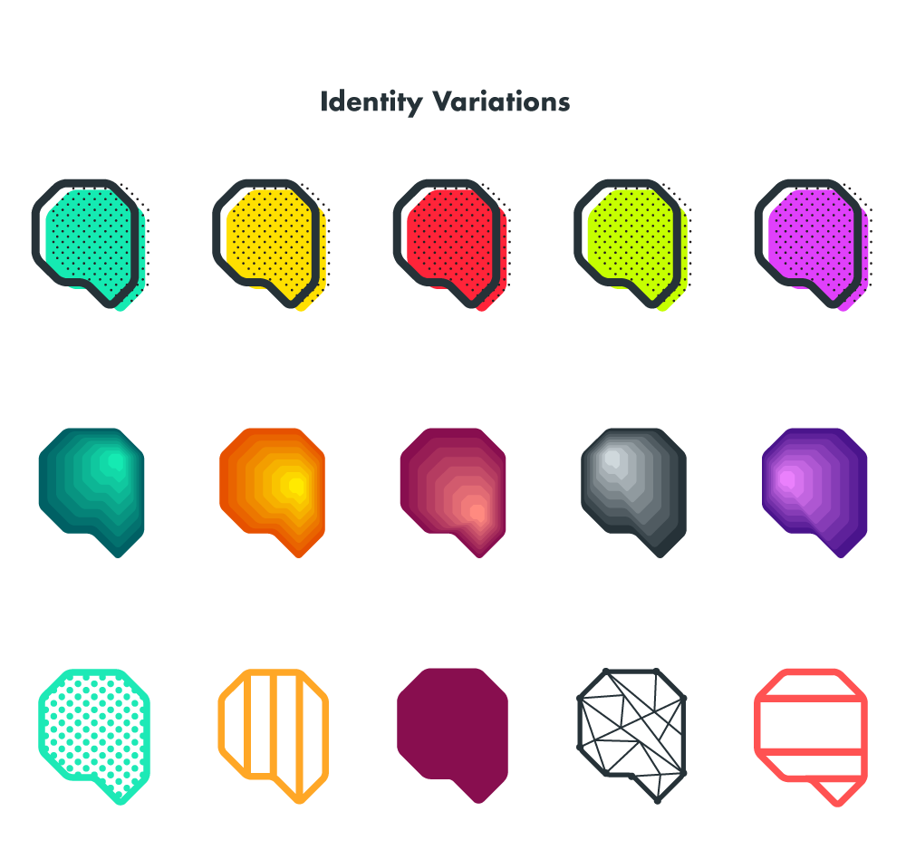
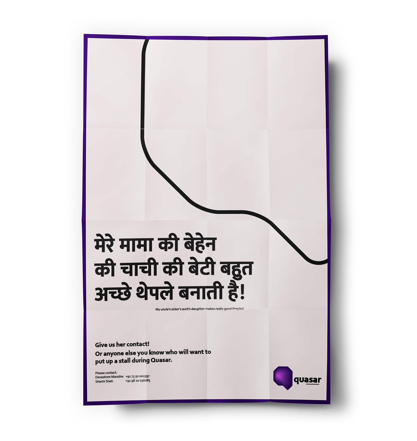
The identity is created in such a way so as to be used independently without any constraints except one: the form of the identity shouldn't be distorted in any way. People could create anything inside the identity keeping the background white (or any other solid colour), or superimpose it on an background with a solid colour or just the outline. This approach seemed obvious considering the huge amount of creative students who would be using it for different purposes for Quasar; for example, marketing material, simple posters, or for personal use.
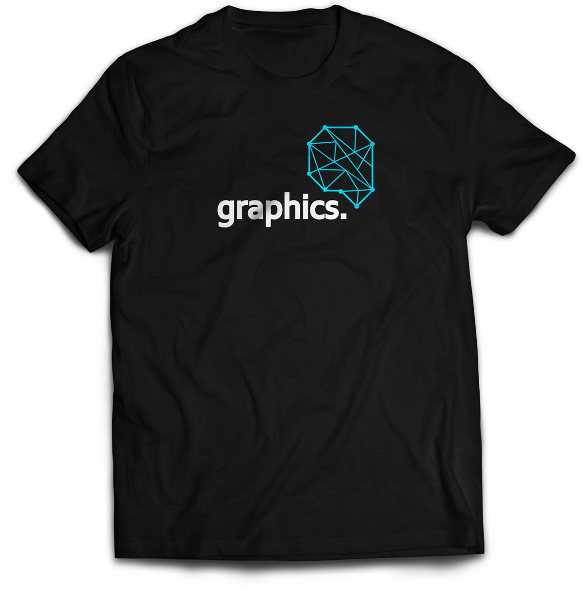
One of such explorations was the one with the layers of the identity symbol repeated on top of the other. This was used predominantly on official posters and merchandise to sumbolize the overlapping of different teams that come together in a harmonious and synergized way to make the festival.


Design by Vedang S. Agnihotri.


THE QUASAR EXPERIENCE
Motion Graphics
Copy
Manav Dhiman
Manav Dhiman
Animation
Rachit Tank & Arjav Shah
Videos [The Quasar Experience]
Video
Media Team
Editing
Siddharth Kapoor
Thank you for your time!


