--------------------------------- >> << ---------------------------------
LINA’S – AL FRESCO DINING
Lina’s é o nome do mais novo e badalado restaurante internacional de Bacolod City, nas Filipinas. Filipinas é um país pertencente ao continente asiático e constituído por um belíssimo arquipélago formado por mais de 7100 ilhas situado próximo à Malásia, Indonésia e Vietnam.
Os proprietários são integrantes da oitava geração de uma família que vive na ilha Negros e é conhecida pelo tradicional cultivo de cana de açúcar.
--------------------------------- >> << ---------------------------------
Lina's is the name one of the newest and trendiest international restaurants in Bacolod City, Philippines. The Philippines is a country belonging to the Asian continent and consists of a beautiful archipelago of over 7100 islands and is situated next to Malaysia, Indonesia and Vietnam.
The owners of Lina’s are members of the eighth generation of a family living in Negros Island, which is famous for its tradition of sugar cane cultivation.
--------------------------------- >> << ---------------------------------
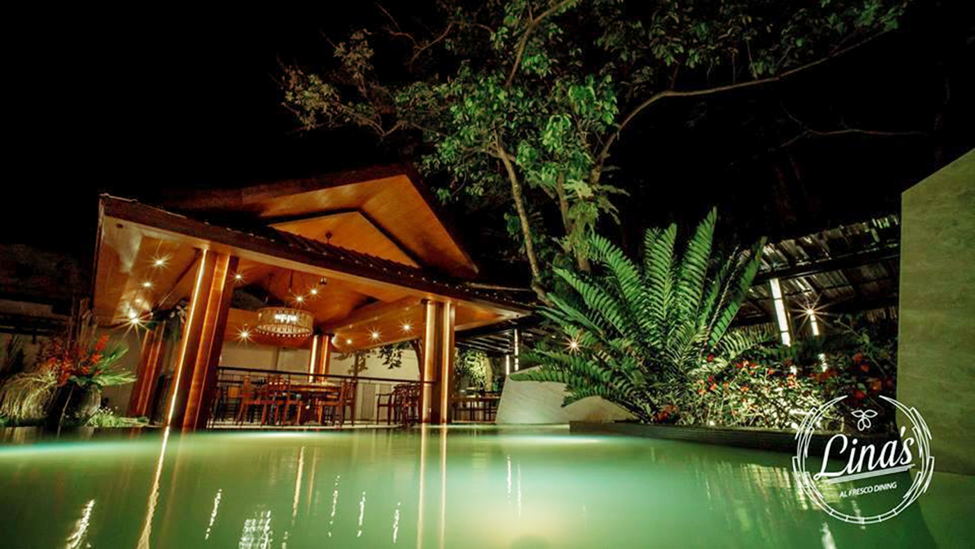
PROPOSTA
A proposta do restaurante é dispor de ambiente estimulante, amigável, informal, porém um tanto clássico. Um espaço onde as pessoas possam ter uma experiência gastronômica internacional memorável.
O menu foi cuidadosamente composto a partir de experiências de viagens dos proprietários pela Europa e Ásia, bem como por uma coletânea de pratos tradicionais cujas receitas foram guardadas pela avó Lina, que dá nome ao restaurante.
Além disso, os proprietários continuam inovando e renovando o cardápio, pois estão sempre viajando pelo mundo, conhecendo novos países em busca de novas experiências gastronômicas.
--------------------------------- >> << ---------------------------------
The idea of this restaurant is to offer a stimulating, friendly and informal place, with some classic touches. A space where people can have a memorable international dining experience.
The composition of the menu was carefully selected from the owners travels in Europe and Asia as well as a collection of traditional Philippine recipes compiled by the owners grandmother Lina, after who the restaurant is named.
Aside from this, the owners continue to innovate and add the menu, because of their exposure to new countries from traveling around the world in search of new dining experiences.
--------------------------------- >> << ---------------------------------
PÚBLICO-ALVO
Os clientes têm poder aquisitivo moderado/alto, viajadas e de gosto refinado, que buscam por pratos únicos e sabem apreciar um cardápio sofisticado, além de curtir um lugar aconchegante, de atmosfera acolhedora em extraordinário jardim.
--------------------------------- >> << ---------------------------------
The guests come from a background of moderate to high income, are mostly well traveled and with sophisticated taste, looking for unique dishes and who know how to appreciate a refined menu. Aside from enjoying a warm, and welcoming atmosphere in an extraordinary al fresco garden setting.
--------------------------------- >> << ---------------------------------
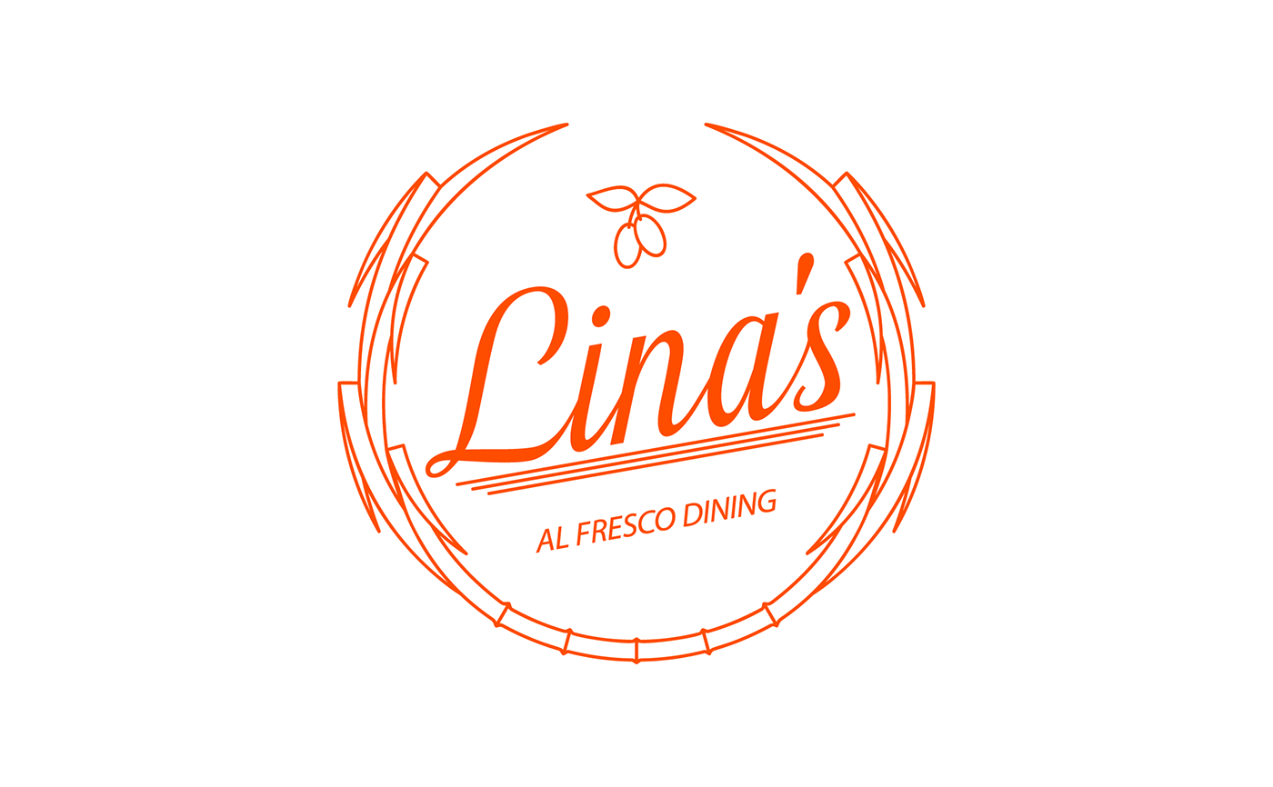
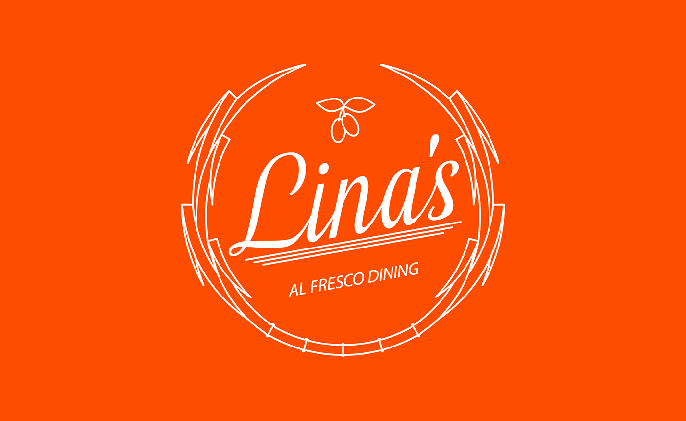
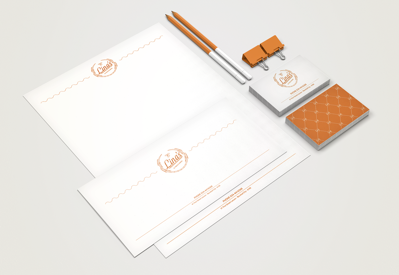
TAREFA – LOGOTIPO E IDENTIDADE VISUAL
A proposta do logotipo é fazer referência aos elementos que vão dar ao restaurante o toque equilibrado entre tradição familiar, valores, cozinha internacional, sabor, classe, sofisticação, contemporaneidade e simplicidade.
A proposta visual do logotipo deve ter caráter universal pois precisa ser facilmente compreendida por pessoas do mundo todo, bem como convergir culturas diferentes num único composto visual.
Além disso, formas e lettering precisam entrar em conformidade para conviverem em harmonia.
A cor laranja estimula a comunicação e realça o apetite: duas propostas que fazem do restaurante o lugar ideal para experiências incríveis.
--------------------------------- >> << ---------------------------------
The proposal of the logo is to communicate elements that give the restaurant a balanced feeling of family traditions, values, international exposure and sophistication while remaining contemporary and uncomplicated.
The visual identity of the logo should be universally easy to understand by people from different cultural backgrounds, converging in a single visual union.
Beside that, shapes and lettering should conform with the idea as to create a harmonious look.
The color orange stimulates communication and enhances the appetite: two proposals that make the restaurant the ideal place for an awesome experience.
--------------------------------- >> << ---------------------------------


--------------------------------- >> << ---------------------------------
Dear Mr. Kuhn,
We want you to know that we are very pleased with the quality of the graphic design that you have created specifically for Lina’s Alfresco Dining.
Your level of sophistication and taste has been nothing short of impressive and we sincerely appreciate your responsiveness and the way you conduct business.
We have recommended you to other businesses because of our satisfaction with your work and talent. We look forward to doing business with you for years to come.
Sincerely,
Josef M. Sagemuller
CEO
Lina’s Alfresco Dining
--------------------------------- >> << ---------------------------------
Thanks for watching!


